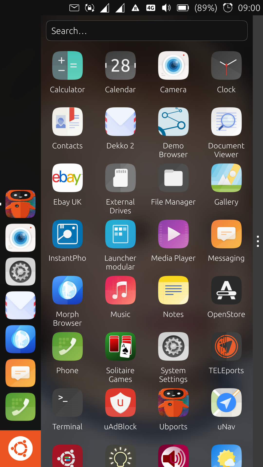
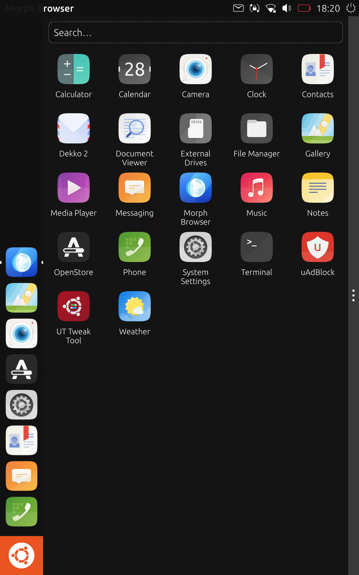
New Launcher, edge channel.
-
@advocatux I accidentaly left it discharge, that's why it was like that.

-
-
@Krille not really look closer

-
I just checked it out on my Nexus 7 and I'm not very fond of the fact that desktop apps and Ubuntu Touch apps are all mixed in with each other now. I liked each type of apps to have its own scope and also hoped for Anbox apps to get their own in the future. Also, it's not intuitive that you have to swipe/click the Ubuntu icon to get the app drawer to show up in the first place, but I assume that's temporary.
-
@ozzelot said in New Launcher, edge channel.:
I just checked it out on my Nexus 7 and I'm not very fond of the fact that desktop apps and Ubuntu Touch apps are all mixed in with each other now. I liked each type of apps to have its own scope and also hoped for Anbox apps to get their own in the future. Also, it's not intuitive that you have to swipe/click the Ubuntu icon to get the launcher to show up in the first place, but I assume that's temporary.
It was always the intent to make legacy apps easier to access by combining them into the main apps view. If Canonical was still building Ubuntu phone and Unity8, this would have made it onto phone images almost 2 years ago.
How is it not intuitive to swipe or click on the Ubuntu logo button? This has always been the way to get to the scopes before. It is not temporary at all. It is how unity 7 works, and it's how unity8 has always worked. The only difference with the new drawer replacing the dash, is that it is not always shown, because to do so goes against the ideals of convergence.
Also, it is called the app drawer. The launcher is the small vertical bar on the left, which some also call a dock.
-
@dobey Naming noted.
I should have made myself clearer: I don't like the fact that after booting and unlocking the device, I get nothing but my wallpaper, and I have to perform extra steps to get to something I've come to expect as a homescreen. There's just nothing given to work with. I can only imagine a new user experiencing this... and it doesn't seem pretty. Therefore, I assumed the temporary nature of this little fact. -
@ozzelot said : I don't like the fact that after booting and unlocking the device, I get nothing but my wallpaper.
Perversely... that's what I like the most.
-
I think the ultimate plan (or at least one possible one) is to allow people to place widgets and launchers on the wallpaper background as if it was a "home" (same as if it was a non-vanilla-Gnome-3 desktop) - but that this will take time to code and the need to streamline the code and image size to what can be easily maintained makes the first step of getting rid of Scopes one that will have to happen in order to make any forward progress from there.
Best regards,
Steve Berson -
@TotalSonic said in New Launcher, edge channel.:
I think the ultimate plan (or at least one possible one) is to allow people to place widgets and launchers on the wallpaper background as if it was a "home" (same as if it was a non-vanilla-Gnome-3 desktop) - but that this will take time to code and the need to streamline the code and image size to what can be easily maintained makes the first step of getting rid of Scopes one that will have to happen in order to make any forward progress from there.
Best regards,
Steve BersonIt has been an idea that a few people have mentioned. There is currently no plan to do it (nor do I think should there be, as it's not a convergent feature).
-
@dobey said in New Launcher, edge channel.:
@TotalSonic said in New Launcher, edge channel.:
I think the ultimate plan (or at least one possible one) is to allow people to place widgets and launchers on the wallpaper background as if it was a "home" (same as if it was a non-vanilla-Gnome-3 desktop) - but that this will take time to code and the need to streamline the code and image size to what can be easily maintained makes the first step of getting rid of Scopes one that will have to happen in order to make any forward progress from there.
Best regards,
Steve BersonIt has been an idea that a few people have mentioned. There is currently no plan to do it (nor do I think should there be, as it's not a convergent feature).
I don't see why allowing icons and widgets on a "home" background (whether mobile, tablet, or desktop) would be consodered "not a convergent feature" when that feature is an integral part of most OS's in all 3 form factors. I do agree that coding that feature to be truly convergent would likely be difficult, and as such should not be a priority for the UBports team.
Best regards,
Steve Berson -
Just tested new Edge 30.07.2019 image on Pro 5.
Oh yeah, the new launcher is great and is so much better then the old one. Even home button on Pro 5 works. When pressed, it behaves like swipe from left and pressed again like swipe from right.
New Unity8/Mir is working smooth on Pro 5. The best performance/smoothness/speed ever!
-
I think the gray bar on the right with the three dots is ugly. Would there be any issue removing it?
-
@B2288 It was actually added from the initial implementation by Canonical to fix gesture issues when closing the drawer. So now only a righ edge swipe would close the drawer instead of anywhere in the drawer. And this bar with dots is the indicator of this gesture which is the same as the one in the indicators. Design-wise and usability-wise I think it's good but honestly, I agree that it doesn't look good especially in desktop mode.
-
No, I added the handle on the right. Previously you could drag from anywhere on the Drawer to get it to close, but that behavior didn't work right. Now you can only drag from the handle.
I tried to make the handle not appear on larger screens to avoid the desktop issue, but that doesn't work. Touch screens can be large enough to get it to disappear.
Of course the code is all open and Drawer.qml is pretty simple to understand. I'd appreciate your suggestions.
-
@UniSuperBox said in New Launcher, edge channel.:
I'd appreciate your suggestions.
Can't you make it magically do what every individual wants on their own devices? It's just code, right?

-
@UniSuperBox What if instead of a handle, the 'short right edge swipe' gesture closed the drawer? In other contexts, the short right swipe reveals the previous app used, so it would make sense that in the drawer context that gesture would hide the drawer and reveal the open application.
-
I don't know who desing the new launcher, but you sir are my hero. On thing that I love about UT is that android and ios feels exactly the same to me and UT with all the swipe gesture brought a new view on phone UI that I love it. And gettng ride of the 'home' screen and having a app drawer like that is the best desing I ever used.
I know some ppl don't like it but I hope if we make change it will be in the form of configuration and not removing this desing.
I switch to edge on my main device just for this feature and I dont regret it!
-
This post is deleted! -
@B2288 Not all devices have the drawer fill all the horizontal space like desktops. In fact in landscape mode, the drawer usually only take up around 3/4 of the screen.
For me, it's not a big deal because it works and serves its purpose. Perhaps a better design in the future.
-
I love the design, three dots and all. It makes sense for the conversion in desktop mode and it looks great on the phone. Besides having a search function, which comes in handy at times. Good job!
Hello! It looks like you're interested in this conversation, but you don't have an account yet.
Getting fed up of having to scroll through the same posts each visit? When you register for an account, you'll always come back to exactly where you were before, and choose to be notified of new replies (either via email, or push notification). You'll also be able to save bookmarks and upvote posts to show your appreciation to other community members.
With your input, this post could be even better 💗
Register Login