UBports Robot Logo UBports Forum
    • Categories
    • Recent
    • Tags
    • Popular
    • Users
    • Groups
    • Search
    • Register
    • Login

    Telegram Style Reduction?

    Scheduled Pinned Locked Moved App Development
    35 Posts 11 Posters 9.3k Views 3 Watching
    Loading More Posts
    • Oldest to Newest
    • Newest to Oldest
    • Most Votes
      Reply
      • Reply as topic
      Log in to reply
      This topic has been deleted. Only users with topic management privileges can see it.
      • J Offline
        Jujuyeh @flohack
        last edited by

        @Flohack Could you try with light gray? πŸ˜›

        flohackF 1 Reply Last reply Reply Quote 0
        • flohackF Offline
          flohack @Jujuyeh
          last edited by

          @Jujuyeh Can you pick me one in HTML notation please πŸ˜‰

          My languages: πŸ‡¦πŸ‡Ή πŸ‡©πŸ‡ͺ πŸ‡¬πŸ‡§ πŸ‡ΊπŸ‡Έ

          J 1 Reply Last reply Reply Quote 0
          • PhoenixLandPiratP Offline
            PhoenixLandPirat
            last edited by

            I prefer the old look, but perhaps if you use the same green as the current telgram this new look would look as good as the current telegram.

            A 1 Reply Last reply Reply Quote 0
            • J Offline
              Jujuyeh @flohack
              last edited by

              @Flohack Try with #CBCBCB or #B0B0B0 πŸ™‚

              flohackF 1 Reply Last reply Reply Quote 0
              • flohackF Offline
                flohack @Jujuyeh
                last edited by

                @Jujuyeh Ok will try, got to go now πŸ˜‰

                My languages: πŸ‡¦πŸ‡Ή πŸ‡©πŸ‡ͺ πŸ‡¬πŸ‡§ πŸ‡ΊπŸ‡Έ

                1 Reply Last reply Reply Quote 0
                • PhoenixLandPiratP Offline
                  PhoenixLandPirat
                  last edited by

                  Perhaps somewhere in settings you could customise both your backgrounds, and text chat colours?

                  So if you like candy green, use that, if you prefer the grey then have that.

                  And you could either have a selection between 3-5 colour options, or just let people use there own #'s?

                  flohackF 1 Reply Last reply Reply Quote 0
                  • S Offline
                    sverzegnassi
                    last edited by sverzegnassi

                    I don't like the idea of a full-white application, I'd prefer to see the current background or, at least, a different shade of white (e.g. #F8F8F8).

                    For the message bubble, I think you could use the light shadow that was meant to be used for Suru buttons.
                    I agree with the other guys, a bit more of padding for the text, a lighter font, and a different tint of UbuntuColors.green (#63c972 or #71ce7f) might be more appealing. πŸ™‚


                    (with Telegram bg: http://i.imgur.com/LUbFMPd.png)

                    The shadow is a simple Rectangle which stays below the white/green container. Something like:

                    Rectangle {
                        id: container
                    
                        Text { [...] }
                    
                        Rectangle {
                            width: container.width
                            height: container.height
                            radius: container.radius
                    
                            y: units.dp(1)
                            z: -1000
                    
                            color: "#e6e6e6"    // theme.palette.normal.base (i.e. #CDCDCD) with opacity: 0.5
                        }
                    }
                    

                    See e.g. the Button style in the Suru theme for QtQuick Controls 2
                    https://github.com/sverzegnassi/qqc2-suru-style/blob/master/qqc2-suru/qml/Button.qml

                    1 Reply Last reply Reply Quote 0
                    • flohackF Offline
                      flohack @PhoenixLandPirat
                      last edited by

                      @ChloeWolfieGirl We got this for background: https://github.com/ubports/telegram-app/issues/34

                      My languages: πŸ‡¦πŸ‡Ή πŸ‡©πŸ‡ͺ πŸ‡¬πŸ‡§ πŸ‡ΊπŸ‡Έ

                      1 Reply Last reply Reply Quote 0
                      • advocatuxA Offline
                        advocatux
                        last edited by

                        I agree with the majority opinion πŸ‘

                        1 Reply Last reply Reply Quote 0
                        • flohackF Offline
                          flohack
                          last edited by

                          Here is proposal by @sverzegnassi (do you think the rectangle is sufficient with y movement only?)

                          The darker green:
                          0_1502576457364_Bildschirmfoto vom 2017-08-13 00-16-28.png

                          The lighter green:
                          0_1502576841495_Bildschirmfoto vom 2017-08-13 00-22-13.png

                          Note the test for white checkmarks in the second one. Font is unchanged, but black on green does not work well.

                          My languages: πŸ‡¦πŸ‡Ή πŸ‡©πŸ‡ͺ πŸ‡¬πŸ‡§ πŸ‡ΊπŸ‡Έ

                          advocatuxA 1 Reply Last reply Reply Quote 0
                          • advocatuxA Offline
                            advocatux @flohack
                            last edited by

                            @Flohack I like the first one because shows more text in the same screen. For example, the first message looks better in 2 rows than in 3 rows.

                            I agree with you, black on green doesn't work well.

                            flohackF 1 Reply Last reply Reply Quote 0
                            • flohackF Offline
                              flohack @advocatux
                              last edited by

                              @advocatux Eh sorry but this was just different sizing of the window on my desktop build πŸ˜‰ - on your device it will be whatever comes up. Its hard to find a good compromise for that for so many different devices

                              My languages: πŸ‡¦πŸ‡Ή πŸ‡©πŸ‡ͺ πŸ‡¬πŸ‡§ πŸ‡ΊπŸ‡Έ

                              advocatuxA 1 Reply Last reply Reply Quote 0
                              • advocatuxA Offline
                                advocatux @flohack
                                last edited by

                                @Flohack no problem, I saw it was in desktop mode but I thought that would affect the final design too.

                                1 Reply Last reply Reply Quote 0
                                • A Offline
                                  Alexisme @PhoenixLandPirat
                                  last edited by

                                  @ChloeWolfieGirl I also prefer the old look πŸ˜‰ But I think I will adapt to the new design because the majority wants it...

                                  1 Reply Last reply Reply Quote 0
                                  • U Offline
                                    UKPhil
                                    last edited by

                                    I think the new version looks good, but think you need the message bubble for sure. If the bubbles were different colour, that would look good. However, if the message bubbles are different colours, then the background should stay white. Likewise, if the background can be personalised and different colours/images selected, the message bubble should be white. Otherwise there will be too much colour going on.

                                    The green message box with the white check marks is easier to see. Sometimes they can be missed if you look at the message quick. I have a friend who had a slight sight issue and often missed the check marks, but I feel this would be easier for him to see.

                                    1 Reply Last reply Reply Quote 0
                                    • flohackF Offline
                                      flohack
                                      last edited by flohack

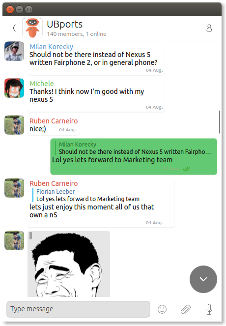
                                      Ok here is my current iteration:

                                      • Background is back
                                      • Readability is better
                                      • Font is thin now - it looks better on the device than here
                                      • simulated shadow with Rectangle behind in x/y shift

                                      EDIT: Quality is OK I think!
                                      0_1503096485724_screenshot20170819_003816674.png

                                      My languages: πŸ‡¦πŸ‡Ή πŸ‡©πŸ‡ͺ πŸ‡¬πŸ‡§ πŸ‡ΊπŸ‡Έ

                                      advocatuxA 1 Reply Last reply Reply Quote 1
                                      • advocatuxA Offline
                                        advocatux @flohack
                                        last edited by

                                        @Flohack that looks fantastic! Kudos.

                                        1 Reply Last reply Reply Quote 0
                                        • flohackF Offline
                                          flohack
                                          last edited by

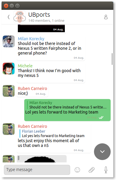
                                          And another one: Green is darker, its the same green now like in the messaging app.

                                          Some small changes but now its 99% final xD
                                          0_1503176363854_screenshot20170819_225429946.png

                                          My languages: πŸ‡¦πŸ‡Ή πŸ‡©πŸ‡ͺ πŸ‡¬πŸ‡§ πŸ‡ΊπŸ‡Έ

                                          uzantoU 1 Reply Last reply Reply Quote 3
                                          • uzantoU Offline
                                            uzanto @flohack
                                            last edited by

                                            @Flohack Great work! I think it's a good idea to use the same style than the messaging app.

                                            1 Reply Last reply Reply Quote 0
                                            • flohackF Offline
                                              flohack
                                              last edited by

                                              Thanks for all the feedback! Now working on getting it released πŸ˜‰

                                              BR

                                              My languages: πŸ‡¦πŸ‡Ή πŸ‡©πŸ‡ͺ πŸ‡¬πŸ‡§ πŸ‡ΊπŸ‡Έ

                                              1 Reply Last reply Reply Quote 2
                                              • First post
                                                Last post