Privileged ICE contacts and medical information available on lockscreen [WORK IN PROGRESS]
-
I too would use the Circle Message app if there was a way to disable the pointless messages of the "you made two phone calls today" type.
-
@BigB
If you can, please add 'Lockscreen', 'SOS' and 'Emergency' as has tags to the OP -
@Flohack said in [Request] Privileged ICE contacts available on lockscreen + medical information:
@3T_Ed NFC is currently not an available option in UT, the API is not implemented down to the Android layer. Just saying.
Thanks. Coming from Microsoft devices it's an old habbit to include NFC when it comes to app compatibility, my bad
-
BigB.
I wonder if you aren't making this too complex. Wouldn't a single contact phone number be all that most people need?
-
This seems to be turning into a major app/OS dev project. If someone is looking for an I.C.E /SOS contact should it not just be easy, quick to find and call. All the other info maybe of use later but not in the situation your I.C.E is being called.
-
@Lakotaubp said in [Request] Privileged ICE contacts available on lockscreen + medical information:
This seems to be turning into a major app/OS dev project. If someone is looking for an I.C.E /SOS contact should it not just be easy, quick to find and call. All the other info maybe of use later but not in the situation your I.C.E is being called.
Yes if you're conscious - no need for an app there - Chances are that you're not and need help from bystanders. If you want their immediate help and subsequent and adequate intervention by emergency services and specialists then this information might be crucial to save your life. That is, the optional features as mentioned above is extra however extremely valuable and time saving.
-
@cliffcoggin @joachimvda
Maybe You are right. Maybe it goes too far.
I think like You that the priority is what you wrote - simple access to ICE contacts.
Why in my opinion there should be more than one phone number? Because many people have more than one phone number.
I'll separate soon in 1st post the really needed base form which we agreed that should be simple without fireworks and the extended one for passionates.
What is the key for me? (only in this case) other mobile OS - paramedics know how to use them so they should find similar thing with at least information they could find in others phones.
It shouldn't be too complicated because it may causes problems.
However I'm for more functionalities but in second place because it consumes more time and I respect others time. (Unfortunately I'm not coder... I just started learning java. When I'll know something in future I'm going to help with UT projects
 )
) -
@3T_Ed said in [Request] Privileged ICE contacts available on lockscreen + medical information:
Yes if you're conscious - no need for an app there - Chances are that you're not and need help from bystanders.
But if you are unconscious one would hope the bystanders would concentrate on saving your life rather than fiddling with your phone.
-
@cliffcoggin said in [Request] Privileged ICE contacts available on lockscreen + medical information:
@3T_Ed said in [Request] Privileged ICE contacts available on lockscreen + medical information:
Yes if you're conscious - no need for an app there - Chances are that you're not and need help from bystanders.
But if you are unconscious one would hope the bystanders would concentrate on saving your life rather than fiddling with your phone.
Quite some resistance...... sorry for wasting your time.
If you're in case of real emergency I hope by then the information will be available to those standing by not knowing what to do just watching that one reluctant person doing cpr or whatever he/she thinks is necessary or capable of, emergency services be guessing and your loved ones to be informed.....
Or.... have anothers be well informed to help you ... tic toc...tic toc...tic toc....
-
Hey Guys come on it's hard to find best configuration. That's why I added section Pros and Cons.
We should consider every fact beginning form stress ending on bad android design.Yes we definitely need this feature
The form of it, list of features is hard to design. That's why we should discuss and give arguments for and against, to find best configuration, together.
BTW updated 1st post.

-
My advice from my day job as software dev: User experience needs to be tested with users, that means to make mockups or click dummies, and then see a) if users understand the idea b) how they like it. For such features like this one where there are different opinions this would make sense.
-
Great to see that the community is taking this request seriously as per last week's Q&A.
Having a good and flexible lock screen app would be really helpfull. I'm well aware that developing an extensive flexible lock screen will consume a lot of time, eventhough there are many good examples out there being used on other platforms.
On the other hand, by doing so it would be a great way to create more exposure, after all it's the first screen potential users would be attracted to. Frankly I believe it would make a huge difference and a much better way to 'show of' my device to family, friend and potential users.
@BigB thanks for keep amending the original post.
-
I had a little time this morning and I left on a completely different idea!
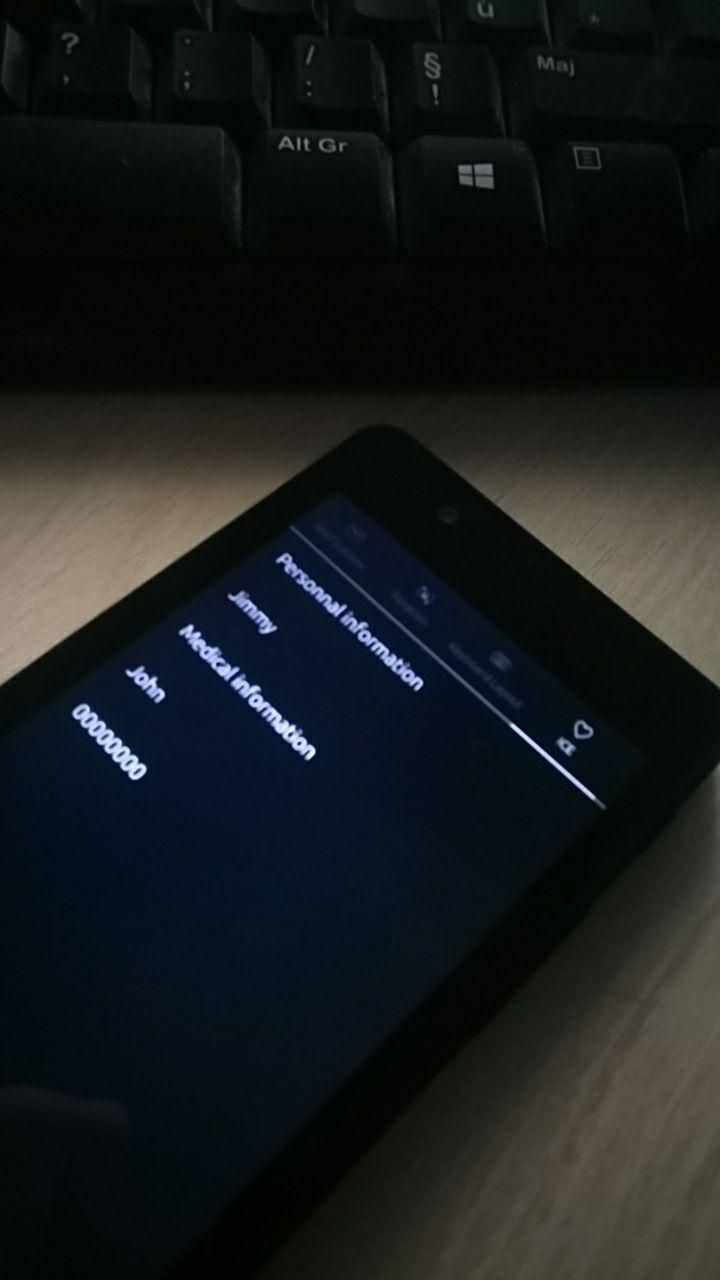
I started by creating an "indicator" in that all the information deemed necessary by the user will be displayed.
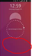
Then when I have a little more time I would look for this indicator to appear when clicking on a button on the lockscreen.
So here it may not be what you wanted but the application will at least have the merit of existing!
I repeat that it was done quickly this morning so it's not very beautiful!

-
@syper said in [Request] Privileged ICE contacts available on lockscreen + medical information:
I had a little time this morning and I left on a completely different idea!
I started by creating an "indicator" in that all the information deemed necessary by the user will be displayed.
Then when I have a little more time I would look for this indicator to appear when clicking on a button on the lockscreen.
So here it may not be what you wanted but the application will at least have the merit of existing!
I repeat that it was done quickly this morning so it's not very beautiful!
This is absolutely great!
I applaud you for being involved and finding creative solutions to problems :clapping_hands:Thank you for taking the time and I hope you will continue building on this idea.
On a positive critical note for quick improvement regarding exposure I'd like to suggest the following
Used symbol
The heart symbol may be to generic and could be replaced by one that is immediately recognizable for emergency cases. Although I'm not familiar with UT layout regulations on do's and don'ts there are emoticons available such as :sos_button: and :medical_symbol: (or a dedicated symbol could be added to the emoticon list) and possible uploading your own preferred symbol based on Red Cross with ICE indicator or medical star would be even better.placement and highlighting in icon top bar
It would be great to have the icon be placed on the left side of the top bar, upper left or right to notifications as the latter is probably the most used icon. Personally I think the ICE icon is worth of having it highlighted in red or blue by default (depending on chosen symbol). Others may want it less prominent, perhaps there could be an option to have a slider 'logo dimmed on/off'? -
@3T_Ed All requests are noted;) I will see what I can do as soon as I have time again
-
@syper
What a runner : https://open-store.io/app/indicator-ice.ubuntouchfr !
:grinning_squinting_face: -
@syper Great start and well done. Agree on changing the symbol. Only the heart shows on OP3 not sure if there is ice under it. Then which symbol? one of the staff types? the caduceus or rod of Asclepius maybe.
Still great work and thanks to all involved from initial idea through to working indicator in the OpenStore. -
@syper
Brilliant!! Very happy you made the first ICE app in the Open Store. A great addition to the top bar, thank you so much! Looking forward to further improvements. Thanks to fellow members as well who kept this thread going to this point and hopefully will keep contributing.@Lakotaubp
On my OPO 3T the heart is showing as a heart (next to 'notifications', in the app store @syper mentioned changes to the icon on the to-do list). When pulling the top menu down on the heart the heart changes to 'heart + ICE'. The odd thing here is that when pulling the menu is pulled down the heart is relocated to another position (in my case 4th from the left), no idea why. Would love to be able to assign the shortcut icon positions myself.As for the Aesculapius, that would be a good icon for the 'Medical information' field (currently being a magnifying glass).
-
@3T_Ed Being a bit picky my concern is that seeing a heart does not make you think medical more like favourite or such. As most people would not know that you can pull down on indicator bar it might get ignored. A more recognized medical symbol might get them to at least tap at it and then seeing some movement investigate further.
-
@Lakotaubp said in [Request] Privileged ICE contacts available on lockscreen + medical information:
@3T_Ed Being a bit picky my concern is that seeing a heart does not make you think medical more like favourite or such.
Fully agreed. See my earlier comment (links), ICE cross or Medical star symbol or SOS (in that order imho) would be better depending on UT design options/restrictions and visibility.
Hello! It looks like you're interested in this conversation, but you don't have an account yet.
Getting fed up of having to scroll through the same posts each visit? When you register for an account, you'll always come back to exactly where you were before, and choose to be notified of new replies (either via email, or push notification). You'll also be able to save bookmarks and upvote posts to show your appreciation to other community members.
With your input, this post could be even better 💗
Register Login