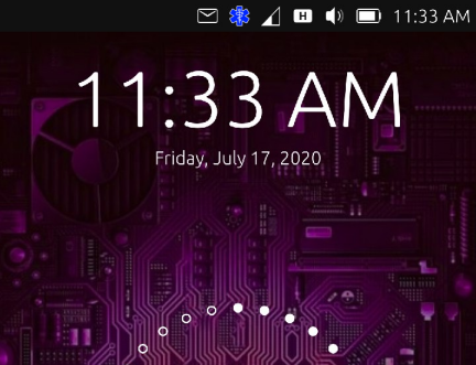
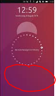
Privileged ICE contacts and medical information available on lockscreen [WORK IN PROGRESS]
-
@3T_Ed All requests are noted;) I will see what I can do as soon as I have time again
-
@syper
What a runner : https://open-store.io/app/indicator-ice.ubuntouchfr !
:grinning_squinting_face: -
@syper Great start and well done. Agree on changing the symbol. Only the heart shows on OP3 not sure if there is ice under it. Then which symbol? one of the staff types? the caduceus or rod of Asclepius maybe.
Still great work and thanks to all involved from initial idea through to working indicator in the OpenStore. -
@syper
Brilliant!! Very happy you made the first ICE app in the Open Store. A great addition to the top bar, thank you so much! Looking forward to further improvements. Thanks to fellow members as well who kept this thread going to this point and hopefully will keep contributing.@Lakotaubp
On my OPO 3T the heart is showing as a heart (next to 'notifications', in the app store @syper mentioned changes to the icon on the to-do list). When pulling the top menu down on the heart the heart changes to 'heart + ICE'. The odd thing here is that when pulling the menu is pulled down the heart is relocated to another position (in my case 4th from the left), no idea why. Would love to be able to assign the shortcut icon positions myself.As for the Aesculapius, that would be a good icon for the 'Medical information' field (currently being a magnifying glass).
-
@3T_Ed Being a bit picky my concern is that seeing a heart does not make you think medical more like favourite or such. As most people would not know that you can pull down on indicator bar it might get ignored. A more recognized medical symbol might get them to at least tap at it and then seeing some movement investigate further.
-
@Lakotaubp said in [Request] Privileged ICE contacts available on lockscreen + medical information:
@3T_Ed Being a bit picky my concern is that seeing a heart does not make you think medical more like favourite or such.
Fully agreed. See my earlier comment (links), ICE cross or Medical star symbol or SOS (in that order imho) would be better depending on UT design options/restrictions and visibility.
-
-
Hi everyone, sorry as warned I unfortunately don't have a lot of time.
Indeed the next changes will be the icons.I promise I won't forget you;)
-
@3T_Ed I agree. Maybe something like this? Or find some inspiration here: https://thenounproject.com/search/?q=medical emergency

-
@Moem said in [Request] [Solutions] Privileged ICE contacts available on lockscreen + medical information:
@3T_Ed I agree. Maybe something like this? Or find some inspiration here: https://thenounproject.com/search/?q=medical emergency

Nice one, should be added to the short list. Could you provide a direct link to the symbol you posted above? I could not find that particular one, would like to see that creator other uploads.
Any reason we should get the symbol from www.nounproject.com website? Are we bound to that project when it comes to selecting icons for UT/topbar?
-
@3T_Ed said in [Request] [Solutions] Privileged ICE contacts available on lockscreen + medical information:
Could you provide a direct link to the symbol you posted above? I could not find that particular one, would like to see that creator other uploads.
I found it here: https://www.iconfinder.com/search/?q=medical emergency
Direct link is https://www.iconfinder.com/icons/6084448/emergency_medical_medicine_iconAny reason we should get the symbol from www.nounproject.com website? Are we bound to that project when it comes to selecting icons for UT/topbar?
I have no knowledge of that. I just figured it would be a good source of inspiration, because many of their icons are small and simple, so they can be used in small sizes and still be recognizable.
-
I just looked up international medical signs. That should get you a generic list of symbols. You might find you need a choice to cover for different parts of the world.
-
@Lakotaubp Any useful results you can point us to? 'Symbol' might yield better results than 'sign' here...
I found the Wikipedia page for the star symbol above, it's apparently called the Star of Life: https://en.wikipedia.org/wiki/Star_of_Life
The fact that it's recognised in multiple countries could make it a good choice.A search for 'star of life' on the Noun Project gives some nice results: https://thenounproject.com/search/?q=star of life
I like this one a lot:

-
Just me playing around a little with colors:smiling_face:

-
Remeber that items on bar are pretty small so sign above (don't know how to call it) should have unique color, to be quick recognizable. How about red, blue or green?
Another helpful thing may be some kind of animation e.g. color, size pulsation, if it's possible (this is idea for now, basic from concept is button on lockscreen).
-
The Star of Life symbol is usually used in blue. I think that is a good reason to make it blue here, too. But on a black background, it would be good to have a white outline because that has maximal contrast with black.
So, this is my proposal.


-
@Moem Hmm, I think that we should use the letters instead of the snake and the staff because they refers to medical personal. I agree that we should use the default colors of the Star of Life.
-
@Rondarius I disagree, ICE is not international enough.
When I see ICE without context, the first thing I think of is the German fast train. Others may think of the U.S. Immigration and Customs Enforcement.The snake and the staff are indeed a well known symbol for anything medical, and the Star of Life is generally used with that symbol. If you leave it out, it seems incomplete to me. It becomes just a star.
The fact that the snake and staff are well known as a medical symbol is an argument for them in my eyes, not against. Most of the situations where people would be looking for the information that this indicator provides are after all of a medical nature. That it can also be used to give you your phone back if you lose it... well, I don't see that as a problem.
-
@Moem I like it but, my first impression that came to me, is that it looks a bit like a bluetooth indicator... Another blue color maybe?
-
@domubpkm It could be darker. Would that help?
Hello! It looks like you're interested in this conversation, but you don't have an account yet.
Getting fed up of having to scroll through the same posts each visit? When you register for an account, you'll always come back to exactly where you were before, and choose to be notified of new replies (either via email, or push notification). You'll also be able to save bookmarks and upvote posts to show your appreciation to other community members.
With your input, this post could be even better 💗
Register Login
 It's amazing!!!