UBports Robot Logo UBports Forum
    • Categories
    • Recent
    • Tags
    • Popular
    • Users
    • Groups
    • Search
    • Register
    • Login

    Privileged ICE contacts and medical information available on lockscreen [WORK IN PROGRESS]

    Scheduled Pinned Locked Moved OS
    contactslock screenmedicalrequestice
    161 Posts 19 Posters 79.3k Views 10 Watching
    Loading More Posts
    • Oldest to Newest
    • Newest to Oldest
    • Most Votes
      Reply
      • Reply as topic
      Log in to reply
      This topic has been deleted. Only users with topic management privileges can see it.
      • MoemM Offline
        Moem @3T_Ed
        last edited by

        @3T_Ed said in [Request] [Solutions] Privileged ICE contacts available on lockscreen + medical information:

        Could you provide a direct link to the symbol you posted above? I could not find that particular one, would like to see that creator other uploads.

        I found it here: https://www.iconfinder.com/search/?q=medical emergency
        Direct link is https://www.iconfinder.com/icons/6084448/emergency_medical_medicine_icon

        Any reason we should get the symbol from www.nounproject.com website? Are we bound to that project when it comes to selecting icons for UT/topbar?

        I have no knowledge of that. I just figured it would be a good source of inspiration, because many of their icons are small and simple, so they can be used in small sizes and still be recognizable.

        Is currently using an Op5t
        Also owns an Op1, a BQ E4.5 and an Xperia X, as well as a BQ tablet and a Pinetab2. Please, someone... make it stop.

        1 Reply Last reply Reply Quote 1
        • LakotaubpL Offline
          Lakotaubp
          last edited by

          I just looked up international medical signs. That should get you a generic list of symbols. You might find you need a choice to cover for different parts of the world.

          MoemM 1 Reply Last reply Reply Quote 1
          • MoemM Offline
            Moem @Lakotaubp
            last edited by Moem

            @Lakotaubp Any useful results you can point us to? 'Symbol' might yield better results than 'sign' here...

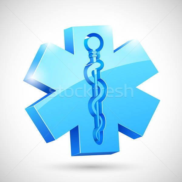
            I found the Wikipedia page for the star symbol above, it's apparently called the Star of Life: https://en.wikipedia.org/wiki/Star_of_Life
            The fact that it's recognised in multiple countries could make it a good choice.

            A search for 'star of life' on the Noun Project gives some nice results: https://thenounproject.com/search/?q=star of life

            I like this one a lot:

            Star of Life

            Is currently using an Op5t
            Also owns an Op1, a BQ E4.5 and an Xperia X, as well as a BQ tablet and a Pinetab2. Please, someone... make it stop.

            1 Reply Last reply Reply Quote 1
            • R Offline
              Rondarius
              last edited by

              Just me playing around a little with colors:smiling_face:
              Star_of_life_ICE.png

              4 Google Pixel 3A
              1 Google Nexus 6P
              2 Google Nexus 5
              2 Pinephones
              2 Sony Xperia X

              1 Reply Last reply Reply Quote 1
              • B Offline
                BigB
                last edited by

                Remeber that items on bar are pretty small so sign above (don't know how to call it) should have unique color, to be quick recognizable. How about red, blue or green?

                Another helpful thing may be some kind of animation e.g. color, size pulsation, if it's possible (this is idea for now, basic from concept is button on lockscreen).

                1 Reply Last reply Reply Quote 0
                • MoemM Offline
                  Moem
                  last edited by Moem

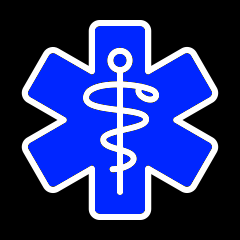
                  The Star of Life symbol is usually used in blue. I think that is a good reason to make it blue here, too. But on a black background, it would be good to have a white outline because that has maximal contrast with black.

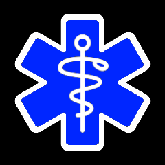
                  So, this is my proposal.

                  UTstaroflife.png

                  UTstaroflife_mockup.png

                  Is currently using an Op5t
                  Also owns an Op1, a BQ E4.5 and an Xperia X, as well as a BQ tablet and a Pinetab2. Please, someone... make it stop.

                  R D 2 Replies Last reply Reply Quote 2
                  • R Offline
                    Rondarius @Moem
                    last edited by

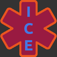
                    @Moem Hmm, I think that we should use the letters instead of the snake and the staff because they refers to medical personal. I agree that we should use the default colors of the Star of Life.

                    4 Google Pixel 3A
                    1 Google Nexus 6P
                    2 Google Nexus 5
                    2 Pinephones
                    2 Sony Xperia X

                    MoemM 1 Reply Last reply Reply Quote 1
                    • MoemM Offline
                      Moem @Rondarius
                      last edited by

                      @Rondarius I disagree, ICE is not international enough.
                      When I see ICE without context, the first thing I think of is the German fast train. Others may think of the U.S. Immigration and Customs Enforcement.

                      The snake and the staff are indeed a well known symbol for anything medical, and the Star of Life is generally used with that symbol. If you leave it out, it seems incomplete to me. It becomes just a star.

                      The fact that the snake and staff are well known as a medical symbol is an argument for them in my eyes, not against. Most of the situations where people would be looking for the information that this indicator provides are after all of a medical nature. That it can also be used to give you your phone back if you lose it... well, I don't see that as a problem.

                      Is currently using an Op5t
                      Also owns an Op1, a BQ E4.5 and an Xperia X, as well as a BQ tablet and a Pinetab2. Please, someone... make it stop.

                      3 1 Reply Last reply Reply Quote 0
                      • D Offline
                        domubpkm @Moem
                        last edited by

                        @Moem I like it but, my first impression that came to me, is that it looks a bit like a bluetooth indicator... Another blue color maybe?

                        MoemM 1 Reply Last reply Reply Quote 0
                        • MoemM Offline
                          Moem @domubpkm
                          last edited by

                          @domubpkm It could be darker. Would that help?

                          Is currently using an Op5t
                          Also owns an Op1, a BQ E4.5 and an Xperia X, as well as a BQ tablet and a Pinetab2. Please, someone... make it stop.

                          R D 2 Replies Last reply Reply Quote 0
                          • 3 Offline
                            3T_Ed @Moem
                            last edited by

                            @Moem said in [Request] [Solutions] Privileged ICE contacts available on lockscreen + medical information:

                            When I see ICE without context, the first thing I think of is the German fast train.

                            :grinning_face_with_sweat:

                            How about a the combination of red(-cross/SOS), white star of life and esculape like this one?

                            https://www.freeiconspng.com/img/27567

                            Can't be confused with Bluetooth symbol and can be used in every country, regardless of religion symbolism.

                            Critics are the true Positives | OnePlus 3T, Lumia 950

                            MoemM 1 Reply Last reply Reply Quote 0
                            • R Offline
                              Rondarius @Moem
                              last edited by

                              @Moem no not darker, the greater contrast to the black background the better. There isn't much color in the indicator bar, just the green envelop, when you recieve a message. The more the icon stands out the better.

                              4 Google Pixel 3A
                              1 Google Nexus 6P
                              2 Google Nexus 5
                              2 Pinephones
                              2 Sony Xperia X

                              1 Reply Last reply Reply Quote 0
                              • MoemM Offline
                                Moem @3T_Ed
                                last edited by Moem

                                @3T_Ed I like that, but we'd need it in a style that's more consistent with current indicators.
                                Maybe like so?

                                UTstaroflife_mockup_red.png

                                Then again, it's really a lot more universally known in blue.

                                Is currently using an Op5t
                                Also owns an Op1, a BQ E4.5 and an Xperia X, as well as a BQ tablet and a Pinetab2. Please, someone... make it stop.

                                R 1 Reply Last reply Reply Quote 0
                                • D Offline
                                  domubpkm @Moem
                                  last edited by

                                  @Moem Just for color inspiration, i found it there :
                                  https://fr.stockfresh.com/image/3118054/medical-symbol

                                  **Carreful, it is said for this link in morph-browser that the certificate is not approved !) **

                                  3118054_stock-photo-medical-symbol.jpg

                                  MoemM 1 Reply Last reply Reply Quote 0
                                  • MoemM Offline
                                    Moem @domubpkm
                                    last edited by Moem

                                    @domubpkm The thing is, if you make the blue lighter, the snake-and-staff symbol gets harder to see, because the contrast between the blue and the white goes down.
                                    As for the contrast with the background, that is what the white edge is for. So maybe it should be a little bit thicker, like below.

                                    All in all I'm going to stick with my proposal:

                                    UTstaroflife2.png

                                    If you disagree, that is fine. Let's see your proposal. :smiling_face_with_smiling_eyes:

                                    Is currently using an Op5t
                                    Also owns an Op1, a BQ E4.5 and an Xperia X, as well as a BQ tablet and a Pinetab2. Please, someone... make it stop.

                                    1 Reply Last reply Reply Quote 0
                                    • R Offline
                                      Rondarius @Moem
                                      last edited by

                                      @Moem I have been looking around a little and I don't know if there is a right or wrong way. I have seen icons with red cross white symbols/letters, blue cross white symbols/letters even an icon with white cross and black snake/staff, But it seems to me that the most common way is red cross with white snake/staff. I'm able to talk with some paramedics on monday and ask them if they have an idea of how the symbol could look like.

                                      4 Google Pixel 3A
                                      1 Google Nexus 6P
                                      2 Google Nexus 5
                                      2 Pinephones
                                      2 Sony Xperia X

                                      MoemM 1 Reply Last reply Reply Quote 0
                                      • MoemM Offline
                                        Moem @Rondarius
                                        last edited by

                                        @Rondarius said in [Request] [Solutions] Privileged ICE contacts available on lockscreen + medical information:

                                        I'm able to talk with some paramedics on monday and ask them if they have an idea of how the symbol could look like.

                                        That's great! In which country? I'm sure that makes a difference. Here in the Netherlands, there is a big blue Star of Life on every ambulance.

                                        If i do a search for 'star of life', as a result I get a wall of blue.
                                        If I search for the generic term 'emergency symbol', I get mostly red and mostly crosses, not stars. Of course, the red cross on white can't be used. And a white cross on red needs some indication that it's not the Swiss flag.

                                        Sometimes the crosses are combined with snake and staff. But most of the snake-and-staff symbols I find are combined with a star, not a cross. And they're usually blue.

                                        Anyway, I've said all I needed to say. I'm sure the maker of the app will be able to pick something good.

                                        Is currently using an Op5t
                                        Also owns an Op1, a BQ E4.5 and an Xperia X, as well as a BQ tablet and a Pinetab2. Please, someone... make it stop.

                                        R AppLeeA 2 Replies Last reply Reply Quote 1
                                        • R Offline
                                          Rondarius @Moem
                                          last edited by

                                          @Moem I live in Sweden and we have the same blue symbol on our ambulances. I check with the paramedics on monday thenπŸ˜ŠπŸ‘

                                          4 Google Pixel 3A
                                          1 Google Nexus 6P
                                          2 Google Nexus 5
                                          2 Pinephones
                                          2 Sony Xperia X

                                          1 Reply Last reply Reply Quote 0
                                          • flohackF Offline
                                            flohack
                                            last edited by

                                            Hi there,

                                            some words on that from the core team:

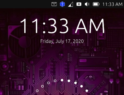
                                            • Adding a colored icon like this to the indicator bar will break the style that we try to keep consistent for system-realated things. So this wont be acceptable at all for taking it into the main OS
                                            • Even if we would accept it, its much too small. Somebody who does not know ,Ubuntu Touch and that is the majority of the ppl on the planet will never ever figure out that they can find ICE contacts and infos there.
                                            • Why donΒ΄t you use the free space below the circle for that:
                                              7bfcfd22-6d60-49df-8a53-100e3457e8f9-grafik.png
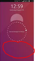
                                            • Yes, that change involves hacking into Lomiri quite a bit, but it is not that complicated. And then add it to the system settings for configuration.
                                            • In this position the icon can be colorful, and big enough so ppl recognize it.
                                            • If you want to align design ideas with the core team, please ping @CiberSheep for that, he is always a friendly sheep πŸ™‚

                                            My languages: πŸ‡¦πŸ‡Ή πŸ‡©πŸ‡ͺ πŸ‡¬πŸ‡§ πŸ‡ΊπŸ‡Έ

                                            KenedaK PhoenixLandPiratP 2 Replies Last reply Reply Quote 5
                                            • AppLeeA Offline
                                              AppLee @Moem
                                              last edited by

                                              @Moem
                                              I agree with Florian, that the best option is to modify the lock screen.

                                              But as a workaround if it's faster to go with the dropdown menu, I suggest a simple white over black symbol.
                                              Letters, snake and staff will be too small to identify, so a simple cross-of-life will work.

                                              As the dropdown menu loads a full page, it's doable to add a bigger logo with clearly stated "In Case of Emergency".

                                              1 Reply Last reply Reply Quote 0
                                              • First post
                                                Last post