UBports Robot Logo UBports Forum
    • Categories
    • Recent
    • Tags
    • Popular
    • Users
    • Groups
    • Search
    • Register
    • Login

    Icon Library

    Scheduled Pinned Locked Moved Design
    108 Posts 11 Posters 30.0k Views 2 Watching
    Loading More Posts
    • Oldest to Newest
    • Newest to Oldest
    • Most Votes
      Reply
      • Reply as topic
      Log in to reply
      This topic has been deleted. Only users with topic management privileges can see it.
      • ? Offline
        A Former User @AppLee
        last edited by

        @AppLee screenshot20200726_180416771.png

        Sorry for the big size, but is just to have a sense how much 3px are.

        1 Reply Last reply Reply Quote 0
        • c4pp4C Offline
          c4pp4 @c4pp4
          last edited by

          I have given a try (OSM Scout Server icon):

          osmscout-server.svg
          https://dpaste.com/DG5BG4GEX

          scout.png

          1 Reply Last reply Reply Quote 2
          • ? Offline
            A Former User
            last edited by

            typewriter3.png

            1 Reply Last reply Reply Quote 2
            • ? Offline
              A Former User
              last edited by

              typewriter4.png

              1 Reply Last reply Reply Quote 0
              • ? Offline
                A Former User
                last edited by A Former User

                chess1.png
                Does anybody has a contact from the Chess (Simple AI) app publisher? His name is Gregor Santner, but I couldn't find his email address. I would like to work with him to change the app icon, in case he wants that 🙂

                3 1 Reply Last reply Reply Quote 2
                • 3 Offline
                  3T_Ed @Guest
                  last edited by 3T_Ed

                  @C0n57an71n
                  Really like your creative thinking within the set parameters.

                  If all designers would stick to this lay out, which is more in line with the UT design than many others, would make the apps have a better overall uniformity, it'd make the Open Store a much more 'calmer' and 'easier' place to search the app you need at first glance.

                  Keep up the good work!

                  Critics are the true Positives | OnePlus 3T, Lumia 950

                  ? 1 Reply Last reply Reply Quote 0
                  • ? Offline
                    A Former User @3T_Ed
                    last edited by

                    @3T_Ed Thanks for the good thoughts! I'm trying to harmonize somehow the icons aspect, without affecting the creativity freedom.

                    1 Reply Last reply Reply Quote 0
                    • 3 Offline
                      3T_Ed
                      last edited by

                      @C0n57an71n
                      You're getting better and better at it 😉

                      You might want to add tags to your first post of this thread (thinking: #design, #app #development, #icons, #openstore)

                      Critics are the true Positives | OnePlus 3T, Lumia 950

                      1 Reply Last reply Reply Quote 0
                      • ? Offline
                        A Former User
                        last edited by A Former User

                        SDR1.png

                        Webp(13).net-resizeimage.jpg
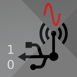
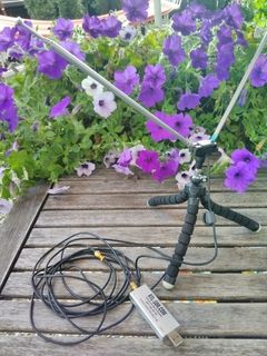
                        In case somebody wonders how an SDR looks like 🙂

                        App icon idea for WebSDR App from Dirk Unverzagt. Maybe he can see this and come with suggestions.

                        3 ? 2 Replies Last reply Reply Quote 1
                        • 3 Offline
                          3T_Ed @Guest
                          last edited by

                          @C0n57an71n said in Icon Library:

                          App icon idea for WebSDR App from Dirk Unverzagt. Maybe he can see this and come with suggestions.

                          Or notify him by email pa3fwm@websdr.org

                          Critics are the true Positives | OnePlus 3T, Lumia 950

                          ? 1 Reply Last reply Reply Quote 0
                          • ? Offline
                            A Former User @Guest
                            last edited by

                            SDR2.png
                            Another App suggestion for WebSDR

                            1 Reply Last reply Reply Quote 1
                            • ? Offline
                              A Former User @3T_Ed
                              last edited by

                              @3T_Ed Thanks! I will send him an email.

                              1 Reply Last reply Reply Quote 0
                              • ? Offline
                                A Former User
                                last edited by A Former User

                                5mm.png
                                Icon concept for 5Morsememory App from Dirk Unverzagt.

                                In case someone wonders: this game is about learning Morse code by flipping playing cards. The code in the icon is for "U" in Morse code. And it fills my gap 😂 😂 😂

                                1 Reply Last reply Reply Quote 0
                                • ? Offline
                                  A Former User
                                  last edited by

                                  typewriter3a.png

                                  3 1 Reply Last reply Reply Quote 2
                                  • 3 Offline
                                    3T_Ed @Guest
                                    last edited by

                                    @C0n57an71n

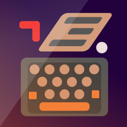
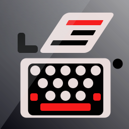
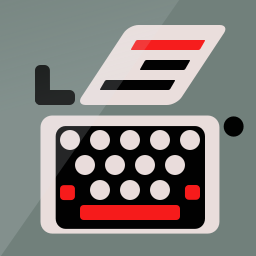
                                    Best iteration of the classic typewriter thus far, it does most justice to the original picture.

                                    Just curious, what makes you decide designing app icons for certain app developers? What makes you pick one in particular? Is it random for 'exercise' or is it based on your hobbies?

                                    Critics are the true Positives | OnePlus 3T, Lumia 950

                                    ? 2 Replies Last reply Reply Quote 0
                                    • ? Offline
                                      A Former User @3T_Ed
                                      last edited by A Former User

                                      @3T_Ed Thanks once again for the words! Well..., the thing with the typewriter was "If I would design a word-processor app, how would I design the icon without using the already classic paper and pen" and since I collect typewriters... The others are just an exercise to see how much can I transmit, with as little as possible and keep the image clear and visible when small. I love to associate things. If they are referring to the radio thing, like SDR or Morse, is because I'm interested in domain and my work is related to that so I've installed some apps and I've saw how terrible their icons are.

                                      1 Reply Last reply Reply Quote 0
                                      • ? Offline
                                        A Former User @3T_Ed
                                        last edited by A Former User

                                        @3T_Ed The best example is the icon for 5Morsememory. How can you put together in an icon the fact that the app refers to playingcards swiping and Morse playing? I love to stretch my imagination for this kind of stuff... I should be swimming in the lake right now, but I have to many ideas... =))
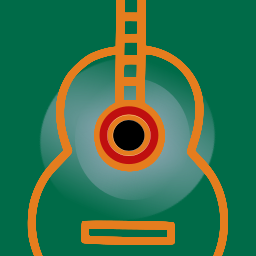
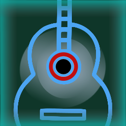
                                        1 Reply Last reply Reply Quote 0
                                        • ? Offline
                                          A Former User
                                          last edited by

                                          musicplayer1.png

                                          Music player.

                                          1 Reply Last reply Reply Quote 1
                                          • ? Offline
                                            A Former User
                                            last edited by

                                            musicplayer2.png

                                            1 Reply Last reply Reply Quote 1
                                            • T Offline
                                              trainailleur
                                              last edited by trainailleur

                                              To the typewriter icon, I would suggest of adding more, but thinner, lines of text to the paper emerging from the top, and most or all of one color. As it is, I would never guess what the stuff above the keyboard was intended to represent had I not seen this thread. You don't want to make people ask themselves, "What are those three bars supposed to mean?"

                                              I just had a look at a few Iphone and Android icons for text editors, and all in my small sample used either multiple thin lines (edit: I just noticed this is the case of the notes icon right above your own in some of the examples above) or very thin lines spanning the whole icon, the former to indicate typed text and the latter to indicate the ruled lines of a blank notebook page.

                                              ? 1 Reply Last reply Reply Quote 0
                                              • First post
                                                Last post