Icon Library
-
Another App suggestion for WebSDR -
@3T_Ed Thanks! I will send him an email.
-
Icon concept for 5Morsememory App from Dirk Unverzagt.In case someone wonders: this game is about learning Morse code by flipping playing cards. The code in the icon is for "U" in Morse code. And it fills my gap

-
-
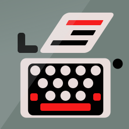
Best iteration of the classic typewriter thus far, it does most justice to the original picture.
Just curious, what makes you decide designing app icons for certain app developers? What makes you pick one in particular? Is it random for 'exercise' or is it based on your hobbies?
-
@3T_Ed Thanks once again for the words! Well..., the thing with the typewriter was "If I would design a word-processor app, how would I design the icon without using the already classic paper and pen" and since I collect typewriters... The others are just an exercise to see how much can I transmit, with as little as possible and keep the image clear and visible when small. I love to associate things. If they are referring to the radio thing, like SDR or Morse, is because I'm interested in domain and my work is related to that so I've installed some apps and I've saw how terrible their icons are.
-
@3T_Ed The best example is the icon for 5Morsememory. How can you put together in an icon the fact that the app refers to playingcards swiping and Morse playing? I love to stretch my imagination for this kind of stuff... I should be swimming in the lake right now, but I have to many ideas... =))
-
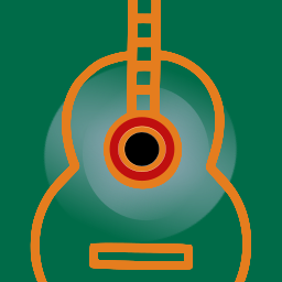
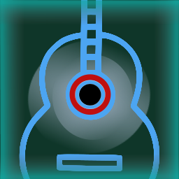
Music player.
-
-
To the typewriter icon, I would suggest of adding more, but thinner, lines of text to the paper emerging from the top, and most or all of one color. As it is, I would never guess what the stuff above the keyboard was intended to represent had I not seen this thread. You don't want to make people ask themselves, "What are those three bars supposed to mean?"
I just had a look at a few Iphone and Android icons for text editors, and all in my small sample used either multiple thin lines (edit: I just noticed this is the case of the notes icon right above your own in some of the examples above) or very thin lines spanning the whole icon, the former to indicate typed text and the latter to indicate the ruled lines of a blank notebook page.
-
@trainailleur Thanks! for the suggestion! But at this moment I think I'm done with this icon :anxious_face_with_sweat: In case that somebody wants to use it I'm gonna modify it as they please.
-
Thank you for sharing your decision making thoughts. I like it when people get inspired and do what keeps them going. You're contributing to the awareness on this forum that app icons do not necessarily have to be like standard pictures or symbols. Your icon of the memory card game definitely shows that, although I have to admit I could not have guessed it by looking at the icon, not before checking the nature of the webapp first that is. Then the aha..moment set in. Well done!
There is still a general idea and association with commonly used icons. Your latest icon of the 'music player' made me think of a Guitar application at first. Only after that initial response I noticed the spinning wheel and the guitar neck serving as a tone arm.
For music players to be recognizable as such I'm afraid we still rely on associations with pauze/play/stop buttons. Having seen what you're capable of, those button symbols fit in very easy within the format you have been using and no doubt you can turn that into something beautifully minimalistic yet easy identifiable as a music player.
Funny thing is, now that your signature is starting to get somewhat familiair and 'predictable' (which is a very positive thing when it comes to icons!) I can already imagine what an icon like that will look like.
Can't wait to see your next creation
-
@C0n57an71n said in Icon Library:
I should be swimming in the lake right now
Maybe you should have with temps over 30 °C +
")
-
@3T_Ed I'm trying to portrait objects more than abstract concepts because the physical object invites you to play with them, they ask for interaction, when an abstract icon doesn't do that. Most of these objects requires action and the red areas come to accentuate that. An icon should be like a small toy that is just inviting you to play with it.
-
@C0n57an71n hey Constantin, I looked at your work with the icons and I'm really impressed. In case you were interested in designing an icon for my app, I'd really appreciate, since I'm terrible at designing icon. Details about my app are here ---> dataMonitor. Unfortunately the latest app version isn't working as expected due to issues collected working on it blindfolded while I wasn't owning an UT compatible device (still waiting for a PinePhone to come), therefore I probably am not able to work on it anytime soon. So, I'm just suggesting this at your convenience, with no pressure nor rush. The icon I made was just supposed to be temporary and I got the intention to replace it once the major technical issues resulted overcome as the minimum goal (I think I'm close to that goal by the way). Thank you in advance
Matteo -
@matteo Love to help and thanks for the appreciation! I'll have a look on what's your app all about and I'll tag you as soon as I got something.
-
That's awesome! @matteo @C0n57an71n
-
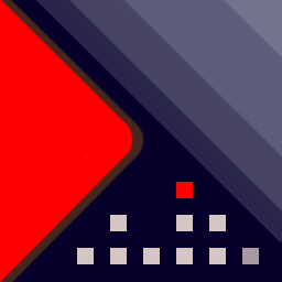
Music player icon. Observe the the house which is an VU-meter and the red square is a window and somebody is awake in the middle of the night and is listening music (see the progressive shading).
-
@3T_Ed said in Icon Library:
Funny thing is, now that your signature is starting to get somewhat familiair and 'predictable' (which is a very positive thing when it comes to icons!) I can already imagine what an icon like that will look like.
Can't wait to see your next creation
Well, I better take that back :grinning_face_with_sweat:
Your Music Player icon is a nice piece, once again showing your unique interpretation capabilities and have those imbedded in your icon design. This is a playback button allright and EQ is very distinguishable.
The person in the house is clear from the creator's mind and fits in the way you described your view earlier so well today on how to portrait an object, its interaction and how to play with it. It's the story behind it all.
How much I like this creative icon and its story, someone searching for a Music Player in the openstore isn't familiar with it, (s)he will be looking for explicit symbols this icon does not have right now for it to be recognized as such. Hope you don't take this as an offense. I like the basic very much, could you give it another go?
-
@matteo
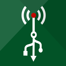
Hi! This is what I'm working at, is not complete, It's based on the electricity meter look.
You want something special to add? since I need to integrate your requests, if any
Waiting for your feedback!
Hello! It looks like you're interested in this conversation, but you don't have an account yet.
Getting fed up of having to scroll through the same posts each visit? When you register for an account, you'll always come back to exactly where you were before, and choose to be notified of new replies (either via email, or push notification). You'll also be able to save bookmarks and upvote posts to show your appreciation to other community members.
With your input, this post could be even better 💗
Register Login