Icon Library
-
To the typewriter icon, I would suggest of adding more, but thinner, lines of text to the paper emerging from the top, and most or all of one color. As it is, I would never guess what the stuff above the keyboard was intended to represent had I not seen this thread. You don't want to make people ask themselves, "What are those three bars supposed to mean?"
I just had a look at a few Iphone and Android icons for text editors, and all in my small sample used either multiple thin lines (edit: I just noticed this is the case of the notes icon right above your own in some of the examples above) or very thin lines spanning the whole icon, the former to indicate typed text and the latter to indicate the ruled lines of a blank notebook page.
-
@trainailleur Thanks! for the suggestion! But at this moment I think I'm done with this icon :anxious_face_with_sweat: In case that somebody wants to use it I'm gonna modify it as they please.
-
Thank you for sharing your decision making thoughts. I like it when people get inspired and do what keeps them going. You're contributing to the awareness on this forum that app icons do not necessarily have to be like standard pictures or symbols. Your icon of the memory card game definitely shows that, although I have to admit I could not have guessed it by looking at the icon, not before checking the nature of the webapp first that is. Then the aha..moment set in. Well done!
There is still a general idea and association with commonly used icons. Your latest icon of the 'music player' made me think of a Guitar application at first. Only after that initial response I noticed the spinning wheel and the guitar neck serving as a tone arm.
For music players to be recognizable as such I'm afraid we still rely on associations with pauze/play/stop buttons. Having seen what you're capable of, those button symbols fit in very easy within the format you have been using and no doubt you can turn that into something beautifully minimalistic yet easy identifiable as a music player.
Funny thing is, now that your signature is starting to get somewhat familiair and 'predictable' (which is a very positive thing when it comes to icons!) I can already imagine what an icon like that will look like.
Can't wait to see your next creation
-
@C0n57an71n said in Icon Library:
I should be swimming in the lake right now
Maybe you should have with temps over 30 °C +
")
-
@3T_Ed I'm trying to portrait objects more than abstract concepts because the physical object invites you to play with them, they ask for interaction, when an abstract icon doesn't do that. Most of these objects requires action and the red areas come to accentuate that. An icon should be like a small toy that is just inviting you to play with it.
-
@C0n57an71n hey Constantin, I looked at your work with the icons and I'm really impressed. In case you were interested in designing an icon for my app, I'd really appreciate, since I'm terrible at designing icon. Details about my app are here ---> dataMonitor. Unfortunately the latest app version isn't working as expected due to issues collected working on it blindfolded while I wasn't owning an UT compatible device (still waiting for a PinePhone to come), therefore I probably am not able to work on it anytime soon. So, I'm just suggesting this at your convenience, with no pressure nor rush. The icon I made was just supposed to be temporary and I got the intention to replace it once the major technical issues resulted overcome as the minimum goal (I think I'm close to that goal by the way). Thank you in advance
Matteo -
@matteo Love to help and thanks for the appreciation! I'll have a look on what's your app all about and I'll tag you as soon as I got something.
-
That's awesome! @matteo @C0n57an71n
-
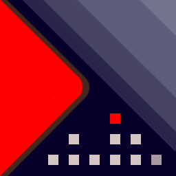
Music player icon. Observe the the house which is an VU-meter and the red square is a window and somebody is awake in the middle of the night and is listening music (see the progressive shading).
-
@3T_Ed said in Icon Library:
Funny thing is, now that your signature is starting to get somewhat familiair and 'predictable' (which is a very positive thing when it comes to icons!) I can already imagine what an icon like that will look like.
Can't wait to see your next creation
Well, I better take that back :grinning_face_with_sweat:
Your Music Player icon is a nice piece, once again showing your unique interpretation capabilities and have those imbedded in your icon design. This is a playback button allright and EQ is very distinguishable.
The person in the house is clear from the creator's mind and fits in the way you described your view earlier so well today on how to portrait an object, its interaction and how to play with it. It's the story behind it all.
How much I like this creative icon and its story, someone searching for a Music Player in the openstore isn't familiar with it, (s)he will be looking for explicit symbols this icon does not have right now for it to be recognized as such. Hope you don't take this as an offense. I like the basic very much, could you give it another go?
-
@matteo
Hi! This is what I'm working at, is not complete, It's based on the electricity meter look.
You want something special to add? since I need to integrate your requests, if any
Waiting for your feedback!
-
-
@C0n57an71n thank you! As your first iteration I really like it
") Only I would suggest to recall, if any possible, one graphical characteristic of the app, for instance the data representation on the graph is similar to stairs built step by step (better day by day); that's what I tried to represent in my old icon if you got the chance to stare at it in case you navigated to the link I tossed here before, even if the result is ugly compared to your job. What do you think?
Only I would suggest to recall, if any possible, one graphical characteristic of the app, for instance the data representation on the graph is similar to stairs built step by step (better day by day); that's what I tried to represent in my old icon if you got the chance to stare at it in case you navigated to the link I tossed here before, even if the result is ugly compared to your job. What do you think? -
@matteo Ok. I know what you mean, I've seen it. I will start something in this direction and show you as soon as I have something.
-
@matteo Do you want the "dM" text on the icon as well?
-
@C0n57an71n no, not needed at all. I have to confess I didn't have many ideas on what to represent and how...."dM" were only added by me in a rush but it isn't necessary. I'd like to leave to you the artistic part, only to keep the Suru style as you already did and maybe something, as the stairs for instance (just as an idea) to be directly correlated to the app...but if you have a better idea, please just share it with me. In the meantime, thank you for considering to contribute this way to my app, I really appreciate that
-
@matteo how do you usually find a designer to make those things for you? Would you say you looking to collaborate with designers more often?
-
@Kaizen it's only by the chance I read about Constantin's work with icons in this Forum. I looked at how he's good at making icons and just proposed in case he was interested to collaborate, that's it. My intention was to do all by myself, the graphical part also, but in the end I realized it's very difficult to do a good job everywhere and sometimes it's better to get involved people who know better than me how to do things. In addition I realized many people in this Community do want to contribute in different fields other than the coding field, therefore I thought it could be a good chance. I know about your effort to enhance the UBports site to have a better looking, so I have the maximum respect towards people having this artistic sensibility.
-
I'm so so sorry @matteo. I think you got me completely wrong. I approach you because I understand you valued his skills as fitting to your needs.
For that spot, I'm here. If, as a community, we could be pointing to each other quicker and understanding others' needs, we can solve problems and drive faster.
Look at me as bridge-builder, closing gaps, and unifying people thought proper planing. A good looking design doesn't solve anything. A communicational language like @C0n57an71n did, is why important, he approaches something with an adequate design which many talented designers doing.
If I figure the common ground between you, I will be able to give more attention to little things that make us approachable community.
Things are working here organically and tend to be a slow process, but with thoughtful design thinking, we can achieve better results.
In the bottom line, you made a connection upon his expression. That's what happens in communities. I'd like to build content/media in that direction to connect people within the community while we are getting more prominent.
In real life, I'm a product designer. Regardless of that, I encourage you to read about Kaizen's philosophy as what I'm standing for. That's my personality right there, not as you though
Maybe you have idea how we can close that gap between designers and developers? I already suggested creating a new section of "Teaming/Grouping" where everyone can offer their skills to collaborate on project together.
So we can work more efficiently within a designated area. I'm not sure if 'request for help' or 'suggest an help' titles are more describe it, until my process get done we need to address things in here.
Shell, we build bridges than?
-
@Kaizen no worries, I don't think I got you wrong, I was just explaining what led me to reach out to Constantin. Any kind of collaboration inside this Community is good and beneficial to bring further the Project. I think your intention is good as well and I'm following the thread you initiated about the UBports site enhancement. Unfortunately I'm not a very good developer yet, in fact dataMonitor is my entry app to Ubuntu Touch, nor a graphical designer at all, but I already received very good contributions from talented users (for instance one user improved very much the app general looking) so I know this kind of collaborations are so productive and effective to get to a good final product. So yes, I think your effort is valid, I don't know how I'm supposed to help there, but I cheer for your vision to happen
Hello! It looks like you're interested in this conversation, but you don't have an account yet.
Getting fed up of having to scroll through the same posts each visit? When you register for an account, you'll always come back to exactly where you were before, and choose to be notified of new replies (either via email, or push notification). You'll also be able to save bookmarks and upvote posts to show your appreciation to other community members.
With your input, this post could be even better 💗
Register Login