Clock Redesign Ideas
-
@cliffcoggin said in Clock Redesign Ideas:
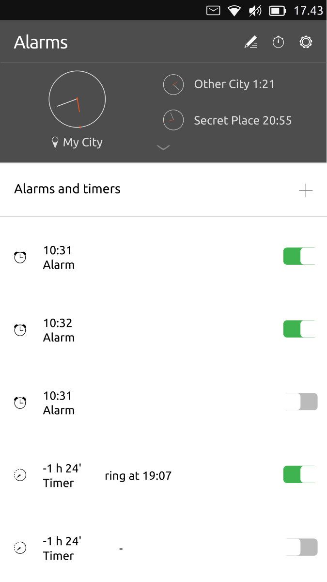
Better still, have the alarms listed on the front page as I mistakenly thought you meant.
That's indeed the idea of the mockup

-
Ah, clearly some misunderstanding here. I thought that was to be the second page as it was headed Alarms.
-
@CiberSheep
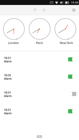
I thought about something like this

With the bottom-edge page including both "add a new city" and "create a new alarm".
A long swipe down on a city's clock will delete it (I know it's not really UT like but I found it easy to do and to remember).
While swiping down, a trash can replace the clock to indicate what happens. -
@AppLee interesting
-
I just realized that:
- Timer is a backwards alarm. We should mix them together
- People complaining about the «hard it is to set an alarm» might be talking about the timer. Is terrible to do it with precision. Alarms are a lot easier
Like that we could do three sections:
alarm+timer | chronometer | clocks ? -
@CiberSheep said in Clock Redesign Ideas:
- People complaining about the «hard it is to set an alarm» might be talking about the timer. Is terrible to do it with precision.
Actually it is the dialer for the alarm that is hard to set, it's like a spinning wheel
-
@CiberSheep
Actually for me timer and chronometer are the same but backward.
Either you count time from 0 and it's a chronometer. Or you set a time and it's a timer with an alarm.But I get your point.
I think that alarm are not that easy to set ; the wheel turning is not ideal IMHO.
For the timer I agree it's even worse, so I set my timers in advance so I don't loose time every time I want to set a new one.
I set 1, 2, 3, 5 and 10 minutes. And for longer period of time I can take the time because it won't take me more time to set it than to actually wait
I'll try to find an idea for the timer+chrono and if you can come up with a solution for timer+alarm, I'm curious of what it can be.
-
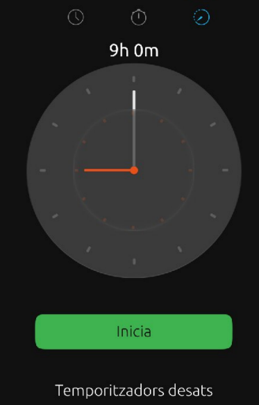
Just to make sure what I mean. This is the timer. Trying to set it is a terrible experience. It must go (the UI).

If you still affirm that the alarm is hard to set. You two have a quest now. I'm really interesting in see how you use the Picker (not joking). Would you be so gentle to record a short video? You could ping me on Telegram @cibersheep
-
@AppLee said in Clock Redesign Ideas:
so I set my timers in advance so I don't loose time every time I want to set a new one.
Uff. I never used it
In my mind:
- Chronometer, you set it and can count the laps.
- Alarm. You set at what time where the alarm goes off.
- Timer. You set a time before the alarm goes off.
So if we consider that, the ui could be: alarm name at 10 or alarm name in 44 minutes. Like that you can also have several timers
-
Would it be possible to have the alarm time dialer move slower by default for better control?
-
@CiberSheep said in Clock Redesign Ideas:
alarm name at 10 or alarm name in 44 minutes
Sure but how to set them, it's a completely different UI.
-
@3T_Ed this is what I'm interested to see, because the Picker moves at the speed of your finger. Also, you can tap on the numbers you see
-
@AppLee That's the game

-
@CiberSheep said in Clock Redesign Ideas:
Just to make sure what I mean. This is the timer. Trying to set it is a terrible experience. It must go (the UI).
Yes the timer is such a devil of a job to set that I don't use it.
My principle request though is the same as 3T_Ed to alter the rolling set dials for the alarm. It needs to be slower/less sensitive or maybe use the keyboard instead.
-
@cliffcoggin You can be part of «the quest» if you have time
-
Slower wheel won't be good IMO, there are 60 possible values and you need to set it precisely and rapidly.
I like how it's done for the timer (moving the minutes hand) but in order to be precise we will need +/- buttons to fine settings.@CiberSheep do you know what kind of widget (visually) we have in QQC2 ?
I'm still confused with QQC2 and the old framework and probably other things I don't know about :smiling_face_with_halo: -
This is an step forward. Still a little ugly. Something is missing...
Word Clock tweak from AppLee idea.
We could show the analogue clock for other places only in big screens or when top panel be «open»
-
@AppLee said in Clock Redesign Ideas:
@CiberSheep do you know what kind of widget (visually) we have in QQC2 ?
You can take a look at the tumbler in https://open-store.io/app/qqc2-gallery.ubadI'm still confused with QQC2 and the old framework and probably other things I don't know about :smiling_face_with_halo:
It took me a while as well. Ubuntu UI Toolkit (uuitk) is a toolkit that uses QtQuick Control (QQC1) module. In the OS there is the QQC2 module but ¿no toolkit? That means you have to use the «raw elements» with Suru Style... or something similar
 very confusing
 -
@CiberSheep said in Clock Redesign Ideas:
@cliffcoggin You can be part of «the quest» if you have time
I have the time and I'm willing to help, but note that while I am good with words I am useless at computing. I couldn't even load UT onto an Android phone, and had to pay somebody to do it for me. If that level of incompetence is of any use, try me.
-
@cliffcoggin said in Clock Redesign Ideas:
If that level of incompetence is of any use, try me.
You are already accepted

Hello! It looks like you're interested in this conversation, but you don't have an account yet.
Getting fed up of having to scroll through the same posts each visit? When you register for an account, you'll always come back to exactly where you were before, and choose to be notified of new replies (either via email, or push notification). You'll also be able to save bookmarks and upvote posts to show your appreciation to other community members.
With your input, this post could be even better 💗
Register Login