Icon Library
-
-
Hi again @C0n57an71n
") Thank you for your efforts.
Thank you for your efforts.
I think I like the most the third one. I tried to implement it already for my app to see the general looking and here below the result (sorry for the bad quality, but I don't have the screenshot function on the PinePhone yet, therefore I needed to take a picture from an other phone):
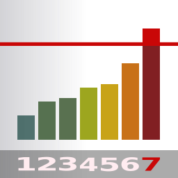
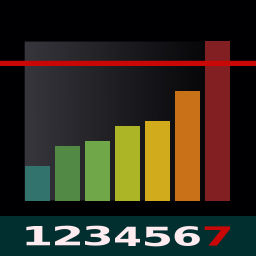
I'm not sure if the resolution is good enough to show the looking, but I think the numbers are too tiny to be clearly read...So now I'm not sure if we want to keep them or not. But I definitely like the icon gist
-
@matteo Yeah..., they don't look too clear in black. I'll do them white, be back to you and see if we keep them or not!
-
-
@C0n57an71n hey, I like the style of this app also....
 I'm not sure which one to choose, all your icons are gorgeous :beaming_face_with_smiling_eyes: I'd like somebody else would chime in here to give their opinion, to helping us to find the best one.
I like the previous one because it's very polished and refined but I like this one as well because it's more stylized and represent the spirit of the app.
In the meantime, I have a question for you: what's the resolution of your icons? Mine was 256x256 pixels and I was suggested by Community people to pick this size as the best option. I think that in this size the icon appears clearer and more defined on the device.
I also was thinking that copying the icon from the present Forum chat as I did before isn't the best move, since it could lose some resolution....I'm on Telegram in quite every UBports chats, could you maybe eventually send your icons there to me as a file to download? Even in PM...EDIT: I opened your icons with Gimp and apparently they are 256x256 pixels size.
-
This is how this last version renders:
-
@matteo
I personnaly prefer the last version.
Simple, stylized, the colors pop and there is also a fold.
I thing it matches UT better.But every opinion exists, so ...
")
-
Eventhough I liked the original electricity meter look very much, the latest icon presented looks very good and matches what one would expect to find when searching for a data monitor app. Colors are very vivid and its mix is attractive.
Meter is going up, which is distincts itself from EQ apps, logical usage of colors and blank spaces (representing numbers) clear no-go limit as set from the start. The icon clearly doesn't need the numbers as shown in the previous concept (they were confusing and non readable on real scale). I'd say @C0n57an71n has done a great job here. No doubt he has a complete background story to go with it (got to love that) but I think he nailed it with this one. Well done!
[Personally I change all apps to the same app format using App Modular, I'm not a fan of app format with different corners but again that's a personal thing.]
edit 1: The graph edges and icon edges are consistent so I can see why the decision making behind it and I have to admit it looks better and more playful as it is now.
edit 2: The number of bars representing a week is a nice touch
-
-
@C0n57an71n Nice, I like it!
-
@Flohack Which one, that's the question...

-
@C0n57an71n
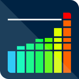
I still prefer the one from yesterday.Not such a fan of gradient...
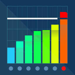
I don't mind the dots, but the grid is too detailed for an icon IMHO -
@C0n57an71n said in Icon Library:
@matteo @AppLee @3T_Ed
To be or not to be...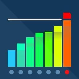
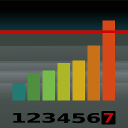
I prefer the first one, the one without the grit. A grit does make it feel to be a mathematical app.
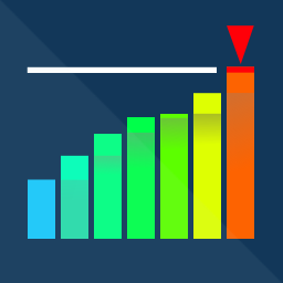
Shading in the bar is an added value, not sure about the dimmed/red dot indicator (what does it represent?)
Edit 1: How about replacing the red top part of the last bar by the orange arrow UT design, pointing downwards (indicating the ability to monitor and control the data limits)?
-
-
@C0n57an71n said in Icon Library:
@3T_Ed I like the idea with the arrow! The dots are to represent the week days. The grid is more of @matteo thing, I would avoid putting it since will make the icon too stuffed, I tend to be really minimalist at this moment.
Agreeing with you regarding the grid. Actually the shading does too however that feature does add value (expected output <-> actual output). Your style is minimalistic and I like that very much. @matteo seems to like that also because he asked you to design an icon for his app based on your initial icons. I'd say, stay true to your own style.
-
-
I prefer the previous design. May I suggest you take that one and then for the last bar:
- filling up to the limit in green
- doubling the existing bar above the limit and fill it red
- in the top of the red part have the arrow as you used in your typewriter concept (July 26th) and have that minimalistic arrow point to right-bottom (that would be a 90 degr. turn compared to the typewriter one)
The above would be indicating green to be good, red to be not in expectancy (drastically passing set limit), orange arrow to reconsider (either adjusting the limit or altering behavior to keep within the set limit). Thinking traffic light here

-
@3T_Ed Nah..., making the last bar in green will fuck up the spectrum's Feng-Shui... I'll come up with something...
-
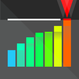
This is what I would use! From my point of view it has all it needs: it suggest what it does, it's well balanced, stands out but not disturbing, lower grey area is more softy, the upper black-red area is more aggressive to show warning,
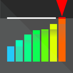
Softened variant.
-
This post is deleted!
Hello! It looks like you're interested in this conversation, but you don't have an account yet.
Getting fed up of having to scroll through the same posts each visit? When you register for an account, you'll always come back to exactly where you were before, and choose to be notified of new replies (either via email, or push notification). You'll also be able to save bookmarks and upvote posts to show your appreciation to other community members.
With your input, this post could be even better 💗
Register Login