Improve system settings disk usage analyzer
-
Perhaps same behavior as UTTT, a popup that asks the user which to delete.
Well, that would add too many steps imho: tap on app to expand, tap clear button and popup opens, then select and press clear, plus an additional warning dialog (it may be needed)...
Even if you put the clear button in the collapsed ListItem you may want too see the numbers before deciding to clear. And to do see the number you would either expand the ListItem (the button in the collapsed ListItem becomes useless) or press the clear button and see the numbers in the popup; but then you may decide you don't have to clear files for that app and to go to another app you have to close the popup, while with ListItem you can just scroll down and expand another one...Sorry for the long reply, I'm not really aware of how much I'm writing while I'm focused on an thought. That seemed so straightforward in my mind! :grinning_face_with_sweat:
-
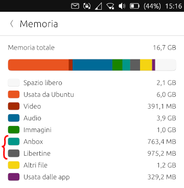
BTW, sorting by a single value has proportional bars. I have to say that's pretty cool!
Maybe the space could be optimized by putting the bar on the side of the app iconAnd yeah, I have to say that the first apps taking way more space that all the others makes the bars on smaller apps quite useless...
-
@mymike Hi, I've added delete process to the design:
https://www.figma.com/file/JuuTo9riDeza5zAl0VXLxl/Memory-management
What do you think?
-
@Capsia said in Improve system settings disk usage analyzer:
@mymike Hi, I've added delete process to the design:
https://www.figma.com/file/JuuTo9riDeza5zAl0VXLxl/Memory-management
What do you think?
Yeah, that's similar to what @kugiigi proposed, but without the popup: you need an additional tap before you are able to clear the space...
What about putting the bars under each label? This way check boxes can be places instead of colored boxes
-
@mymike said in Improve system settings disk usage analyzer:
What about putting the bars under each label? This way check boxes can be places instead of colored boxes
Looks great

-
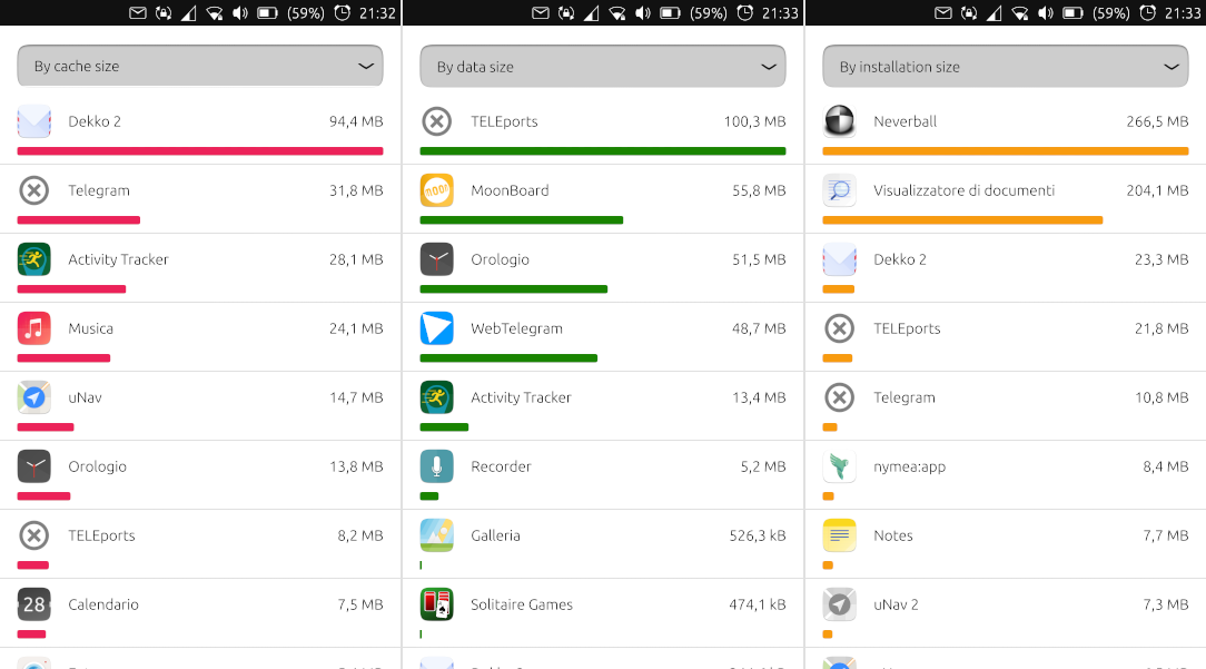
Just a quick comment on the problem of short bars on relative graphs: Is this really a problem? When opening this setting I guess most users are interested in what is taking up space on their system, and the very short relative graphs is a great indication that "it's not this".
At least for me, that's much more valuable than the technical details about each app. And the graphs are a great way of making it clear, while the difference between 100 mb and 100 kb when written out is hard to grasp for most (non-tech) people.
")
-
Cool. Just came across this thread. I do love to see that this part of system settings is being thougth of. I do very much like the ideas.
Just a quick comment on the last design: As @mymike already said, I too think it does not need to be a two step action. The clear button could be set inactive if no check box is checked.
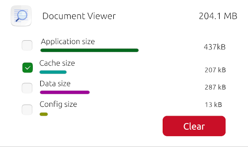
And I guess the numbers only do not match because it is a mockup? Otherwise I would expect
app size + cache size + data size + config size = total size. -
@potet said in Improve system settings disk usage analyzer:
Just a quick comment on the problem of short bars on relative graphs: Is this really a problem?
No, it isn't, you're right. Just a minor thing I noticed that 95% of the users won't...
When opening this setting I guess most users are interested in what is taking up space on their system, and the very short relative graphs is a great indication that "it's not this".
At least for me, that's much more valuable than the technical details about each app. And the graphs are a great way of making it clear, while the difference between 100 mb and 100 kb when written out is hard to grasp for most (non-tech) people.
Keep things simple! - Sometimes I forget about it lol...
-
@danfro said in Improve system settings disk usage analyzer:
Cool. Just came across this thread. I do love to see that this part of system settings is being thought of. I do very much like the ideas.
Thanks! I am glad people appreciate my work

Just a quick comment on the last design: As @mymike already said, I too think it does not need to be a two step action. The clear button could be set inactive if no check box is checked.
Sure
And I guess the numbers only do not match because it is a mockup? Otherwise I would expect
app size + cache size + data size + config size = total size.Yeah, that one is just a mockup with random values :beaming_face_with_smiling_eyes: Maybe I should make it more clear whether it's a mockup or running code...
-
@mymike It is not only the fresh new design. But being able to delete those items from system settings I would call a breakthrough. Definitely worth appreciation.
-
I managed to place correctly all the GUI bits to clear the app data. The actual erase will come next!
-
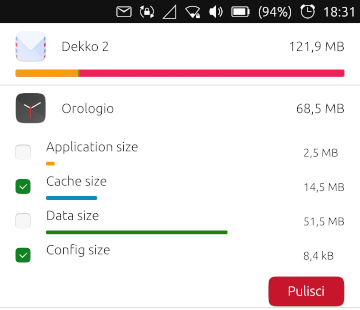
@mymike I'm late to the party but I wish only to say: great job Michele! I like very much how you designed the breakdown of stored data for each app; the idea of proportional bars and the data characterization by different colors is just brilliant. Thank you and keep up the good work
")
-
@matteo said in Improve system settings disk usage analyzer:
@mymike I'm late to the party
It's never too late :winking_face_with_tongue:
but I wish only to say: great job Michele! I like very much how you designed the breakdown of stored data for each app; the idea of proportional bars and the data characterization by different colors is just brilliant.
Well, tbh proportional bars are common in disk analyzer apps but I'm glad you like these features!
Thank you and keep up the good work
Sure :smiling_face_with_smiling_eyes:
-
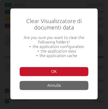
Confirmation dialog: the bullet list doesn't look that good, any idea to make it cooler? a single label is more complicated because I need to dynamically add the folders the user selected to remove, considering translation and commas too...
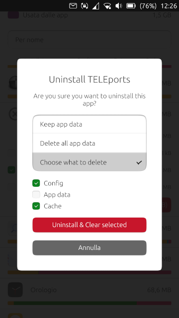
I also wanted to let the user uninstall an app. Do you think it make sense or there are already enough way to do it (Drawer and OpenStore)?
I was thinking that if the user selects the checkbox near app size, then the red button would change from "Clear" to "Uninstall". Eventually if other checkboxes are selected to it could be "Uninstall & Clear". But the checkbox way isn't very user-friendly, I guess... What about another button next to the clear one?
In the confirmation dialog I'd ask if the user wants to keep app data even if uninstalling it, remove every data or select which data need to be cleaned.
-
@mymike In my opinion, those features would be great. These are the things I've been planning to implement but never actually done them because I'm afraid of the C++ parts of settings app
 , Anyway, in my opinion with these features, it'll qualify for a standalone section in the setting app since it's already an app management page. I'm not sure though where to put it exactly but I'm thinking a separate page where you can also navigate to from the storage page. Then you can maybe also add app updates, although I think it's already planned to remove this feature from the update page so maybe it's not a good idea after all. But of course these entails a lot more effort
-
@kugiigi said in Improve system settings disk usage analyzer:
These are the things I've been planning to implement but never actually done them because I'm afraid of the C++ parts of settings app
,Yeah, I was scared too at the beginning and it took me a while to understand more or less how it works...
Anyway, in my opinion with these features, it'll qualify for a standalone section in the setting app since it's already an app management page. I'm not sure though where to put it exactly but I'm thinking a separate page where you can also navigate to from the storage page.
Yeah, I was thinking about that too but I haven't done anything yet because first I want to implement all the features. moving the page can always be done later...
I think the best thing would be to put an icon in the main page (where?) and a link in the memory page.
In that page I'd put a similar header to the memory page with the bar showing installed, cache, config and data sizes so that you know what takes up more spaces. Putting these categories in the main bar in memory page is too much imho, as segments in the bar would be too little to see them clearly.Then you can maybe also add app updates, although I think it's already planned to remove this feature from the update page so maybe it's not a good idea after all. But of course these entails a lot more effort
Yeah, as the future of app updates in settings is unclear I wouldn't make work on that :winking_face_with_tongue:
-
@mymike UI ideas regarding uninstalling of app:
- option: use a list view's swipe action on the apps name to provide delete/uninstall [not obvious as with all list views, but standard list view behaviour]
- option: move the "clear" button to the left unterneath the tick boxes and have another uninstall button at the right hand side
Uninstall should always ask the user to clear all three folders. We do not wish this to happen per default, because sometimes you only want to remove the app to reinstall it but keep the data.
I would like to see an uninstall here together with the clear data options. OpenStore does not provide this and I think there should be one core place (that is not UTTT) where users can do this. I would rather reduce the other options if it does get too much.
-
@mymike Could you use a
Column(Layout)with four labels? Then set visibility of the three labels depending on the users selection. Or a label and a column with the three options. Even a grid could be used for the dot/number column and the words column. Although then setting visibility is more difficult.Maybe use "... clear the following files?" instead of "folders"? Files is more general and maybe less scary ;-).
With "app" being a common word, maybe use that instead of the full "application"?
"Are you sure you wish to clear the following files:
x app configuration
x app data
x app cacheEdit: There was a "rule" about how to phrase questions. Wasn't it better instructing the user what to do? @CiberSheep
Press "proceed" to delete the following files:
x app configuration
x app data
x app cache
"Proceed"
"Cancel" -
@danfro said in Improve system settings disk usage analyzer:
Edit: There was a "rule" about how to phrase questions. Wasn't it better instructing the user what to do? @CiberSheep
Press "proceed" to delete the following files:
x app configuration
x app data
x app cache
"Proceed"
"Cancel"I think the idea is that the label on the button should reflect the action being taken. So in this case "Clear" instead of "OK", or "Proceed", as the latter two are too generic.
-
@danfro said in Improve system settings disk usage analyzer:
Maybe use "... clear the following files?" instead of "folders"? Files is more general and maybe less scary ;-).
With "app" being a common word, maybe use that instead of the full "application"?
done!
@mymike Could you use a
Column(Layout)with four labels? Then set visibility of the three labels depending on the users selection. Or a label and a column with the three options. Even a grid could be used for the dot/number column and the words column. Although then setting visibility is more difficult.I did this when uninstalling an app, what about using checkboxes too when clearing only?
Hello! It looks like you're interested in this conversation, but you don't have an account yet.
Getting fed up of having to scroll through the same posts each visit? When you register for an account, you'll always come back to exactly where you were before, and choose to be notified of new replies (either via email, or push notification). You'll also be able to save bookmarks and upvote posts to show your appreciation to other community members.
With your input, this post could be even better 💗
Register Login