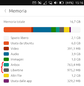
Improve system settings disk usage analyzer
-
@kugiigi said in Improve system settings disk usage analyzer:
These are the things I've been planning to implement but never actually done them because I'm afraid of the C++ parts of settings app
 ,
,Yeah, I was scared too at the beginning and it took me a while to understand more or less how it works...
Anyway, in my opinion with these features, it'll qualify for a standalone section in the setting app since it's already an app management page. I'm not sure though where to put it exactly but I'm thinking a separate page where you can also navigate to from the storage page.
Yeah, I was thinking about that too but I haven't done anything yet because first I want to implement all the features. moving the page can always be done later...
I think the best thing would be to put an icon in the main page (where?) and a link in the memory page.
In that page I'd put a similar header to the memory page with the bar showing installed, cache, config and data sizes so that you know what takes up more spaces. Putting these categories in the main bar in memory page is too much imho, as segments in the bar would be too little to see them clearly.Then you can maybe also add app updates, although I think it's already planned to remove this feature from the update page so maybe it's not a good idea after all. But of course these entails a lot more effort

Yeah, as the future of app updates in settings is unclear I wouldn't make work on that :winking_face_with_tongue:
-
@mymike UI ideas regarding uninstalling of app:
- option: use a list view's swipe action on the apps name to provide delete/uninstall [not obvious as with all list views, but standard list view behaviour]
- option: move the "clear" button to the left unterneath the tick boxes and have another uninstall button at the right hand side
Uninstall should always ask the user to clear all three folders. We do not wish this to happen per default, because sometimes you only want to remove the app to reinstall it but keep the data.
I would like to see an uninstall here together with the clear data options. OpenStore does not provide this and I think there should be one core place (that is not UTTT) where users can do this. I would rather reduce the other options if it does get too much.
-
@mymike Could you use a
Column(Layout)with four labels? Then set visibility of the three labels depending on the users selection. Or a label and a column with the three options. Even a grid could be used for the dot/number column and the words column. Although then setting visibility is more difficult.Maybe use "... clear the following files?" instead of "folders"? Files is more general and maybe less scary ;-).
With "app" being a common word, maybe use that instead of the full "application"?
"Are you sure you wish to clear the following files:
x app configuration
x app data
x app cacheEdit: There was a "rule" about how to phrase questions. Wasn't it better instructing the user what to do? @CiberSheep
Press "proceed" to delete the following files:
x app configuration
x app data
x app cache
"Proceed"
"Cancel" -
@danfro said in Improve system settings disk usage analyzer:
Edit: There was a "rule" about how to phrase questions. Wasn't it better instructing the user what to do? @CiberSheep
Press "proceed" to delete the following files:
x app configuration
x app data
x app cache
"Proceed"
"Cancel"I think the idea is that the label on the button should reflect the action being taken. So in this case "Clear" instead of "OK", or "Proceed", as the latter two are too generic.
-
@danfro said in Improve system settings disk usage analyzer:
Maybe use "... clear the following files?" instead of "folders"? Files is more general and maybe less scary ;-).
With "app" being a common word, maybe use that instead of the full "application"?
done!
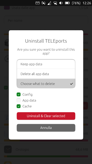
@mymike Could you use a
Column(Layout)with four labels? Then set visibility of the three labels depending on the users selection. Or a label and a column with the three options. Even a grid could be used for the dot/number column and the words column. Although then setting visibility is more difficult.I did this when uninstalling an app, what about using checkboxes too when clearing only?
-
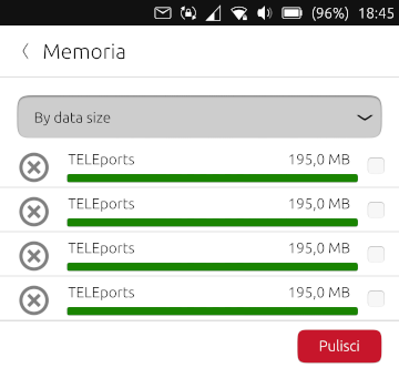
Also what do you think about this?
The idea is: if you order by app data size, then you can select app data from multiple app and clear them with one tap (I thought this could be useful when clearing the cache)
The user is still allowed to tap on an app, expand it and clear/uninstall only files relative to that app.
The global clear button at the bottom can be made visible only when at least one app is selected (through the checkbox on the right, obviously) and list next to the button the apps selected and a sum of the space that would be freed...
This is a mockup, I'd wait your feedback to implement this because you may say this isn't that useful and then we can skip this feature
-
@mymike
Not sure I understand your last idea.
You mean the user can select multiple apps, then tap the global "clear" button.
Now a popup shows which kind of data the user want to batch clear ? -
@AppLee said in Improve system settings disk usage analyzer:
You mean the user can select multiple apps, then tap the global "clear" button.
Yeah
Now a popup shows which kind of data the user want to batch clear ?
My idea was that the kind of data to clear correspond to the sorting the user chose, idk if an option to change it later make much sense: the user chose the app with in mind a precise kind of data, why should change it later? because he thought to select e.g. cache wile he was selecting config? Mmh, could be...
Instead of clearing kind of data depending on the sorting, we can add an additional selector at the top (maybe tabs, before the option selector for sorting) and let the user choose there what kind of data he's going to clear: a global tab where you expand apps and select only for that app what to clear and then a data tab, cache tab and config tab where you can't expand apps and there's only the checkbox on the right.
For this I think it's better to move everything related to apps in a dedicated page. -
@mymike said in Improve system settings disk usage analyzer:
My idea was that the kind of data to clear correspond to the sorting the user chose
Ok, I get it now.
Then I find it very interesting. But just to clarify the button needs to repeat the sorting info : "clear apps data", "clear cache" or "clear config"So the user has all the required information when acting on it.
-
@mymike I like the idea of a global/batch clear option. How about the following:
Longpresshold to enter multiselect state of list view. Then add a second "header" with the three clear options (cache, config, data) as checkboxes. Maybe have cache preselected when apps where sorted by cache.
Have an select all button (for the apps) in that header too as in other list views. The clear button then clears the selected data types for all selected apps.
So this is a global clear with intelligent preselection, rather than an single clear based on sorting.
-
@danfro Yeah, that could work. Even if I don't like much the long press to trigger it. If you don't know about it, it's hard to find...
But now that I think about it again: what about a table with a row for each app and in the row put appname+icon and the 3 values with a checkbox or a custom button that keeps the pressed state. in the table header you have the buttons to select a whole column (e.g. all the cache column)
This way the colored bars doesn't fit very well, the table needs to be quite compact -
@mymike True, a table might work better. Would a "super table" work, where cache, data and config are separate columns? A bit like this:
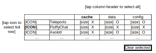
Bold = row/column tapped and fully selected.
-
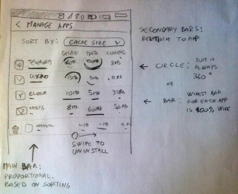
The downside of the super table is that it is less immediate to see what takes up space, am I wrong?
Also it's all too compacted in my sketch, but I guess making rows more tall won't help much...
What about hiding the app name and show only the icon?
Let me explain this better: There is a simple list like here With a button at the bottom "Start cleaning space". Now the app name, the bar and the size on the right disappear and the 3 columns appear. tap or keep pressed on the icon to see temporarily the name.
The issue here is: bars (or circles) should be proportional to what. proportional to the app size? proportional to other values on the column? proportional to everything else (like 1 degree/pixel is 1MB)?I haven't talked about burst uninstalling yet...Dedicated page? But for each app you uninstall you have to decide whether to keep, remove or select the data to remove, and so the super table already lets you to do so, but there's little space left for an additional uninstall button (or 3, like the 3 options in the dialog)... A row under each app with the three buttons? "Uninstall & Clear", "Uninstall & Keep", "Uninstall & Select". The first will check all the three columns for that app, the second will uncheck them ad the third won't touch them. All of them would mark the app as "to be uninstalled" when confirming the cleaning with the bottom button.
Oh, maybe an uninstall button/icon can make the row under the app with the 3 button visible...I'm getting lost in this super table sigh, to many thing to show and to many actions the user can perform, and they need to match perfectly each other... But maybe something cool can came out of this
-
@mymike
I see we are both lost because it starts to be too complex.
Let summarize things a bit.
I'm focusing here on actions and visual information. In my process, it helps figuring how to perform such actions given the chosen display.As you're the one doing the hard work you have the decision power.
Actions evoked:
- Remove app
- Clean app data
- Bulk cleaning app data
- Clean app config
- Bulk cleaning app config
- Clean app cache
- Bulk cleaning app cache
If I missed some, please complete the list.
Then we have the visual components.
We have to decide what will be displayed. Again I list all that I have in mind.- App data size
- App config size
- App cache size
- App total size
- App name
- App logo
- Checkbox to select app to be deleted
- Checkbox for app's items to be cleaned
- Sorting options
- Visual confirmation that sorting is applied properly
- Visual information regarding the relative size of data, cache and config
- Action buttons
- Warnings
- Action feedback
Of course all information and all actions don't have to be implemented.
It might help to sort what's important and what is just noisy.IMHO the long press can be used for hidden infrequent actions like bulk actions.
We have the same behavior in messaging app and I guess it's OK this way.
So long press on any line will add a checkbox on each line and allow a single action to be perform for all selected apps.
We have to choose one because too many options will be confusing.
I suggest using the sorting option to either clean data, config or cache.
At the bottom we'll have a cancel button and an action button explicitly stating the action.Individual actions can be implemented using the swipe left or right quick actions. That's a common way to do it on UT.
-
@AppLee said in Improve system settings disk usage analyzer:
I see we are both lost because it starts to be too complex.
Let summarize things a bit.Yeah, great!
Actions evoked:
- [..]
If I missed some, please complete the list.
Do we want a bulk removing app too?
IMHO the long press can be used for hidden infrequent actions like bulk actions.
We have the same behavior in messaging app and I guess it's OK this way.
So long press on any line will add a checkbox on each line and allow a single action to be perform for all selected apps.Ok, I agree long press can trigger bulk cleaning.
You don't think cleaning multiple data type at the same time could be useful?
I suggest using the sorting option to either clean data, config or cache.
I thought about it already but I don't feel it's the right choice: sorting option should only sort, not decide what you're going to clean...
At the bottom we'll have a cancel button and an action button explicitly stating the action.
ok
Individual actions can be implemented using the swipe left or right quick actions. That's a common way to do it on UT.
Yeah, but swiping is meant to put buttons and don't waste space in the list. If we already expand the list item, we don't have to worry to waste space.
-
@mymike said in Improve system settings disk usage analyzer:
Do we want a bulk removing app too?
I was just putting all ideas. Accepting or rejecting one is completely up to you.
The lists are for general purpose.You don't think cleaning multiple data type at the same time could be useful?
Here starts my personal opinion

Yes it can be useful, but my opinion is with combining multiple choices it makes it harder to perform a simple operation while the gain is not that important once in a while.I will more frequently delete cache for multiple apps.
Deleting config+cache on multiple apps doesn't require a specific feature. I can easily repeat the operation for config and then for cache... and it's less probable that I'll have to do it.I thought about it already but I don't feel it's the right choice: sorting option should only sort, not decide what you're going to clean...
Then maybe we shouldn't have a "sorting" option. But a scope.
I want to see cache, data or config and maybe perform an action towards this kind of data.
We can always have total size for each app for convenience, but exit the details...That's the choice you'll have to make. What is the goal :
- Showing what space is used and where
- Cleaning such space
What should be the easiest and fastest? What is an additional feature that can be less easily accessed ?
-
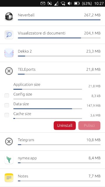
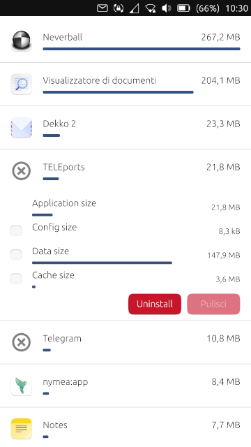
What do you think about the first picture vs the second one?
-
- For me second is cleaner.
- Also for the buttons: Remember, only main action colored
 the one at the right
-
@CiberSheep said in Improve system settings disk usage analyzer:
- For me second is cleaner.
ok
- Also for the buttons: Remember, only main action colored
 the one at the right
But how should I decide which one is the main? The other one will be grey even if negative?
-
I'm getting lost in this super table sigh, to many thing to show and to many actions the user can perform, and they need to match perfectly each other... But maybe something cool can came out of this
Sorry for making you pulling your hair out by suggesting this.
 As @AppLee said, just gathering ideas. Even if dropping them is all we do with it, it brings us a step further.
Hello! It looks like you're interested in this conversation, but you don't have an account yet.
Getting fed up of having to scroll through the same posts each visit? When you register for an account, you'll always come back to exactly where you were before, and choose to be notified of new replies (either via email, or push notification). You'll also be able to save bookmarks and upvote posts to show your appreciation to other community members.
With your input, this post could be even better 💗
Register Login