-
@doniks not especially any complaints! I'd rather say: thank goodness your app exists !


-


-
@doniks Thanks for adding 64 bit support!
-
new version 1.3.5 in the store
-
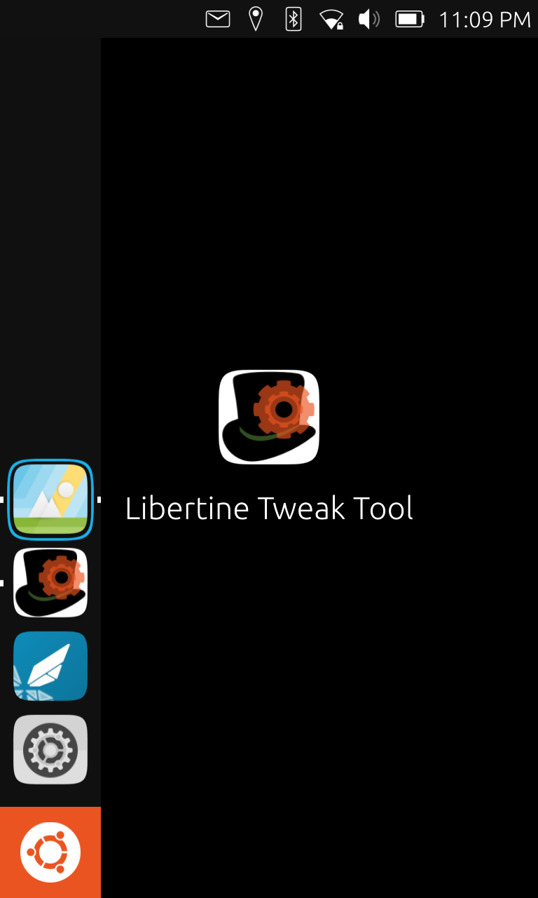
@doniks I thought the icon could be improved and created a different icon:

This is a png file. The original file is a svg file. It seems like the forum does not like svg files, so I made a merge request.
I did not like the low resolution of the current icon, this should not be a problem with a svg file.
If you still prefer the current icon, that is no problem. -
@johndoe Hey thanks a lot! Yea, the current one is an eye sore I know. I need to dig up a device to test and see whether it is ok in all places.
Looking at the aestetics I really like the hatband. I think it is a nice subtle clue for the hat shape, especially where the icon is really small. And the cogwheel on top is very intuitive hint to distinguish between libertine proper and the libertine tweak tool.
What I am not so sure about are the colors. I associate a top hat with distinguished subtelty. But the striking green on black and orange on green contrasts remind me more of St Patricks day. Fun, but not subtle!
Would you mind trying other colors? Maybe a silver hatband and keep the orange cogwheel. Or maybe hatband and cogwheel in some shade of grey?
Update: maybe it could also be a tiny bit smaller? right now the hat gets cut at the top and at the bottom
-
Sorry for being OFF TOPIC. Some days ago I red https://openai.com/blog/dall-e/ and reading this thread I though to myself, that such a tool would be great for icon creation/modification.
 That's all, have a nice day.
 -
@doniks No problem, I will try to change it when I have some free time (probably at the weekend).
-
I changed the icon size and you can also choose between different colours here:
https://gitlab.com/AdamSchrey/libertine-tweak-tool/-/tree/master_new/assetsIf you merge my project into yours, the old icon will maybe be deleted and you could remove the colour combinations you do not like.
-
@doniks Did you noticed my last reply? I changed the icon size and you can also choose between different colors here:
https://gitlab.com/AdamSchrey/libertine-tweak-tool/-/tree/master_new/assets -
@johndoe said in Libertine Tweak Tool:
@doniks Did you noticed my last reply? I changed the icon size and you can also choose between different colors here:
https://gitlab.com/AdamSchrey/libertine-tweak-tool/-/tree/master_new/assetsoh @johndoe I'm so sorry. I try to get to it this week
-
@doniks No problem. You can also let me know, if I should change something or if you just prefer the current icon.
-
Libertine Tweak Tool allows you to adjust the appearance of desktop apps that you have installed in your Libertine container.
-
@johndoe so, I'd like to go with the light grey version of the icon.
However, when I rebuild the arm64 version, it doesn't run on the pinephone. This has nothing to do with the new icons, the problem is the same when I rebuild the current version. Something ... maybe in clickable? ... must have changed. The old arm64 build that's currently in the store still runs, but a new build doesn't. Now, if it were only about pinephone, I think it wouldn't matter so much, since graphical libertine applications don't work on the pinephone yet, but I'm concerned that it might affect other 64 bit phones as well. The armhf version works ok.
Is someone here with a 64 bit phone that could test this build? https://gitlab.com/doniks/libertine-tweak-tool/-/jobs/1210056802/artifacts/browse/build/aarch64-linux-gnu/app/
-
@doniks - the Libertine Tweak Tool arm64 beta is working well on my Volla Phone (RC channel). I like the new icon.
Best regards,
Steve Berson -
thanks for the confirmation @TotalSonic
new version is now in the store. thank you very much @johndoe for making the icon!
sorry it took so long
-
@doniks You're welcome and no problem
-
I'm happy to announce that LTT just learned how to be translated from Anne Onyme 017. Thanks a lot!
German has just been added in gitlab and French is in the works. If you feel like contributing another language (It's just a dozen strings or so, but admittedly quirky ones). Please check out the README
-
@doniks Hello
In this topic, I raised some doubts about the usefulness of Libertine Tweak Tool regarding the Xdpi setting that allows (among other things) to increase the graphical representation of applications running in the Libertine container.I was about to say that I was wrong when I first discovered Libertine and LTT. Indeed, I just redid some screenshots with LXTerminal and I saw that the dead zone on the right in landscape mode does NOT depend on the Xdpi setting of LTT as you can seen here :
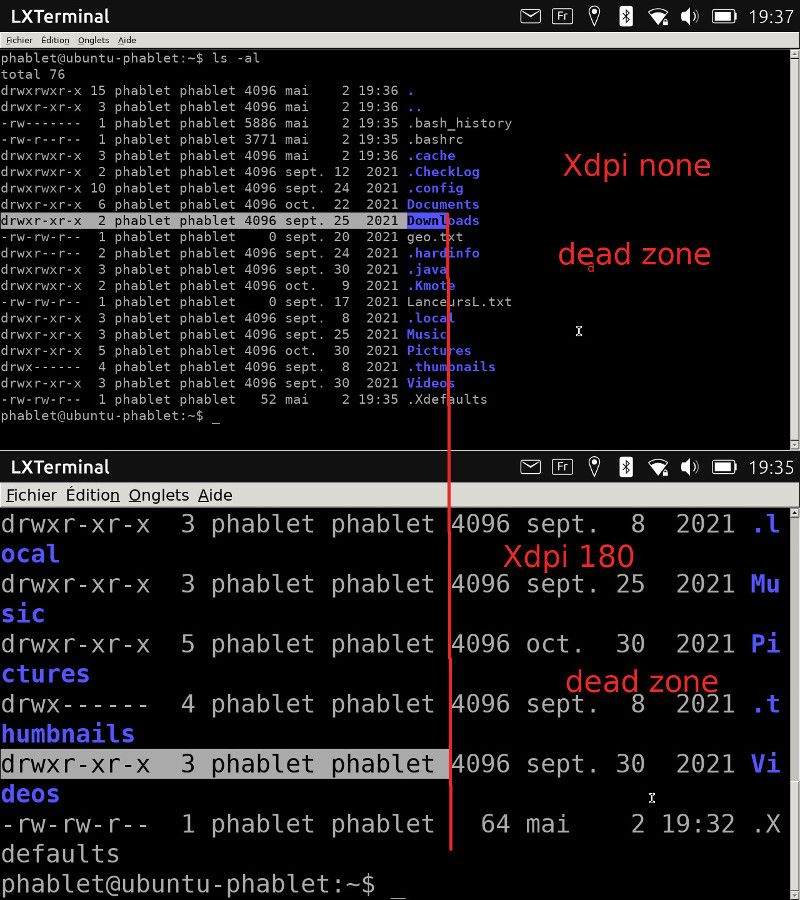
With this application, the behavior (selection of a line of text with the mouse in this case) seems identical for an absence of Xdpi setting and for a forcing of Xdpi at 180However, I also did some testing with Gedit (and with my CheckLog application) and I saw the following:
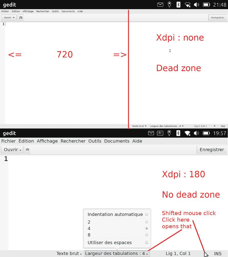
In fact, the dead zone is not dead, there is an offset between the mouse position and the widget grid of the application. And this depends on the Xdpi setting.I thought the problem was limited to landscape mode but I also saw with Gedit that there are also problems in portrait mode as you can see here :
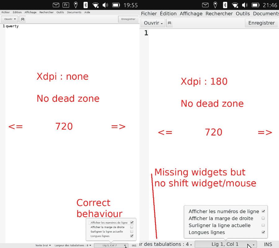
The action bar at the bottom seems to be framed on the right and in this case, we lose widgets on the left while at the top the two buttons are positioned normally, one on the left, one on the right. The left-framed menu bar loses items on the right. This happens when the Xdpi setting of 180 is the right one for other applications but not for this one.Finally, I couldn't try again in windowed mode because I can't find the com.canonical.Unity8 schematics anymore (switch to OTA-22 or change on my part?)Find it again. Could be able to make more tests ...I am not saying that these errors are due to LTT but simply that LTT highlights them and in some cases the applications become unusable. I think that not all applications take into account the dpi setting (especially my CheckLog application programmed only "in pixels") and Gedit obviously has big problems on this side.
This is why I considered at the time that a single dpi setting was not the solution and that it was better to set the graphic size of each application with its own menus when possible (Font size for example).
BR
Pulsar33 -
ugh sounds complicated. thanks @pulsar33 for writing this up! do you see a difference in this dead zone / offset behaviour between touch and mouse? I probably need to play with this myself to understand.
Hello! It looks like you're interested in this conversation, but you don't have an account yet.
Getting fed up of having to scroll through the same posts each visit? When you register for an account, you'll always come back to exactly where you were before, and choose to be notified of new replies (either via email, or push notification). You'll also be able to save bookmarks and upvote posts to show your appreciation to other community members.
With your input, this post could be even better 💗
Register Login