I wanna go home
-
@sixwheeledbeast uh yes i guess, but you are already home then arent you

i think its the plus kit, not the basic one, and takes a littlebbit of time to setup correctly
-
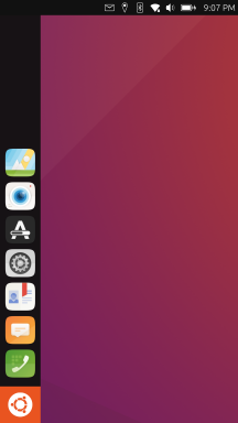
Having a way to have no sidebar like the showdesktop app, maybe I see "home" differently. A blank space with only the top bar to distract me

-
@sixwheeledbeast
ahh i get what yoy mean, yes
that is possible in ambots settings, -
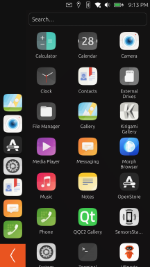
I think the whole UI has to be redesigned, but not in the same way as Android or IOS. Instead, a desktop OS approach just like on Linux, but compressed in a mobile format. That way the phone can be intuitive both when used as a phone and while docked.
So how to do that? Easy:
1. Make the dock behave as a desktop dock.
Instead of pinning apps there, make it show apps that are opened, just like on a desktop. That way you lose the whole "swipe up to check your open apps" thing while remaining intuitive to use. That doesn't necessarily mean you can't pin some apps there though, but it should be optional - just like on a desktop.
That way, clicking an app on the dock can maximize/minimize.2. Use the Ubuntu button as a start menu/app drawer button.
You click it and the app menu opens. It can be separated in sections depending on the type of apps too. Pretty much the same as on Linux Mint. Clicking the button again closes the "start menu".
3. Allow adding apps to the home screen, like on a regular desktop.
I don't know why this isn't a thing. This compensates the changes in the dock. Allow grouping apps in folders too, etc.
4. Move the status bar to the bottom of the screen.
That way you solve the problem with camera cutouts and align the concept well with the gestures I suggest.
4. Gestures:
- Left swipe to show dock in an app is a great choice.
- Right swipe is now free, because the dock shows all processes instead. It can be used to return to the desktop instead. Long swipe can kill the app.
- Down swipe can be used to open notifications.
- Up swipe can extend the status bar and extend into a control panel - WIFI, Bluetooth etc.
This solves your home screen dilemma and is a good way to improve the UI of the OS.
-
-
The Launcher/dock already works like that except minimizing by clicking on the foreground app
-
Not exactly sure if I understand this correctly but I think it does work like that already too. Which is actually used very rarely since you can just long swipe
-
This is something that may come in the future or maybe never. I think the higher priority is to improve the features in the app drawer.
-
I've never seen a phone shell that has a bottom status bar
I don't think that's a good idea and it doesn't really solve anything since the shell still needs to adjust things for the cutout, just on other components or even apps. -
I don't think gestures will ever change that much. It's already set and works well. Personally, bottom gesture should be free for context-based actions instead of being fixed into specific system actions.
-
-
@kugiigi I see, I haven't used UT in a few months, so I might've missed a few things.
In that case, my suggestions are to add minimizing to the apps on the side bar. This will solve the issue on going to the home screen quick.
If apps are allowed to be added to the desktop, that will make the home screen feel like one. It will also separate it from the side bar and the app drawer clearly.
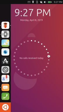
My suggestion for the lock screen is to make it look like it is on Android. It's simple and it works - a clock, date and notifications.
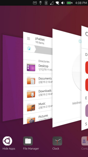
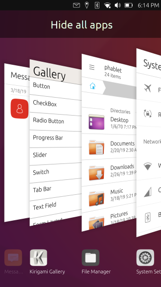
In addition, the background apps screen could be improved too. If its opened with a swipe up it would be more intuitive IMO. The layout could resemble the tab layout that Firefox on Android uses - simple 2x3 grid with an "x" above each app if you would like to close it. It wold be cool to show free/available ram at the bottom. Finally, a button to close all apps would be great.
That way you get:
- A task bar with opened apps, which allows you to quickly switch between them, or get to the desktop quickly.
- An app drawer.
- A desktop with apps of your choice functioning as a home screen.
- A "running apps" screen which allows you to manage/close apps.
One last idea:
If the "running apps" is a swipe up, then a swipe right could be used to quickly get back to the desktop too.
-
@Turbolqk Most sound like awful ideas. If you use it for long enough they're already implemented better than you think.
-
-
@Turbolqk
swipe-up, too, is already reserved for app-specific functions -
I’ve been using Ubuntu Touch for four months. So I have no experience of older versions prior to 24.04.
The frequently cited arguments that “users were unsettled by these or those changes” therefore don’t apply to me.My conclusion: Getting started with Ubuntu Touch was a bit bumpy, but I now really appreciate how it works. What I appreciate most is the app chain on the left-hand side. This efficient, unique selling point should definitely not be tampered with. Switching between apps is also brilliant. I don’t miss a home screen, desktop, etc. at all. Least of all do I feel the need for the interface to resemble that of Android or iPhone.
I might have one wish: a multi-page app drawer (vertical or horizontal) or some other way of grouping apps rather than simply sorting them by name. Perhaps with horizontal dividers or spacing.
Translated with DeepL.com (free version)
Pixel 3a, works with NextCloud, pihole, Wireguard VPN, Trilium, GhostCloud, Paperless ngx...and a lot of great apps from the Open Store.
Lenovo Tab M10 HD TB-X306X LTE -
@Linus67 said:
I might have one wish: a multi-page app drawer (vertical or horizontal) or some other way of grouping apps rather than simply sorting them by name. Perhaps with horizontal dividers or spacing.It is currently under development and there is a €2,000 bounty for it (issue #127):
https://os-sci.com/lomiri#Contribute -
@libremax Thanks for the link. That’s exactly what I mean, only even better.
-
@Linus67 Yeah. I think the priority is to improve the app drawer and add features there. That's kind of the "home" in UT. I don't think there's immediate need to do drastic change to have an actual home. The desktop is also empty but I don't think it should also be a priority. Maybe on the desktop use case but not on mobile.
-
This post is deleted! -
@Zer0 please, I would suggest you don't spam on old subjects. One thread for your app is more than enough
-
 C CiberSheep locked this topic on
-
@CiberSheep
I don't think this is spam, just a ping for "home apps" users (like I did myself here when Pavel released "Home").
Sadly "home" and "launcher modular" no longer have their original mainteners (and I'm very worried about what happened to Pavel...).They got "forked" by some others to work under Focal, but that's kind of dead ends.
So this is a way to tell those apps former users there is an alternative, I guess.After all, he announced here, just few post upper, that he intended to do something "homish".
Now he did and announce it.I don't believe that deserved locking thread.
-
@Keneda thank you Kaneda, but this user was reviving threads inactive for months with the same message (that I merged into one thread or deleted if it was only this message).
One thread is enough. Mentions on active threads are ok if it's not only the link to other threads. -
@CiberSheep
This thread was still active before he gets here.
Beside this is "the official" home discussion thread. -
C CiberSheep unlocked this topic on
-
-
This post is deleted!




Hello! It looks like you're interested in this conversation, but you don't have an account yet.
Getting fed up of having to scroll through the same posts each visit? When you register for an account, you'll always come back to exactly where you were before, and choose to be notified of new replies (either via email, or push notification). You'll also be able to save bookmarks and upvote posts to show your appreciation to other community members.
With your input, this post could be even better 💗
Register Login