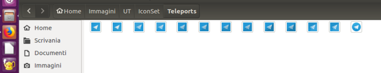
TELEports. New Telegram app icon design
-
@Flohack Yes I'm also in favor to keep it as it is now... At least I tend to... As @elastic I like that it resembles the original but having the white circle in the blue disc you imagine it standing on a teleporter plattform
") and additionally there are the teleporter beams on it. The similarity to uNavs icon is unfortunate... Lets try to force @costales to change uNavs icon
and additionally there are the teleporter beams on it. The similarity to uNavs icon is unfortunate... Lets try to force @costales to change uNavs icon 
-
IMHO it's fundamental that the icon resemble the original one obviously avoiding any trademark infringing. I think we can use the original "3D-ish" icon as a base and colors (so to keeping similarity with the official one and make it discernable from the Unav one) and apply on it some of the UT official graphic guideline/style so to avoid trademark infringing.
for example something like:

and

they both are in origami style. in the first the geometry and the style of the paper airplane is different from the original/official logo (it'is another paper airplane ;)). the second is more similar in terms of geometry but the teleport effect make it whole new icon.
-
@aury88 I really like the second one
-
@Aury88 Prdon me for intrusion. I like the second one. Just one suggestion. How about get rid of one of the top-right folds. Like this:

There were too much folds in your original for me.I also took the liberty to invert background coloring (dark <-> light), but dunno why. Just a feeling.
Anyway kudos o your contribution.
Edit: I also like the fist one. Simplicity in it's finest form.
jEzEk
-
-
@hummlbach said in TELEports. New Telegram app icon design:
its so asymetric now.
Sometimes asymmetric is more beautiful
")
@hummlbach said in TELEports. New Telegram app icon design:
or lets remove all folds in the upper right edge...(?)
This is a trick question, right? You can not remove both of the upper-right folds. You always need at least one to maintain light-dark background (without using gradients).
-
@jezek If we need a single fold probably is better to maintain only the upper one because it is based on one of the main folds/lines in the airplane (as the icon guideline says). about the dark-color it is used also to make the farther wing more dark so to give a 3d effect. tomorrow i will post some iterations of the design with the light color fold applied on the top side (or dark in the lower) so we can see what is better for the 3d effect and for the icon.
about the single or the double fold honestly I didn't saw that the single fold style was the mainly used. My error.
@hummlbach I don't think a little less sharp edge would be so visible with the icon sizes. vice versa if we make them more rounded (greater radius) we risk making it difficult to understand that the element is an airplane with missing pieces. we can try to reduce the number of the missing strips so to lower the number of the sharp edges
-
ok, I made some design iteration based on your suggestions.

(2.2)Applying a light fold on the airplane doesn't make it more white (obviously) and we lost part of the 3D effect.
So a better way is to apply a dark fold in the lower (nearest) wing.
first iteraction:
(2.3) but here the shadow on the inner part of the airplane is wrong (shadow cast in the wrong direction)
So imho is better to apply the fold aligned on another edge of the airplane :

(2.4) here the shadow is correctly applied.the last one is the case with two folds (I still like them):

(2.5) -
@aury88 2.5 for me
-
@aury88 2.5
-
@aury88 2.4
-
@Aury88 2.5 for me.
-
Every icon with many elements is bad, it's too hard to recognize in the case where it small. The icon must be simple and recognizable. And if app name is far from original, then icon must point user what about this app
-
-
@gleblee IMO, any icon design should also not be dependent upon the background it may be displayed on, to signify what it's for. This is especially important when one wants to build apps that may be useful across multiple platforms, which have varying design guides for how app icons should fit in.
Honestly, to me, the whole concept of having all icons be round/square/squircle/whatever makes things worse, and they all just start to look the same.
-
@flohack what do you mean with "icon in desktop file format"? on my desktop i find only .png file format.
what file extension do you need? what dimension(s)? where do I have to upload it/them?the small details problem can be in part resolved by reducing number of (missing) airplane's parts starting from the smallest (missing) strips, but I think it's a problem only when the icon is understandable and distinguishable only thank to them.
PS: on my low-res computer screen with the image previews sizes reduced to minimum, the icon is distinguishable like the official telegram one (they both seem more to arrows than paper airplanes) and still is possible to "feel" there are some differences between them . clearly it's not possible to distinguish the details (3D, shadows etc but many of them, at this size, are not visible also in the official UT icons ) and is not possible to understand it's a "teleporting paperairplane"; but the icon seems still usable if you don't have another icon on a full blu backgroung with an arrow/paper airplane pointing top right. the same apply on the official logo if you don't have another icon with a arrow or a paperairplane on a full blu circle in backgroud.
PS2: the image above is reduced and has lost more details so use it with caution. the righter icon is the telegram official logo and I think the same icon used on smartphones. -
@flohack I tried right away how it looks like, so I can provide some screenshots again
-
@hummlbach thank you !
it's really interesting to see how on my smartphone, despite the smaller screen and image size, more details remain visible compared to the same image on my laptop screen .... the next laptop will be an ultra-HD xD -
Hello everybody!
Going back to this comment, IMHO the version without the "stripes" works best
As @gleblee said:
Every icon with many elements is bad, it's too hard to recognize in the case where it small. The icon must be simple and recognizable.
+1
-
+1
I think the logo needs to be more and more clear, not more complicated. Otherwise, it’s really "terrible".
Hello! It looks like you're interested in this conversation, but you don't have an account yet.
Getting fed up of having to scroll through the same posts each visit? When you register for an account, you'll always come back to exactly where you were before, and choose to be notified of new replies (either via email, or push notification). You'll also be able to save bookmarks and upvote posts to show your appreciation to other community members.
With your input, this post could be even better 💗
Register Login