New Launcher, edge channel.
-
@arubislander said in New Launcher, edge channel.:
The comment that sparked off this discussion was more about esthetics than function.
The problem with this though is that we cannot ship something which is optimally designed to a single person's preferred aesthetic. We need to design things that are usable by as many people as possible, if we want UT to gain a significant user base. That means things need to be visually obvious, accessible, etc… and we must think from the point of views of others to accomplish such a design.
-
@dobey
The three dots have been on the notifications drop down for ages... it wasn't obvious to me what they did until someone pointed it out fairly recently.
-
@3arn0wl Do you mean it wasn't obvious that it's a handle for dragging and closing the drawer?
Personally I got it right from the start, well I guess that's because I've used the drawer pre-handle so I immediately noticed the change. To me, it is perfectly usable and intuitive and definitely an improvement from the mess it was before.
I guess it's just that it doesn't look great especially on larger screens but I'd take usable than pretty any day of the week")
-
@kugiigi said in New Launcher, edge channel.:
@3arn0wl Do you mean it wasn't obvious that it's a handle for dragging and closing the drawer?
For dragging it, yes. I thought you had to have your fingers over the icons at the top. Once I found out, I did suggest some tiny < > icons in stead.. but I'm not sure, on reflection.
-
@3arn0wl said in New Launcher, edge channel.:
For dragging it, yes. I thought you had to have your fingers over the icons at the top. Once I found out, I did suggest some tiny < > icons in stead.. but I'm not sure, on reflection.
The indentation dots and similar have been used for quite a long time as "grip" indicators in GUIs, for objects which may be dragged, such as toolbars and pane handles. This is because it is a bit skeuomorphic given how physical objects have such designs as a means of increasing surface area contact as your skin presses into them when squeezing (thus increasing the "grip" you have on them).
So, while I wouldn't be surprised if you consciously didn't recognize this, the visual indication of this type is used to create a subconscious realization.
-
@B2288 said in New Launcher, edge channel.:
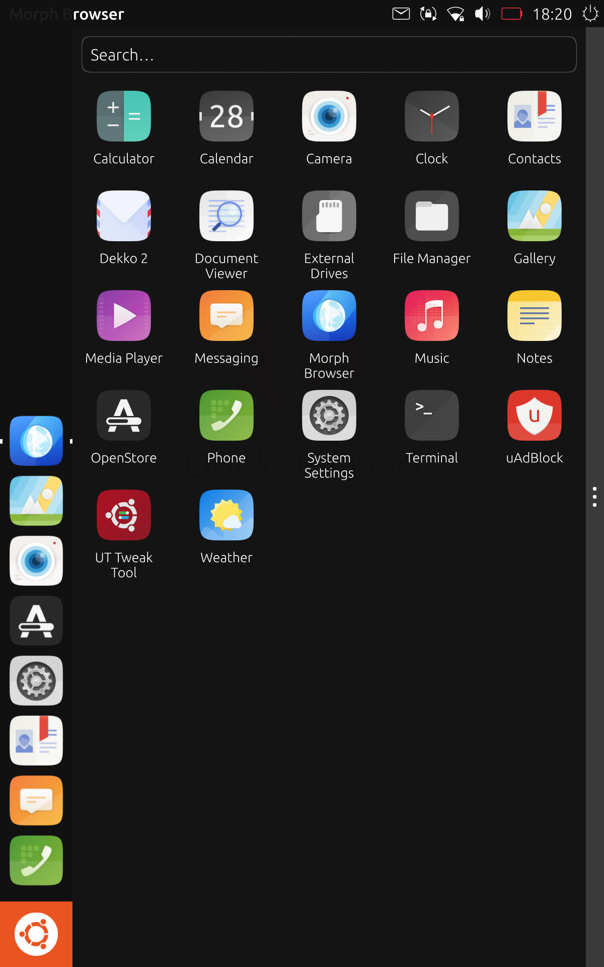
I think the gray bar on the right with the three dots is ugly. Would there be any issue removing it?
I personally don't think its all too bad really. What I think is ugly is the large, square, orange ubuntu icon in the corner!
-
@dieharddan just work on launcherPanel.qml: replace the icon child of the rectangle (id: bfb) at the beginning of the qml file with a qml Image type with right size and wanted source. Like this (where I also made the launcherPanel transparent):
PS it's my first message, I apologize in advance for any of my mistakes or inappropriate actions.
Plus, my system: ota-22, google pixel 3a. How long on ub_Touch? 3 months. Side notes? THANKS to developers. -
@rebellion Hello,
Can it be done on version 20.04?? I have digged inside and could not find unity8 folder.
Also can you make top panel transparent?
If yes, could you please elaborate steps?
Thanks,
-
@Salah said in New Launcher, edge channel.:
and could not find unity8 folder.
Maybe try with "lomiri" as it's the new name for unity8.
-
@Keneda I see.
Thanks

-
 A arubislander locked this topic on
Hello! It looks like you're interested in this conversation, but you don't have an account yet.
Getting fed up of having to scroll through the same posts each visit? When you register for an account, you'll always come back to exactly where you were before, and choose to be notified of new replies (either via email, or push notification). You'll also be able to save bookmarks and upvote posts to show your appreciation to other community members.
With your input, this post could be even better 💗
Register Login