An idea for the UBports/UBtouch website
-
Hi all,
I've been complaining for a while about the UBports website, but I needed to be constructive. So I finally found some spare time to produce a mock up of something that corrects (according to my own taste) the navigation and communication issues of the actual ubports/ubuntu_touch.io websites.Here under the ubuntu_touch.io :

The UBports community page :
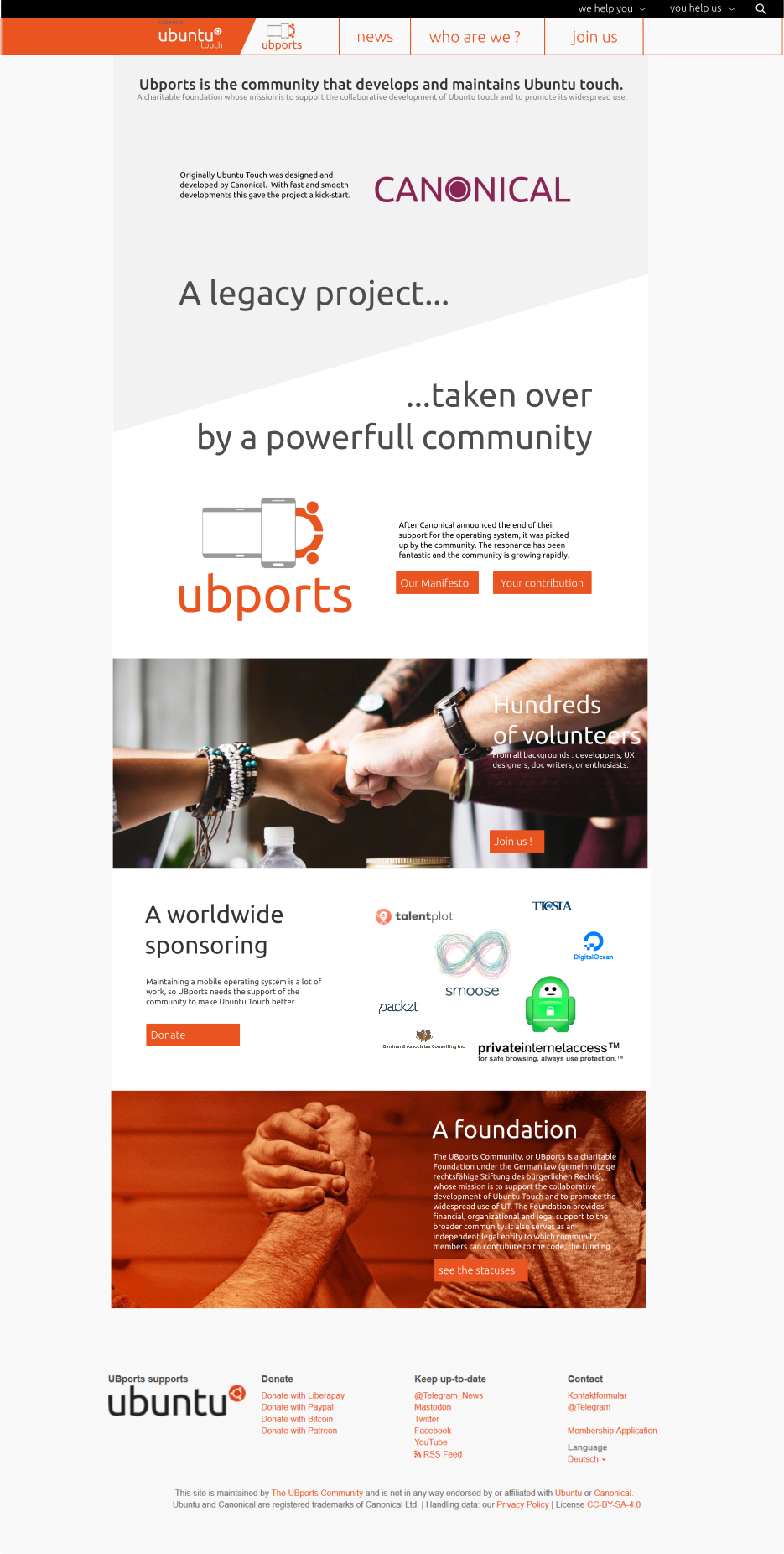
The "help eachothers" header :
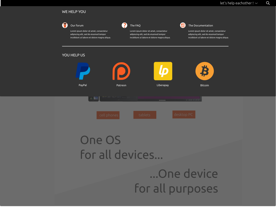
The different visual identities for the "Community", and for the "product" pages:

I didn't specified yet the full navigation in the websites. I suppose it is quite straightforward. Don't expect to have the full content of the actual webpage inside : my point was exactly to cut down all the unnecessary wordings/subpages...
Last comment : I furiously copied the official Canonical page. It was on purpose.The idea is dropped, let's challenge it on the forum

-
nice work

-
@gimenez
It looks great in my opinion. It does give a good oversight of all major features and subjects. It is easy to understand even for non geeks. Good job. -
Gooood Job!! I Love It
-
Great idea!
-
Huh, this shapes up pretty well. How do you think it should look on tablet and mobile form factors?
-
Glad to see the support ! So I kept doing and here a new version, including tablet and phone formats.
A clearer header : now the "Ubports supports UBtouch" is in reading order.

The corresponding curtain menu contains more stuff :
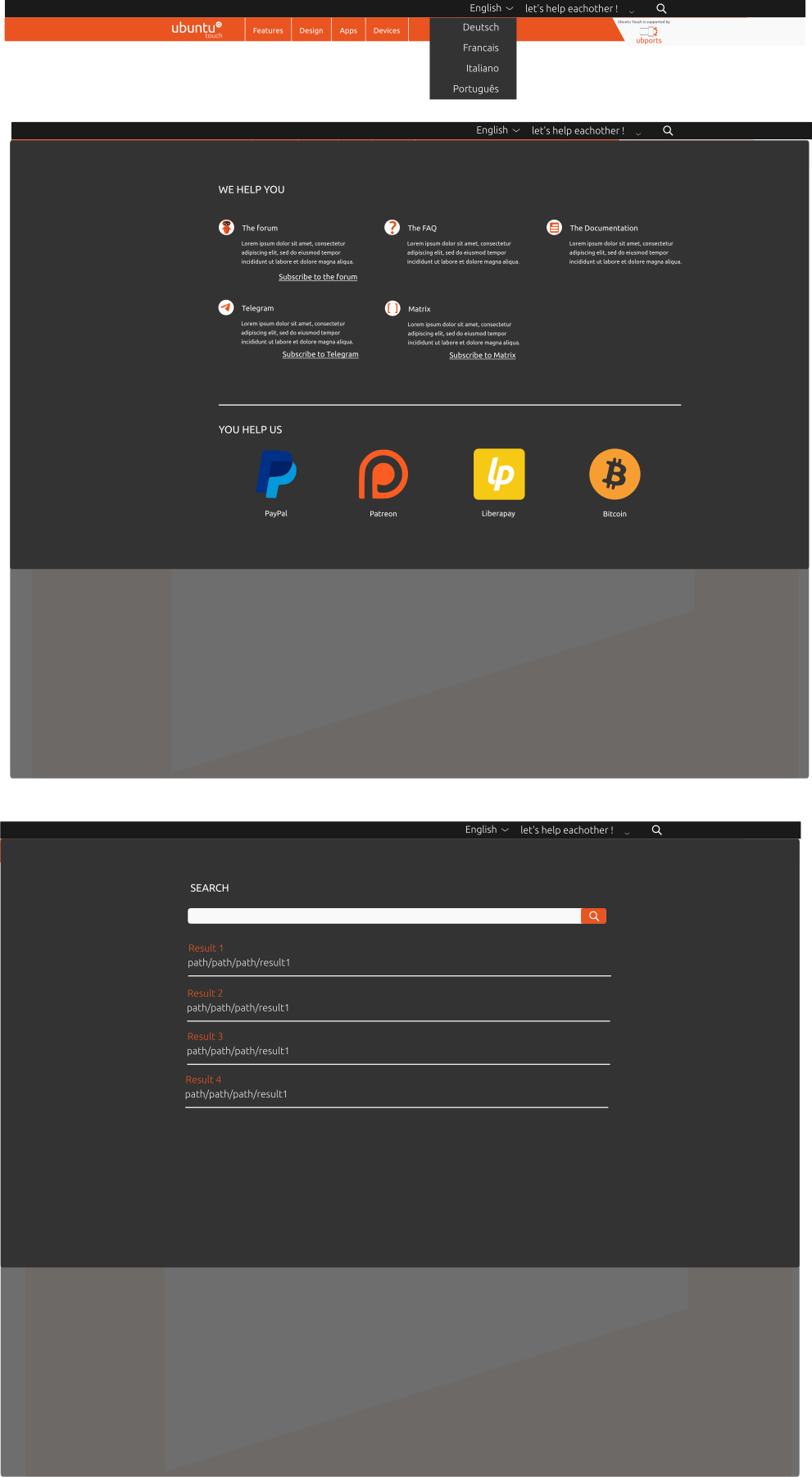
And there is a "burger menu" phone version :

The UBports welcome page, Desktop size:
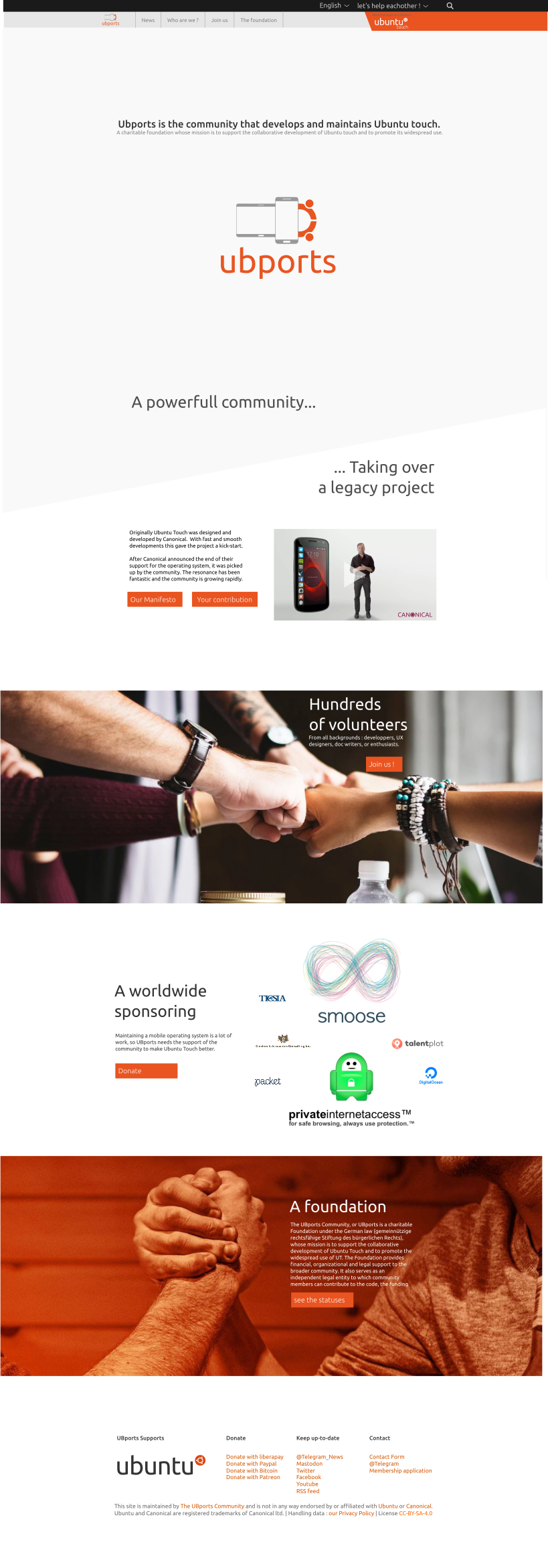
The UBtouch welcome page, Desktop size :

The UBtouch welcome page, tablet size, with reshaping comments :

The UBtouch welcome page, phone size, with reshaping comments :

The promoted device page, in desktop mode (and partially incomplete), as an example of a subpage. I guess the table-like presentation is straight forward to convert into phone mode.
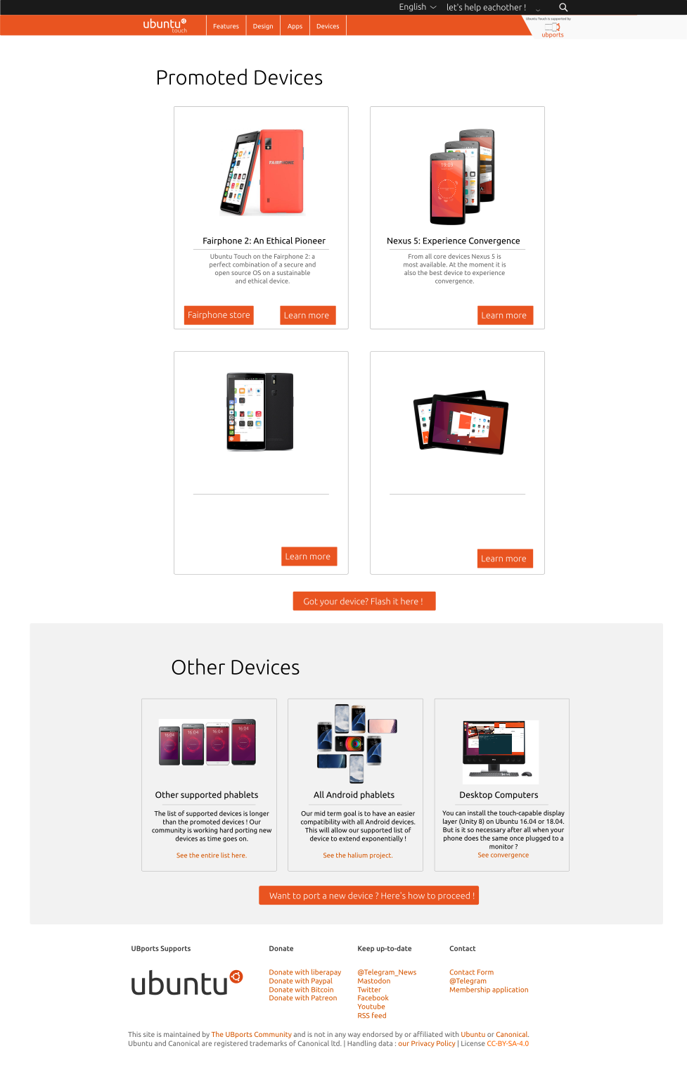
Sorry for the poor resolution, but we're at the limit of the max image sizes. I also wanted to share the .svg file, but it exceeds the max size... (together with embedded images, it makes 35Mb...). If wanted, we'll find a way to share it !
-
@gimenez said in An idea for the UBports/UBtouch website:
Sorry for the poor resolution, but we're at the limit of the max image sizes. I also wanted to share the .svg file, but it exceeds the max size... (together with embedded images, it makes 35Mb...). If wanted, we'll find a way to share it !
Perhaps Imgur or similar?
Anyways, the amount of effort you've put into it, and the quality of your concepts, is amazing! -
@Leppa
Thanks!Here a short term solution (link available for three weeks only) :
https://filetransfer.io/data-package/kyCgKUaNThe zip contains the exports for this forum, the exports at the correct definition (1920px wide for the desktop mode for instance), the raw .svg sources and a pdf version for an easier preview than openning Inkscape.
-
Great work. I feel it solves some of the confusing elements of the current website, nice work.
-
@Giiba Great work, yjis would have really helped when I was researching ubports.
-
One small suggestion, which I make not out of cynicism but simply because I think overselling is a problem when people are enthusiastic about a project (as we rightfully are): maybe leave off the verbiage about a "growing list of devices" until the list actually grows? So far as I recall, only one community port has ever appeared, all the Halium ports have some way to go, and the non-Halium devices are in early days yet, so hasn't it actually been a couple of years since the list grew?
Hello! It looks like you're interested in this conversation, but you don't have an account yet.
Getting fed up of having to scroll through the same posts each visit? When you register for an account, you'll always come back to exactly where you were before, and choose to be notified of new replies (either via email, or push notification). You'll also be able to save bookmarks and upvote posts to show your appreciation to other community members.
With your input, this post could be even better 💗
Register Login