Hi all,
I've been complaining for a while about the UBports website, but I needed to be constructive. So I finally found some spare time to produce a mock up of something that corrects (according to my own taste) the navigation and communication issues of the actual ubports/ubuntu_touch.io websites.
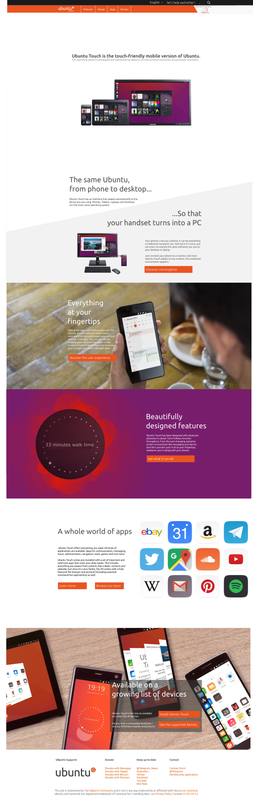
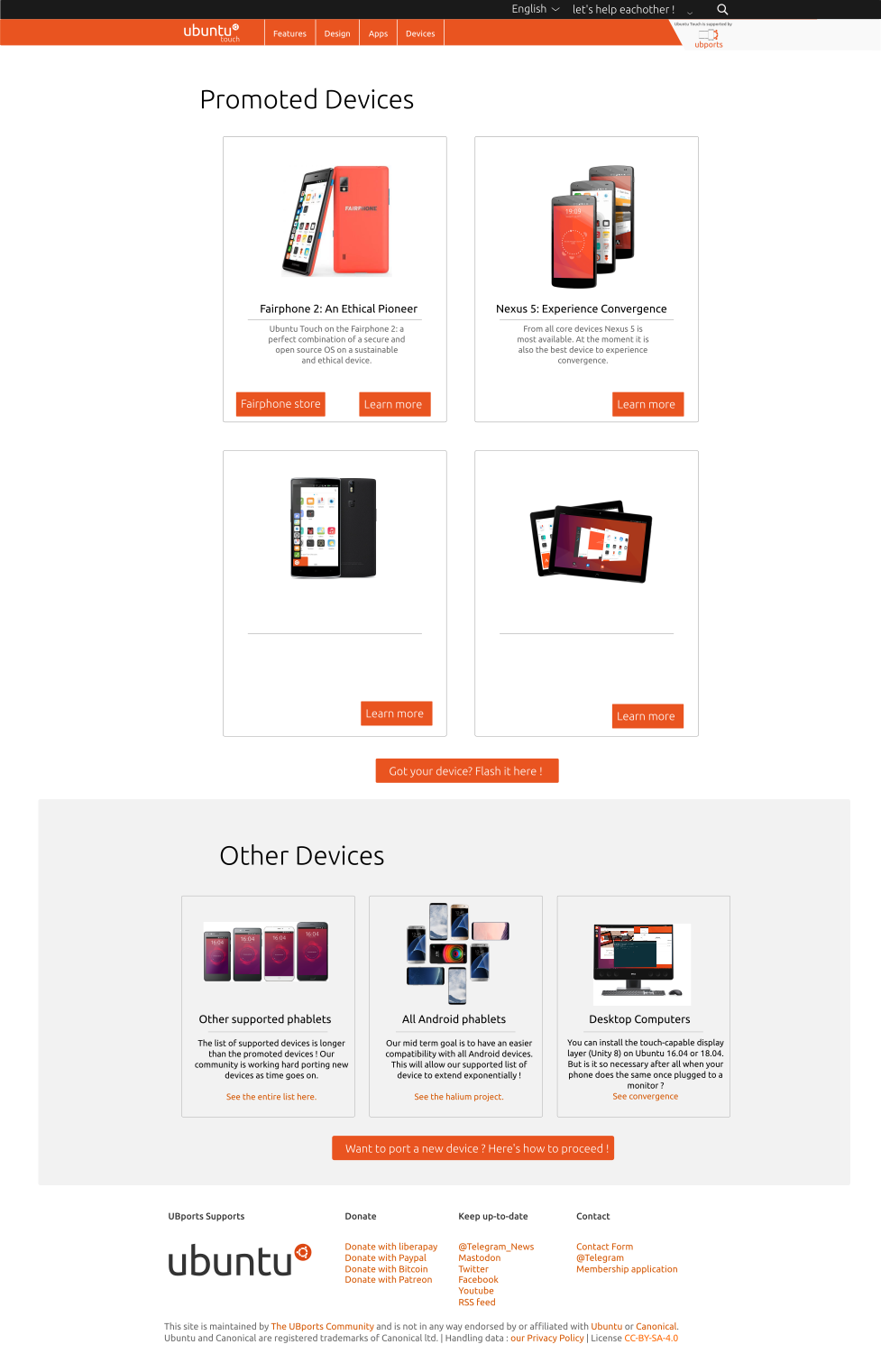
Here under the ubuntu_touch.io :

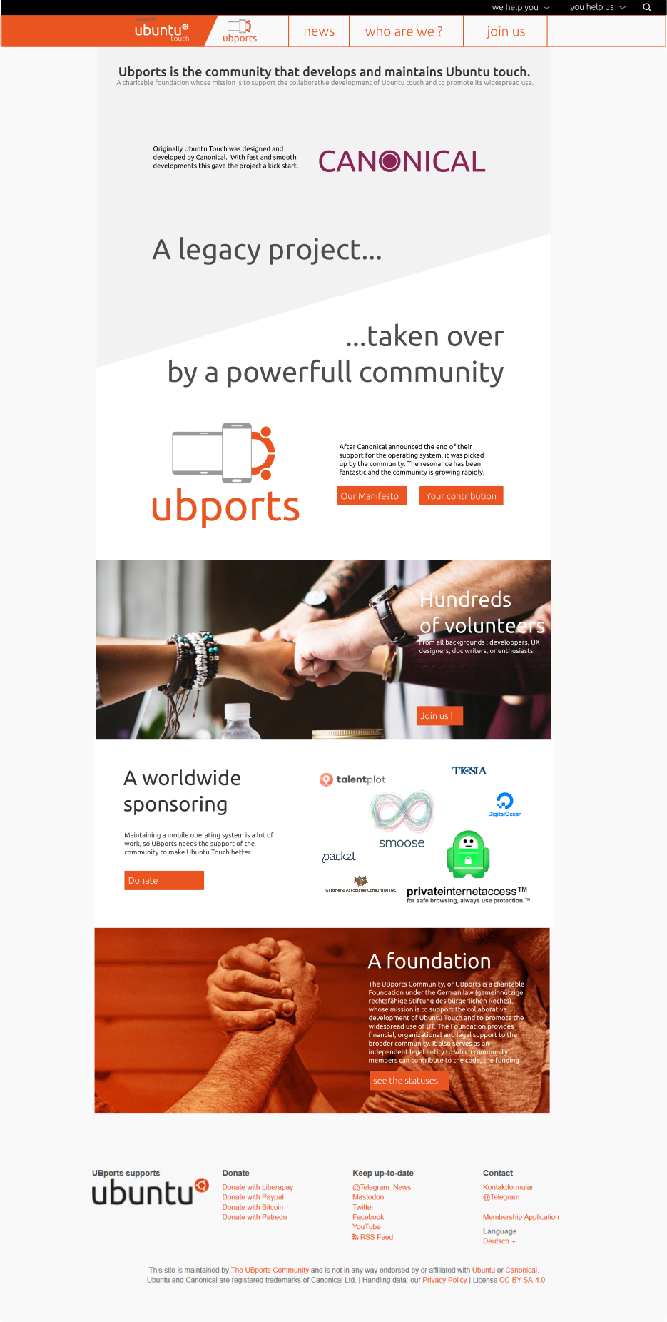
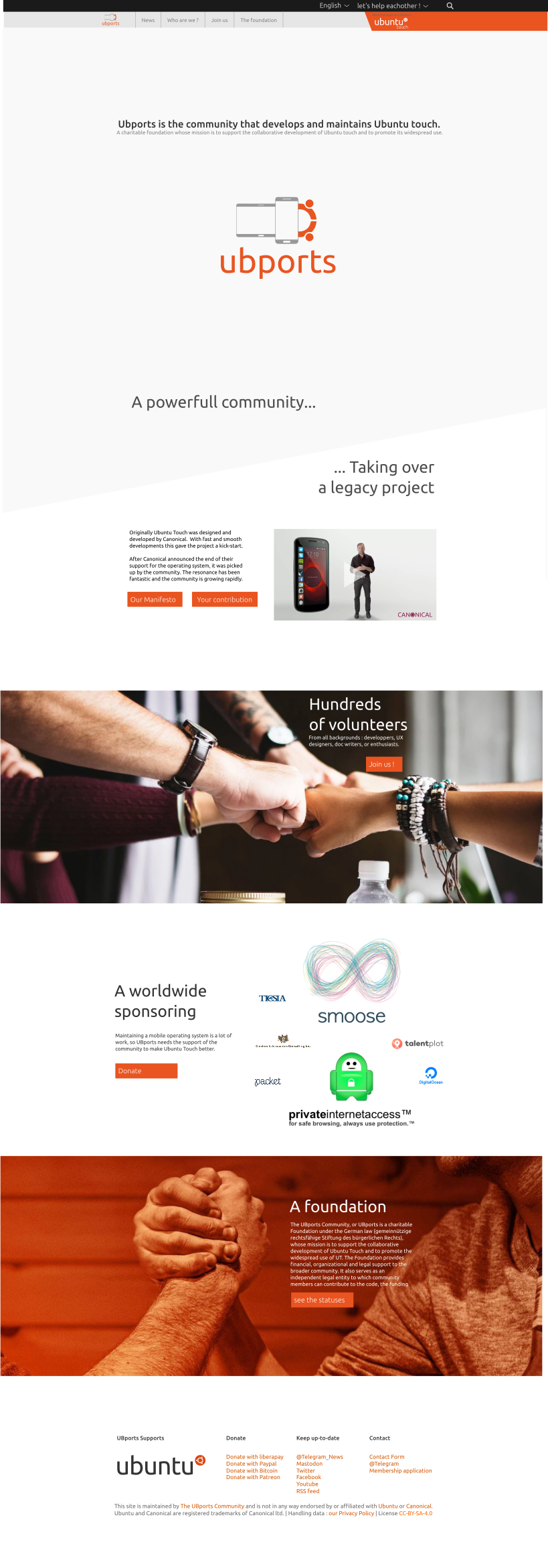
The UBports community page :
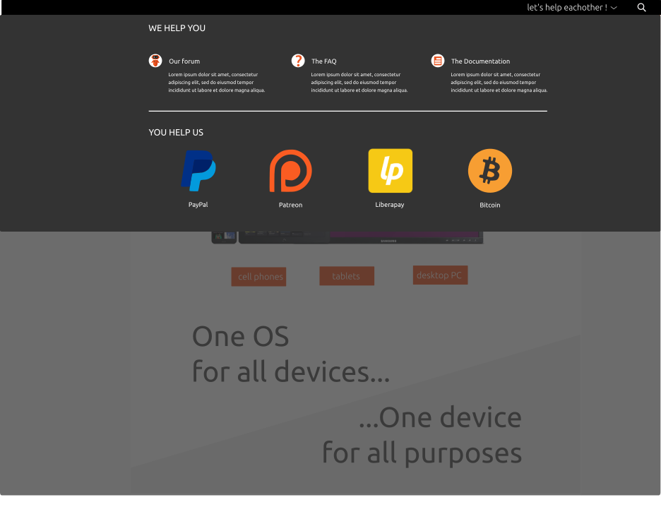
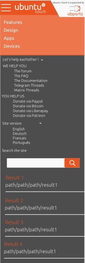
The "help eachothers" header :
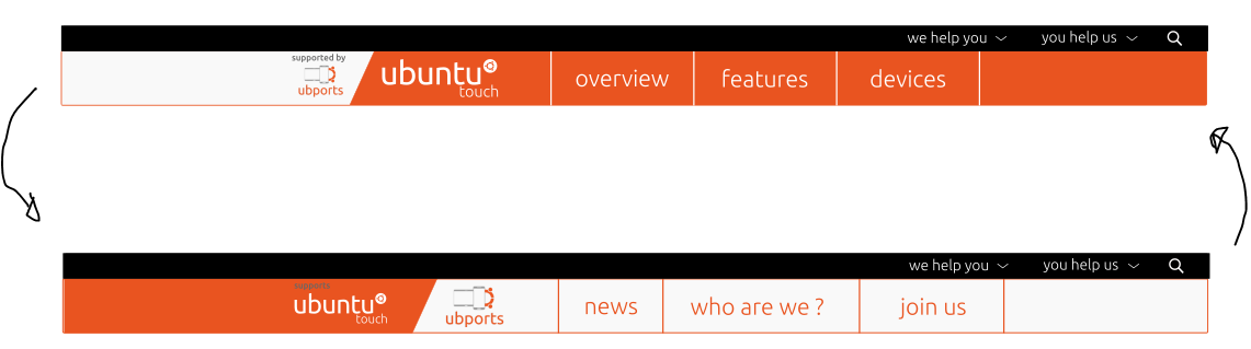
The different visual identities for the "Community", and for the "product" pages:
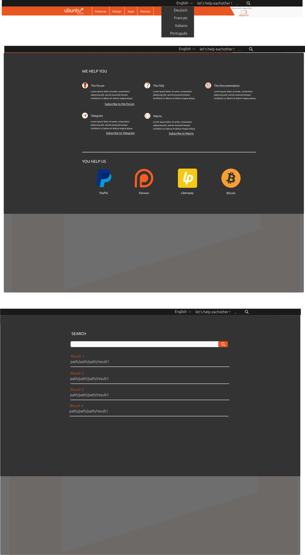
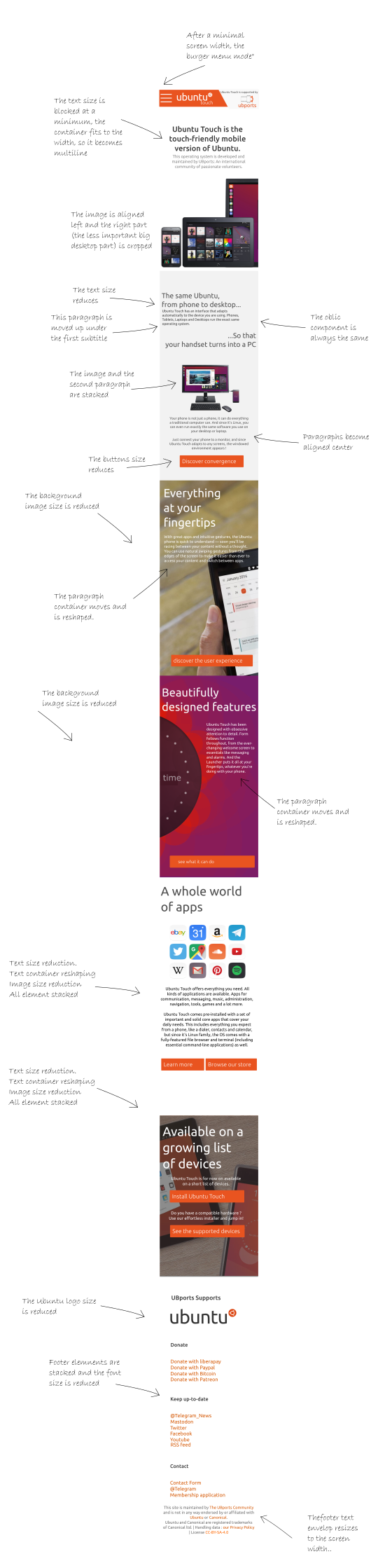
I didn't specified yet the full navigation in the websites. I suppose it is quite straightforward. Don't expect to have the full content of the actual webpage inside : my point was exactly to cut down all the unnecessary wordings/subpages...
Last comment : I furiously copied the official Canonical page. It was on purpose.
The idea is dropped, let's challenge it on the forum ")
")

 My concern was that the sliding left/right works while you pull the "curtain" down. But once you've release you thumb, the only way to swipe to the neighboring menus is to come back to the upper bar.