[Discussion] File Manager improvements
-
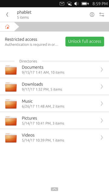
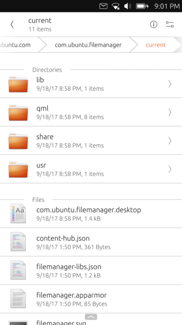
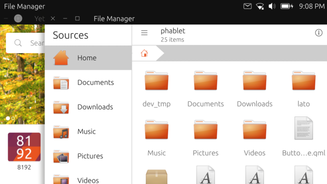
Congratulations on the update of the file manager! Now it looks like a real file manager and in my opinion the UI is very intuitive and friendly.
-
It's still work-in-progess, but we have some good news. During the last weeks, with a massive help from @nfsprodriver , the new File Manager finally started to take shape.
We will probably release a testing version in the store next week, so you can provide us all the feedback about the new UI and - most likely - bugs


-
great work man, much appreciated
-
@sverzegnassi looks amazing, thanks for the work to all are involved
-
Yes, it looks very good, clean. Thank you for your excellent work.
-
@sverzegnassi Great job! I'll be waiting for the store version to test it.
-
A development release of File Manager (v. 0.5.x) is now available on OpenStore. It won't uninstall the stable version you have already installed.
https://open.uappexplorer.com/app/filemanager.sverzegnassi
Please let us know your feedbacks, so that we can sort out the final fixes and release it as stable.

Thanks everybody for your help! -
Good job! Many good things in there.
 I particularly like the miniature pictures and icons for known file types. Uncompress also worked fine.
On the improvement side the select all/select none is very confusing i think. If i click around a little bit, it starts indicating the opposite of what it is. I think it would be better if it just selects all if it is checked and unselects all if it's unchecked. So, static text and simple select/unselect would be better i think.

Another thing about selecting is that i think it would be good if the clipboard could be filled up gradually until it is cleared, so that i can for instance select two files in two different directories and copy to a third directory. Maybe a good idea would be to have a configuration so that it can work in both that more complex way and use the simpler selection model as it is now?
The last thing i found is that i was only able to select properties for the current directory, but not for directories and files in that directory.
Thanks for your efforts with the new file manager!

-
Update: Viewing options are also very nice.

Sorting on size as well would be good.
Sort order graphics only right for sorting on name. Suggest replacing with arrow up and arrow down.
-
@sverzegnassi Looks very promising to me,maybe there should be two versions like this,one for the regular users (on a regular ota )update.
Then, one for the dev types , (advanced users).
A little bit of juggling to get right functions in the right places, and give it another name.???? -
Building separate images for separate channels goes against the current release pattern: build a devel image, promote it to RC, promote it to Stable. This ensures that the same image goes through all of these steps and the same thing arrives at all stages.
-
@UniSuperBox It was more a thought of keeping a loaded weapon,in the gun case.
-
@Marathon2422 Oh, I see. I thought you were suggesting that we build another system image with the redesign.
-
I'll paste my suggestions here as well from Telegram, so that they won't get lost:
- The blue color will be better for selection. Not only it will look better, but it will match the Suru color codes, where green is for on state, positive actions etc. and blue is meant for highlights, selections etc. (vide blue text selection, blue caret, blue left side of slider etc.
- I'd also reduced the border radius to a very small value, or non radius at all.
That's just looking on screenshots, I haven't tested it yet.
Edit: red, green and blue color roles are - among all the other UI concepts - described in the Design Values document: http://design.ubuntu.com/apps/get-started/design-values
-
Nice redesign!
I would add as a comment that the sandwich-icon in the upper-right corner should be changed as it only opens the location selection. Normally there is a menu behind such a sandwich-icon, so that's confusing especially since there is the same icon in the lower-right corner. -
OK, I've just downloaded it and I've got two other notes:
-
Renaming files should not be on the left action bar of item list. It's for negative/destructive actions, and it is misleading. I expect that it has been done in order to avoid actions collapsing to menu, but in my opinion menu is not a problem - file operations are not what users do very frequently on phones, so if two of rename, properties, cut and copy collapse into a menu, in my opinion is not a problem. And wanting to rename file I would not look for it on the left action bar.
-
Scrolling speed is slower then expected. I'd suggest looking into messaging app - it has the best (and problably more up to date) scrolling speed. But I know that many apps have the same slower scroll as file manager - I guess it's an SDK related issue.
-
-
-
Select All/None is a standard implementation as appears on Document Viewer app and Clock app too. We might consider to review those strings for all the core apps in future, but I wouldn't try to implement something different: it might still be confusing for many others.

-
A clipboard manager (and "progressive" paste) were planned initially. I'm not sure they will be there in the final release, but I would like to add them in a near future. Glad to see there's someone else who would like such feature.
-
In the list view you can swipe each item and reveal the "Properties" action. For the grid view it is still WIP, as we're currently redesigning the component.
-
Sorting on size should be feasible, we will try to include it in the final release.
- I got your point, but I don't think we need it. Both regular users and advanced users perform mostly the same operations on files. The only difference I see might regard the type of file they manipulate (user's content vs system files) and some specific actions (e.g. symlinking or changing file permissions). It's still something we can handle from a single app, and I'd prefer not to duplicate the needed effort on two different projects. Did you take in consideration some specific scenario?
-
There is - in my opinion - a huge problem with the Ubuntu palette.
The blue is over-saturated: it might be good for highlighting selection state of small items, it does not seem suitable on bigger items. We updated the source code yesterday, and we will anyway push an update that includes the blue highlight, in order to get a wider feedback from users.
Just for reference - from the toolkit v. 1.3 specifications - blue is specifically suggested for text selection and text cursor. Green - instead - is used for the check boxes that are usually shown in the ListItem component, and that was the reason of our choice. We could otherwise revert to a tone of grey, or use a checkbox (definitely - not orange like in gallery-app )
) -
Border radius: yes, we have already changed it after I saw your feedback on Telegram
-
Scrolling speed. Long story short: I forgot to apply for the hundredth time the well-known old patch which is included in all the core apps to fix this issue.

-
Thanks for the feedback on actions placement. We didn't pay much attention to this, since it was still on our to-do list. Glad you gave us something to discuss. ^^
- We moved the hamburger menu on the right, since we already got some request for showing the "go back" action on the left. From my point of view, we shouldn't show a "go back" button at all, and we should move the menu back at the leftmost position. We will discuss about this again, and see what we can do. Thanks for the feedback.
-
-
@sverzegnassi said in [Discussion] File Manager improvements:
We might consider to review those strings for all the core apps in future, but I wouldn't try to implement something different: it might still be confusing for many others.

I would like to give you an example, because it really is confusing.
 Start the file manager and do long press on "Videos". Now "Select all" is checked, but only one file is checked. Humm... Then i uncheck it, and it is unchecked "Select None". This state i can get some sort of sense of, but then checking "Select None" makes the whole thing confusing again because no file is selected and the "Select All" is checked. Humm, again.
-
@sverzegnassi said in [Discussion] File Manager improvements:
The blue is over-saturated: it might be good for highlighting selection state of small items, it does not seem suitable on bigger items
Good point. But green is very saturated too and you actually walked it around by adding a bit of transparency
 Let's to the same with blue (possibly a bit more transparency if it feels too saturated) and it will be cool.
Gallery app has not receive many updates from Canonical, so they probably didn't take time to update the design after the orange has been thrown out from the palette.
According to 1.3 color specification: do you have access to documentation or guidelines that has not been yet released? Could you possibly release it somewhere, so that it would serve as a reference for both core and third party apps developer?
I think guidelines like this should land somewhere on the official Ubports website as a documentation for App development. -
@sverzegnassi Oh, I wasn't complaining about the position of the hamburger menu, just that it shouldn't be a hamburger. I'd say it needs another icon.

And yeah, the Go Back is i bit confusing.
