UBports Robot Logo UBports Forum
    • Categories
    • Recent
    • Tags
    • Popular
    • Users
    • Groups
    • Search
    • Register
    • Login

    Icon Library

    Scheduled Pinned Locked Moved Design
    108 Posts 11 Posters 31.0k Views 2 Watching
    Loading More Posts
    • Oldest to Newest
    • Newest to Oldest
    • Most Votes
      Reply
      • Reply as topic
      Log in to reply
      This topic has been deleted. Only users with topic management privileges can see it.
      • ? Offline
        A Former User @CiberSheep
        last edited by

        @CiberSheep The fold effect is made with a layer of black or white at 5%-10% transparency...
        So simple it was...:man_facepalming:

        1 Reply Last reply Reply Quote 0
        • ? Offline
          A Former User
          last edited by

          logo.png
          The same typewriter, other approach.

          AppLeeA LakotaubpL 2 Replies Last reply Reply Quote 0
          • AppLeeA Offline
            AppLee @Guest
            last edited by

            @C0n57an71n
            I appreciate the work done and I'd like to point out that less information in your icons might fit better UT's styling.
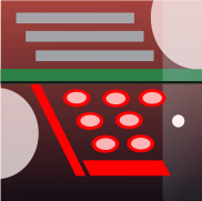
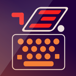
            I mean in your last icon, I get the lines and the keys, but why the big clear circles and the little white one ?

            ? 2 Replies Last reply Reply Quote 0
            • LakotaubpL Offline
              Lakotaubp @Guest
              last edited by

              @C0n57an71n Bit like @AppLee I feel keep the orange part (lines and ovals) and add in the fold effect from bottom right to top left and work round that. As you can tell this is not what I do much.

              ? 1 Reply Last reply Reply Quote 0
              • ? Offline
                A Former User @AppLee
                last edited by A Former User

                @AppLee Thanks for the feedback. Unfortunately, a typewriter by itself it's complex. I need some elements to distinguish it from a calculator, cash casa etc. The white semicircles are there to better define the shape of a typewriter and make the upper part go left and the bottom part go right. They suggest as well the rolls of a typewriter...

                1 Reply Last reply Reply Quote 0
                • ? Offline
                  A Former User @Lakotaubp
                  last edited by

                  @Lakotaubp Yeah, I need to reduce the complexity and make it as symple as possible, but still be able to recognize a typewriter. Another thing is to remember that this icon needs to be recognizable when minimized... Thanks for the feedback. Appreciated.

                  LakotaubpL 1 Reply Last reply Reply Quote 0
                  • ? Offline
                    A Former User @AppLee
                    last edited by

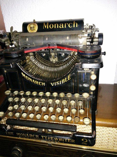
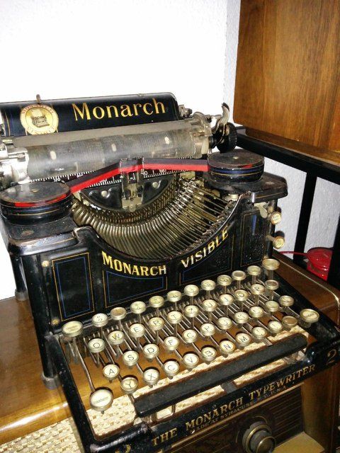
                    @AppLee As for the small white circle, I'll leave some photos to explain better what is it 😉
                    photo_2020-07-26_10-13-42_resized.jpg photo_2020-07-26_10-13-51_resized.jpg

                    1 Reply Last reply Reply Quote 1
                    • LakotaubpL Offline
                      Lakotaubp @Guest
                      last edited by

                      @C0n57an71n I did mean the fold line bottom left to top right not what I did put. Or looking again horizontal just above the orange ovals to look like a sheet if paper. Darker on keys lighter above.

                      1 Reply Last reply Reply Quote 0
                      • ? Offline
                        A Former User
                        last edited by

                        logo2.png
                        Opinions about this one?

                        LakotaubpL AppLeeA 2 Replies Last reply Reply Quote 0
                        • LakotaubpL Offline
                          Lakotaubp @Guest
                          last edited by

                          @C0n57an71n Just my opinion as I can't mess about with this stuff but for me keep the top half of this one but change lines on page to same orange as handle. Then reorientate the keyboard from the first one to fit the above, and just the one fold effect. However besides all that thanks for your time, effort and input once again.

                          ? 2 Replies Last reply Reply Quote 0
                          • ? Offline
                            A Former User
                            last edited by

                            radio.png
                            For a future FM Radio app....

                            1 Reply Last reply Reply Quote 1
                            • 3 Offline
                              3T_Ed
                              last edited by

                              Not sure if design rules allow this, why not use the red part as integrated part of the top section (upper right)? That would make the icon more stylish, attractive and in line with other icons that are worked on, thinking CiberSheep 's redesign of the Morph icon.

                              On a sidenote, wouldn't be great if the icon designs - besides the general UT design ruled so not just this one, as same goes for existing and upcoming ones - could just have some overlapping elements that can underline a somewhat more uniform design trend when opening the Open Store and stretching the cooperative vision of the platform, devs and community as a whole.

                              One of the pros of UT is that devs and designers are interacting with the community before launch. Love it, thank you for sharing your designs and thoughts. Good luck!

                              Critics are the true Positives | OnePlus 3T, Lumia 950

                              ? 3 Replies Last reply Reply Quote 0
                              • ? Offline
                                A Former User @3T_Ed
                                last edited by

                                @3T_Ed Thanks for thoughts. Will consider what you said.

                                1 Reply Last reply Reply Quote 0
                                • ? Offline
                                  A Former User @3T_Ed
                                  last edited by

                                  @3T_Ed The red thing gives icon energy and helps visualed impared to distinguish between them. Each of the icon from this style should have the red object always in another place in the plane.

                                  1 Reply Last reply Reply Quote 0
                                  • ? Offline
                                    A Former User @Lakotaubp
                                    last edited by

                                    @Lakotaubp I've said a little bit underneath that the red thing will be an element to accentuate and serves for visual impaired as to distinguish between icons as the red thing will be always in another place in the icon plane. It's a strong color and I cannot abuse of it.

                                    1 Reply Last reply Reply Quote 1
                                    • c4pp4C Offline
                                      c4pp4
                                      last edited by

                                      Not sure if it's the right place to ask but can someone please rework OSM Scout Server icon to be a regular square? I think it's pretty ugly now.

                                      https://github.com/rinigus/osmscout-server/blob/master/icons/osmscout-server.svg

                                      scout.png

                                      c4pp4C 1 Reply Last reply Reply Quote 1
                                      • AppLeeA Offline
                                        AppLee @Guest
                                        last edited by

                                        @C0n57an71n said in Icon Library:

                                        Opinions about this one?

                                        Much better IMHO.
                                        And the radio one is nice too.

                                        Now the main thing for me is the background. You used a gradient and a darker stripe.
                                        I thing a solid color with a single fold would be better.

                                        And if I may, maybe try smaller lines for the type writer (but not sure it would be better... just something worth trying 😉 )

                                        ? 1 Reply Last reply Reply Quote 0
                                        • ? Offline
                                          A Former User @3T_Ed
                                          last edited by

                                          @3T_Ed radio1.png

                                          1 Reply Last reply Reply Quote 0
                                          • ? Offline
                                            A Former User @AppLee
                                            last edited by

                                            @AppLee I've tested the lines thickness by zooming out. I would have loved them slicker, but when zoomed out to an icon size,,, I haven't test them on my N5, only in PNG format,,,

                                            1 Reply Last reply Reply Quote 0
                                            • ? Offline
                                              A Former User @Lakotaubp
                                              last edited by

                                              @Lakotaubp typewriter2.png

                                              LakotaubpL 1 Reply Last reply Reply Quote 0
                                              • First post
                                                Last post