• Categories
  • Recent
  • Tags
  • Popular
  • Users
  • Groups
  • Search
  • Register
  • Login
UBports Robot Logo UBports Forum
  • Categories
  • Recent
  • Tags
  • Popular
  • Users
  • Groups
  • Search
  • Register
  • Login

Icon Library

Scheduled Pinned Locked Moved Design
108 Posts 11 Posters 30.1k Views 2 Watching
Loading More Posts
  • Oldest to Newest
  • Newest to Oldest
  • Most Votes
    Reply
    • Reply as topic
    Log in to reply
    This topic has been deleted. Only users with topic management privileges can see it.
    • ? Offline
      A Former User @3T_Ed
      last edited by 26 Jul 2020, 13:14

      @3T_Ed Thanks for thoughts. Will consider what you said.

      1 Reply Last reply Reply Quote 0
      • ? Offline
        A Former User @3T_Ed
        last edited by 26 Jul 2020, 13:18

        @3T_Ed The red thing gives icon energy and helps visualed impared to distinguish between them. Each of the icon from this style should have the red object always in another place in the plane.

        1 Reply Last reply Reply Quote 0
        • ? Offline
          A Former User @Lakotaubp
          last edited by 26 Jul 2020, 13:24

          @Lakotaubp I've said a little bit underneath that the red thing will be an element to accentuate and serves for visual impaired as to distinguish between icons as the red thing will be always in another place in the icon plane. It's a strong color and I cannot abuse of it.

          1 Reply Last reply Reply Quote 1
          • C Offline
            c4pp4
            last edited by 26 Jul 2020, 13:42

            Not sure if it's the right place to ask but can someone please rework OSM Scout Server icon to be a regular square? I think it's pretty ugly now.

            https://github.com/rinigus/osmscout-server/blob/master/icons/osmscout-server.svg

            scout.png

            C 1 Reply Last reply 27 Jul 2020, 01:21 Reply Quote 1
            • A Offline
              AppLee @Guest
              last edited by 26 Jul 2020, 13:49

              @C0n57an71n said in Icon Library:

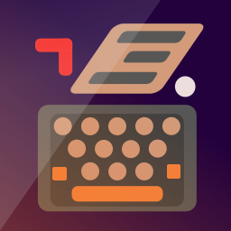
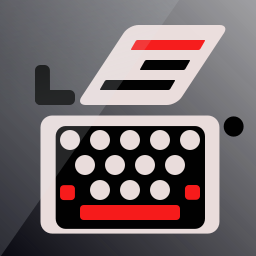
              Opinions about this one?

              Much better IMHO.
              And the radio one is nice too.

              Now the main thing for me is the background. You used a gradient and a darker stripe.
              I thing a solid color with a single fold would be better.

              And if I may, maybe try smaller lines for the type writer (but not sure it would be better... just something worth trying 😉 )

              ? 1 Reply Last reply 26 Jul 2020, 14:00 Reply Quote 0
              • ? Offline
                A Former User @3T_Ed
                last edited by 26 Jul 2020, 13:56

                @3T_Ed radio1.png

                1 Reply Last reply Reply Quote 0
                • ? Offline
                  A Former User @AppLee
                  last edited by 26 Jul 2020, 14:00

                  @AppLee I've tested the lines thickness by zooming out. I would have loved them slicker, but when zoomed out to an icon size,,, I haven't test them on my N5, only in PNG format,,,

                  1 Reply Last reply Reply Quote 0
                  • ? Offline
                    A Former User @Lakotaubp
                    last edited by 26 Jul 2020, 14:23

                    @Lakotaubp typewriter2.png

                    L 1 Reply Last reply 26 Jul 2020, 14:28 Reply Quote 0
                    • L Offline
                      Lakotaubp @Guest
                      last edited by 26 Jul 2020, 14:28

                      @C0n57an71n I like that one. lets hope I'm not the only one 🙂

                      ? 1 Reply Last reply 26 Jul 2020, 14:35 Reply Quote 0
                      • ? Offline
                        A Former User @Lakotaubp
                        last edited by 26 Jul 2020, 14:35

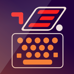
                        @Lakotaubp The thing is I don't know how visible is the typewriter body on phone resolution. Right now is at 3px.

                        A 1 Reply Last reply 26 Jul 2020, 14:57 Reply Quote 0
                        • A Offline
                          AppLee @Guest
                          last edited by 26 Jul 2020, 14:57

                          @C0n57an71n
                          Basically on the phone, there are two sizes.
                          The one from the launcher and the one from the app drawer.
                          What I do is change the icon of an existing app in order to check it out.

                          Just replace the file in the app directory.

                          ? 2 Replies Last reply 26 Jul 2020, 15:00 Reply Quote 0
                          • ? Offline
                            A Former User @AppLee
                            last edited by 26 Jul 2020, 15:00

                            @AppLee Super tipp! Thanks! 😉

                            1 Reply Last reply Reply Quote 0
                            • ? Offline
                              A Former User @AppLee
                              last edited by 26 Jul 2020, 16:06

                              @AppLee screenshot20200726_180416771.png

                              Sorry for the big size, but is just to have a sense how much 3px are.

                              1 Reply Last reply Reply Quote 0
                              • C Offline
                                c4pp4 @c4pp4
                                last edited by 27 Jul 2020, 01:21

                                I have given a try (OSM Scout Server icon):

                                osmscout-server.svg
                                https://dpaste.com/DG5BG4GEX

                                scout.png

                                1 Reply Last reply Reply Quote 2
                                • ? Offline
                                  A Former User
                                  last edited by 27 Jul 2020, 18:30

                                  typewriter3.png

                                  1 Reply Last reply Reply Quote 2
                                  • ? Offline
                                    A Former User
                                    last edited by 31 Jul 2020, 08:47

                                    typewriter4.png

                                    1 Reply Last reply Reply Quote 0
                                    • ? Offline
                                      A Former User
                                      last edited by A Former User 31 Jul 2020, 09:40

                                      chess1.png
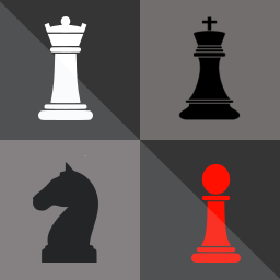
                                      Does anybody has a contact from the Chess (Simple AI) app publisher? His name is Gregor Santner, but I couldn't find his email address. I would like to work with him to change the app icon, in case he wants that 🙂

                                      3 1 Reply Last reply 31 Jul 2020, 10:01 Reply Quote 2
                                      • 3 Offline
                                        3T_Ed @Guest
                                        last edited by 3T_Ed 31 Jul 2020, 10:01

                                        @C0n57an71n
                                        Really like your creative thinking within the set parameters.

                                        If all designers would stick to this lay out, which is more in line with the UT design than many others, would make the apps have a better overall uniformity, it'd make the Open Store a much more 'calmer' and 'easier' place to search the app you need at first glance.

                                        Keep up the good work!

                                        Critics are the true Positives | OnePlus 3T, Lumia 950

                                        ? 1 Reply Last reply 31 Jul 2020, 10:07 Reply Quote 0
                                        • ? Offline
                                          A Former User @3T_Ed
                                          last edited by 31 Jul 2020, 10:07

                                          @3T_Ed Thanks for the good thoughts! I'm trying to harmonize somehow the icons aspect, without affecting the creativity freedom.

                                          1 Reply Last reply Reply Quote 0
                                          • 3 Offline
                                            3T_Ed
                                            last edited by 31 Jul 2020, 10:26

                                            @C0n57an71n
                                            You're getting better and better at it 😉

                                            You might want to add tags to your first post of this thread (thinking: #design, #app #development, #icons, #openstore)

                                            Critics are the true Positives | OnePlus 3T, Lumia 950

                                            1 Reply Last reply Reply Quote 0
                                            26 out of 108
                                            • First post
                                              26/108
                                              Last post