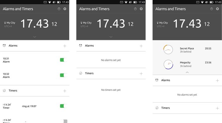
Clock Redesign Ideas
-
@jezek
I agree the clock has to stay.What I meant is that the world clock is actually giving the current time AND it also gives the time for preset timezones...
So no need for me to have a specific local clock...
As cibersheep stated, the clock size can be responsive to the number of location set. -
@CiberSheep
Could the app have an open framework?
By that I mean that by long press on the icons for every function, it brings up a window with some settings, like:Launch at start
If you want the app to launch into clock, world clock, timer, alarm etc...
Or the last opened function will be the default function when relaunching the app.Resize
Resize the app that will be launched at start. Resize the clock, world clock etc. Resize the icons for every function.Move
Maybe you want all the icons to be on the left side of the phone, to be used with one hand. Or centered in the middle, to the right, up, down....Change the look of the different functions, if I now had something that looked like the clock in the previous post and wanted to use it, I could change the look of the clock, with some limitation of course. Or have different themes to choose from.
Just some ideas. :smiling_face:
-
@Kaizen said in Clock Redesign Ideas:
Couple of words in general on clocks.
Thanks
@AppLee said in Clock Redesign Ideas:
I personally like having the dial.
If it's to check seconds, I don't know if I would keep it. People doesn't know to read analogue clock. We might just show the seconds

@jezek said in Clock Redesign Ideas:
I would like to oppose to this idea.
By order of most to least used we have: Alarms, Timer, Chronometer, Clock, World Clock.
Having the clock in the lock screen and other apps that solve other requirements could be an option.
Sketches/Drawings are always welcome
@Rondarius said in Clock Redesign Ideas:
Could the app have an open framework?
Short answer: no

Long answer: you might want to show a sketch of your idea. Keep in mind that I would prefer to follow the guide lines for the core apps. The goal is have an elegant, minimalistic and simple app, yet useful that fits in Ubuntu Touch. So, no moving UI elements, over settings apps and alike. That's why of the long thinking. The app should do what is supposed to do (whatever that is :D) in the best way possible without intervention
To all: thanks all for your input. I'd rather to discuss from now on a more general vision on the app first before going into small details.
-
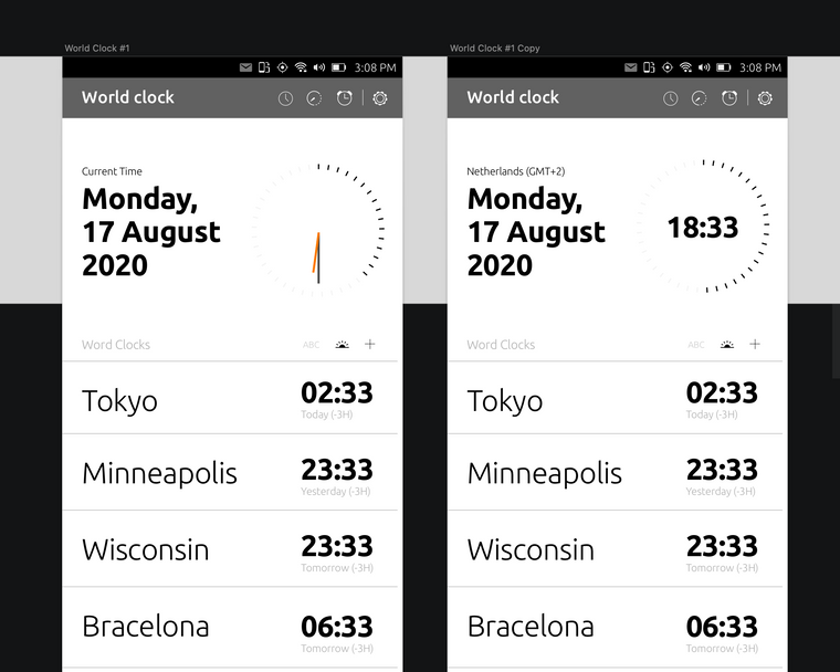
Maybe going this way...

-
@CiberSheep Great discussion and thank you for taking the lead on redesigning the UT clock.
I agree with @Kaizen that in terms of perceptual efficiency a numeric (aka "digital" display) is most efficient. However, as per @CiberSheep's survey people don't use the clock app to get the time at a glance. So I think there is an interest in an "analog" dial design of the clock app for the use cases identified in the survey.
I also agree with @Rondarius that a useful minimalist representation of a clock needs clearly distinguishable hands and some indicators of hours on the dial (e.g. bold dots/tick marks for 12,3,6 and 9h small ones for the other hours). Given the required precision of the clock app in every day use however, a second hand and tick marks or even numbers for seconds may be too much and reduce its usefulness.
I think @Rondarius design proposal without the seconds would be the way to go.NG
-
@CiberSheep the "my city time" has a dot between hours and minutes, while the world clocks have a colon there. I think we should use the same "hours minutes seperator" for all times
 (?)
(?)
(And ofc the time format should be localizable.) -
@CiberSheep said in Clock Redesign Ideas:
Maybe going this way...

Looking good! It would be nice to have both options, analog/digital and we can have the right to choose what we want

Keep up the good work!
-
@CiberSheep Where is the delete button?
-
@Kaizen
Some standard gesture in UT is to swipe-right a line to reveal the trashcan icon.
That's already how it works in the current app. -
@AppLee Thanks.
World Clock:
My friends and family located in many cities around the globe. Sometimes, when I'm not sure who is awake for small talk (East or West), I need to double-check myself on the search engine.My need is to understand "Where am I" comparing to other folks -> quickly! (It may be aligned with "Ubuntu philosophy" Think about it
 ) I will call this feature "maphakathi" (Middle in Zulu).
Typography:
I'm avoiding use Ubuntu Medium Weight. it's in the middle of light and bold, and it's hard to define, which is a title and which not, and very confusing.Spacing:
Spacing is different than Ubuntu Touch, I'm afraid spacing is necessary to read this kind of information.Figma Link for everyone to clone and take if from here
I tried to adopt the look-screen style. In addition you'll find other alternative screens for Timer and Alarm. (WIP)

-
@Kaizen Interesting. Thank you.
I like the concept of the clock for the seconds.
Hello! It looks like you're interested in this conversation, but you don't have an account yet.
Getting fed up of having to scroll through the same posts each visit? When you register for an account, you'll always come back to exactly where you were before, and choose to be notified of new replies (either via email, or push notification). You'll also be able to save bookmarks and upvote posts to show your appreciation to other community members.
With your input, this post could be even better 💗
Register Login