Clock Redesign Ideas
-
Let's dance:
Let's redesign the Clock. Send your sketches. Have in mind that it has to be Ubuntu Touch. Keep in the Suru guidelines and remember that is has to rotate (so portrait and landscape) and adapt to small and big screens. Some ideas collected from the survey:
we are giving a prominent space to World Clocks and Clock, which are thins that few people uses (specially clock if it's visible on the indicators)
I'm thinking that:- Could it be possible to join timers and chronometer in one Section and add a Sections for Alarms? So that could be: Alarms | Clock | ChronoTimer?
- Do we keep Sections as they are but swap World Clocks and Alarms? So they are visible when opening the app? And put the World Clocks in the BottomEdge?
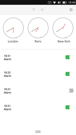
- We make the clock smaller to squeeze the world clocks there? We get rid of the clock And split the Selection between a list of alarms and a list of world clocks?
-
If you use Inkscape you can check the app template: https://gitlab.com/cibersheep/mockup-templates
If you need some screenshots: https://gitlab.com/ubports/apps/clock-app/uploads/fcb83323691e79e9e11f48344e1ac886/clock-screensheeeps.zip
-
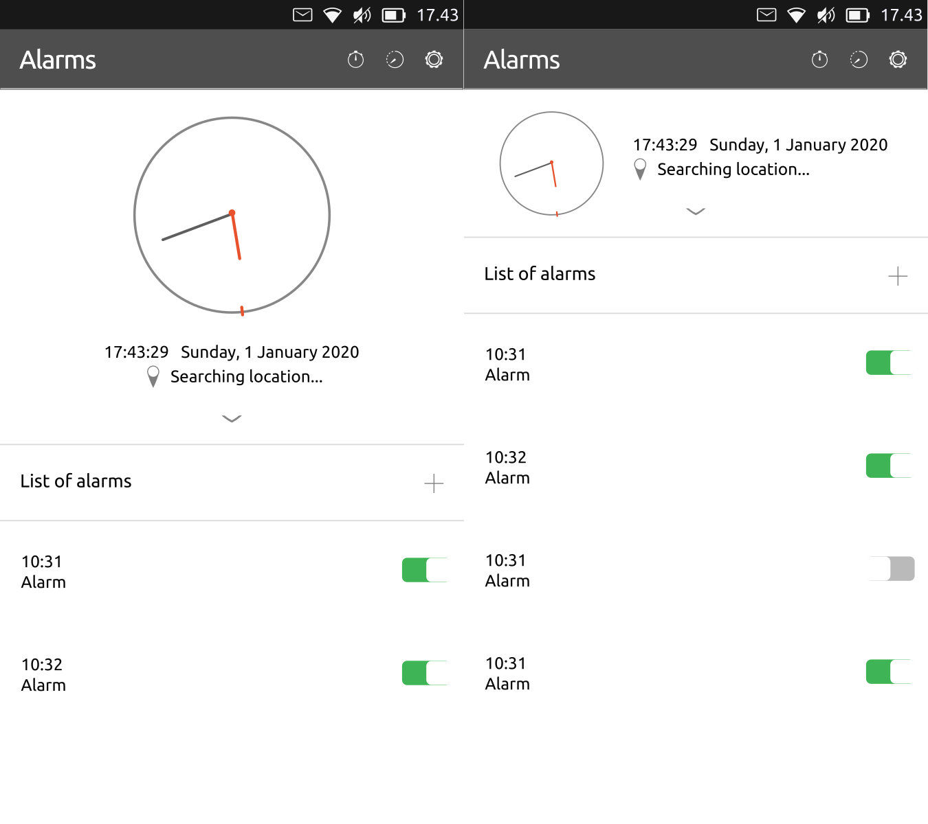
Not so convinced about this but:
If we don't get rid of the clock this could be somewhere to startAdaptive clock depending on the number of alarms we have stored

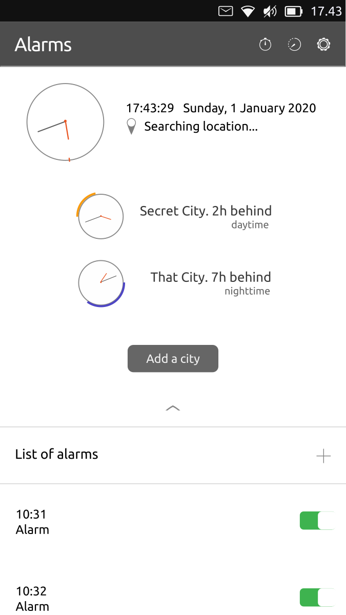
And for those who use word clocks, in a similar way of the Weather App:

-
@CiberSheep
Looks very good, I'd be very happy with this layout. Why is it you're not sure about it?
It meets the demand for clear alarm setting and to those needing the extra world clocks. I recall some would like to add a classic/numbered ring and 24/12h, will there be a slider on the back-end to support that?Thanks
-
It looks fine, but apart from displaying the clock dial it does not seem to differ from the existing alarm page.
-
@3T_Ed said in Clock Redesign Ideas:
Why is it you're not sure about it?
I feel it a bit ugly... it needs a magic thing
I recall some would like to add a classic/numbered ring and 24/12h, will there be a slider on the back-end to support that?
I was thinking in deleting the clock completely. I would imagine no one can read analogue and you have the clock on the indicator at all time... so both feels a bit redundant and/or useless.

@cliffcoggin said in Clock Redesign Ideas:
It looks fine, but apart from displaying the clock dial it does not seem to differ from the existing alarm page.
I see I cannot trick you

Feel free to send your sketch

-
@CiberSheep said in Clock Redesign Ideas:
I see I cannot trick you

That's a relief. I wondered if there was some subtle change my old eyes were missing.
Your survey confirms that the alarm function is the most widely used, yet I don't see how this change improves the functionality unless it becomes the main page, i.e. the one that opens when the app is started rather than the awkward to access alarm page. If that is the intention then I welcome the change.
-
@cliffcoggin said in Clock Redesign Ideas:
@CiberSheep said in Clock Redesign Ideas:
the awkward to access alarm pageBottom edge access to most wanted features is a «standard» in the OS:
- Dialer > open the bottom edge to see recent calls
- Calendar > trigger bottom edge to add appointments
- Messanges > bottom edge to create a new SMS
- Weather > add cities
- Notes > add new note
etc

-
@CiberSheep said in Clock Redesign Ideas:
@cliffcoggin said in Clock Redesign Ideas:
@CiberSheep said in Clock Redesign Ideas:
the awkward to access alarm pageBottom edge access to most wanted features is a «standard» in the OS:
True, yet there is a button on the main page to add a city so why not also have one for adding an alarm? Perhaps even move the add city to the bottom edge access menu as I imagine that is used much less frequently than add alarm.
Better still, have the alarms listed on the front page as I mistakenly thought you meant.
I hope a few others are going to comment as I don't want to dominate the discussion with my ideas. -
@cliffcoggin said in Clock Redesign Ideas:
Better still, have the alarms listed on the front page as I mistakenly thought you meant.
That's indeed the idea of the mockup

-
Ah, clearly some misunderstanding here. I thought that was to be the second page as it was headed Alarms.
-
@CiberSheep
I thought about something like this

With the bottom-edge page including both "add a new city" and "create a new alarm".
A long swipe down on a city's clock will delete it (I know it's not really UT like but I found it easy to do and to remember).
While swiping down, a trash can replace the clock to indicate what happens. -
@AppLee interesting
-
I just realized that:
- Timer is a backwards alarm. We should mix them together
- People complaining about the «hard it is to set an alarm» might be talking about the timer. Is terrible to do it with precision. Alarms are a lot easier
Like that we could do three sections:
alarm+timer | chronometer | clocks ? -
@CiberSheep said in Clock Redesign Ideas:
- People complaining about the «hard it is to set an alarm» might be talking about the timer. Is terrible to do it with precision.
Actually it is the dialer for the alarm that is hard to set, it's like a spinning wheel
-
@CiberSheep
Actually for me timer and chronometer are the same but backward.
Either you count time from 0 and it's a chronometer. Or you set a time and it's a timer with an alarm.But I get your point.
I think that alarm are not that easy to set ; the wheel turning is not ideal IMHO.
For the timer I agree it's even worse, so I set my timers in advance so I don't loose time every time I want to set a new one.
I set 1, 2, 3, 5 and 10 minutes. And for longer period of time I can take the time because it won't take me more time to set it than to actually wait
I'll try to find an idea for the timer+chrono and if you can come up with a solution for timer+alarm, I'm curious of what it can be.
-
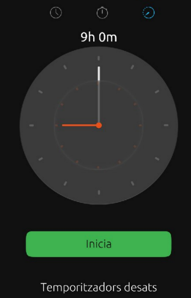
Just to make sure what I mean. This is the timer. Trying to set it is a terrible experience. It must go (the UI).

If you still affirm that the alarm is hard to set. You two have a quest now. I'm really interesting in see how you use the Picker (not joking). Would you be so gentle to record a short video? You could ping me on Telegram @cibersheep
-
@AppLee said in Clock Redesign Ideas:
so I set my timers in advance so I don't loose time every time I want to set a new one.
Uff. I never used it
In my mind:
- Chronometer, you set it and can count the laps.
- Alarm. You set at what time where the alarm goes off.
- Timer. You set a time before the alarm goes off.
So if we consider that, the ui could be: alarm name at 10 or alarm name in 44 minutes. Like that you can also have several timers
-
Would it be possible to have the alarm time dialer move slower by default for better control?
-
@CiberSheep said in Clock Redesign Ideas:
alarm name at 10 or alarm name in 44 minutes
Sure but how to set them, it's a completely different UI.
Hello! It looks like you're interested in this conversation, but you don't have an account yet.
Getting fed up of having to scroll through the same posts each visit? When you register for an account, you'll always come back to exactly where you were before, and choose to be notified of new replies (either via email, or push notification). You'll also be able to save bookmarks and upvote posts to show your appreciation to other community members.
With your input, this post could be even better 💗
Register Login