Login screen/Code input Design
-
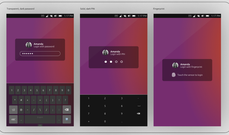
Yo, I've got an idea how Enter passcode screen would look:
I have noticed, that we don't blur anything. We only blur the background image once and use it everywhere. So the same blur'ed image might be used for the lockscreen.
Warning: I didn't use ubuntu font.
Will try to do that with ubuntu font later.using ut on xiaomi mi a2
-
@purplevvay said in Login screen/Code input Design:
Yo, I've got an idea how Enter passcode screen would look:
Yo, how would one enter a passcode / passphrase with letters in that version?
-
@cibersheep This explains why this decision was made, but is that really still reasonable? There are many design decisions in ut that are clearly focused on the mobile experience in UT. Why do we make an exception here? Any text input will work on desktop as well. It isn’t clear to me why this login has to be parallel to the desktop experience.
-
@purplevvay Something like this looks great. Only one more button to trigger the real keyboard would be needed
-
You base your reasoning on your personal use which is that you're typing a pin code to unlock your phone.
A most secure way is to use a passphrase.The user experience for a passphrase would be really bad if you get such keyboard (with numbers) and need an extra action to pop up the keyboard instead.
Now, the settings switch the usual keyboard between digits and alphabetical depending on the type of code you're using.
I agree that the input window can be improved.
But regarding the keypad, I prefer to keep the usual keyboard and add layers to allow a better look and feel. -
@applee I can understand that .Maybe its possible to find a good solution for both by leaving an option to use either the Number or letter input.
-
@purplevvay
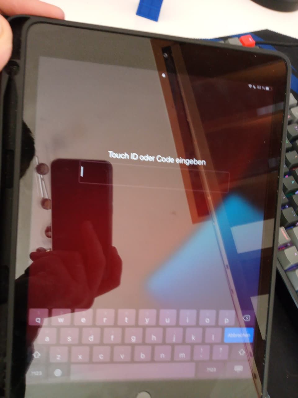
Sorry for such a poor picture, this cant be screenshotet -
@applee said in Login screen/Code input Design:
A most secure way is to use a passphrase.
True, you use the root password to unlock the device. Same password is used for example in ssh. I guess the passcode is less difficult to "crack".
@aarontheissueguy said in Login screen/Code input Design:
Sorry for such a poor picture, this cant be screenshotet
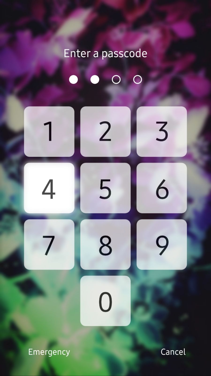
No problem, thanks for sending me that.I have improved the screen I made and got an idea of keyboard input screens:
https://drive.google.com/file/d/1UX7MVN1GUy7vgyTwN9NgTlqgwsexDoZ8/view?usp=sharing
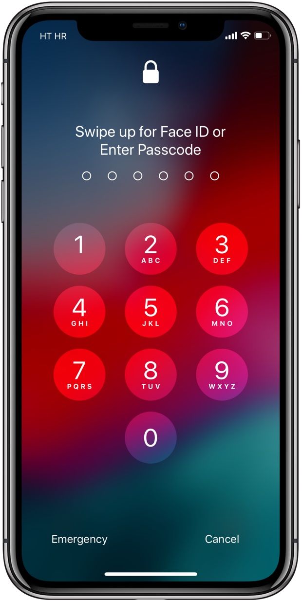
(can't upload file, sorry)Didn't expect it to look that similar to IOS.
-
@aarontheissueguy said in Login screen/Code input Design:
@cibersheep This explains why this decision was made, but is that really still reasonable?
Yes. UT is aimed to be a multidevice OS
There are many design decisions in ut that are clearly focused on the mobile experience in UT. Why do we make an exception here?
This is not an exception. This is the rule. That's why, for example, you can navigate through nearly all the system with a keyboard.
Any text input will work on desktop as well. It isn’t clear to me why this login has to be parallel to the desktop experience.
You must be able to enter pass phrase from touch screen. And with multi-user support.
-
@purplevvay Still looks great though, @CiberSheep and @AppLee mentioned a a few valid points on why the current login is used and what should be kept in mind when thinking about a redesign. Do you guys think that something like the above design might be an option for UT?
-
@aarontheissueguy said in Login screen/Code input Design:
@purplevvay Still looks great though, @CiberSheep and @AppLee mentioned a a few valid points on why the current login is used and what should be kept in mind when thinking about a redesign. Do you guys think that something like the above design might be an option for UT?
Maybe a user button could be positioned like this
-
I'm sorry if I missed something, but I've never heard that creating more than one user is possible in UT.

Maybe a user button could be positioned like this
That looks very good! But I think you should put the user in the same distance from left as the pin keyboard (1st picture).
Also I think for the last 2 images the user profile picture should be above the password bar and in centered horizontally. The name should be in the middle horizontally too and below the profile picture.
(just my opinion
") )
) -
I think you should put the user in the same distance from left as the pin keyboard (1st picture).
Well, I have tried to do that and it didn't look good,
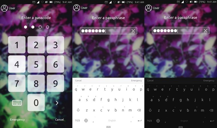
So I think the user icon should be centered everywhere:
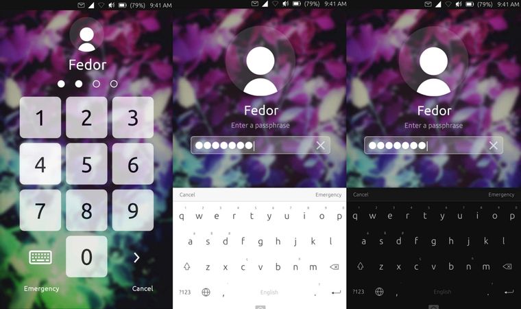
using ut on xiaomi mi a2
-
@purplevvay
This is not a mockup?If it is an actual tweaking of yours, you could propose to merge it on the uTouch git ^^
Maybe on second and third image, you could reduce size of user so it's the same as on the first one.
-
@keneda No, it's a mockup. Ok I'll make it same.
-
@purplevvay Can you turn this into reality yourself? I have some QML knowledge, but I doubt it would be good enough for this task (I can try though). It would be great if we could find a person who can make this real.
I would love to give whoever makes this real a gift card as a small thank you in return, even if it doesn't get merged into master in the end.
-
@purplevvay This looks great!
-
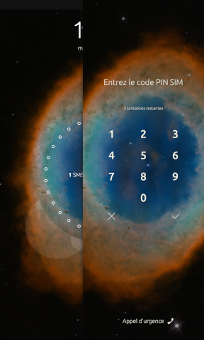
If I may add, the sim unlock screen is actually the old design of the lock screen
As already mentioned, the current design is better for convergence and it's easier to use as well since the keypad is at the bottom. I do agree that it could be improved though in terms of "eye-candy" so any good looking designs without sacrificing usability are welcome and greatly appreciated
-
@aarontheissueguy I feel so bad... Unfortunately I don't have any ideas how to do that.

But I'll keep learning new stuff...This looks great!
Thank you!
If I may add, the sim unlock screen is actually the old design of the lock screen
I think so.
As already mentioned, the current design is better for convergence and it's easier to use as well since the keypad is at the bottom.
I guess editing the passphrase bar is enough to get the same look the mockup has. The only one problem is the blur.
-
@kugiigi said in Login screen/Code input Design:
If I may add, the sim unlock screen is actually the old design of the lock screen
And its design depends on the grid size set for the device ^^