Login screen/Code input Design
-
@aarontheissueguy said in Login screen/Code input Design:
@cibersheep Couldnt we make the actual textfield invisible and create a replica to create that look?
Making it
visible: falseI don't think it work, butopacity: 0might.You might want to check the terminal app code. I never found how it does it.
-
@cibersheep oh, intresting. i guess terminal isnt a traditional text box either - i once tried to port cool retro term, but couldnt get the keyboard to show
")
-
@cibersheep said in Login screen/Code input Design:
This is very interesting. I don't know if the OSK can show up if the cursor is not in a TextField though
I think it could be a text field with the appropriate letter spacing and a text label with the empty dots on the background. The text field would have a custom password char, no border and hidden cursor. Would it be simpler to implement like that?
@mateo_salta said in Login screen/Code input Design:
@capsia oh, I like the emergency screen, this could easily be in the bottom edge. We would then need to make corresponding gsettings, and settings in the settings app.
Great!
@mateo_salta said in Login screen/Code input Design:
@capsia Im not sure we would want to change one swipe to something else, but camera or other shortcuts, could come as configurable buttons, but that is a lot of work. It would be great to see more ideas on how to go about 'no unlock' launching of apps. There are also things in the quick launch menus in the launcher that are conditionally hidden when designated private, this makes sure the open window names are not shown for morph browser when locked, something similar may be needed for apps to use this feature if we want to implement, ie take pictures but not allow deleting, or viewing the gallery portion of the app, or if you want quick clock app access, show time/stopwatch, but not edit zones or alarms, is a complicated feature, but one that could be really cool if made
")
My idea to implement it, was to run the apps in something similar to the 'guest session' that unity7 used to have. This way the app won't have access to userdata. Then the app could say which data to save in the user session. When the user logins will be notified that new pictures ( timers.... or anything else) were taken in guest mode and ask him whether he wants to save them or not. Of course this would need a lot of work too, because we will need to provide multiuser capabilities.
@mateo_salta said in Login screen/Code input Design:
@capsia hm, I wonder if some kind of overlay blend mode is available, we might be able to make some kind of color changing glass look if that is possible, instead of a grey see through box
I think that the current background darkening looks good, however if you think it can be improve it, give it a try.
-
@mateo_salta said in Login screen/Code input Design:
@purplevvay yes, this is implemented as a background could be white in places making the text there in unreadable, if we come up with a better option, this could be removed
possibilities?- adapt color with calculating brightness(could lead to just grey text, or partially disappearing text)
- drop shadow(difficult to get right)
- more complicated text overlay blend mode( more difficult, resource intensive, might not exist in a simple command)
I don't think so. Also the time and the day showing widget are white. So we don't need to worry about that.
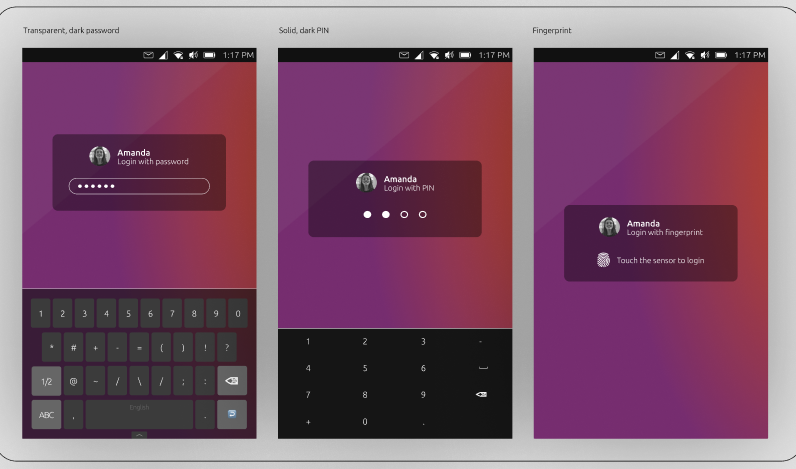
@capsia said in Login screen/Code input Design:
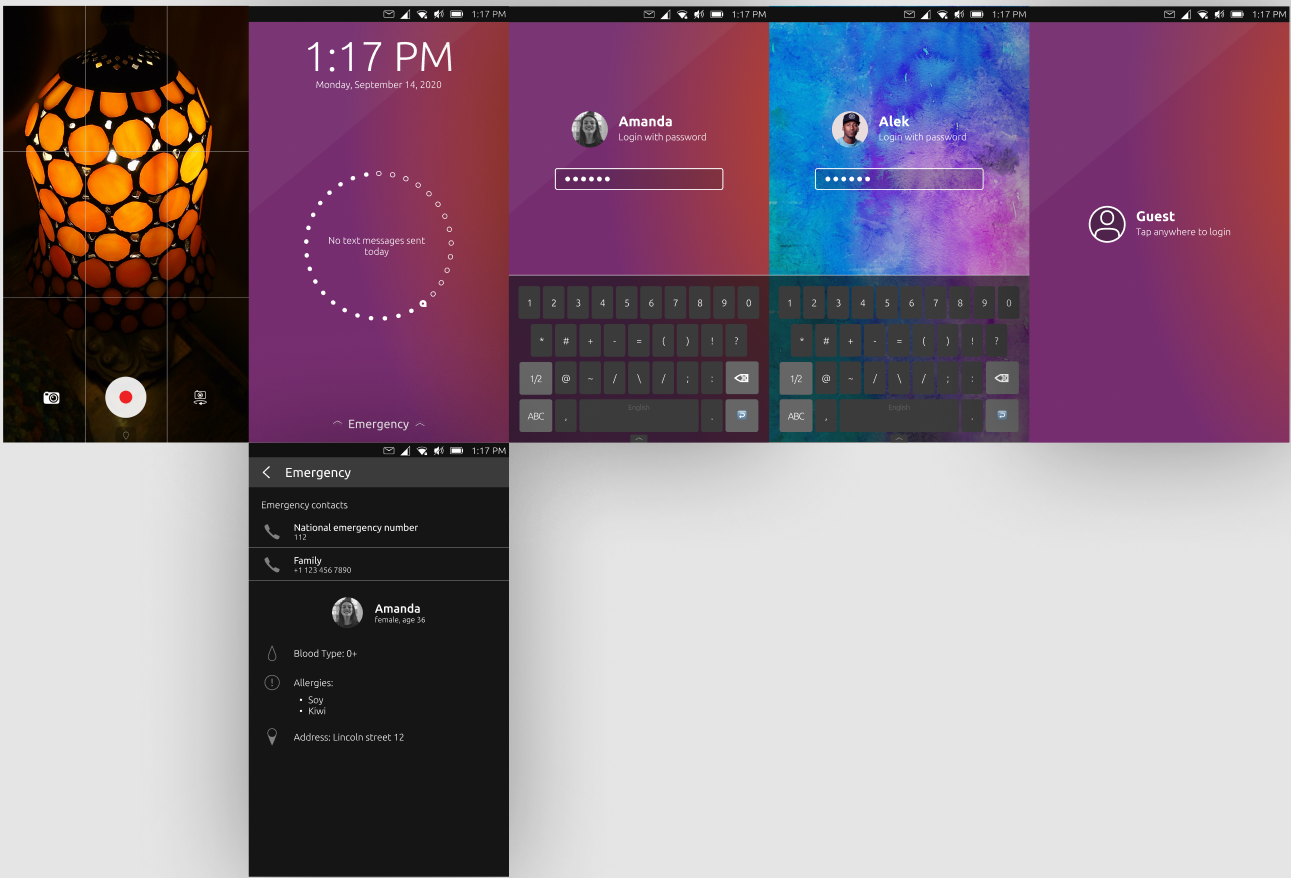
Hi, I have a few updates. I've managed to make the white text more visible on light backgrounds using a bit bigger text and I made a design for the emergency screen.
Looks so good! Also I really like the landscape mode. But I think we should scale the items differently. Ubuntu Touch supports convergence and gives us ability to use our smartphone like a computer. But this system is developed for mobile devices (smartphones, tablets) so it should be optimized primarily for them.
I mean we should make the items a little bit bigger.Hi, I apologize for not replying for long time.
I have tried to match all the needs in these mockups.
The problem is that emergency and unlock instructions make the screen look overdetailed. So I have tried to use Suru icons (system default icons). But some of them are made by me, so it would be cool if someone, who knows more in design, will make them.
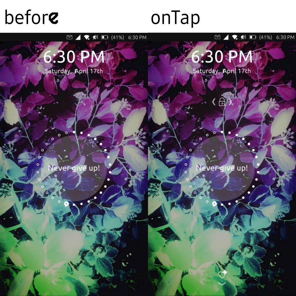
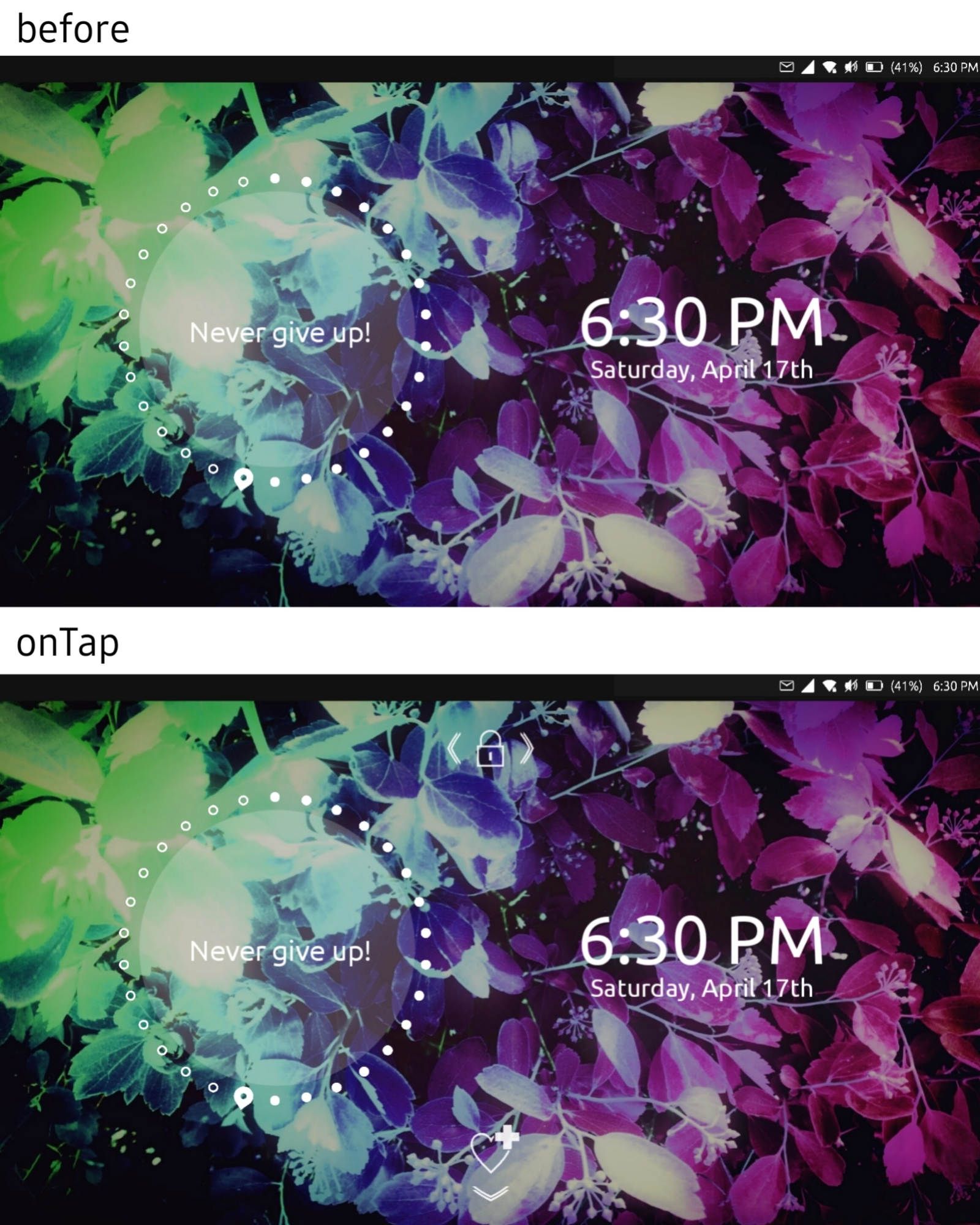
So basically when you turn on the screen you just see clocks and day showing widget. But when you tap, the unlock and emergency swipes instructions appear.
I have also an idea about the passphrase/pin section (screen):
The size of text field should match the current one.
using ut on xiaomi mi a2
-
@purplevvay Interesting, very interesting
-
@capsia awesome, then we can leave the semi dark overlay, and use white text
-
@purplevvay I like the icon only idea
looking niceI think we don't need a "go back", or if we want just the arrow to the left of the login?
-
At all involved, I'm thrilled to see this project grow. While it looked like the ICE initiative was dying it's great to see it being integrated in another great project we all would like to welcome.
Besides the benefit of a wonderful lockscreen and perhaps saving lives with an accessible ICE I hope the Lomiri Circle can make way for the @Capsia design for updates on homescreen.
Wish I could contribute at this stage however lacking programming and styling skills my added value will be that of positive critical feedback and earlier posts in the ICE topic
Thank you all for taking these steps to make this a reality!!
-
@mateo_salta said in Login screen/Code input Design:
@purplevvay I like the icon only idea
looking niceI think we don't need a "go back", or if we want just the arrow to the left of the login?
I have tried doing that, but if I just place the "Back" icon to the left (near the text field), some people may think that this button allows to change the user. If I place that below, it won't be that visible as the forward button is.
I haven't got any other ideas (maybe yet). -
@purplevvay try placing it top left crner. As in the rest of the system
-
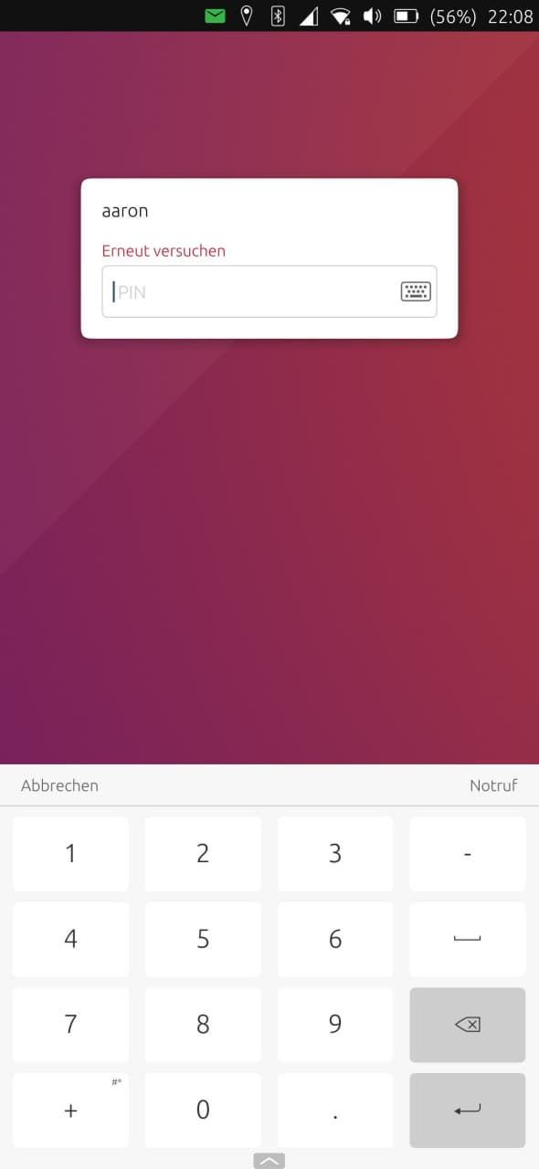
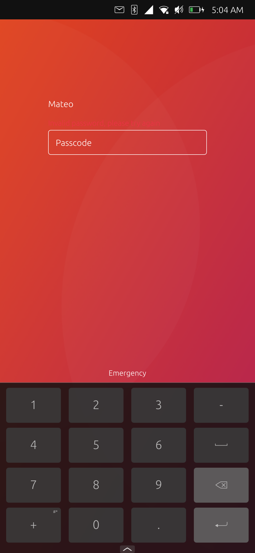
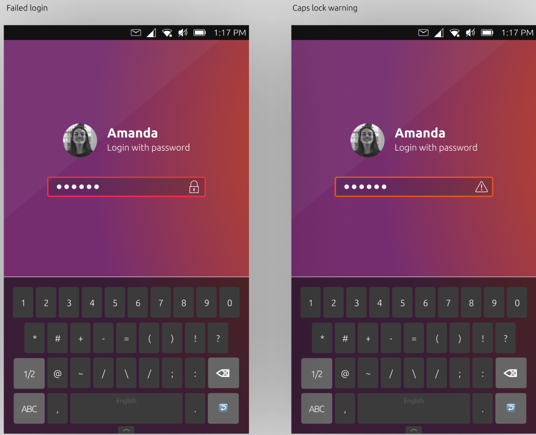
so, interesting, if we get rid of the box background completely, error text is not really visible. It is looking good replacing the text with white to match. here are screens, one no background, one with .3 opacity
-
@purplevvay Hi, your designs look great!
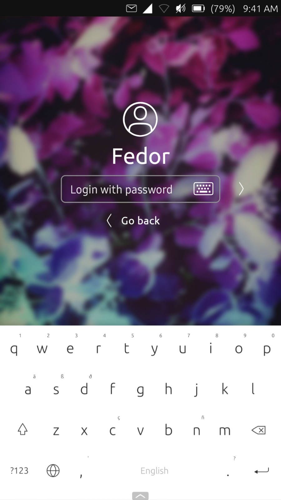
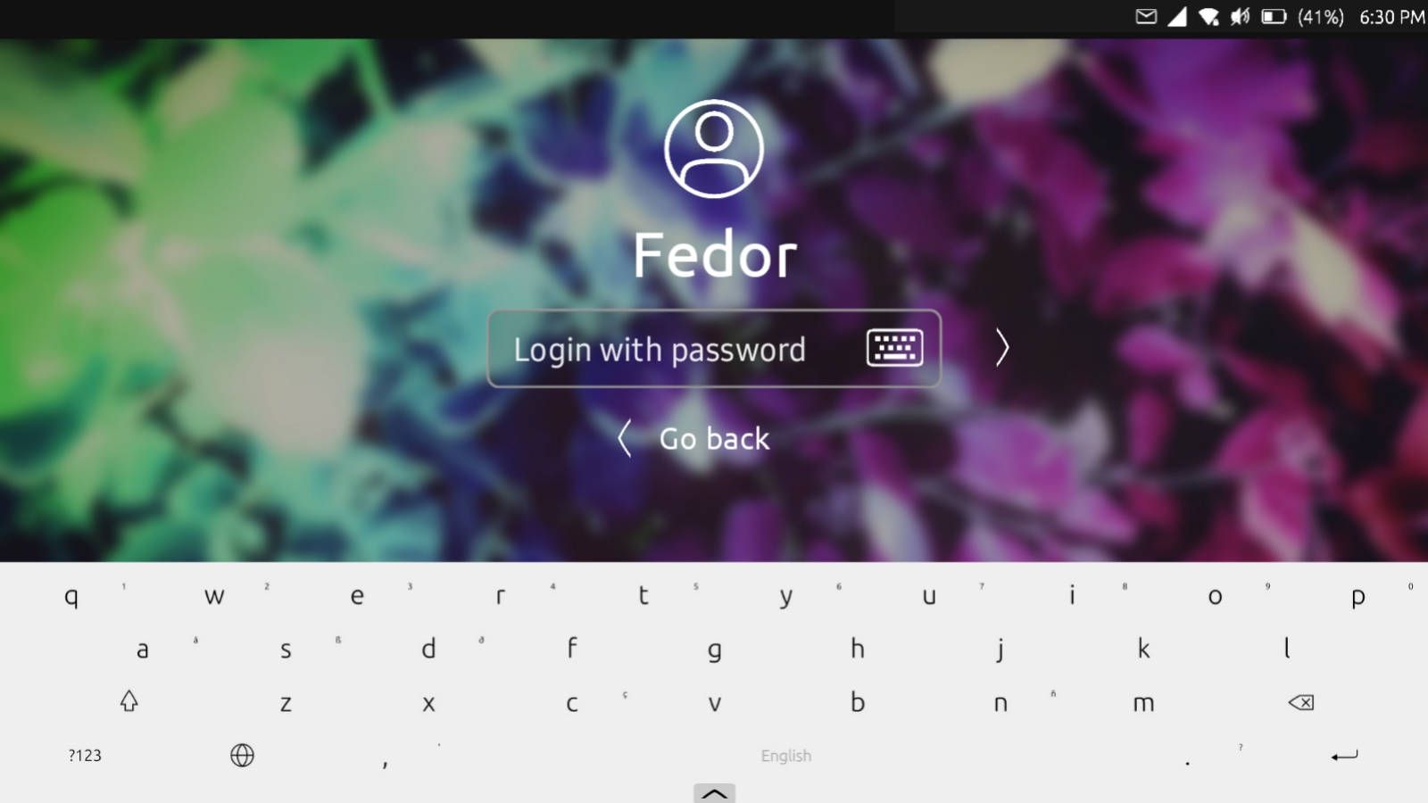
The icons look awesome, the only thing I would keep as full text is the emergency text, because it would be more visible. Also the arrow at the bottom is inverted, in the system apps ( contacts, weather, calculator... ) the arrow is oriented the other way.Sure also the mobile landscape mode should be designed. I've put the user icon on the left of the username in my designs to fit also this need. Otherwise the keyboard might overlap the login field. Making it look the same on all screen sizes would be better for convergence. On my phone the space available is less than half of the screen height (other phones with different screen ratio might have less space).
I don't understand the function of the keyboard icon. Can't I just tap on the input field to open keyboard and swipe down to hide it?
My idea for the back button is to use a left to right swipe to go back. I've thought the login as a succession of screen displaying all users and quick app access. Swiping left/right would allow you to switch screens.
@mateo_salta said in Login screen/Code input Design:
so, interesting, if we get rid of the box background completely, error text is not really visible. It is looking good replacing the text with white to match. here are screens, one no background, one with .3 opacity
Maybe we can change the way we display errors:
-
@capsia said in Login screen/Code input Design:
I don't understand the function of the keyboard icon. Can't I just tap on the input field to open keyboard and swipe down to hide it?
When you connect an external keyboard, the OSK doesn't show. If you tap on the icon, it will.
My idea for the back button is to use a left to right swipe to go back.
I think is better to use top left arrow than swipe, as is the general way to go back in the system (Camera is an exception, is ones of our divas)
-
yeah, the keyboard is for external keyboard/mouse set-up, but for some reason there is not a check to see if one is not connected, if we can fix that it should not show on touch only.
-
@cibersheep Thank you for the explaination. Now it's clear, if we can hide it when external keyboard is not detected as @mateo_salta suggested would be better.
Sure, we can use the back icon. Initially I've thought it more as a switch between screens than a button to go back, but since we currently have only 2 screens (greeter and login) and no multi-user or guest apps the back button makes more sense. I took the idea of the swipes from scopes. I liked scopes very much
-
@capsia well, the code is there for multi user, just not enabled yet, so we do want to be careful to theme/move existing things. eventually we will need some way of making a fake extra account to test.
-
Nice! @Capsia did you see the new qa - that is looking awesome! Are you merging the narrow view greeter and wide view? ultimately we are wanting the greeter to rotate
Very awesome to see your work on this with @UniSuperBox -
@capsia I love the login page with your picture, however, maybe it should be the Ubuntu Shape rather than a circle? bit more Suru styled?
-
Hello,
@mateo_salta Thank you! Having a greeter that is able to rotate would be great, so, yes, that's part of the plan. I just need to do one step at the time and I'll be there.
Working with @UniSuperBox is awesome! Thank you very much, I've learned a lot with you!
@PhoenixLandPirat Thank you for the suggestion! The accounts icon was already circular when I started, I've just used the one from the Suru theme :upside-down_face:
-
@capsia said in Login screen/Code input Design:
The accounts icon was already circular when I started, I've just used the one from the Suru theme
That icon is used through out the system such as in system settings, idk where else it's used, but I think when you have a profile picture, it should use the same shape as the people in the contact/messaging app, rather than a circle, I dont think its as big of an issue if someone doesn't set a image for there account, I think that the Ubuntu Shape would make the login screen fit with the system a bit better.
Youre welcome for the suggestion, and thank you for all your work!