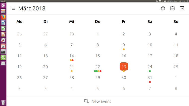
Calendar views
-
@elastic Yes, of course, no problem at all... Plus you brought new ideas... You might want to open new issues on github, this way the developers can track these...
-
I agree that the calendar needa work, but the addition of the day dot is a little step forward. The week view doea need to show five days at a min. The different colour event would have to associated to the calendars that they are added by. On the whole it does need bringing up to date and a new issue in github could be the answer to get things moving.
-
It's not yet ready to ship: At the moment the color is taken from the last event of the day. Just to get you guys hooked...

 ]
] -
Since the requirements are not that clear, I have to ask back:
Should there be multiple dots in the same color, if there are multiple events from the same calendar?
Pro: 1) you can see the multiplicity 2) its easiest to implement and already done Con: lack of space - what leads us to the next question...
What should happen if theres not enough space for all the dots of a day?
(Should there be some space between the dots? Someone any other suggestions how to place the dots?)
-
@hummlbach Would it be possible to implement one dot per calendar with an event on the specific date? That would mitigate the space issue, unless you have a lot of calendars.
-
@arubislander said in Calendar views:
@hummlbach Would it be possible to implement one dot per calendar with an event on the specific date? That would mitigate the space issue, unless you have a lot of calendars.
I second this idea
-
@hummlbach if you need testers let me know... For me one dot per calendar with one or more appointments (incl all day events) would be perfect
Many thanks for your work -
I've implented it as you suggested (only one dot per calender). But I found a bug by testing it myself: If theres a multiple-days-all-day event, split on two month views (i.e. an event on 7. and 8. of april) the dots for one month are not displayed... (and theres at least one other constellation that i haven't understood yet causing the same symptoms). But nevertheless you may test it, if you want.[0_1522086751737_com.ubuntu.calendar_0.6.3_armhf.click](Uploading 100%)
-
Oh, it seems that I'm not allowed to upload click packages...

-
@hummlbach yes I definitely want to test it, could you upload it somewhere else?
-
@hummlbach said in Calendar views:
I've implented it as you suggested (only one dot per calender). But I found a bug by testing it myself: If theres a multiple-days-all-day event, split on two month views (i.e. an event on 7. and 8. of april) the dots for one month are not displayed... (and theres at least one other constellation that i haven't understood yet causing the same symptoms).
Thanks for the click, I did some testing and can confirm the bug. Weird ... maybe it’s the way you ruled out multiple dots per calendar per day? It might somehow tell the UI to show nothing for the whole month ... - do the dots show up if you don’t reduce the possible dots per day per calendar to one?
One other thing: do you think it’s possible to get the all-day events in week view coloured ? And maybe a seven days view of the week in landscape ... just asking

-
@hummlbach I can confirm that with the new version the calendar works as expected - you should publish it in open store
-
@elastic Calendar is a core app, he should make a PR to the official repo.
-
Calendar is a nice app that I use every day. It will be great to have colors for events depending on the calendar.
If there is several events from the same calendar for a day, is it possible to put the number of events into the colored dot or there is no space enough? -
@teigneux Yes the dots are pretty small, I don't think you could read it.
-
@hummlbach And what about numbers instead of dots?
-
What about an appointment that spreads across several full days (eg. a vacation)? - can that be displayed as a horizontal bar across those dates?

-
@mihael You guys are crazy...
 I would stay with the dots - think thats a reasonable thing. But organize a poll if you want something else, and lets see what wins the race...
  Especially the lines over several days would be a bigger change (and if i got it right, you were also kidding a little bit :)). Perhaps there are other improvements that are 'more important'.
 -
@hummlbach I am kidding a little bit because this is (for me) a very relaxed environement because I appreciate very much what you (the developers) are doing for us (the users) for free! Thank you!
-
@hummlbach Hey, I see what you did!
 - that is absolutely beautiful!!! Thanks!!!
Can we have a shortcut to month view? - it bothers me that I have to click twice in order to see the full month...
