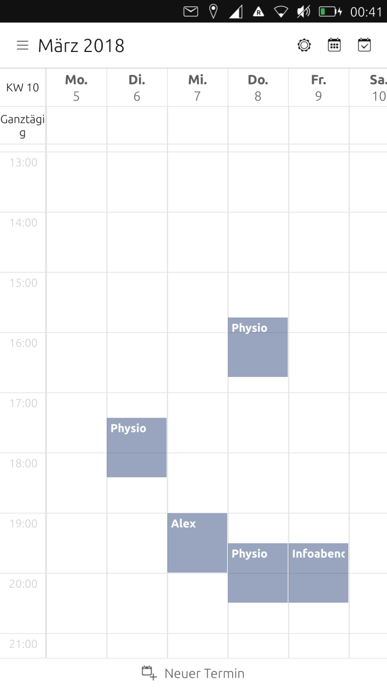
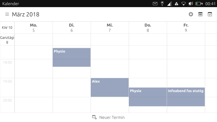
Calendar views
-
@hummlbach said in Calendar views:
I've implented it as you suggested (only one dot per calender). But I found a bug by testing it myself: If theres a multiple-days-all-day event, split on two month views (i.e. an event on 7. and 8. of april) the dots for one month are not displayed... (and theres at least one other constellation that i haven't understood yet causing the same symptoms).
Thanks for the click, I did some testing and can confirm the bug. Weird ... maybe it’s the way you ruled out multiple dots per calendar per day? It might somehow tell the UI to show nothing for the whole month ... - do the dots show up if you don’t reduce the possible dots per day per calendar to one?
One other thing: do you think it’s possible to get the all-day events in week view coloured ? And maybe a seven days view of the week in landscape ... just asking

-
@hummlbach I can confirm that with the new version the calendar works as expected - you should publish it in open store
-
@elastic Calendar is a core app, he should make a PR to the official repo.
-
Calendar is a nice app that I use every day. It will be great to have colors for events depending on the calendar.
If there is several events from the same calendar for a day, is it possible to put the number of events into the colored dot or there is no space enough? -
@teigneux Yes the dots are pretty small, I don't think you could read it.
-
@hummlbach And what about numbers instead of dots?
-
What about an appointment that spreads across several full days (eg. a vacation)? - can that be displayed as a horizontal bar across those dates?

-
@mihael You guys are crazy...
 I would stay with the dots - think thats a reasonable thing. But organize a poll if you want something else, and lets see what wins the race...
  Especially the lines over several days would be a bigger change (and if i got it right, you were also kidding a little bit :)). Perhaps there are other improvements that are 'more important'.
 -
@hummlbach I am kidding a little bit because this is (for me) a very relaxed environement because I appreciate very much what you (the developers) are doing for us (the users) for free! Thank you!
-
@hummlbach Hey, I see what you did!
 - that is absolutely beautiful!!! Thanks!!!
Can we have a shortcut to month view? - it bothers me that I have to click twice in order to see the full month...

-
@mihael
 @ shortcut
Your welcome! I've bin profiting from various open source communities/projects over the last 15 years and didn't manage to contribute remarkably. Now I'm really really happy beeing on the giving side also. At least a little bit.
-
-
@hummlbach Shortcuts: I was thinking that buttons should be there for the most often accessed features and thus the "settings" and "calendars" buttons could become entries under the left menu and instead in the upper right corner we could have buttons for the different views: year, month, day and agenda...

-
@hummlbach looks good, would it be possible to have 5 in portrait and 7 in landscape? That would be perfect for me ...
-
I'd also like to add my thanks. The app is really great, I'm using it every day.
The views with more days shown look very good. Did you try a full 7 days in portrait?
I would also be interested in the possibility of the week or day view showing all 24 hours on the screen, at least in portrait mode.
Thanks again for the great work.
-
@mihael concerning the shortcuts in the upper right corner: I understand your point but we would need appropriate icons and I'm not sure how that goes with eventually existing ui guidelines for the core apps...? Perhaps I have something better in mind...

@elastic @bf I think how much should be viewed on a screen could be discussed controversially (number of days as well as hours)... I didn't yet try 7 days neither in landscape nor in portrait. If we would make the number of days viewed dependent on something, it would be the width of the 'view port' I think (not landscape/portrait). I will evaluate the possibilities/options.
Please express your needs as issues on github. (Being as precise and consistent with other issues as possible not having a specific technical solution in mind.)
-
Hey, its eastern! Have you been searching for easter eggs already? I have hidden one for you.

-
Call for testing: https://github.com/ubports/calendar-app/releases
-
@hummlbach sorry I’ve been busy ...
The new zoom options are brilliant, many thanks.
Sometimes it switches to month view while zooming in and out in the week view but I really like the feature
Unfortunately the coloured dots in month view are gone in the latest beta (not sure about the first betas as I didn’t have any time for testing during the last weeks ...) -
@elastic Both, the missing dot color and the switch from week to month view (and also from day to week view) are intentionally. (The color of the dots are missing because I branched from master before the dot colors were merged in.) The switches between the views should only happen on zoom out actually (not when zooming in, I hope it behaves like that(?)).
Hello! It looks like you're interested in this conversation, but you don't have an account yet.
Getting fed up of having to scroll through the same posts each visit? When you register for an account, you'll always come back to exactly where you were before, and choose to be notified of new replies (either via email, or push notification). You'll also be able to save bookmarks and upvote posts to show your appreciation to other community members.
With your input, this post could be even better 💗
Register Login
