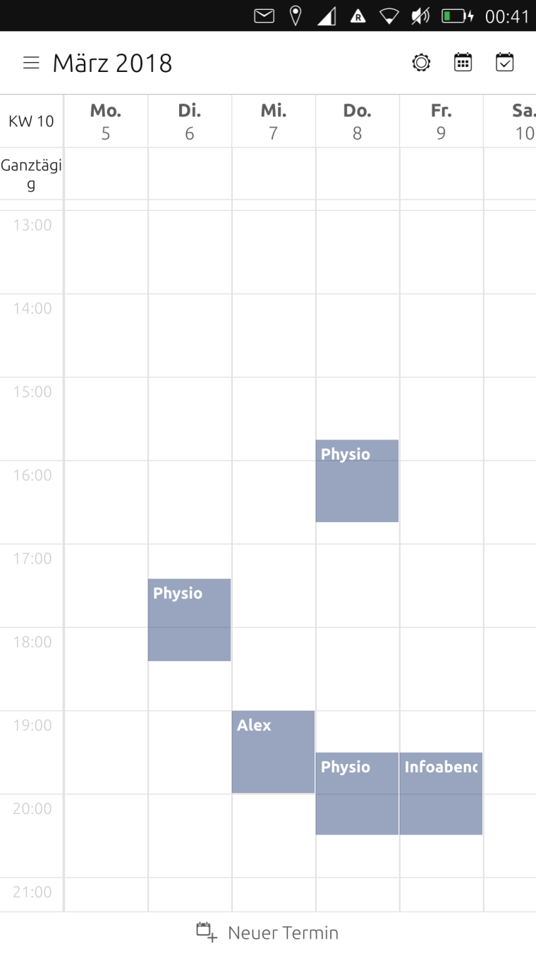
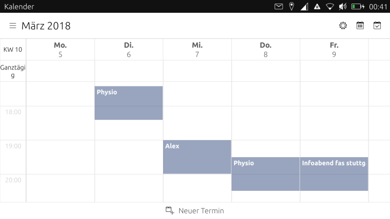
Calendar views
-
@hummlbach Hey, I see what you did!
 - that is absolutely beautiful!!! Thanks!!!
Can we have a shortcut to month view? - it bothers me that I have to click twice in order to see the full month...

-
@mihael
 @ shortcut
Your welcome! I've bin profiting from various open source communities/projects over the last 15 years and didn't manage to contribute remarkably. Now I'm really really happy beeing on the giving side also. At least a little bit.
-
-
@hummlbach Shortcuts: I was thinking that buttons should be there for the most often accessed features and thus the "settings" and "calendars" buttons could become entries under the left menu and instead in the upper right corner we could have buttons for the different views: year, month, day and agenda...

-
@hummlbach looks good, would it be possible to have 5 in portrait and 7 in landscape? That would be perfect for me ...
-
I'd also like to add my thanks. The app is really great, I'm using it every day.
The views with more days shown look very good. Did you try a full 7 days in portrait?
I would also be interested in the possibility of the week or day view showing all 24 hours on the screen, at least in portrait mode.
Thanks again for the great work.
-
@mihael concerning the shortcuts in the upper right corner: I understand your point but we would need appropriate icons and I'm not sure how that goes with eventually existing ui guidelines for the core apps...? Perhaps I have something better in mind...

@elastic @bf I think how much should be viewed on a screen could be discussed controversially (number of days as well as hours)... I didn't yet try 7 days neither in landscape nor in portrait. If we would make the number of days viewed dependent on something, it would be the width of the 'view port' I think (not landscape/portrait). I will evaluate the possibilities/options.
Please express your needs as issues on github. (Being as precise and consistent with other issues as possible not having a specific technical solution in mind.)
-
Hey, its eastern! Have you been searching for easter eggs already? I have hidden one for you.

-
Call for testing: https://github.com/ubports/calendar-app/releases
-
@hummlbach sorry I’ve been busy ...
The new zoom options are brilliant, many thanks.
Sometimes it switches to month view while zooming in and out in the week view but I really like the feature
Unfortunately the coloured dots in month view are gone in the latest beta (not sure about the first betas as I didn’t have any time for testing during the last weeks ...) -
@elastic Both, the missing dot color and the switch from week to month view (and also from day to week view) are intentionally. (The color of the dots are missing because I branched from master before the dot colors were merged in.) The switches between the views should only happen on zoom out actually (not when zooming in, I hope it behaves like that(?)).
-
@hummlbach zooming and switching to another view - I realised that this is the intended behaviour when zooming again from an already ‘maximised’ view but it also happens when you’re just zooming a bit to fast or to long to reach the whole week view - so I accidentally ended up in month view a few times ...
-
This is intended too.
 But theres actually a threshold before it takes you to the other view... Mhmm...
 -
I also think the new zoom options are brilliant, thanks a lot; it makes it much nicer to use. The jump to month view due to zooming out too far might not be wanted behaviour for everyone if it's too sensitive; I don't know if the threshold could be increased so that after zooming out to 7 days you would then have to do a fast or large squeeze with the fingers to make it jump to month view. At the moment it's very sensitive, but this is nit-picking and I love the new feature and can easily live with the jump to month view. Thanks for the great work. I will use for a few days and post any more comments if I have them.
-
The automatic switch from day to week view when zooming works perfectly, just as you would intuitively expect, so it's just the week to month jump that's a bit sensitive.
-
-
Awesome work! I have been waiting a long time for some improvements to the UT Calendar app. At last, it is actually useable. Looking forward to further improvements and will also report any issues or feature requests that I come up with.
Thanks!
-
Thanks so much to put colored dots in the month view! It is very useful, and also prettier

-
@Teigneux @tomoqv Youre welcome!

Btw.: Currently we're facing the problem, that a reboot 'downgrades' the calendar to the previous version. So for some reason the new version is not persistent... :-? @NeoTheThird is trying to figure out why that happens. -
@hummlbach said in Calendar views:
@Teigneux @tomoqv Youre welcome!

Btw.: Currently we're facing the problem, that a reboot 'downgrades' the calendar to the previous version. So for some reason the new version is not persistent... :-? @NeoTheThird is trying to figure out why that happens.I have rebooted several times and still have the new Calendar on my OPO.

