@dobey this is correct my current device is a one plus 3 to monitor the progress of ubports before I decide to go all in on a all Linux device. If my hardware is the limit that's fair.
Posts
-
RE: USB C Dac support
-
RE: No Up Down Or Sideways Keys Available in Terminal/Keyboard
ow this is cool thank you
-
RE: Unable to zip files in file manager
ok will do happy to help where i can to help this project grow
-
Unable to zip files in file manager
Feature request: There is the ability to unzip files currently from the file manager however there is no option to zip files on the device.
-
Namable Tabs In Terminal
Feature request: we have the ability to have more then one tab open on the terminal application , it would be nice to be able to name the tabs that are open.
-
No Up Down Or Sideways Keys Available in Terminal/Keyboard
Feature Request: There is currently no way to select the up key to quickly access the last command entered into the terminal as well as a fast way to move side to side within your line when typing a command.
-
No Tab Key In Keyboard/Terminal
Feature request : we should have a key available to use as a tab key when using the terminal to quickly auto complete commands
-
No Search Function In File Manager
Feature request: The file manager allows you to navigate though the dir structure however we can not search for a file in the current dir.
if we where able to search for files in current dir as well as search by extension it would make the file manager even more powerful.
-
USB C Dac support
Feature request: i have noticed i can not plug in my USB c audio dac on my device and play music from it, this may be a missing feature currently.
-
RE: Battery percentage in toolbar
@rocket2nfinity im getting the impression UT Tweak is a important config app if this is the case we should consider it as one of the base applications we install with the OS or merge the functionality into settings
-
Battery percentage in toolbar
Feature request: we should allow for a battery percentage to be displayed on the tool bar as a more accurate representation of current battery status at a glance
-
Non Military time option
Feature request: we should have the ability to choose between military and standard 12h time formats for the toolbar
eg
standard with day night : 12:45am
standard with no day night: 12:45
military: 24:45 -
Confusing icons in the toolbar
On the toolbar where we can see info such as WiFi and battery status there is a persistent icon that looks like a mailbox icon which is confusing at a glance as a icon would suggest there are notifications to tend to however when there are notifications the same icon is shown in green, it may be a good idea to hide the icon when no notifications are in need to be tended to.
-
RE: I wanna go home
I wana go home where it is safe and where my kingdom stands
the following are suggestions and just my two cents these suggestions and comments are directed at no party or developer, i am just a android developer adding my two cents in a attempt to help UBPorts become successful. i will break my comments down in sections that are hopefully insightful and a new perspective from a outsider.
The land on which i stand
It is important to understand when we are developing a new os which has its underpinnings solidly rooted in safety and security for the end user this does not mean we must give up on past experiences and leanings which may not be our own. Innovation is not the process of a new idea but the execution of a idea in a way that makes it better then before.for ubports what this means is do not attempt to rebuild the wheel there is a set of navigation traditions that work well and have been accepted by the mobile community and these traditions do not effect the safety and security of the device therefor we should adopt them bellow is a outline of what this could look like.

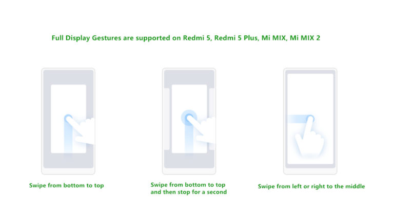
Gesture navigation has now been formalised in the mobile world these learning can be applied to ubports for a seamless transition into the OS. I would recommend we keep the left to right swipe to open the app menu as this is a uniquely ubports take on the apps menu. however we should consider a bottom to top swipe to get back to a home screen as well as a bottom to top swipe stopping in the centre to get to the currently running applications.

meanwhile the right to left swipe currently being used for the currently running apps should serve as a back gesture. many apps have the back key all the way at the top its hard to reach at times and will continue to be this way on larger devices.
Take me to my kingdom
The home screen every os has one this space should be one that is configurable and usable for the user. we must take into account ubuntu desktop has a screen where a wallpaper can be changed as well as shortcuts can be placed. this area should be available for each user to decide what they wish to do on it and not dictated to them by the os.

ubports != desktop in your pocket
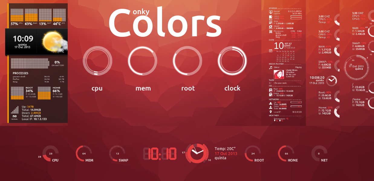
we must remember however a mobile phone is not our desktop its purpose is not the same, therefor we must also consider how we use the device. allot of what users want to do is get information quickly at a glance and lets remember parts of what makes Linux special is the ability to customise it. we must consider implementing a way to have widgets and desktop apps on the main screen this dose not make us a lesser os just because others have also done it it makes this product a viable alternative with all the benefits of a safety and privacy respecting os.