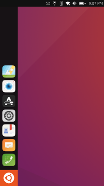
I wanna go home
-
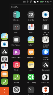
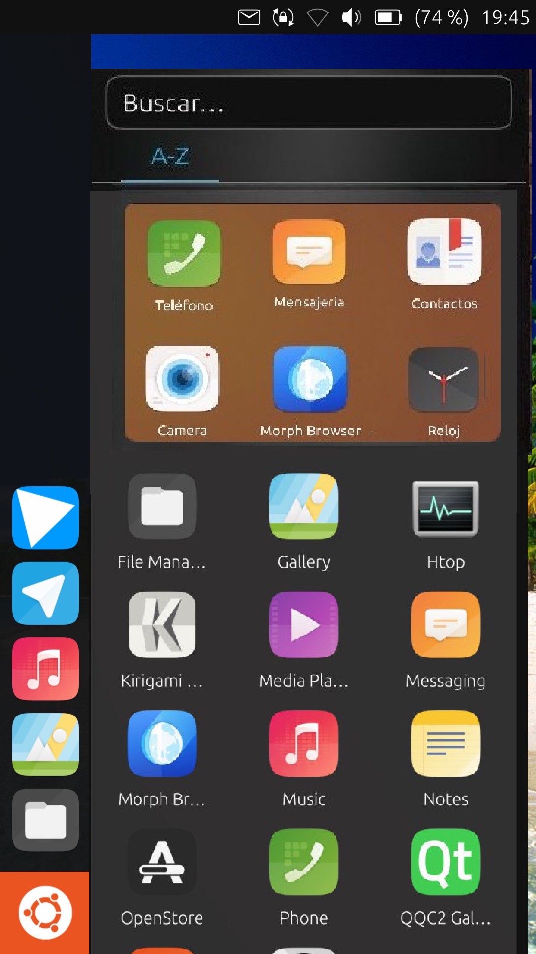
Hi guys, I really like the drawer idea, it's very similar to the Unity dash, I'll leave you my opinion too, the idea of closing the drawer with an arrow doesn't seem right to me, especially if it's in the lower zone, why not in the upper zone?
The assumption of closing the Drawer is because you haven't chosen any app, and if we slide it from the center of the Drawer to the left to close it, wouldn't it be better?
Another idea, not to overload the left app bar, before the drawer apps, to have an area that you move the apps there, calling this area FAVOURITES. Sorry about the photo, it's not perfect,
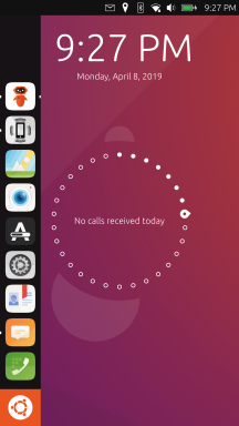
I think the background should be empty of everything, only on the screen unlocking the relog with the circle, as it is now,
it would be nice if the wallpaper slides like the apps
So we can get to what we leave there.greetings...
-
if we slide it from the center of the Drawer to the left to close it, wouldn't it be better?
The swipe is how it's supposed to work, but can't be used due to https://bugreports.qt.io/browse/QTBUG-74842. So for now, we compromise with a back button.
Favorites are hard to justify when the Launcher already exists and includes your favorite apps.
-
@UniSuperBox ok
-
Hey, I have written a little blog post about this topic. My idea was that it might be helpful to look how other operating systems are solving this problem: https://christianpauly.github.io/homescreen
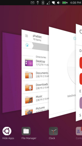
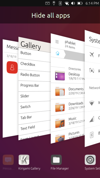
The conclusion is that it might be very important weither the "Homescreen" is below or over the open apps from the user point of view and Gnome 3 might have a very good solution for this. -
All the discussion makes perfectly sense for desktop environments on PCs and laptops...
On a mobile all I want is to get the funktion/information as fast and easy as possible... every extra klick or swipe is just an extra delay... my best mobile experience has been meego followed by the scopes idea
 (while I only ever used the "today" "news" and "apps" scope which resambled the meego experience)
So whatever you plan to do, keep it simple and without swipes and Klicks everywhere to get to another screen, function,...
BTW I've never been a fan ov unity
 - xfce is the DE of my choice - so I might be a bit old fashioned
-
@Krille said in I wanna go home:
The conclusion is that it might be very important weither the "Homescreen" is below or over the open apps from the user point of view and Gnome 3 might have a very good solution for this.
But the GNOME 3 solution is not "minimize all apps" in this case. It is simply that the "all applications" view is not some transparent thing that appears on top of the system, but simply is a separate thing and the open applications are not visible behind it.
There's also an important thing missing from this "comparison" (and which is commonly ignored in many such types of comparisons), which is that it only considers what other systems are currently doing, and not how we can do things different/better.
Why can't the "home" screen just be simple and plain? When you come home to your abode, and you're standing in front of the door, all you can see is the plain exterior. You can't see what's stocked in the pantry/fridge/freezer, or what all accessories, etc… might be stored within it, or even how you can access them. You must first go through the openings to get inside and discover all those things. In the same way, having only the launcher/panel visible along with the background wallpaper is the clean exterior, and it makes it clear where you need to go in order to find the interior.
-
My 2 cents, @UniSuperBox - for what it's worth!
I'm a great fan of Unity7: I like the app tray, and I think the Dash is a powerful tool for searching the computer for apps and files.
I think that development in this direction would give UT real distinctiveness as well as it being a great user experience. Of course, it would also leave the "Desktop" free for the adoption of widgets... or whatever we choose to call them.

Perhaps on the first time of using it, the app tray should be open, but have the option, as we have now, to hide it...
-
Just 2 cents from a Windows user:
The Windows desktop was made in resemblance to a real desk and the things you find there: Files, Folders and even a trashbin (technically not ON the desktop ofc). Its a matter of personal preference HOW you organize your desktop:
- Some keep it 100% clean
- Some have a few items lying around
- Some got a sh1tload of unnecessary things there.
My current desktop at work has 32 items: A mixture of starter icons, documents and whatever. Windows got adopted also for the "chaotic" way how you can work with it. It tries to give you maximum freedom on that:
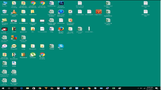
Does anybody understand what´s going on here? No. Does the owner of this desktop understand it? Yes, and he might be most productive with it.
During work, I almost never have to go to the desktop, however. I use it rarely. Also a matter of personal preference.
Can´t we just offer: Appdrawer AND background to organize stuff? You could pin starters and documents to the background (Problem: convergence and how to deal with the layout?)
A good DE gives all users a possible way to develop their own habits and preferences. Not try to force them into a single use pattern.
BR
-
I was thinking what Flohack said, we'd have an empty desk,
I don't know if anyone's ever said it,
but we have the solution to it and it's done.
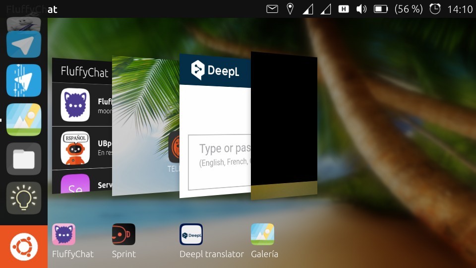
It would be to unite the work of Brian and Dalton, SPRINT+Drawer, 2 programs better than one.To have a modulable background to which you can add your apps and maybe one day Widgets, with the home of Drawer apps, this would be the best and each person can put the apps as everyone wants, for Unity 8 we would have a desktop in optimal conditions of use, in this case would follow the desktop background as Scopes does now by sliding all the apps. I think it doesn't look like android,
greetings...
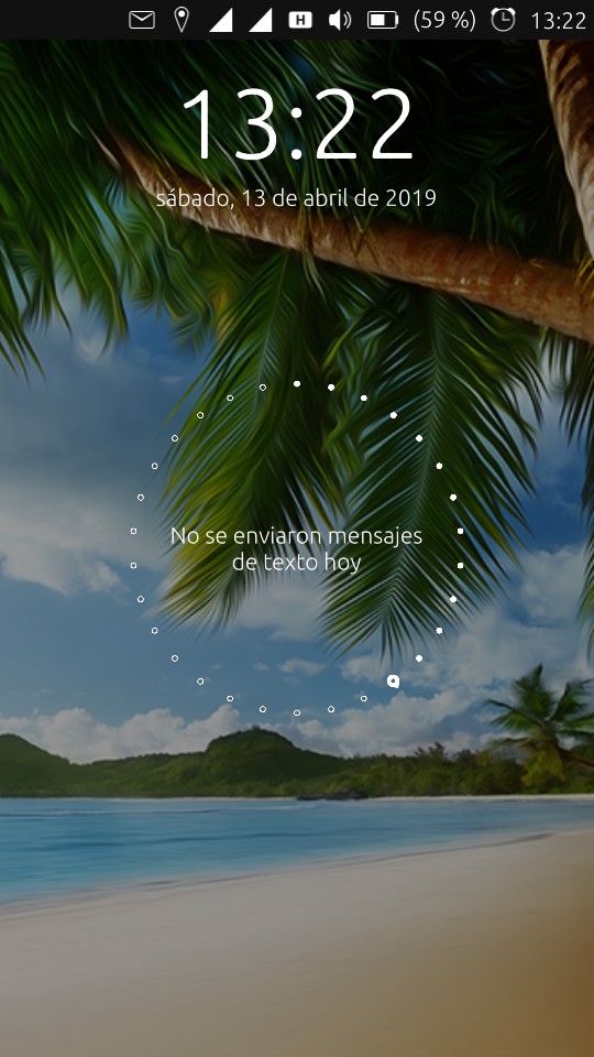
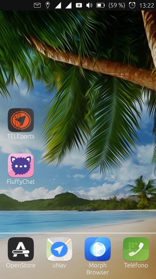
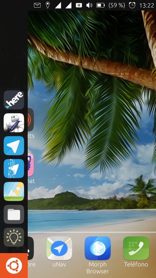
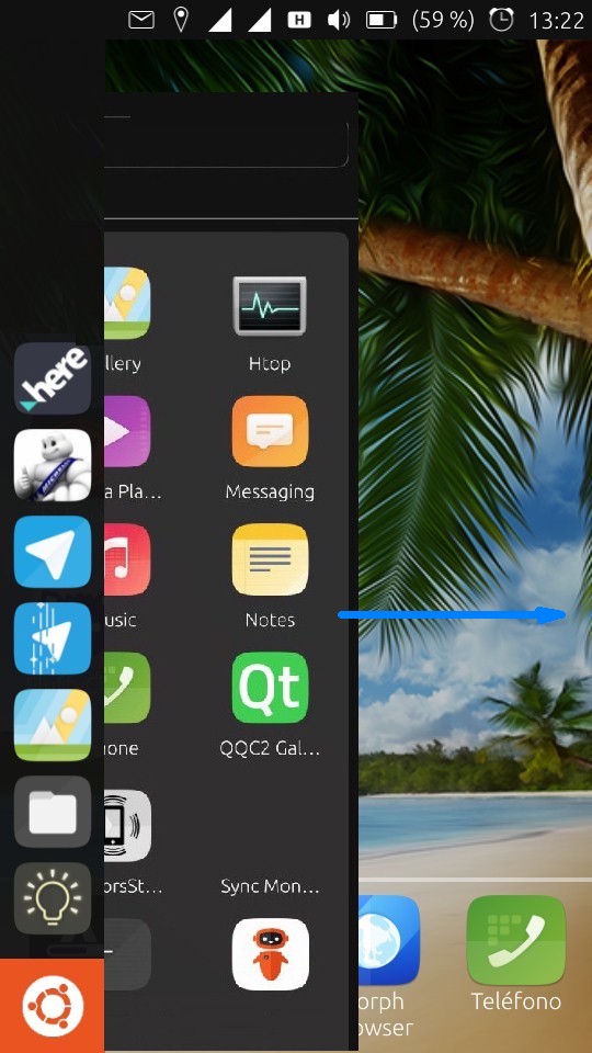
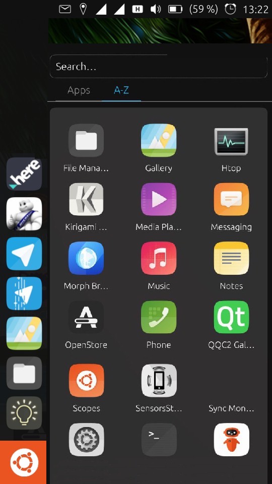
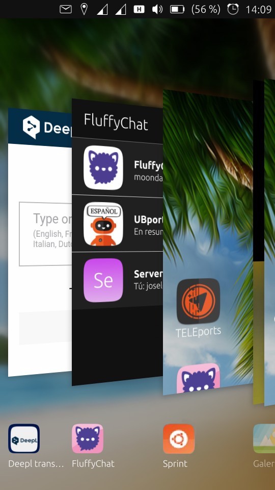
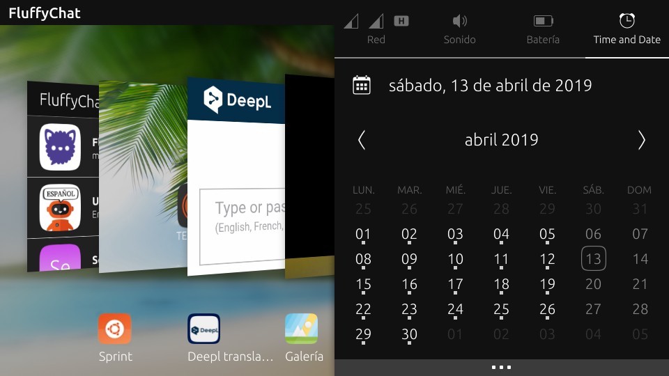
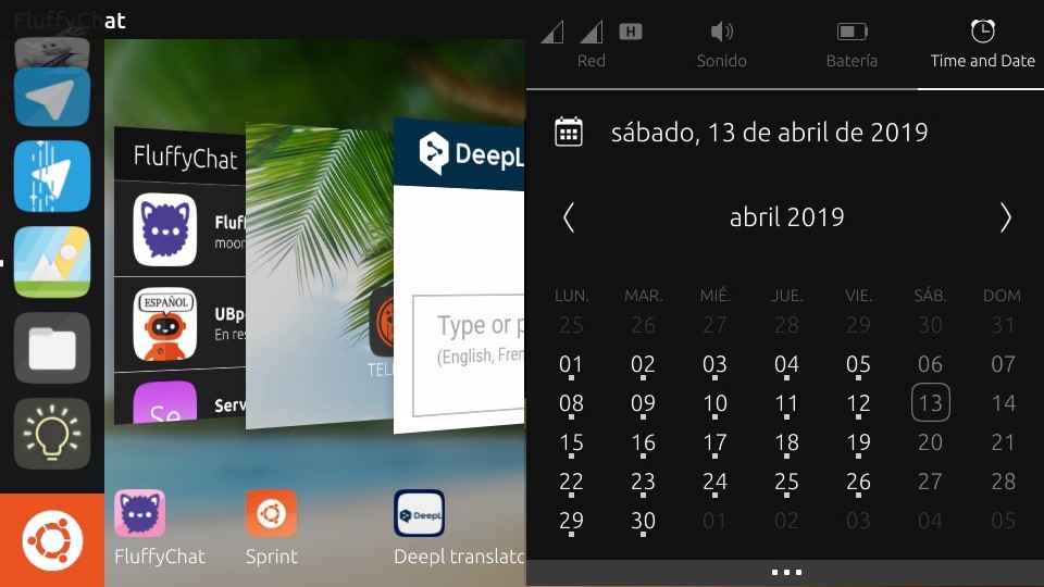
Maybe it's better with your own logo
-
Hello
My opinion is that you can put as many things as you want on the background as long as you don't impose this to everyone. I only have my favorite image as well as the date and time and I don't want anything else, not even the message circle I disabled. A plus for me would be that the background image changes regularly among a personal choice (images or links contained in a specific folder for example).
So whatever you add, make this optional please.
Best regards
Pulsar33 -
@Pulsar33 I think the same as you, I want to put a family photo without app icons, using Sprint that allows me, if you want to leave Sprint empty, but if you want to put 3 apps that you use more or some widget, we have that possibility,
that's freedom, having a lot of choice. -
Hm I'm not sure that its a good thing to make it possible to place app shortcuts on the desktop. For this customization there is the Launcher.
-
@Krille you are right, it is not normal to see that on Pc desktop, but in Tablet is used, it is not only the apps, it is also widgets, notes, documents, etc...... is the difficult thing of convergence, you do something for everyone, mobile, tablet and PC.
greetings...
-
So, what have we learned this week?
- Everyone wants a home
- No one can agree on what home is
- Some people like the desktop "stuff on your desktop" paradigm, others hate it
- New Unity8 already provides features we're used to seeing on a home screen, but not somewhere that is a home screen
Quite a few shades of gray here. I don't think we'll be able to reach consensus for everyone without just getting in and doing something, then taking the feedback from that. It's really hard to describe dynamic functionality in words and sometimes it doesn't make sense until it's put in front of you.
Personally, I think Kugi said it best early on:
I guess I could live without "home" until we get a great idea that's really a game changer
Let's try some things out and see what sticks, starting at the simplest first. The best ideas will naturally float up and get traction behind them. As they develop past their initial stages, we'll see more development toward interfaces which are consistent at every point.
I must reiterate that (since my job title is "development manager" and I feel the need to protect the time of our paid and volunteer developers) I do not support adding lots more settings or compromising between ideas. I truly believe we can make one really good way to use a mouse, keyboard, and/or touchscreen on any size personal device and the only way we'll do that is by working together. If that is totally not to someone's liking, we are not the only mobile operating system.
So, to put what is next more concretely:
- We may experiment with Jan's idea to tap the background (it's only a few lines of code to change what tapping there does) and ask for feedback from small groups.
- Otherwise, we don't want to make any huge changes to new Unity8 before it is released to Stable the first time. We'll release then iterate.
Go out and make.
-
This home is ubuntu touch, not android or ios or others, is ubuntu touch!
Any other modification does not satisfy everyone, maybe there is a solution,a conky for ut would be liked by everyone!!! -
@Giampy said in I wanna go home:
Any other modification does not satisfy everyone, maybe there is a solution,a conky for ut would be liked by everyone!!!
One would. Make it like you can do a desktop with it like @Flohack and other said.
Those who don't wan't to use it as a desktop just don't and let it empty...
Everyone satisfied. -
I do wish there was a way to choose between the old scope layout and this new lack of home screen

-
This is perfect! Who needs a Home!
-
I like the new app drawer instead of the last ui which had scopes. It reminds me a LOT of the unity 7 dash. If only it had the functionality of the Unity 7 dash of ubuntu 14.04(when it came out) such as universal search(search for applications, files, contacts, music and video from local as well as online sources) it would be cool.
In fact, bringing the concept of lenses and scopes to THIS drawer makes more sense. Maybe the drawer could become the universal home scope and have lenses for different file types. This could also work for convergence and bring in a lot of the Unity 7 fans who are unhappy with Gnome3(like me) and perhaps even reduce maintenance of Unity 7 post 2021. I don't know if it is possible.. or feasible. An intriguing idea nonetheless.
-
@Keneda PRs welcome.
Making the code much more complex to satisfy a smaller number of users, does not "make everyone happy," particularly those who are left to implement and maintain the more complex code.
Hello! It looks like you're interested in this conversation, but you don't have an account yet.
Getting fed up of having to scroll through the same posts each visit? When you register for an account, you'll always come back to exactly where you were before, and choose to be notified of new replies (either via email, or push notification). You'll also be able to save bookmarks and upvote posts to show your appreciation to other community members.
With your input, this post could be even better 💗
Register Login