OSK Enhancements Proposals
-
@AppLee I've tested it. Indeed, we have to go to the beginning of the line to go back up.
But, is it really a bug or a voluntary programming choice? In the case of messages, I would rather opt for voluntary choice but.... -
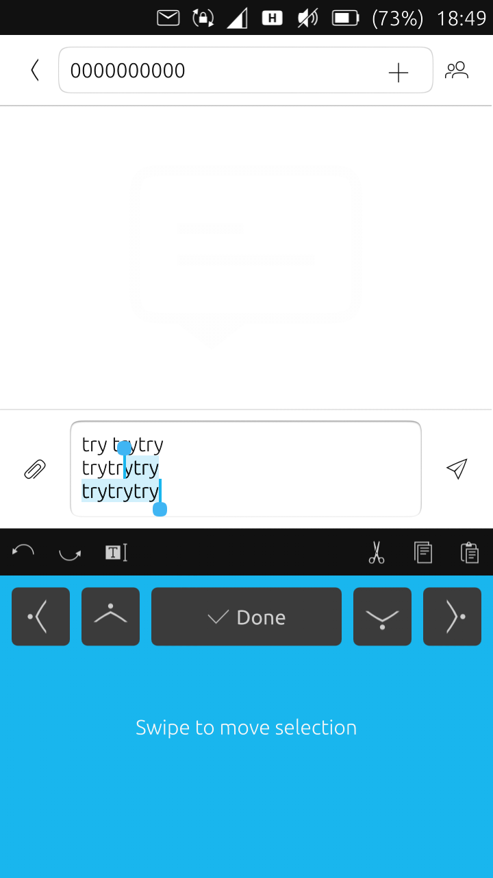
Great work on this! One thing I think would be nice is adding a double tap to close selection mode, and clicking done should always close out all together which would eliminate having to click done twice to close.
-
@PhoenixLandPirat I see, people don't want more indicators. Then my proposal is to make a setting that can switch the clipboard manager indicator on/off. Default would be off, so no one would get a new indicator.
-
@domubpkm I'm not sure I follow what you're talking about ':)
But you mentioned messages, I guess you're talking about the focus jumping between theToandMessagefields when moving the cursor in the messages app. I think that's been like that even before and it's something that the app needs to adjust and not the OSK
@dieharddan That has been suggested before and I think it's very easy to implement. Maybe some one can try it and test it out if it's really better that way.
-
@kugiigi To clarify, it was here : in the message writing area

Ok, understood, it isn't the OSK. -
Anyone is welcome to try this PR and any feedback is welcome.
It'll be good to know your opinion and suggestion
-
@kugiigi Could you include in your OSK keyboard these three basic actions on the selected characters: bold, italic, underlined.
If not, the first one: bold.
I think this could be useful. Anyway, I needed it !
-
@domubpkm, most things do not accept formatted text, so this would be useless in most apps. For those it would need to be hidden, and it wouldn't be obvious why.
-
@UniSuperBox The idea seemed interesting to me that precisely this could work in some web pages or applications, too bad that the realization is more difficult !
-
@domubpkm Well at first, I thought it's a ridiculous idea but I think it could make sense
perhaps it could live in the bar at the top but it will only be visible when the text field on focus supports formatting. But I'm still unsure if it's really worth it. Maybe it is something that is better implemented in each app. -
@kugiigi A RIDICULOUS IDEA? I'm offended!!! ,,,


-
Before making a possible query on Github, I would like to know if the following is technically feasible:
I explain: using the very useful app Writer by Marcos costales, the OSK carriage return creates a large space between lines. Is it possible to set up the Shift + Enter combination on the OSK to have lines without spaces? (Shift + Enter works with the external keyboard in the application writer).
Thank you. -
@domubpkm It is technically possible, yes. But I think this should be fixed by the app instead of the OSK. Enter should default to next line. Then perhaps a button to add new paragraph.
-
@kugiigi Okay, I passed on the info.
Hello! It looks like you're interested in this conversation, but you don't have an account yet.
Getting fed up of having to scroll through the same posts each visit? When you register for an account, you'll always come back to exactly where you were before, and choose to be notified of new replies (either via email, or push notification). You'll also be able to save bookmarks and upvote posts to show your appreciation to other community members.
With your input, this post could be even better 💗
Register Login