UBports Robot Logo UBports Forum
    • Categories
    • Recent
    • Tags
    • Popular
    • Users
    • Groups
    • Search
    • Register
    • Login

    UI for MMS errors

    Scheduled Pinned Locked Moved Design
    19 Posts 8 Posters 1.8k Views 4 Watching
    Loading More Posts
    • Oldest to Newest
    • Newest to Oldest
    • Most Votes
      Reply
      • Reply as topic
      Log in to reply
      This topic has been deleted. Only users with topic management privileges can see it.
      • lduboeufL Offline
        lduboeuf
        last edited by

        hi,

        Following discussion https://forums.ubports.com/topic/5100/the-mms-lost-story here for the UI part:
        What are your ideas for this kind of error message ?

        screenshot20201029_214557700.png

        mymikeM 1 Reply Last reply Reply Quote 0
        • mymikeM Offline
          mymike @lduboeuf
          last edited by

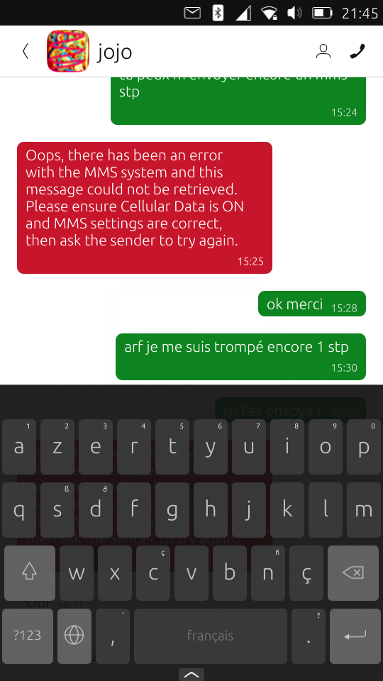
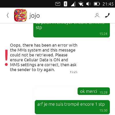
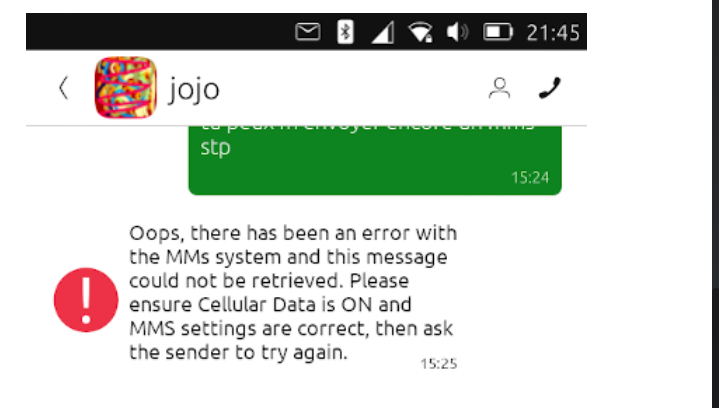
          @lduboeuf Personally I think that a message bubble like that is confusing, because you may think that's a message... It needs a different style imho.

          Maybe putting the error message full width (or almost full) and not on the side helps...

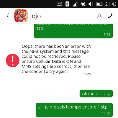
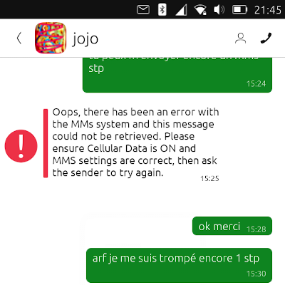
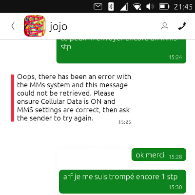
          But I think the most confusing factor is that it uses the same style as a regular SMS. Maybe removing the bubble and putting a red vertical line before the text (so on the left) or maybe an error icon, like the exclamation mark, always before the text...

          I'll try to make some mockup, maybe next week...

          AppLeeA 1 Reply Last reply Reply Quote 2
          • AppLeeA Offline
            AppLee @mymike
            last edited by

            @mymike
            I totally agree that it looks like a "regular" message.
            Though other error messages are also displayed like this.
            Personnally I'm okay with that.

            But if a better option come out, that's great.
            Thanks

            mymikeM 1 Reply Last reply Reply Quote 0
            • KenedaK Offline
              Keneda
              last edited by

              Normal messages never are red on my phone, so it doesn't look quite normal.

              2015-2023 : Meizu MX4 ☠️⚰️✝️
              2023-2024 : Nexus 5 ☠️⚰️✝️
              2024-***** : FPOS Fairphone 5 waiting UT for freedom 😉
              🇲🇫🇬🇧

              1 Reply Last reply Reply Quote 0
              • mymikeM Offline
                mymike @AppLee
                last edited by

                @AppLee said in UI for MMS errors:

                @mymike
                I totally agree that it looks like a "regular" message.
                Though other error messages are also displayed like this.

                Can you please make me an example? I know that when it fails to send an SMS the message bubble gets red, but inside the bubble there is the text you wrote, not an error message from the app...

                AppLeeA 1 Reply Last reply Reply Quote 0
                • mymikeM Offline
                  mymike
                  last edited by mymike

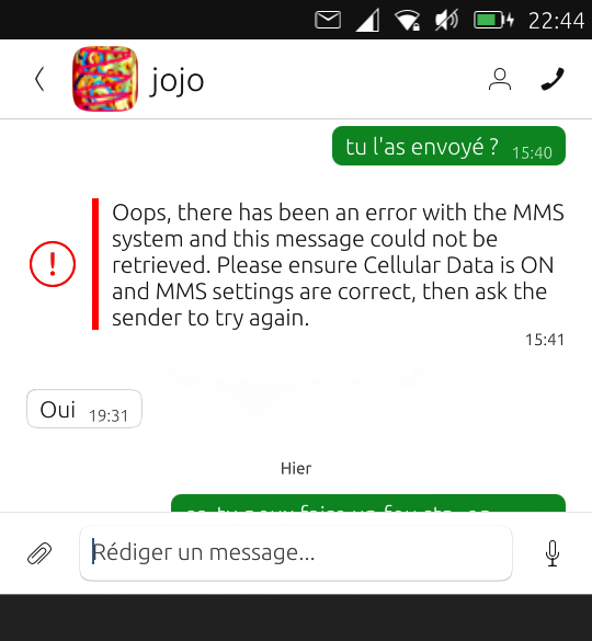
                  These are some ideas to display the error without the bubble...

                  258559a6-4b4b-45c4-ab5c-1d633aced39f-immagine.png 575e1997-403b-442f-b8d4-dd905abdae0c-immagine.png cf24e930-9f0d-421c-90f3-5a622d6a6e4b-immagine.png 8d46e261-f35b-409f-b2f9-b719a615ca17-immagine.png

                  lduboeufL 1 Reply Last reply Reply Quote 1
                  • AppLeeA Offline
                    AppLee @mymike
                    last edited by

                    @mymike said in UI for MMS errors:

                    I know that when it fails to send an SMS the message bubble gets red, but inside the bubble there is the text you wrote, not an error message from the app...

                    Yes you're right.
                    My point was that red already point towards an error.
                    I welcome your idea to make it more obvious and maybe we need to find an homogeneous way to show errors within the messenger.

                    The option I like the most is the one with both the vertical bar and the "!"

                    jezekJ 1 Reply Last reply Reply Quote 1
                    • lduboeufL Offline
                      lduboeuf @mymike
                      last edited by

                      @mymike Oh that's nice 🙂
                      So can we vote for one of them ?. @CiberSheep maybe can also tell ?

                      D 1 Reply Last reply Reply Quote 1
                      • CiberSheepC Offline
                        CiberSheep
                        last edited by

                        Interesting. I like the ones with round icon and left red bar. Maybe smaller icon and centered text?

                        Is the idea to show it as if it was a message without bubble?

                        Another planet, another time, another universe!

                        1 Reply Last reply Reply Quote 0
                        • lduboeufL Offline
                          lduboeuf
                          last edited by

                          do we have already that icon on UT?

                          CiberSheepC mymikeM 2 Replies Last reply Reply Quote 0
                          • CiberSheepC Offline
                            CiberSheep @lduboeuf
                            last edited by

                            @lduboeuf
                            dialog-warning-symbolic

                            ^____^ not quite the same but it the one used in UTTT for example

                            Another planet, another time, another universe!

                            1 Reply Last reply Reply Quote 1
                            • mymikeM Offline
                              mymike @lduboeuf
                              last edited by

                              @lduboeuf I took it from other icons like transfer-error, where it is put in a corner (see here)

                              1 Reply Last reply Reply Quote 0
                              • jezekJ Offline
                                jezek @AppLee
                                last edited by jezek

                                @AppLee said in UI for MMS errors:

                                My point was that red already point towards an error.

                                Pardon my intrusion. I think an error shouldn't differ only with color. It's good practice to presume that user is colorbind, or the display is only b/w, etc. Just saying.

                                Btw, I like the one with round icon and left red bar, as @CiberSheep does.

                                jEzEk

                                1 Reply Last reply Reply Quote 0
                                • D Offline
                                  domubpkm @lduboeuf
                                  last edited by

                                  @lduboeuf screenshot20201031_032439480.png
                                  simple, clear and visible with no frills: my favourite

                                  1 Reply Last reply Reply Quote 0
                                  • lduboeufL Offline
                                    lduboeuf
                                    last edited by

                                    Thanks for the propositions, i will try my best, and come back here
                                    I've found mail-mark-important in actions/scalable very closed to the red icon. I guess i can apply a red ColorOverlay to it.

                                    1 Reply Last reply Reply Quote 1
                                    • FlaF Offline
                                      Fla
                                      last edited by

                                      IMO the text is too long.I'll think about a better message.

                                      Would it be possible to add a link to automatically pull the MMS ?

                                      lduboeufL 1 Reply Last reply Reply Quote 0
                                      • lduboeufL Offline
                                        lduboeuf @Fla
                                        last edited by lduboeuf

                                        @Fla said in UI for MMS errors:

                                        IMO the text is too long.I'll think about a better message.

                                        Thanks ( i hope it will not change that much, because i need to update each time in 2 project... )

                                        Would it be possible to add a link to automatically pull the MMS ?

                                        That the final goal, but another story that i can't do alone. For instance only notify the user a MMS was lost: see here for discussion: https://forums.ubports.com/topic/5100/the-mms-lost-story/7

                                        1 Reply Last reply Reply Quote 0
                                        • lduboeufL Offline
                                          lduboeuf
                                          last edited by lduboeuf

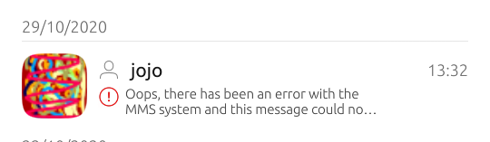
                                          That is what i've got after fighting some time with QML Layout...

                                          screenshot20201101_224426210.png

                                          in thread list:

                                          screenshot20201102_094020339.png

                                          1 Reply Last reply Reply Quote 3
                                          • FlaF Offline
                                            Fla
                                            last edited by Fla

                                            I would propose the following text: "You received an MMS that could not be downloaded because your internet connection was disabled. Please activate it and ask the sender to try again".

                                            Also, about the design, can you please try to put the content of your last mock up (including the exclamation mark and the red border) inside the message bubble of the sender, and written in italic? That way it really shows that a message should have been received there.

                                            1 Reply Last reply Reply Quote 0
                                            • First post
                                              Last post