TELEports. New Telegram app icon design
-
@flohack Oh, sorry.
And I just read about the toilet sit

-
TELEpottyports
-
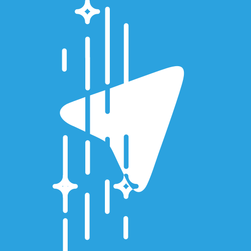
And another one made by @nanu-c:

idea 5 -
This post is deleted! -
I like 1 and 3 most. Actually I find 3 is the nicest icon, but I must admit that a portal is a bit different from a port. What bothers me about the first is that the teleporter beam is cut off at the top. Maybe we can move the teleport plattform a bit downwards and then the plane a bit upwards s.t. it stays in the mid and the beam is not cut off...?
-
Idea 6

-
Idea 7
-
This post is deleted! -
What do you thing about the ideas below?


-
Other variations for the same idea.
")


-
@mariusbfs i like this
-
@louies Thank you! I must admit that I have taken the arrow icon from www.flaticon.com. The rest is my idea. If you like the approach, I may change something in the shape to make it original. Not sure how copyright works in this case...
-
@mariusbfs Good icon indeed.
For the license you should check, in the website, the license and use that the author chose for it. -
two ideas better than one idea, look at how these images look like
greetings...


-
@josele13 Huh cool!
-
Dont forget we need a Suru icon, so you need to bring in a "paper fold" line + alpha shadow somewhere
- Also, the main App icon must be suqare with rounded edges as described. -
This post is deleted! -
@flohack Hehe that means nanus suggestions are the only ones valid up to now

-
So, following @Josele13's idea this could be it:

@Flohack Do you need a rounded corners version for something? If you use the sqared svg UT takes care of the corners
Another planet, another time, another universe!
-
I don't have the time to design a new icon, but I can help making the icon we'll chose more Suru (folds, shadows, gradients, etc...) if it's needed
Hello! It looks like you're interested in this conversation, but you don't have an account yet.
Getting fed up of having to scroll through the same posts each visit? When you register for an account, you'll always come back to exactly where you were before, and choose to be notified of new replies (either via email, or push notification). You'll also be able to save bookmarks and upvote posts to show your appreciation to other community members.
With your input, this post could be even better 💗
Register Login