UBports Robot Logo UBports Forum
    • Categories
    • Recent
    • Tags
    • Popular
    • Users
    • Groups
    • Search
    • Register
    • Login

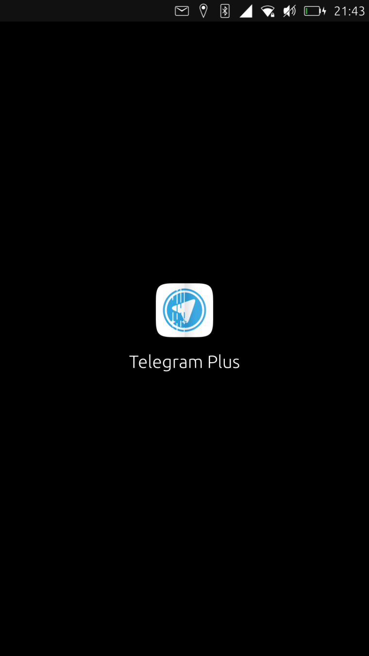
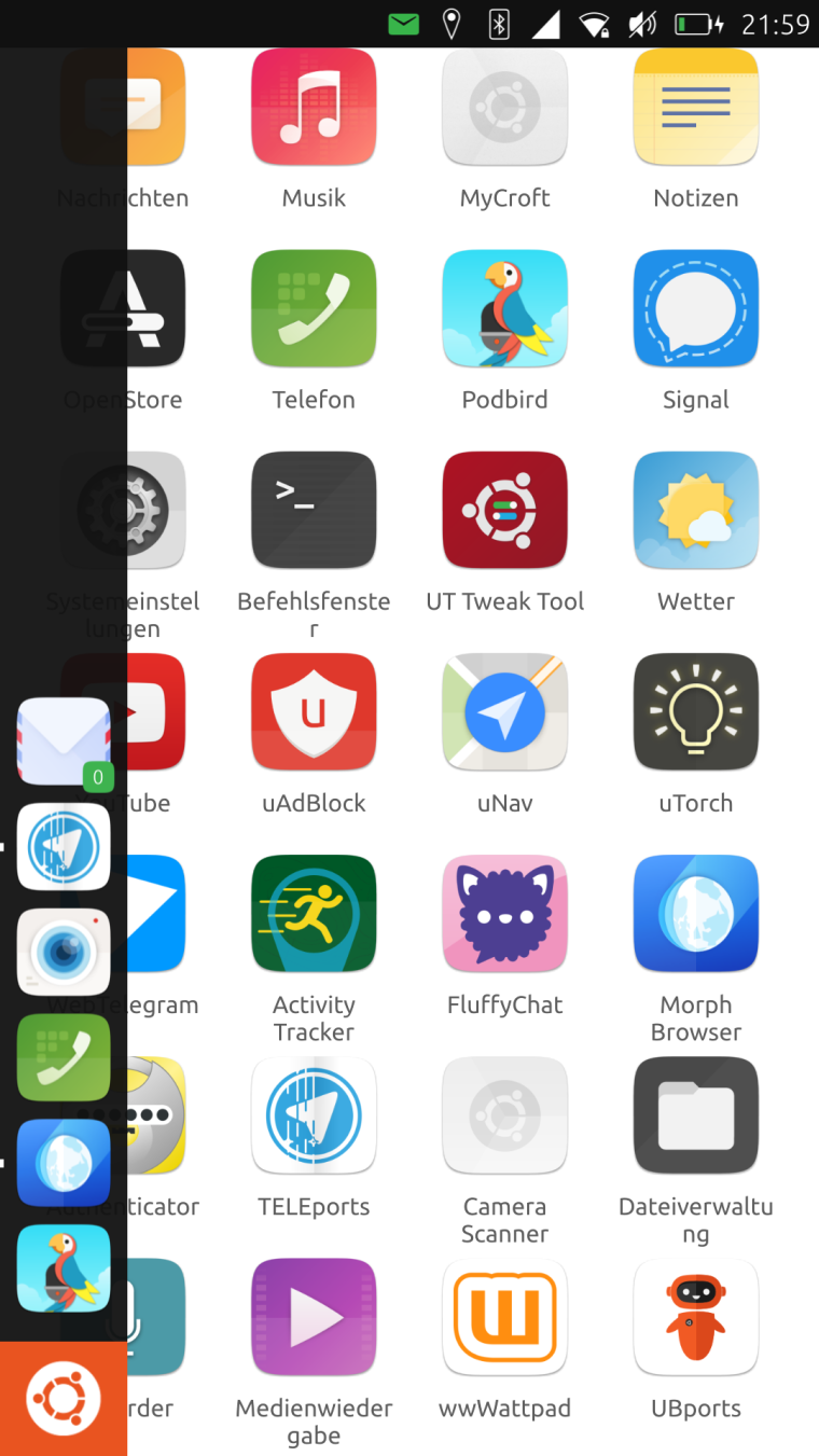
    TELEports. New Telegram app icon design

    Scheduled Pinned Locked Moved Design
    72 Posts 26 Posters 26.9k Views 3 Watching
    Loading More Posts
    • Oldest to Newest
    • Newest to Oldest
    • Most Votes
      Reply
      • Reply as topic
      Log in to reply
      This topic has been deleted. Only users with topic management privileges can see it.
      • CiberSheepC Offline
        CiberSheep @mariusbfs
        last edited by

        @mariusbfs Good icon indeed.
        For the license you should check, in the website, the license and use that the author chose for it.

        Another planet, another time, another universe!

        1 Reply Last reply Reply Quote 0
        • Josele13J Offline
          Josele13
          last edited by

          two ideas better than one idea, look at how these images look like

          greetings...

          0_1546979640432_Telegram plus.jpg

          0_1546979655572_Telegram plus2.jpg

          Xiaomi Redmi Note 9 pro
          Oneplus Nord 100
          Xiaomi Redmi Note 7
          Nexus 5
          Bq E4.5 Ubuntu edition .... is dead

          flohackF 1 Reply Last reply Reply Quote 5
          • flohackF Offline
            flohack @Josele13
            last edited by

            @josele13 Huh cool!

            My languages: πŸ‡¦πŸ‡Ή πŸ‡©πŸ‡ͺ πŸ‡¬πŸ‡§ πŸ‡ΊπŸ‡Έ

            1 Reply Last reply Reply Quote 0
            • flohackF Offline
              flohack
              last edited by

              Dont forget we need a Suru icon, so you need to bring in a "paper fold" line + alpha shadow somewhere πŸ™‚ - Also, the main App icon must be suqare with rounded edges as described.

              My languages: πŸ‡¦πŸ‡Ή πŸ‡©πŸ‡ͺ πŸ‡¬πŸ‡§ πŸ‡ΊπŸ‡Έ

              ? H 2 Replies Last reply Reply Quote -1
              • ? Offline
                A Former User @flohack
                last edited by A Former User

                This post is deleted!
                1 Reply Last reply Reply Quote 0
                • H Offline
                  hummlbach @flohack
                  last edited by

                  @flohack Hehe that means nanus suggestions are the only ones valid up to now 😜

                  1 Reply Last reply Reply Quote 0
                  • CiberSheepC Offline
                    CiberSheep
                    last edited by

                    So, following @Josele13's idea this could be it:

                    0_1546992729927_8ba4c8ff-c72b-4f1c-8922-779e6d4582f4-imatge.png

                    @Flohack Do you need a rounded corners version for something? If you use the sqared svg UT takes care of the corners πŸ˜„

                    Another planet, another time, another universe!

                    flohackF 1 Reply Last reply Reply Quote 8
                    • mymikeM Offline
                      mymike
                      last edited by

                      I don't have the time to design a new icon, but I can help making the icon we'll chose more Suru (folds, shadows, gradients, etc...) if it's needed

                      1 Reply Last reply Reply Quote 1
                      • T Offline
                        TischlerWilly
                        last edited by TischlerWilly

                        could we fould Yumi somehow to make a plane of it.
                        or let him throw the paperplane?

                        1 Reply Last reply Reply Quote -1
                        • glocesterG Offline
                          glocester
                          last edited by

                          ... maybe something like this...
                          0_1547066813095_Teleports.png

                          G R 2 Replies Last reply Reply Quote 5
                          • G Offline
                            GIEMME @glocester
                            last edited by

                            @glocester Nice! I like it.

                            BQ Aquaris E4.5 since 2015

                            1 Reply Last reply Reply Quote 1
                            • R Offline
                              rocky58 @glocester
                              last edited by

                              @glocester Also me... I like it!!!

                              1 Reply Last reply Reply Quote 0
                              • H Offline
                                hummlbach
                                last edited by

                                Oh no... it looks so whatsappy to me... πŸ˜• the color... lets make the color telegram-blueish, please.
                                And what about putting it upwards s.t. the suru fold matches the fold of the plane? πŸ™‚

                                1 Reply Last reply Reply Quote 0
                                • H Offline
                                  hummlbach
                                  last edited by

                                  Nice participation @all btw! love this

                                  1 Reply Last reply Reply Quote 0
                                  • flohackF Offline
                                    flohack @CiberSheep
                                    last edited by

                                    @cibersheep Looks great! No, I dont need rounded corners if they are made automatically. Just wanted tomention the design considerations, so that people wont expect to have a circle as an icon xD

                                    My languages: πŸ‡¦πŸ‡Ή πŸ‡©πŸ‡ͺ πŸ‡¬πŸ‡§ πŸ‡ΊπŸ‡Έ

                                    1 Reply Last reply Reply Quote 2
                                    • danfroD Offline
                                      danfro
                                      last edited by danfro

                                      To complete the ideas from the Telegram-thread a few days ago I add my draft as well. Although I was already reminded that there used to be a browser "in the old times" using a similar logo. πŸ™‚
                                      Teleports - port - steering wheel was the idea behind it...

                                      Edit 1:
                                      In Germany there is a phrase "ein sicherer Hafen" (a safe port). A port suggests safety (for ships).
                                      If that makes sense in other languages a marketing phrase for TELEports (independent of the icon) could be:
                                      <marketing> "TELEports - a safe port for your chats" </marketing>

                                      Edit 2: For legal purposes, the plane is taken from https://commons.wikimedia.org/wiki/Category:Telegram_Messenger#/media/File:Telegram_logo.svg and comes as public domain. No copyright fraud intended.

                                      0_1547149918049_Bildschirmfoto von 2019-01-05 16-45-25.png

                                      1 Reply Last reply Reply Quote 1
                                      • H Offline
                                        hummlbach
                                        last edited by hummlbach

                                        @flohack @cibersheep so the background of the icon will be white right?
                                        If it will be transparent you wont see any rounded corners anyway no matter if they are made automatically or not? πŸ™‚
                                        If the background will be white: could we see how it looks on a non white background? At best... just did it:
                                        0_1547153228350_screenshot20190110_214346133.png
                                        0_1547154045234_screenshot20190110_215952141.png

                                        flohackF glocesterG 2 Replies Last reply Reply Quote 9
                                        • flohackF Offline
                                          flohack @hummlbach
                                          last edited by

                                          @hummlbach Yes that looks awesome!

                                          My languages: πŸ‡¦πŸ‡Ή πŸ‡©πŸ‡ͺ πŸ‡¬πŸ‡§ πŸ‡ΊπŸ‡Έ

                                          1 Reply Last reply Reply Quote 1
                                          • glocesterG Offline
                                            glocester @hummlbach
                                            last edited by glocester

                                            @hummlbach I agree, looks awesome ... Sam Hewitt's work was excellent ... and this is just the old icon inside a circle...

                                            1 Reply Last reply Reply Quote 1
                                            • dobeyD Offline
                                              dobey
                                              last edited by

                                              That looks eerily similar to the uNav icon though. They are both a stylized arrow pointing to the upper right corner, and inside a circle.

                                              H 1 Reply Last reply Reply Quote 1
                                              • First post
                                                Last post