TELEports. New Telegram app icon design
-
As you may know, TELEports is the new UBports app for Telegram. Better, Faster, Stronger
")
It needs an icon. Take your pencils and bring your art.- We must not use the Telegram plain icon for copyright issues.
3, 2, 1: go!
-
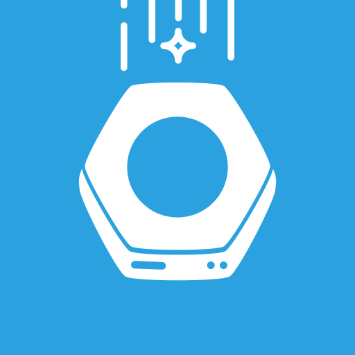
Idea 1:

Idea 2
Idea 2b

-
Idea 2c

-
Good work! We need to get @nanu-c on here to get some more comparisons...
-
I like 1 and 2b best.
2a resembles a bit of a toilet seat to me - sorry

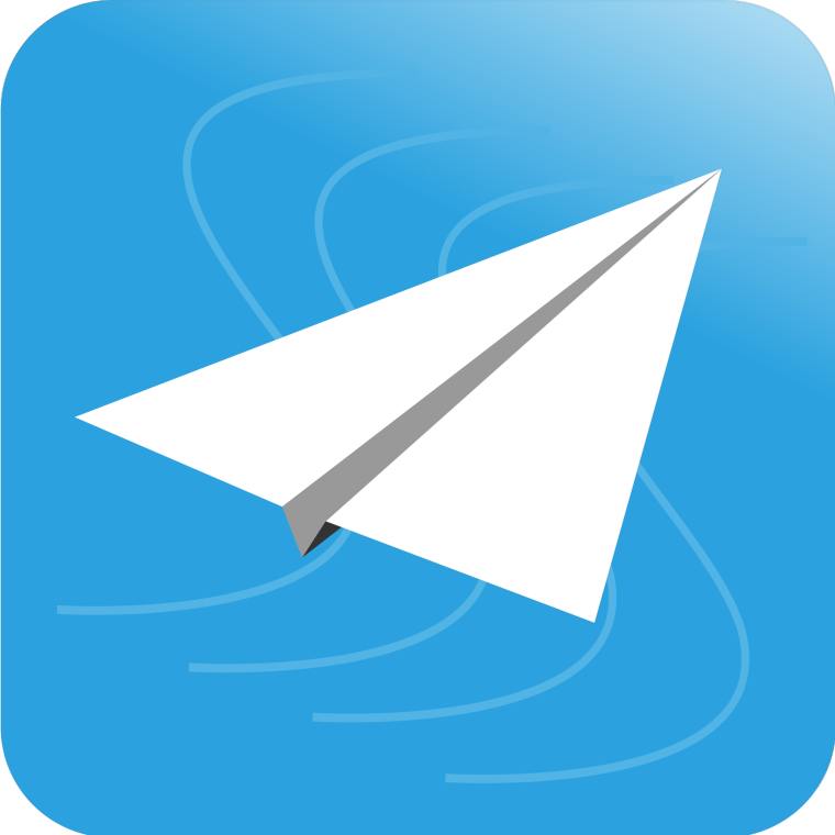
2c is nice, question is if we should give up the quote of the paper planeMy languages: 🇦🇹 🇩🇪 🇬🇧 🇺🇸
-
Could change the symbols between the vertical lines to paper planes on 2c or just some of them.
-
@nanu-c made the following icon:

idea 3
like
Maybe we would change the angle of the plain a bit s.t. it matches the perspective of the hole a bit more. -
-
@flohack said in TELEports. New Telegram app icon design:
question is if we should give up the quote of the paper plane
That one is not from the official, so we keep the recognition of the app, being legal
Another planet, another time, another universe!
-
@3arn0wl Mmmm... it needs work, I think.
Remember that main concept should be in the center (otherwise it will get lost)
You have the guidelines here:
-
@cibersheep No I meant it the other way round: We may want to keep the paper plane. That´s why I favor the designs with it
")
-
@flohack Oh, sorry.
And I just read about the toilet sit
-
TELEpottyports
-
And another one made by @nanu-c:

idea 5 -
This post is deleted! -
I like 1 and 3 most. Actually I find 3 is the nicest icon, but I must admit that a portal is a bit different from a port. What bothers me about the first is that the teleporter beam is cut off at the top. Maybe we can move the teleport plattform a bit downwards and then the plane a bit upwards s.t. it stays in the mid and the beam is not cut off...?
-
Idea 6

-
Idea 7

-
This post is deleted! -
What do you thing about the ideas below?