App Design Concept


-
Hi guys, want to propose a design for UT more practical,
many Apps have the design parameters as each developer wants, buttons up, down, left to right, completely out of control. settings, configurations, actions each developer chooses how his App moves.
there are two ways to pick up a phone, from below as you use Android, from the left as you use Iphone, doing both things at once is cumbersome, this should be talked about and propose a change,
I propose a change for the better, but I would like community people and developers to talk about it to make a more uniform operating system, which is the best mobile OS,
I propose to use the phone from the left hand Iphone style, but that the action buttons, settings and adjustments can be done without moving the hand, only with the thumb of left hand, so you have the right hand to write, point, take .... right hand totally free.
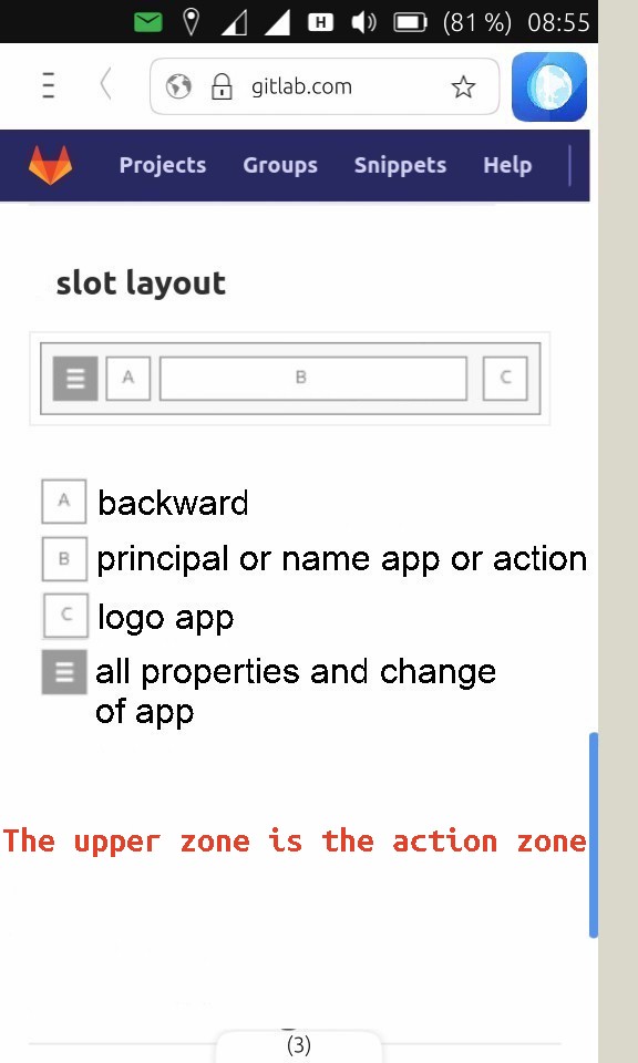
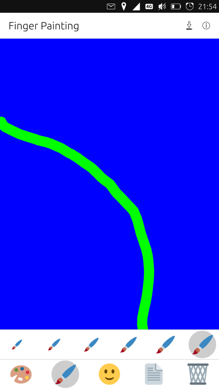
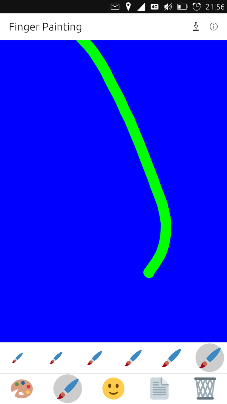
the finger reaches a maximum length on the screen, then the action should be at your fingertips
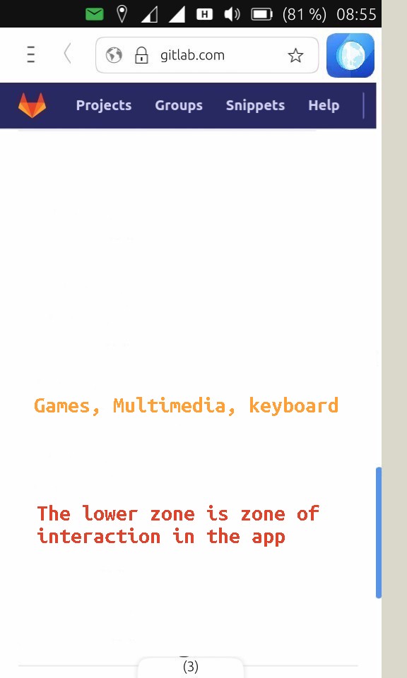
when you interact with the phone is when you use both hands, that's when you're longer in the App you've opened, for example with games, with multimedia or with the keyboard typing, that's when you need the use is at the bottom of the phone.
I take this opportunity to comment, I am one of those who thinks that an operating system should not have the color black or white, only serve for letters and bars, these two colors make the systems are less elegant, but maybe it is good for the consumption of resources.
Now I will send photos for you to see my idea, there are many photos,
after the community has its say,greetings...


-
I am impressed. Thinking of redesigning the UI of my app to comply with this.
But might wait to see what comes out of the discussion, first. -
Okay i think I got most of your ideas. In a nutshell you're suggesting to kill the trailing menu (and put the app icon there instead) in order to:
- be able to do the most basic/important actions respectively navigate through the app with the left hand only
- get app headers that are more consistent
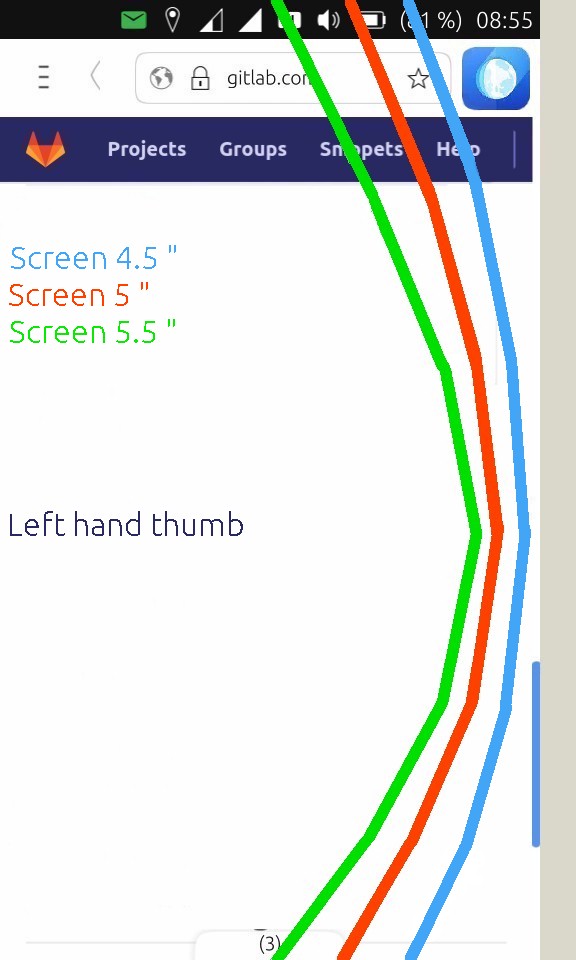
Thats my thumb range btw. First picture is how I usually hold my phone:
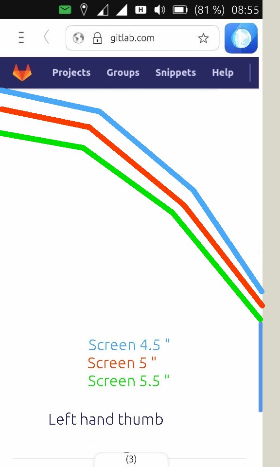
It may take a while to get used to it, but its possible/thinkable to hold the phone orthogonal to the fingers s.t. the thumb range in my case on turbo looks like that:
Nice. Interesting thoughts!
-
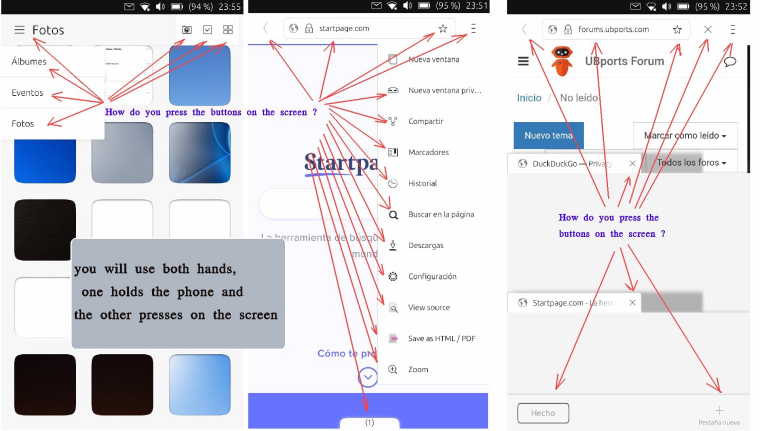
@hummlbach My idea is to take the phone in half, from that position the thumb reaches a good part of the phone, you can slide the top bar and you can slide the bottom bar, you can open the left bar and almost slide the right side, if you place the action buttons in the left area as in the Ubuntu desktop, you can manage almost all the functions of the phone with one finger, the OK finger,
with that you get to have the right hand for other things, take a book, write, call the taxi, etc etc etc. etc..
Even if you are right-handed, you can handle it well.greetings...
-
I'm not sure I like having the app icon there in the header. What does it actually do?
Anyway, my current idea of app UI/UX are in my recent apps (Palitan and Pesbuk).
The header is kinda typical with a left action button(s), title, and right action button(s).
The cool part is that those action buttons can be triggered and reachable via the bottom edge.
I think Samsung's One UI wherein the header can be enlarged to be more reachable from the bottom is also great....which I borrowed by the way in my 2 recent apps too")
In my personal opinion, this design works in a converged UI since the header is still at the top which is ideal in desktop use but still reachable from the bottom when used on phones.
-
One concern that occurred to me is that this arrangement, which would (in my case) encourage an increase in the use of the left thumb, could also increase the likelihood of smartphone thumb injury...

🇦🇼 🇳🇱 🇺🇸 🇪🇸
Happily running Ubuntu Touch
JingPad (24.04-1.x daily)
OnePlus Nord N10 5G (24.04-2.x daily)
PinePhone OG (20.04)
Meizu Pro 5 (16.04 DEV) -
@arubislander may also encourage phones to base jumping and face planting... (but i would risk that ;))
@kugiigi \me is also not sure about the app icon there...
-
What about people who hold their phone with right hand instead of left? What about people who don't have hands, or who cannot use them with a touch screen?
Simply moving stuff from point X to point Y does not solve any real problem. Unfortunately life is far more complex than that. Any changes in overall design really needs to account for a lot more situations, and be as accessible to as many people as possible. And that's exactly what I've started the Ergo toolkit to do. It will eventually be good enough to replace ubuntu-ui-toolkit, and is meant to be more adaptable and accessible.
-
@kugiigi the idea of the icon in the header is to give symmetry to the app, if you just put the preference buttons and back, the name of the app or action to the center, there is an empty space to the right,
is not by function, but visually it is nice to see the icon .
-
@arubislander said in App Design Concept:
One concern that occurred to me is that this arrangement, which would (in my case) encourage an increase in the use of the left thumb, could also increase the likelihood of smartphone thumb injury...
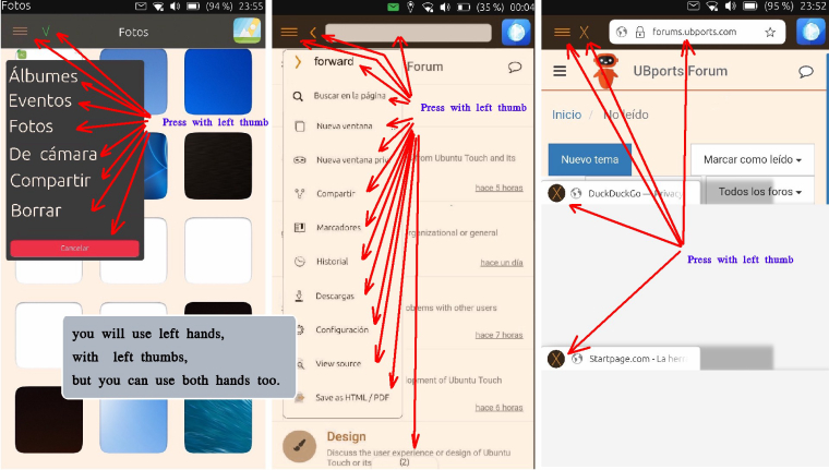
The lesions on the fingers are odious, but although there are action buttons on the left side, does not mean that you use only the left hand, you can continue as now picking up the phone with the left hand and up the right to press, I think it is uncomfortable to use both hands,
for example when you use the browser and want to go to history, bookmarks, etc ... you have to raise the right hand, having the phone held with the left hand sure that backwards you use the left hand, for convenience and speed.
the idea is that from the left hand you use everything, using only one finger,
when you interact with the app such as games, multimedia and the keyboard to type then if you use both hands.
greetings...
-
@dobey you can hold the phone with your right hand if you want, in fact I do that too many times, but when you use the telegram and leave the left bar you will have to raise your left hand too, or when you use the browser to return to the previous page as well,
this idea is fine for both tablets and Unity 8, that screens are larger by resolving to have the icons in the same place as any desktop app,on your desktop you imagine that you had on the left side File, Edit and History and then on the right Bookmarks, Tools and Help
You'd think I'd have to move the mouse around.
Greetings...
-
@josele13 said in App Design Concept:
@dobey you can hold the phone with your right hand if you want, in fact I do that too many times, but when you use the telegram and leave the left bar you will have to raise your left hand too, or when you use the browser to return to the previous page as well,
It really depends on the size of the phone. Pretty much any phone over about 4.5 inch screen, is impossible to use with a single hand, especially as the side bezels are reduced to nothing on newer and larger phones.
this idea is fine for both tablets and Unity 8, that screens are larger by resolving to have the icons in the same place as any desktop app,
How is simply moving something from the right side of a toolbar at the top of the screen, to the left side, and replacing the right side with an icon that does nothing, actually better? What evidence are you using to evaluate the design?
on your desktop you imagine that you had on the left side File, Edit and History and then on the right Bookmarks, Tools and Help
But why are they split this way in the first place? And why do I need them to be there at all?
You'd think I'd have to move the mouse around.
Why? Should we not also design converged applications in a manner to support a reduction in the need for mouse usage?
When I look at your concepts, I don't know what I'm looking at. There's no clear benefit that I can see, no explanation or evidence about how it improves the system for everyone, and seemingly unrelated bits added in. Thought experiments, and design concepts are fine to do, but I think it's best to start by defining the problem we're trying to solve. What exactly is the problem you're proposing to solve with this? Single-handed phone usage? Single-handed usage in left hand only? If we can define the problems exactly, and consider also people who may not fit into that mold, we can design much better software, and solve the problem for a lot more people.
-
@dobey said in App Design Concept:
But why are they split this way in the first place? And why do I need them to be there at all?
That's clear, no one can use a phone with one hand, so I propose that the action buttons are on the left side, if someone wants to use only one hand, it is not mandatory to use the left hand you can use the right hand if you want, there is not a meter distance to change in excess if you use both hands,
the submenus that I have put on the left side, could also be placed in the center of the screen, so that using the right or left hand would not affect you, some app put it to the right and others to the left, I think it does not look good ,
put the icon on the right side is by symmetry in the top bar, if you think it does not look good, it is removed from that position, I particularly like to see it.
greetings...
-
@josele13 Can you please define the exact problems you are looking to solve? I still have no idea what the problem is, only that you have dumped a bunch of screenshots to show something that you personally think is better, for no other reason than you personally think it is better because you can then use only your left hand on your device.
Also, I strongly suggest to try and stop looking at UI/UX design from the "does this look good to me?" point of view, and try to place yourself into the roles of others. For example, some things to consider when designing interfaces:
- People who use Right-to-Left languages
- People who may be unable to use your preferred hand for interacting with the device
- People who may have nervous system conditions that can make interacting with touchscreens more difficult
- People who may have various vision concerns
Most things are not going to be resolved by a general design concept, but still must be considered when creating such designs. Most of these will often need to be solved in app-specific code on a per-app basis.
-
@dobey I think that the concept of being able to do as much as possible with one hand is correct. This does not rule out that it can still use two hands.
It would also be useful to have a "right-handed" or "left-handed" function that speculatively overturns the UI. -
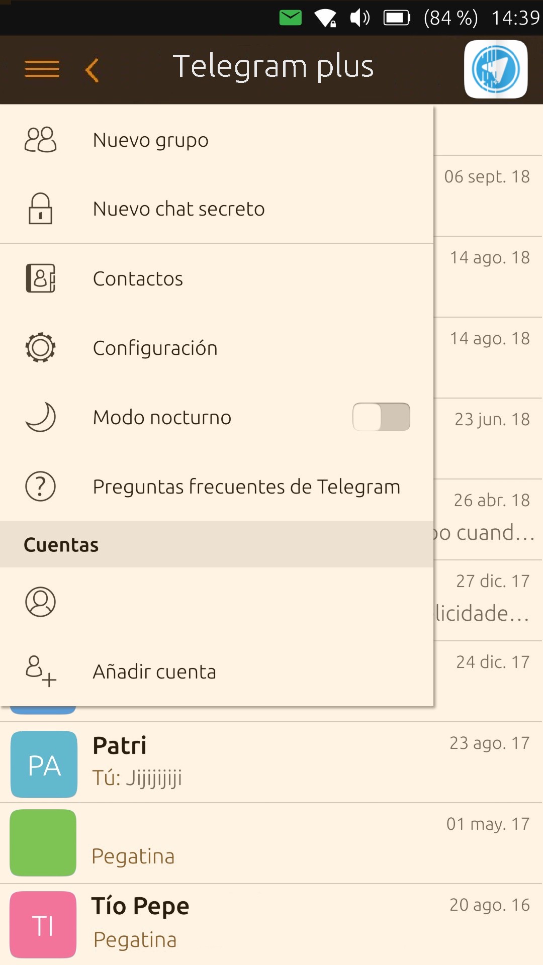
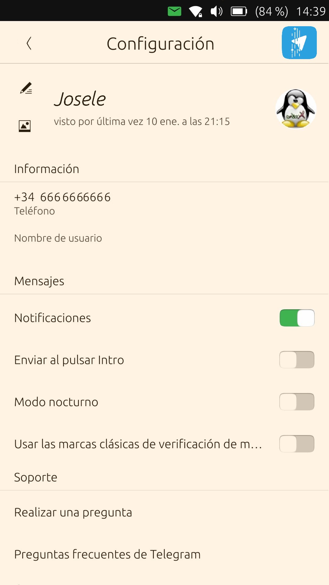
The original idea was to unite everything to one form, that all the apps have the control buttons scattered up, down, left and right without a rule, really looks like the jungle, we are talking about putting order in the Chaos, make a homogeneous operating system, that anyone who does not know Ut see the system clean and nice design, easy to see, easy to use, all submenus equally, but each app with the functions each application needs to work,
in the interaction of each app the developers have to put the buttons as each app needs, a document is not a game, is not the relog, is not a player, is not a browser, is not Telegram, etc ... the interaction uses the whole screen and you will use both hands, although it would be a detail of the developer when you press on the buttons at the top of the app were on the left side.
I offer an alternative to this chaos, but what I say is worthless if the community does not see it well.
Android has the idea of using only one hand with the three lower buttons, and to act easily and get out of the apps, even if it's the basics. My idea is good to use a single hand and a single finger, this does not mean that a right-handed can not use the phone, you should not make a mistake in limitations of use, you can use it too, but use both hands as you are doing so far, even for those who read from right to left can do the same, it is not a drastic change of the system, is to join them to a place of use.
if you like the idea of placing the buttons to the right as Windows, you will use it easily with the right hand, but you will have problems with the left bar of Unity, you no longer arrive with the right hand, for options is better the left hand,
I think it's a good proposal for Ut, but the community has the last word.
Greetings...
Xiaomi Redmi Note 9 pro
Oneplus Nord 100
Xiaomi Redmi Note 7
Nexus 5
Bq E4.5 Ubuntu edition .... is dead -
Hello,
I really agree with all what @dobey says. I never use my thumbs to use my phone and I noticed that most seniors do the same. I don't have the agility and I'm afraid to drop my phone. In addition, I find that restricting the freedom of developers reduces the interest in having a variety of applications. Standardization has advantages as long as it does not become tyrannical. I really do not see the point of this proposal.
Best regards
Pulsar33 -
@josele13 Thank you, now I understand- and I realy like your idea. There is only one thing I would change. I would like to use the app icon

as the menu/action bottom (on the left side of course),

so nobody is pushing on it unnecesarily. -
@josele13 said in App Design Concept:
The original idea was to unite everything to one form, that all the apps have the control buttons scattered up, down, left and right without a rule, really looks like the jungle, we are talking about putting order in the Chaos, make a homogeneous operating system, that anyone who does not know Ut see the system clean and nice design, easy to see, easy to use, all submenus equally, but each app with the functions each application needs to work,
While I'll agree that there some issues with the tabs view of Morph browser, and possibly with some other parts of it, I must disagree that your proposal is a solution to any of these issues, and in fact creates more design problems clearly evidenced in your mock-ups. However, it would be good to document the tab close button inconsistency in a bug report against morph.
I really don't understand the rest of what you said. And frankly, even if all the buttons are on only one side of the screen, they are still not all reachable with only the thumb of the same hand. Holding my Nexus 5 where the bottom edge is resting against my small finger, it is impossible to reach comfortably to the top of the screen, or even where the toolbar is, with the thumb. This is even more true on my HTC 10, which has a wider body and slightly larger screen, with higher resolution. Even on my slightly smaller Nexus 4 with its 4.6" screen, the toolbar is still out of comfortable reach.
So I must say that I am unable to see what problems (which you still have not clearly defined) are supposedly solved by this proposal, though I can see several problems with it, many of which are new. To make the best experience and interface design possible, we must first clearly define the problems that need to be solved.
-
@thilov I imagine that you want to use the icon as a configuration that uses the 3 lines, one more idea, is fine, but you have to propose this change to the community, I put an image ...
greetings...
Hello! It looks like you're interested in this conversation, but you don't have an account yet.
Getting fed up of having to scroll through the same posts each visit? When you register for an account, you'll always come back to exactly where you were before, and choose to be notified of new replies (either via email, or push notification). You'll also be able to save bookmarks and upvote posts to show your appreciation to other community members.
With your input, this post could be even better 💗
Register Login