Icon Library
-
-
@C0n57an71n I like that one. lets hope I'm not the only one
")
-
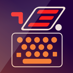
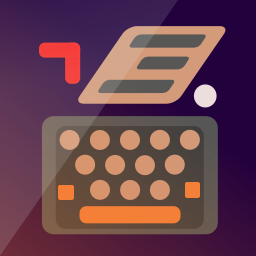
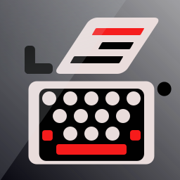
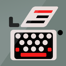
@Lakotaubp The thing is I don't know how visible is the typewriter body on phone resolution. Right now is at 3px.
-
@C0n57an71n
Basically on the phone, there are two sizes.
The one from the launcher and the one from the app drawer.
What I do is change the icon of an existing app in order to check it out.Just replace the file in the app directory.
-
@AppLee Super tipp! Thanks!
")
-
Sorry for the big size, but is just to have a sense how much 3px are.
-
-
-
-
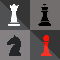
Does anybody has a contact from the Chess (Simple AI) app publisher? His name is Gregor Santner, but I couldn't find his email address. I would like to work with him to change the app icon, in case he wants that -
@C0n57an71n
Really like your creative thinking within the set parameters.If all designers would stick to this lay out, which is more in line with the UT design than many others, would make the apps have a better overall uniformity, it'd make the Open Store a much more 'calmer' and 'easier' place to search the app you need at first glance.
Keep up the good work!
-
@3T_Ed Thanks for the good thoughts! I'm trying to harmonize somehow the icons aspect, without affecting the creativity freedom.
-
@C0n57an71n
You're getting better and better at itYou might want to add tags to your first post of this thread (thinking: #design, #app #development, #icons, #openstore)
-

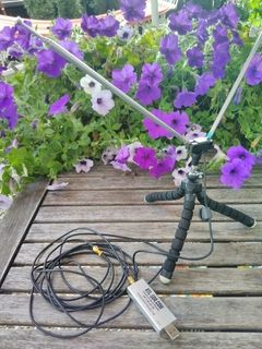
In case somebody wonders how an SDR looks likeApp icon idea for WebSDR App from Dirk Unverzagt. Maybe he can see this and come with suggestions.
-
@C0n57an71n said in Icon Library:
App icon idea for WebSDR App from Dirk Unverzagt. Maybe he can see this and come with suggestions.
Or notify him by email pa3fwm@websdr.org
-

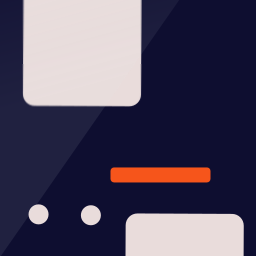
Another App suggestion for WebSDR -
@3T_Ed Thanks! I will send him an email.
-
Icon concept for 5Morsememory App from Dirk Unverzagt.In case someone wonders: this game is about learning Morse code by flipping playing cards. The code in the icon is for "U" in Morse code. And it fills my gap

-
-
Best iteration of the classic typewriter thus far, it does most justice to the original picture.
Just curious, what makes you decide designing app icons for certain app developers? What makes you pick one in particular? Is it random for 'exercise' or is it based on your hobbies?