Improve system settings disk usage analyzer
-
I'm getting lost in this super table sigh, to many thing to show and to many actions the user can perform, and they need to match perfectly each other... But maybe something cool can came out of this
Sorry for making you pulling your hair out by suggesting this.
") As @AppLee said, just gathering ideas. Even if dropping them is all we do with it, it brings us a step further.
As @AppLee said, just gathering ideas. Even if dropping them is all we do with it, it brings us a step further. -
@mymike I like this approach.
Having thought about it, only for cache I see the use of bulk cleaning. That could be done with a button in the header, if needed.
Although the right image does look cleaner, as @CiberSheep already said, I can imagine, that very small portions of data can look like "dirt on the screen" or a graphical fault.
Maybe make the not filled bar's color a tiny bit brighter?
And (don't beat me
 ) do we need the dividers? I think in many places we found, that things look nicer without them.
As for the main action: Which is the main purpose? Managing apps data or uninstalling apps? OR Which is the more "dangerous/intrusive" action? Delete or clear?
I think, I would go for the first one and say managing data is the main purpose, so have the clear button red.Will uninstall prompt the user to clear all data (popup maybe)?
-
@mymike
I agree with ciberSheep, I prefer the one on the right.
And I also agree with danfro that deleting the app is not the prime focus here.I deleting the app can be managed with swipe right and delete.
Expanding the app line gives option to cleanup some data with a single action : cleaning.
Long press to allow bulk modification.The question I have is what would be the best way to choose the action performed in mass ?!
I like the idea of the "sorting" option as an input, but I hear the drawbacks... -
@danfro said in Improve system settings disk usage analyzer:
Maybe make the not filled bar's color a tiny bit brighter?
Yeah, I'll make a test
And (don't beat me
) do we need the dividers? I think in many places we found, that things look nicer without them.Idk, but I'll test this one too :thumbs_up_light_skin_tone:
As for the main action: Which is the main purpose? Managing apps data or uninstalling apps? OR Which is the more "dangerous/intrusive" action? Delete or clear?
I think, I would go for the first one and say managing data is the main purpose, so have the clear button red.Yeah, I think I'll make red the clear button.
Will uninstall prompt the user to clear all data (popup maybe)?
Yes, I already posted it but you may have missed it :winking_face:
-
@AppLee said in Improve system settings disk usage analyzer:
I deleting the app can be managed with swipe right and delete.
Ok, I'll try the swipe and remove the uninstall button
Expanding the app line gives option to cleanup some data with a single action : cleaning.
Well, right now if you select e.g. cache and then press uninstall, the dialog will select "Choose what to delete" instead of the default "Delete all app data" and will check cache from the list in the popup.
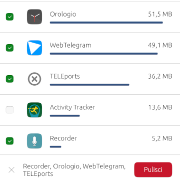
Long press to allow bulk modification.
The question I have is what would be the best way to choose the action performed in mass ?!
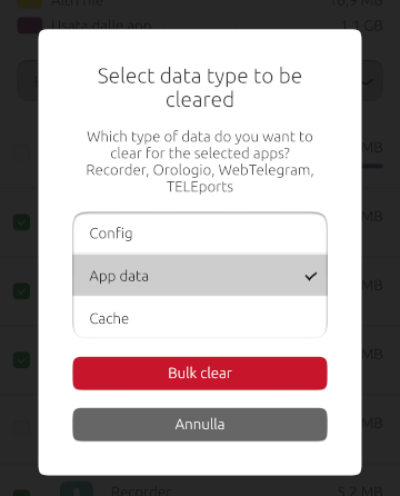
An idea could be to make the user to chose it later: Long press, select the apps, press the "Clean..." button at the bottom and a popup will ask you "What do you want to clean from these apps?" and it will list the apps you have selected with an option selector for cache, config and data.
If we want we can also put an uninstall button (grey) at the bottom when in bulk mode. Or, more hidden as the impact is quite big, put the swipe to right in the list item floating at the bottom...
-
-
So I fixed some other things like update asynchronously the list when uninstalling an app or cleaning some data. I added a pull-to-refresh component too to update the list manually.
It's all in this github branch if someone is interested https://github.com/mymike00/system-settings/tree/xenial_-_better-disk-usage
If someone wants a.debto test these changes, let me know. -
I managed to get things working for bulk cleaning, but the GUI can still be improved. What do you think?
-
@mymike Ouh, it's getting a lot better on every iteration
") good work
good workOff topic: I have a new favorite word: Orologio
-
@CiberSheep said in Improve system settings disk usage analyzer:
@mymike Ouh, it's getting a lot better on every iteration
good workThanks!
Off topic: I have a new favorite word: Orologio
ahahah :face_with_tears_of_joy:
-
So, finally testing this on my phone. Very nice!
A few things to think about:
- we should move storage to a separate point in the main screen (has been said here before I think)
- could the buttons be made wider? Then only the label is going to change. The buttons changing size looks "dizzy".
- I am not sure if we need to paint a "refreshing list" somehow after clearing something. I cleared the cache of one app and it disappeared. Panic. After thinking for a second, sure it moved down the list. But I guess users are always wary when deleting things.
- when multiselecting, I like how the apps are listed at the bottom. But here could we maybe rename the button to "proceed" or so? Then the user does not need to worry about what is going to be deleted but will expect another prompt/choice (that is coming after pressing the button).
- the multiselect dialog could do with a space between the "Which type of data..." and the list of apps. Or maybe place them in brackets? "... selected apps (list of apps)?"
- if nothing is selected in expanded view, tapping on the (disabled) "clear" button does collapse the view. That feels not natural? Maybe do nothing there?
Just some thoughts. Maybe too nutpicking. No real need to change things. More suggestions if others feel the same, then we can think about it.
If I discover more, I will come back. Enjoying it now I am...
-
@danfro said in Improve system settings disk usage analyzer:
So, finally testing this on my phone. Very nice!
A few things to think about:
- we should move storage to a separate point in the main screen (has been said here before I think)
An idea was to put an app icon in the homepage that would open a page with the app list (no bar for the whole storage), and leave the Storage page under About with only the global storage bar and its categories and a button to "Manage Apps". Idk If this could be implemented easily but I think it would be the cleanest thing to do.
- could the buttons be made wider? Then only the label is going to change. The buttons changing size looks "dizzy".
The issue is that with different languages, button gets different sizes so I can't know which length is enough... I can put a hidden button with the wider text and take the width from it, but it seems a bit hackish... What about a small animation when it changes the width? Otherwise the size can be put outside the button...
- I am not sure if we need to paint a "refreshing list" somehow after clearing something. I cleared the cache of one app and it disappeared. Panic. After thinking for a second, sure it moved down the list. But I guess users are always wary when deleting things.
Oh you mean an animation for the listitem going down? I hope it could be done. I am afraid the model is resetting itself completely and so the ListView doesn't know anymore the index of the app before the cleaning... I'll try to make it happen
- when multiselecting, I like how the apps are listed at the bottom. But here could we maybe rename the button to "proceed" or so? Then the user does not need to worry about what is going to be deleted but will expect another prompt/choice (that is coming after pressing the button).
Yeah, I was afraid of that. Initially I put "Clear..." that usually indicates that the action is not immediate but a dialog would open instead, but then the button gets too longer imho and there is fewer space for the app list... An icon could not be very clear but maybe I'm wrong...
- the multiselect dialog could do with a space between the "Which type of data..." and the list of apps. Or maybe place them in brackets? "... selected apps (list of apps)?"
Sure, some space would improve readability
- if nothing is selected in expanded view, tapping on the (disabled) "clear" button does collapse the view. That feels not natural? Maybe do nothing there?
Ah ofc. Since the button is disabled the tap event is propagated to the ListItem which then collapses... I can put a MouseArea over the button that, when the button is disabled, stops the event from propagating to the ListItem
Just some thoughts. Maybe too nutpicking. No real need to change things. More suggestions if others feel the same, then we can think about it.
No, I'm very pleased to hear such detailed suggestions! Since the core functionality are there, now it's time to do this little graphic improvements :winking_face:
If I discover more, I will come back. Enjoying it now I am...
Great! Next time if you tag me in the message I'll get notified and reply you sooner :thumbs_up_light_skin_tone:
-
An idea was to put an app icon in the homepage that would open a page with the app list (no bar for the whole storage), and leave the Storage page under About with only the global storage bar and its categories and a button to "Manage Apps". Idk If this could be implemented easily but I think it would be the cleanest thing to do.
Sounds good to me. App management in main screen. Storage info where it used to be.

The issue is that with different languages, button gets different sizes so I can't know which length is enough... I can put a hidden button with the wider text and take the width from it, but it seems a bit hackish... What about a small animation when it changes the width? Otherwise the size can be put outside the button...
Buttons only adjust the width to the text if no width is set, right? So if we set a nice and wide width and add an elide to the label that should do it.
Another idea: place the "clear" button to the left and the "uninstall" button on the very right. Because the user ticks the boxes at the left hand side, it seems appropriate to have the clear button on that side. Uninstall stays right. This way increasing the clear buttons width by adding more text to it will not move the uninstall button around. That reduces the movement of elements.
Another option would be to NOT display the clearage size in the button. The numbers are there for the user to sum it up. The sum could be easier displayed in the next step because the dialog has got more space available. This way the clear button would keep its fixed width.
Btw. I like how the uninstall button changes its content from uninstall -> uninstall & clear. Definitely keep that!
- I am not sure if we need to paint a "refreshing list" somehow after clearing something. I cleared the cache of one app and it disappeared. Panic. After thinking for a second, sure it moved down the list. But I guess users are always wary when deleting things.
Oh you mean an animation for the listitem going down? I hope it could be done. I am afraid the model is resetting itself completely and so the ListView doesn't know anymore the index of the app before the cleaning... I'll try to make it happen
If an animation can not (easily) be done [check messaging app when deleting chats as example], maybe put a rectangle over the whole list [z=1] with a spinner and a label saying "refreshing list" or "updating list". Use a timer to give that a second or so. And then redisplay the list. Maybe the label isn't even needed.
Yeah, I was afraid of that. Initially I put "Clear..." that usually indicates that the action is not immediate but a dialog would open instead, but then the button gets too longer imho and there is fewer space for the app list... An icon could not be very clear but maybe I'm wrong...
Maybe we should not worry about that too much. After using it the first time, users will know about the second confirmation dialog. And I get the feeling, we will only be failsafe here, with an explanatory label above. But that would just not look nice. In the end most places for (batch) clearing things provide such a dialog.
Ah ofc. Since the button is disabled the tap event is propagated to the ListItem which then collapses... I can put a MouseArea over the button that, when the button is disabled, stops the event from propagating to the ListItem,
Great! Next time if you tag me in the message I'll get notified and reply you sooner :thumbs_up_light_skin_tone:
@mymike No worries. But pinging you right now.
Just for perfection, if a value is zero, maybe set the checkbox to disabled because there is nothing there to clear?
And I know we had this discussion, but if a size is zero (or close to zero), because there is no bar visible at all, the label looks misaligned in relation to the checkbox. But not adding that space will mess up the whole layout and make it irregular. Maybe we will just have to get along with that. It does look great all in all the way it is. So...
- I am not sure if we need to paint a "refreshing list" somehow after clearing something. I cleared the cache of one app and it disappeared. Panic. After thinking for a second, sure it moved down the list.
-
Wow so many replies
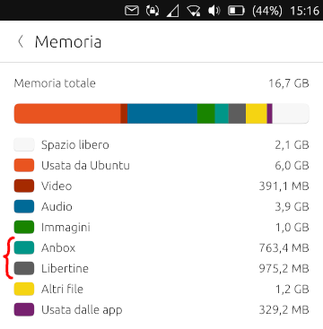
I love that improvement. Just to make sure we are also not only making a better UI but to also get a few numbers right here that probably were wrong since ever, and where people always complain they dont understand the huge amount of "used by Ubuntu" files:
- First it should read "Used by Ubuntu Touch"
Then, this is a bit complicated category:
- Some space is just wasted by the partition layout
- Some space is unused, even if it would be designated for the system, but its too small of a partition
- Then you have the real system files
- Some devices need to repurpose a part of data for their cache, since otherwise they cannot update properly.
So the breakdown for any device could be calculated as follows:
- Total space: 32GB
- "Reserved space" new category: Total Space - size of userdata partition, lets say 27GB remain
- "Used by Ubuntu Touch" the file /data/ubuntu.img if it exists plus the size of the /data/cache folder - lets say its 3.4GB
- In this case, the user has still 23.6GB space to be allocated with Apps and data.
Rest remains the same I think. On some devices ubuntu.img will not be there because their system partition is large enough to host that file. But, unfortunately, on some devices system partition is lets say only 2.5GB, too small, and it cannot be used. That space is kinda wasted then.
-
@flohack said in Improve system settings disk usage analyzer:
- First it should read "Used by Ubuntu Touch"
Oh yeah, of course! How did we missed that one :grinning_face_with_sweat: ?
- "Reserved space" new category: Total Space - size of userdata partition, lets say 27GB remain
I think then people will start asking what is it reserved for... To be honest I don't like this naming that much but if you think it suits the category I'll go for it. Maybe I can put a little
 icon that opens a little popup that explains the partition thing
- "Used by Ubuntu Touch" the file /data/ubuntu.img if it exists plus the size of the /data/cache folder - lets say its 3.4GB
I'll need to sort out how to do
Rest remains the same I think. On some devices ubuntu.img will not be there because their system partition is large enough to host that file. But, unfortunately, on some devices system partition is lets say only 2.5GB, too small, and it cannot be used. That space is kinda wasted then.
How this should be handled then?
Thank you for your inputs on this Flo

-
"Resevered for System Usage" ?
-
"Wasted due to former OS"
-
I think we should be very clear about what size is consumed by our installation, and whats just reserved by Android partitioning. You know we get the bad press "UT consumes 8GB space for nothing" when in fact its much less. We want to be as transparent as possible.
I dont think people will be confused by that, you could also call it "Reserved Android partitions" maybe. BUt make clear how much space the actual installation takes up.
-
Hello! I liked this designs very much. Is there any news?
-
D domubpkm referenced this topic on
-
Wow, what a usefull work you did @mymike !
How can i missed this thread...I will just up it with link to one of your post : https://forums.ubports.com/post/57940
 Sorry.
Hello! It looks like you're interested in this conversation, but you don't have an account yet.
Getting fed up of having to scroll through the same posts each visit? When you register for an account, you'll always come back to exactly where you were before, and choose to be notified of new replies (either via email, or push notification). You'll also be able to save bookmarks and upvote posts to show your appreciation to other community members.
With your input, this post could be even better 💗
Register Login