Improve system settings disk usage analyzer
-
I was looking to improve the disk usage analyzer page in system settings as, other than for the apps, it doesn't give a detailed view of your phone's disk status.
Especially, I don't like the "Other files" section because that's too generic and a user might not understand what it stands for (I discovered today that it refers only to files inside user home directory that are not in another category) so my general goal is to spli that category into more detailed ones.
Initially I thought to add "anbox" and "libertine" as new categories, because I don't like them grouped under "other files", and that's already a handy improvement.
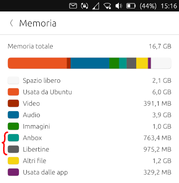
DocumentsandDownloadsfolder are included under "Other files", I'd split them too into dedicated categories..cache,.configand.localfolders are also included under "other files". I'm not sure if it makes sense to have a dedicated category for each of them, maybe it makes more sense to group them under "Used by apps". Also it'd be cool to say for each app sizes of cache, data and config (in addition to instilled size) and let you clean them like in UTTT (with proper warning dialogs to confirm).It'd be cool also a button to Manage each category, but idk how this could be properly implemented: libertine will open libertine settings, but others? Opening the file manager at a specific location won't improve it much imho... Other that that, opening music app or docviewer is a chance too but those apps don't have a dedicated UI to manage disk space. OK you can sort files in docviewer by size, but you can have files under
Documentswhich aren't in docviewer list... So I'll leave this out for the moment, if someone else doesn't have a better idea. -
@mymike Thank you for your work. In terms of storage, what I would like to find somewhere, because I don't think this information is directly accessible and viewable (maybe i'm wrong), is the total space, the free space and the used space of the memory card. I miss that!
-
@domubpkm In the code I'm seeing some stuff related to external storage so maybe that's not too much work for it. I'll have a look. Thanks for your feedback!
-
So this afternoon i managed to move
.cache,.configand.local/sharefolders under "used by apps" from "other files" (minus.cache/libertine-containerof course)
And got a working backend to get cache, config and data sizes for each app (the UI needs improvements, I know
") I'm open for suggestion on how should I display those values)
I'm open for suggestion on how should I display those values)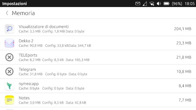
-
@mymike
Actually I think it's not that bad I can live with that.To make a small contribution I'd say that "Config" should go first because that's the smallest value you should get. Then I'd put the "Cache" because that can be cleared if needed and kept low.
And finally "Data" because that should be something you want to hold longer and it could also indicate a need for sorting the data to make more space.If you add some spacer between those values so they display in consistent columns that will be fine.
At first it was strange that the bigger value is not the total size, but it made quickly sense that it is the actual app size.
Thanks for this, that something I truly appreciate because I had the same idea, but never did something about it.
Thank you very much. -
I agree with @AppLee I think that the app size should be added next to the other values and that the value on the right should be the aum of the four.
-
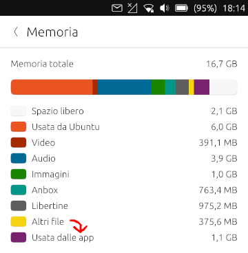
I added Documents and Downloads folder as indipendent categories. Now "other files" has been reduced quite much...
What do you think about displaying a bar for each app, instead of numbers? And the number displaying the total space used by the app. I am a bit afraid of the performance cost here...
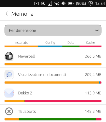
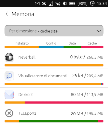
I was planning to add new ordering options, one for each size value available (so cache, config, data, installed size and total). When ordering by a size value that is not the total (e.g. by cache) I can display the size of the cache right before the total value, like in the mockup down here
-
@mymike said in Improve system settings disk usage analyzer:
What do you think about displaying a bar for each app, instead of numbers?
Why not do both? And you could switch between the views.
-
Why not do both? And you could switch between the views.
Do you have a cool idea on how to switch between the views?
-
@mymike said in Improve system settings disk usage analyzer:
Do you have a cool idea on how to switch between the views?
Hmm... I dunno what cool is, but here are few ideas:
- Switching through the select box (with "Per dimensione" text). One of the options would be the default "Per folder" view.
- Tabs/icons like in Contacts/Clock app
- Hide the switch folder/app in settings
- small switch icon in top right (like radar view in weather app)
Edit: Maybe someone has more cool ideas for switching, or maybe switching is overkill and only one view is better? (I personal always prefer more choices to choose from)
")
jEzEk
-
The bars do look good but I can't think of use cases on why you want to see the breakdown like that. But if you think it make sense I think it's fine and perhaps instead of two views, the user can just tap and item to see a breakdown with numbers.
-
or maybe switching is overkill and only one view is better?
Yeah, I think that one view is enough. I'd try to keep the UI as cleaner as possible and the UX as simpler as possible. What to show there still needs to be decided: bars? numbers? both? something else?
-
The bars do look good but I can't think of use cases on why you want to see the breakdown like that.
Well, it is a nice way to show what takes space in each app: you see immediately that dekko takes a huge space in cache while teleports stores a lot of data.
If you guys think that it doesn't make much sense, it' ok for me to remove it, but imho it is much more direct than those 4 numbers written down...
But if you think it make sense I think it's fine and perhaps instead of two views, the user can just tap and item to see a breakdown with numbers.
Yeah, I was thinking that the user can tap on each app to open a popup where he can choose to delete some of those folders, like in UTTT. And there we can show exact sizes for each folder. We can eventually add a link to open the file manager in the folder the users choose, like "I don't want to delete all the cache, but I'd like to see what's there, maybe something can be deleted manually"
-
Another idea for bars is that they don't takes up all the width, but they're proportional, so that
xpixels on the screen will correspond toybytes in every app. The first app by size will have a bar that is 100% wide, and if an app uses half the space of the first one it's bar will be 50% wide.This way you see immediately how much an app impacts your memory space, other that seeing for each app what takes up more memory: if the app itself, the cache or whatever...
screenshot coming soon

-
@mymike
IMHO, the numbers have more value.
But you sold me the bar too. Maybe you can put the text on top of the color bar but I'm not sure it will be easy to read though.
Another option is to keep a smaller bar on top or at the bottom of the numbers.One screen is fine and make more sense IMHO.
Different sorting options can be very useful ; the drop down menu is simple to use and does not take too much space, so I like it this way.Edit: The idea of a fixed number of pixel/byte seems to me not really intuitive and it could lead to problems with larger sizes or being hard to read for small values.
I prefer the ratio cache, config, app and data over total app size. -
IMHO, the numbers have more value.
But you sold me the bar too.Well, yeah, of course numbers have more value and we should put them somewhere but I don't think the list is where they fit best...
Maybe you can put the text on top of the color bar but I'm not sure it will be easy to read though.
Well, if we use dark colors for the bar and white text they should be readable quite well... I already tried this for the header/legend but it stretches the text with the current implementation

Another option is to keep a smaller bar on top or at the bottom of the numbers.
Yeah, can be an option. It will require some time to align properly the labels on top of the bars: I'd align each label with the center of the corresponding colored rectangle, but I'd need to deal edge cases like when 2 rectangles one next to the other are really small...
Different sorting options can be very useful ; the drop down menu is simple to use and does not take too much space, so I like it this way.
Next thing on my todo list
Edit: The idea of a fixed number of pixel/byte seems to me not really intuitive and it could lead to problems with larger sizes or being hard to read for small values.
I prefer the ratio cache, config, app and data over total app size.The graphic effects is really cool, but yes there are some issues when app sizes get too different...
One thing I thought (but could be another overkill) is the chance to sort of "hide" some of the biggest apps so that the proportion for the bars is calculated against an app that has a more "normal" value. Like don't consider neverball and doc viewer and use as 'the biggest' app teleports or dekko, or an even smaller app like nymea.
This could be helpful if you're analyzing the space and you want to keep those big apps but you can't clean space with them because it's all installation size or because you already cleaned space from them and you can't clean space anymore, and you want then to analyze smaller apps with a readable bar, not with a bar that's taking few pixels on the screen... -
@mymike said in Improve system settings disk usage analyzer:
One thing I thought (but could be another overkill)
 Better is the ennemy of good
 It will require some time to align properly the labels on top of the bars
According to me there is no need to align, it will cause more trouble than it will help.
Just keep the same order and it will be fine.For your streching problem, just use the color bar as a background like for a simple button (you can find simple examples in beginners tutorial for QML).
If you have your code available somewhere, you can share it and I can have a look.Thanks again for the good work.
-
According to me there is no need to align, it will cause more trouble than it will help.
Just keep the same order and it will be fine.Yeah, it'll be enough.
For your streching problem, just use the color bar as a background like for a simple button (you can find simple examples in beginners tutorial for QML).
The issue is that I wanted to align the labels but the whole bar is took from a ShaderEffectSource to put it inside a
UbuntuShape... If we decided to not align the labels, then I think putting them iside the bar isn't an option anymore because then the cache label can be found over the data rectangle...If you have your code available somewhere, you can share it and I can have a look.
The source code is at github.com/mymike00/system-settings/tree/xenial_-_better-disk-usage
Thanks again for the good work.
It's a pleasure improving Ubuntu Touch for me
-
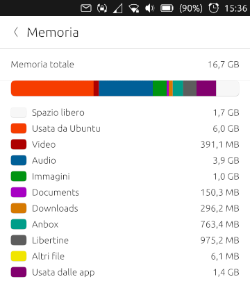
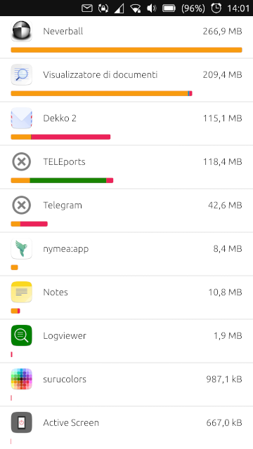
I added more sorting options
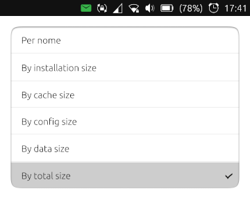
The value on the right of the app now reflects the order chosen: order by cache will display the cache size.
Here I'm a bit unsure about bars... Should I show them normally? This doesn't feel good as down the list apps can have a wider installed size bar than the upper ones
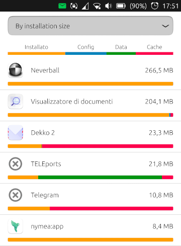
Should I show only the value chosen, with the proportion to the first app in that order? That'd way better! Should I just hide them? Maybe they doesn't add a significant value... -
@mymike Hi, great work,
I like the bars, but they look a bit too colored in the UT UI, maybe we should display just one bar at time.I have a prototype at:
https://www.figma.com/file/JuuTo9riDeza5zAl0VXLxl/Memory-management?node-id=491%3A1
Hello! It looks like you're interested in this conversation, but you don't have an account yet.
Getting fed up of having to scroll through the same posts each visit? When you register for an account, you'll always come back to exactly where you were before, and choose to be notified of new replies (either via email, or push notification). You'll also be able to save bookmarks and upvote posts to show your appreciation to other community members.
With your input, this post could be even better 💗
Register Login