Login screen/Code input Design
-
@aarontheissueguy said in Login screen/Code input Design:
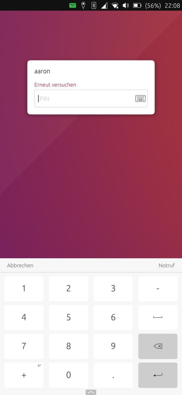
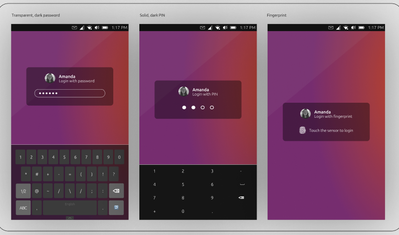
@purplevvay Still looks great though, @CiberSheep and @AppLee mentioned a a few valid points on why the current login is used and what should be kept in mind when thinking about a redesign. Do you guys think that something like the above design might be an option for UT?
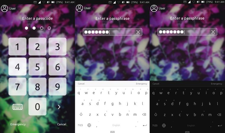
Maybe a user button could be positioned like this
-
I'm sorry if I missed something, but I've never heard that creating more than one user is possible in UT.

Maybe a user button could be positioned like this
That looks very good! But I think you should put the user in the same distance from left as the pin keyboard (1st picture).
Also I think for the last 2 images the user profile picture should be above the password bar and in centered horizontally. The name should be in the middle horizontally too and below the profile picture.
(just my opinion
 )
) -
I think you should put the user in the same distance from left as the pin keyboard (1st picture).
Well, I have tried to do that and it didn't look good,
So I think the user icon should be centered everywhere:
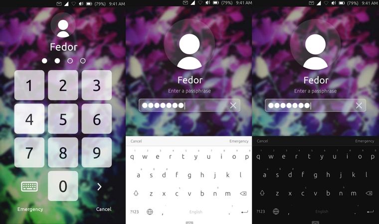
-
@purplevvay
This is not a mockup?If it is an actual tweaking of yours, you could propose to merge it on the uTouch git ^^
Maybe on second and third image, you could reduce size of user so it's the same as on the first one.
-
@keneda No, it's a mockup. Ok I'll make it same.
-
@purplevvay Can you turn this into reality yourself? I have some QML knowledge, but I doubt it would be good enough for this task (I can try though). It would be great if we could find a person who can make this real.
I would love to give whoever makes this real a gift card as a small thank you in return, even if it doesn't get merged into master in the end.
-
@purplevvay This looks great!
-
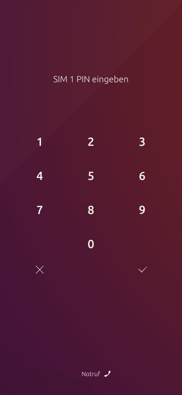
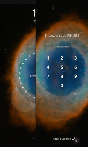
If I may add, the sim unlock screen is actually the old design of the lock screen

As already mentioned, the current design is better for convergence and it's easier to use as well since the keypad is at the bottom. I do agree that it could be improved though in terms of "eye-candy" so any good looking designs without sacrificing usability are welcome and greatly appreciated
-
@aarontheissueguy I feel so bad... Unfortunately I don't have any ideas how to do that.

But I'll keep learning new stuff...This looks great!
Thank you!
If I may add, the sim unlock screen is actually the old design of the lock screen
I think so.
As already mentioned, the current design is better for convergence and it's easier to use as well since the keypad is at the bottom.
I guess editing the passphrase bar is enough to get the same look the mockup has. The only one problem is the blur.
-
@kugiigi said in Login screen/Code input Design:
If I may add, the sim unlock screen is actually the old design of the lock screen
And its design depends on the grid size set for the device ^^
-
Hi, I've made some designs previously for the ICE topic and I've added some also for the login screen. Let me know what do you think. The image is too big to upload so I'll share the direct link

https://www.figma.com/file/qmsxA1Ep7YPxAXHX9ELkcc/ICE-LockScreen-Design?node-id=491%3A1
-
@capsia I think thats definitely a big upgrade, while not being to far away from the original. I need some context though, what is the ICE topic?
-
@aarontheissueguy The ICE is the In Case of Emergency button, you can find more about it in the original discussion: https://forums.ubports.com/topic/4551/privileged-ice-contacts-and-medical-information-available-on-lockscreen-work-in-progress
-
@capsia
Your mockup https://forums.ubports.com/topic/4551/privileged-ice-contacts-and-medical-information-available-on-lockscreen-work-in-progress/147?_=1618350476833 was very promising indeed. -
@purplevvay Ive started working on a dummy for such a design in QML it will be done tomorrow. With the dummy we will be able to feel it in our hands and adjust things before someone actually starts making something.
-
@capsia said in Login screen/Code input Design:
Hi, I've made some designs previously for the ICE topic and I've added some also for the login screen. Let me know what do you think. The image is too big to upload so I'll share the direct link
https://www.figma.com/file/qmsxA1Ep7YPxAXHX9ELkcc/ICE-LockScreen-Design?node-id=491%3A1WOW! This is really good!
Would be really cool having that in later updates!@aarontheissueguy said in Login screen/Code input Design:
Ive started working on a dummy for such a design in QML it will be done tomorrow. With the dummy we will be able to feel it in our hands and adjust things before someone actually starts making something
Okay. Will be glad to know how is that going. Best of luck!
-
I think we can improve just by removing the background behind the keyboard and allowing the password box to theme, maybe transparancy on that a bit.
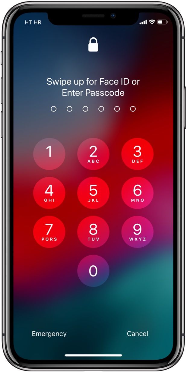
I disagree with going back to the fullscreen dialer:- harder to type with one hand
- too much like 'other os', we want to be diffrent, but also consistant and more usable, making things look like another os just for familiarity is not good
- showing password length isnt good for security (true we only have 4pin right now, but hopefully will change)
Current notes:
- matches system keyboard
- nice to type with one hand
- needs transparancy( i have wip pull request)
- needs theme and removal of hardcoded background color
- do we need 'cancel', user can back out other ways
- theme 'emergancy' in a better way, bottom bar buttons are an artifact from old designs, word buttkns could be better as icons
-
@mateo_salta I think if we can achieve all of the things you described that would already improve things a lot can you send a link to the code of your pr? I would be interested in taking a look at it. I decided to make a dummy for the other design anyway, You might want to take a look at it.
-
@purplevvay
Here is a link to a click dummy i made, I will add the keyboard functionality in the next days. Some proportions may be different and it would be great if you could send me the assets you used to design this. -
Sorry for the long delay.
@mateo_salta said in Login screen/Code input Design:
I think we can improve just by removing the background behind the keyboard and allowing the password box to theme, maybe transparancy on that a bit.
I disagree with going back to the fullscreen dialer:- harder to type with one hand
- too much like 'other os', we want to be diffrent, but also consistant and more usable, making things look like another os just for familiarity is not good
- showing password length isnt good for security (true we only have 4pin right now, but hopefully will change)
Current notes:
- matches system keyboard
- nice to type with one hand
- needs transparancy( i have wip pull request)
- needs theme and removal of hardcoded background color
- do we need 'cancel', user can back out other ways
- theme 'emergancy' in a better way, bottom bar buttons are an artifact from old designs, word buttkns could be better as icons
That's true. I'm trying to create a new mockup based on what you have said.
@aarontheissueguy said in Login screen/Code input Design:
@purplevvay
Here is a link to a click dummy i made, I will add the keyboard functionality in the next days. Some proportions may be different and it would be great if you could send me the assets you used to design this.Great job!!!
Hello! It looks like you're interested in this conversation, but you don't have an account yet.
Getting fed up of having to scroll through the same posts each visit? When you register for an account, you'll always come back to exactly where you were before, and choose to be notified of new replies (either via email, or push notification). You'll also be able to save bookmarks and upvote posts to show your appreciation to other community members.
With your input, this post could be even better 💗
Register Login