Busy, crowded app overview; Can Ubuntu Touch be converted to an iPhone interface?
-
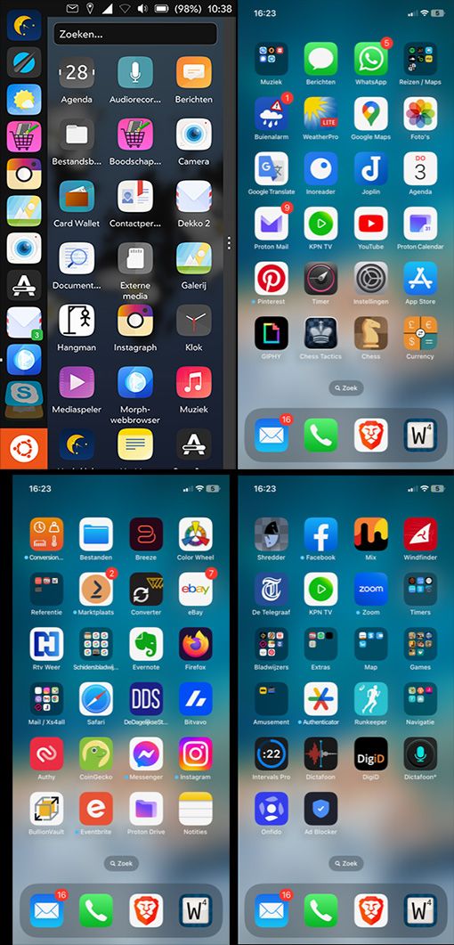
Why the iPhone interface seems calmer is; There are 7 horizontal rows of apps, and 4 vertical rows of apps. There is rhythm in it for me, which I experience as comfortable. Graphic designers then speak of 'It aligns'.
As a graphic designer, I am used to looking at why one print design is successful. And the others don't.
With Ubuntu Touch, the rhythm is disturbed by the dock on the left; The apps are - viewed horizontally - not in one row with the apps to the right.Of course designing for printed matter is a completely different discipline. But just look at the design of newspapers and magazines. And see how you can draw invisible - but certainly connecting - lines along photos and text columns. As a result, our eyes are guided through the page in a calm way. And certainly with a newspaper page that offers a lot of information, that rest in the design, that reading comfort, is important.
There are also exceptions to this rule in graphic design. But that is often on newspaper-, magazine-pages, or other printed matter, where less information is presented. But now I digress. :winking_face: -
@Cycle-Maniac
Maybe you could fill an ehancement issue on lomiri gitlab to ask for the app launcher to hide when app drawer is pulled ?Feature wich i think would be a good ehancement, no need twice the same apps on screen like it can be the case now.
@kugiigi
No, bottom dock in addition to the launcher is not necessary i think.
At least not if it is not optional, like launcher or dock or twice in settings. -
I do think Lomiri has a symmetry problem mainly because of the left Launcher. And that's more emphasized on smaller or portrait screens like phones compared to desktops. I myself has been thinking of how to improve that
 . One of the things I thought is to hide the Launcher when the Drawer is shown. And maybe transition them to like a bottom dock? I think this quite difficult to solve and I'm not really good with designs and art
Given that you're a graphic designer, maybe you help on this regard and propose a design?

-
@kugiigi: No, the dock at the bottom wouldn't make a difference.
@CiberSheep: I now understand that the app drawer is the app overview. And so it only appears when I request it via the dock. But when it appears, the app drawer appears, the apps of which do not always line up nicely with the dock icons.
I am definitely not an Apple fanboy. But as nice and intuitive as iOS (and macOS) work; It really is unbeatable.
I agree with CiberSheep that you should not copy another OS. Still I hope that there will be UT fork (like Linux MInt does) with iOS look and feel.What I like so much about my iPhone; The apps I use the most are on the first app page; Apps that I use less often I put together in a shared folder; And I put the apps that I use once every six months on the next page (one swipe, and I'm there).
Further:
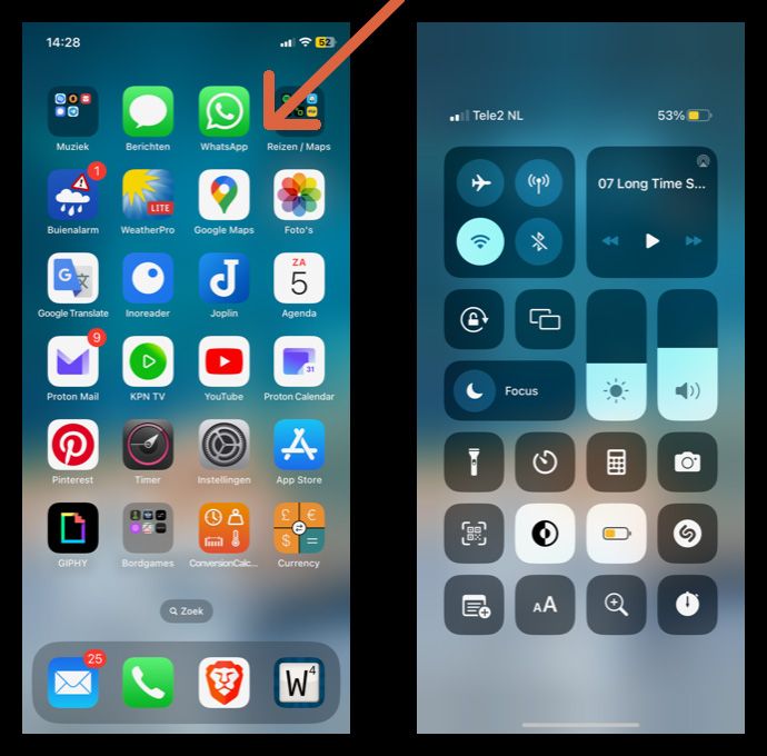
Everyone knows the horizontal and vertical swipe movements, to screens with settings. iOS also has a diagonal swipe (see the orange arrow in the image below) to a screen with settings for airplane mode, wifi, timer, stopwatch, calculator, camera, sound volume, and more.
If I want to change settings deeper in iOS, I have to do that via 'Settings' (the gray gear). I would say; That can also be subsumed under a diagonal swipe from the top left. But that was not chosen.
And so there is also an app 'files' on iOS; Why not put that under a diagonal swipe from the bottom left?
.
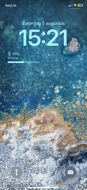
... and if I want to see an empty screen, with or without artwork; I put my iphone to sleep, and I start it up again; Then I get that blank screen (with time, date, battery status):
-
@Cycle-Maniac
Ubuntu Touch would not benefits a fork, there is so few dev power that splitting effort would be a loss for us, users.For now, the goal is to have a full working 20.04 UT.
And then maybe some work will be done to the UI.
Some is already done for example the app Ubuntu Touch tweak tool gives user lot of options that are not in the OS settings, like scalling or touch edge settings, but in the last UT updates, some of those settings are now included in core setting app (edge setting for instance).
UT UI in the canonical era was way different from now, but when ubports took the flag, they made choices to focus on the most important.
Homescreen(s) and UI is an old and long topic here, do some research you'll see that it's not trivial for anyone.
That's why, in the meantime of waiting for something official done to the core OS UI homescreen(s), some work was done by community dev, like Home or Launcher Modular (this one seems to be dead as I just checked can no longer be found on openstore).
For now, you'll have to deal with the actual UI.
I don't know if you're a dev yourself, but if you are, and want to involve further into UT, I'm sure ubports dev team will be glad to have someone willing to improve UT UI.
-
@Cycle-Maniac said in Busy, crowded app overview; Can Ubuntu Touch be converted to an iPhone interface?:
I am definitely not an Apple fanboy. But as nice and intuitive as iOS (and macOS) work; It really is unbeatable.
Sorry to disagree, but I think you've mistaken intuitive and "used to". :beaming_face_with_smiling_eyes:
Because never in a thousand years would I have figured about a diagonal draw...UI design of a smartphone is not just about "graphical design", you also have to deal with technical constraints (that can be overcome with time and money) and mostly subjectivity.
Everyone is different and everyone find great things in both iOS and Android, but no one has not a complaint and wish something was different or more like X or Y.Having the drawer less crowded means less apps visible at a glance hence scrolling or typing action.
I thin @kugiigi is right about masking the launcher when the drawer is expended but the transition might be weird...
I thing if the drawer had the same spacing between icons you might feel it is a bit more calming and pleasing (I feel it could be an answer to your issue) but many will probably say that before they had all their favorite apps right there and now they have to scroll...So really not a simple question.
If you come up with a mockup and if someone is willing to try and implement it, I guess we can have a poll and decide to mainstream it or make it available to tweak this out. -
@AppLee said in Busy, crowded app overview; Can Ubuntu Touch be converted to an iPhone interface?:
but many will probably say that before they had all their favorite apps right there and now they have to scroll...
This, and also that even is the spacing were the same, the icons would not always align because the icons in the drawer can be scrolled. Also the (icons in the) Dash can be sized independently from the (icons in the) Drawer ...
-
-
@AppLee @arubislander do you know why Launcher Modular is no longer in the store ?
-
@Keneda
Sorry, no idea.
Are you on Focal? Or did it disappear from xenial?
Maybe the maintainer removed it? ... Just speculation, I have no clue nor insight. -
@Keneda If it is not listed in the Open-Store at all, then it must have been delisted by the maintainer. The reasons for which I could only speculate about, so I won't.
-
@AppLee xenial
I don't find it but recently there were a thread here from the maintener for a new app icon. -
I just want to add; I transferred a donation.
I think my next phone has Ubuntu Touch. :heart_suit: -
Thank you for the donation.
That is highly appreciated. -
@AppLee said in Busy, crowded app overview; Can Ubuntu Touch be converted to an iPhone interface?:
@Cycle-Maniac said in Busy, crowded app overview; Can Ubuntu Touch be converted to an iPhone interface?:
I am definitely not an Apple fanboy. But as nice and intuitive as iOS (and macOS) work; It really is unbeatable.
Sorry to disagree, but I think you've mistaken intuitive and "used to". :beaming_face_with_smiling_eyes:
Because never in a thousand years would I have figured about a diagonal draw...UI design of a smartphone is not just about "graphical design", you also have to deal with technical constraints (that can be overcome with time and money) and mostly subjectivity.
Everyone is different and everyone find great things in both iOS and Android, but no one has not a complaint and wish something was different or more like X or Y.Having the drawer less crowded means less apps visible at a glance hence scrolling or typing action.
I thin @kugiigi is right about masking the launcher when the drawer is expended but the transition might be weird...
I thing if the drawer had the same spacing between icons you might feel it is a bit more calming and pleasing (I feel it could be an answer to your issue) but many will probably say that before they had all their favorite apps right there and now they have to scroll...So really not a simple question.
If you come up with a mockup and if someone is willing to try and implement it, I guess we can have a poll and decide to mainstream it or make it available to tweak this out.Exactly! I love intuitive designs too and I too am a normal user (and 31 years old, so not an old geezer!), but iOS is not intuitive for me (and Android is even worse). Ubuntu Touch is way more intuitive to me, including the app drawer. I love the app drawer and launcher so much as they currently are, so please don't change that! Or if it's changed, at least provide an option to keep the current workflow for people like me.
Hello! It looks like you're interested in this conversation, but you don't have an account yet.
Getting fed up of having to scroll through the same posts each visit? When you register for an account, you'll always come back to exactly where you were before, and choose to be notified of new replies (either via email, or push notification). You'll also be able to save bookmarks and upvote posts to show your appreciation to other community members.
With your input, this post could be even better 💗
Register Login

