UBports Robot Logo UBports Forum
    • Categories
    • Recent
    • Tags
    • Popular
    • Users
    • Groups
    • Search
    • Register
    • Login
    1. Home
    2. gb
    3. Best
    Offline
    • Profile
    • Following 0
    • Followers 0
    • Topics 3
    • Posts 9
    • Groups 0

    Posts

    Recent Best Controversial
    • UI / UX discussion

      Hi,

      I would like to add my 2 cents to try to improve user interface and user experience (ui/ux) in Ubports and would be very greatful if you could give your impresions about my propposal and add your ideas about the topic.
      I haven't seen much discussion in the forum about overall ui/ux. There has been for sure at Canonical and the UX & Graphics telegram group.

      Looking at how we interact with the system there are the following gestures/actions:

      • Drag (left to right) displays the app launcher.
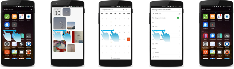
      • Drag (right to left from edge of the phone not passing the middle of the screen, we will call it "short.drag") changes to the last app in focus.
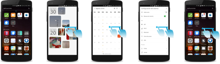
      • Drag (right to left from edge passing the middle of the screen. from now on "long-drag") displays the app-switcher.
      • Drag (top downwards) displays icon menus.
      • Drag (buttom upwards) displays scopes or an application specific panel.

      I see the following possible improvements (I made some mockups to illustrate it and help understanding it):

      1. App-switcher.

      0_1535385777156_app.jpg

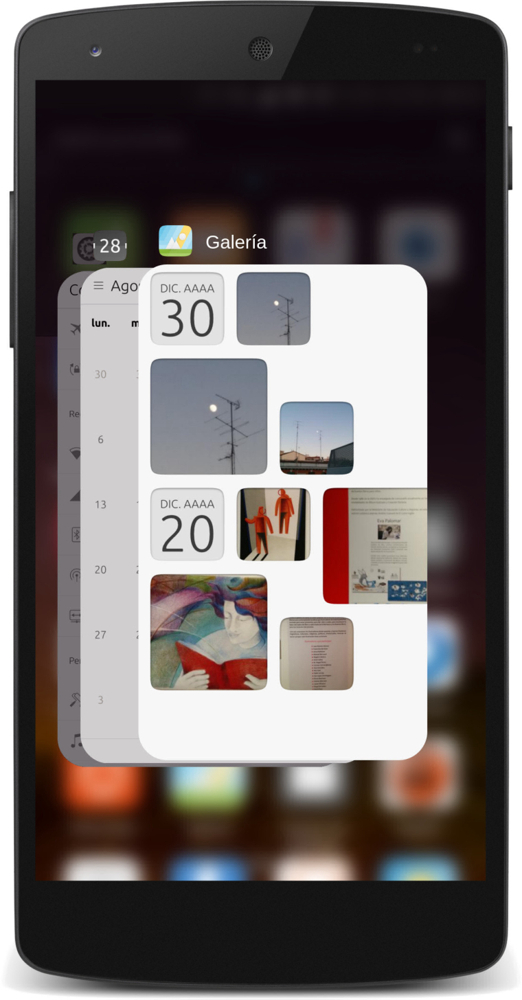
      • The last app viewed should be the first of the pile.
      • App windows in the pile should be flat (app borders parallel to the screen borders).
      • con / (Name) on top of the app window.
      • Home scope shouldn´t be showed as a normal app in the app-switcher.
      • Home scope at the background blured, if touched, home scope is showned.
      • Increase size of app window.
      • Make the app windows borders rounded (optional).

      2. App Switcher Accesibility.

      0_1535385927610_App Switcher R-L.jpg
      0_1535385961327_App Switcher L-R.jpg

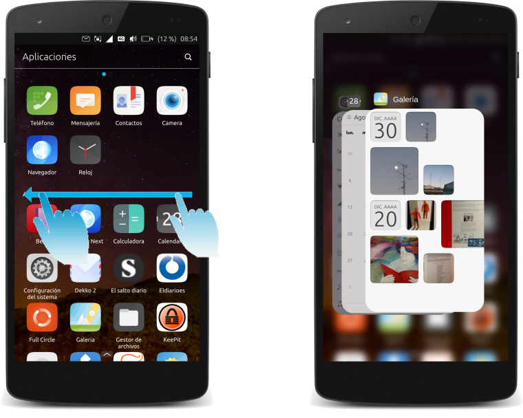
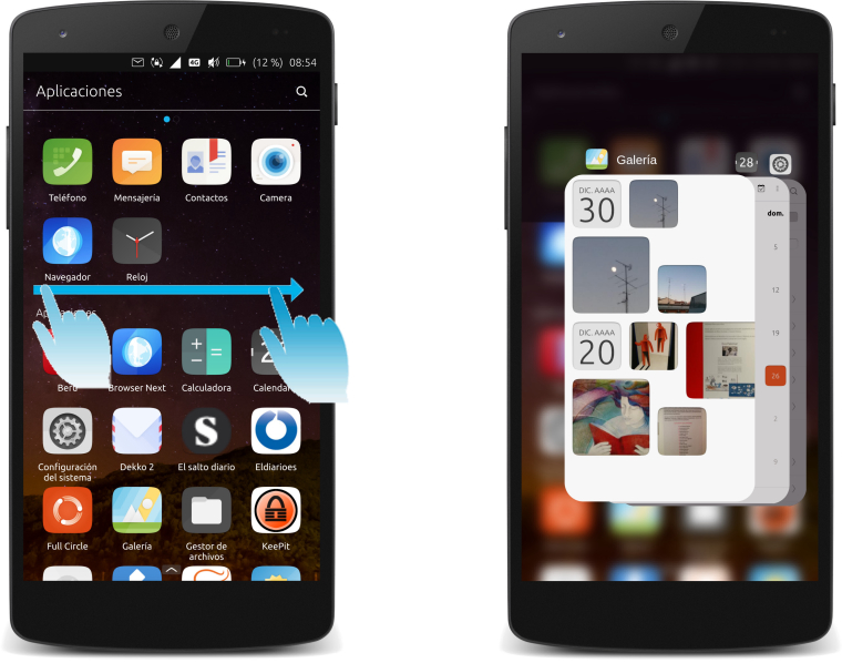
      • Access to app-switcher from left and right sides of the screen via long drag.
      • App launcher would open via long press and drag (left to right)

      0_1535386004385_App Launcher.jpg

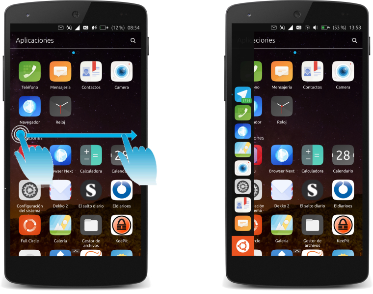
      3. Navigation through apps.

      0_1535386350541_Next-App.jpg
      0_1535386378470_Previous-App.jpg

      • Instead moving only to the last app opened, move to the previous (left) or next (right) app.
      • This would make possible to navigate faster through apps via short drag.
      • Short drag from right side would change to the next app in the pile.
      • Left short drag would change to the previous app in the pile.

      What do you think about this?
      Do you see a way of improving this or other related ui/ux part?
      Let´s discuss it and see what we can get.

      posted in Design
      gbG
      gb
    • RE: Not enough free space in /var/cache/apt/archives

      Thanks for the tip @advocatux
      I followed the instructions and I have a container working and I could install packages.

      posted in Support
      gbG
      gb
    • RE: UI / UX discussion

      @Xray2000 thanks, just trying to contribute 🙂

      @Marathon2422 I haven´t think about landscape mode and tablet version ( the app switcher could be the same as above or do a specific app switcher for tablet version)

      @gnu-mobile reaching "home" is a very important action, that should be very easy and fast to reach. Right now there are 2 ways to do it:
      a) open app switcher, select the home scope, so to gestures.
      b) open app launcher and select home icon. This icon is quite difficult to reach (right handed person) depending how you are holding the phone.
      This is why I proposed to leave the home scope at the background so you can go to home from every corner once the app switcher is opened.
      There could be other solutions like the ones used by android and ios having a button at the bottom of the screen. (Switch apps on iPhone X)
      About your idea of showing app launcher with the tray menu, I think there is not enough space for booth at the same time.

      @Krille welcome 😄 I think we need some discussion about this.
      1): This is related with scopes idea that Canonical promoted. Having the icons in the background has to do with the desktop metaphor. ios and android used them and have options like having "folders" to group them. I don´t know what is going to happen with scopes but this would be another theme to talk about. I did not wanted to open to many themes at the same time.
      2). I personally don´t use too much the app launcher. Do you use it?
      It would be interesting to have a measuring system to know how people interact with their phones in order to prioritize between design options.

      posted in Design
      gbG
      gb