UBports Robot Logo UBports Forum
    • Categories
    • Recent
    • Tags
    • Popular
    • Users
    • Groups
    • Search
    • Register
    • Login

    New badge for Yumi?

    Scheduled Pinned Locked Moved Design
    70 Posts 23 Posters 21.2k Views 2 Watching
    Loading More Posts
    • Oldest to Newest
    • Newest to Oldest
    • Most Votes
      Reply
      • Reply as topic
      Log in to reply
      This topic has been deleted. Only users with topic management privileges can see it.
      • Aury88A Offline
        Aury88 @Lakotaubp
        last edited by

        @Lakotaubp I don't know...it seemed to me he was referring there to yumi and it's badge

        LakotaubpL 1 Reply Last reply Reply Quote 0
        • LakotaubpL Offline
          Lakotaubp @Aury88
          last edited by

          @Aury88 That's why I emphasized could.
          The Ubuntu badge might just disappear which would solve any issue with Yumi. Or Yumi might have a Yumi/Ubports specific one which would also solve any issue using them as we wish. I Personally quite like that idea.
          Maybe the less that looks like the Ubuntu (the badge) one the better. That would stop any other associated issues maybe.
          After that..........

          1 Reply Last reply Reply Quote 0
          • TotalSonicT Offline
            TotalSonic @Aury88
            last edited by

            @Aury88 said in New badge for Yumi?:

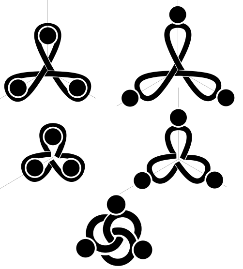
            here some iterations..!
            LogoCore.png

            ...my screen is filling with friendship...
            Here the link to the svg:
            https://mega.nz/#!UN0SDA7J!njORZM45c7EuA5DotnT8eW3KKdTD36mN9HL_iYIsmEo

            I really like the bottom logo on this one a lot, far superior to the others in my opinion.

            Best regards,
            Steve Berson

            1 Reply Last reply Reply Quote 3
            • Aury88A Offline
              Aury88
              last edited by Aury88

              so if we are talking about a symbol that could substitute the Canonical's circle of friends imho we should also consider how it look in other UBports logos/symbols:
              for examble:
              Test Logo.png
              also this is the only one among my suggestions that fit in the project name
              TestNome.png

              ? V 2 Replies Last reply Reply Quote 2
              • ? Offline
                A Former User @Lakotaubp
                last edited by A Former User

                @Lakotaubp
                I think a new badge is a very good idea: I've privately maintained that Yumi was the lovechild of Wall-E's pet, Hal, and his girlfriend, EVE.

                1 Reply Last reply Reply Quote 0
                • ? Offline
                  A Former User @Aury88
                  last edited by

                  @Aury88 these are exactly what i was thinking of if a "total rebrand" came about. good work!

                  1 Reply Last reply Reply Quote 0
                  • V Offline
                    Vartojas @Aury88
                    last edited by

                    @Aury88 i think, I do like the last best and I liked it even a bit more, were the 'o' in the color of the logo, not the letters.

                    1 Reply Last reply Reply Quote 0
                    • H Offline
                      hummlbach
                      last edited by

                      The last one with the three linked circles reminds me of the borromean rings:
                      https://en.m.wikipedia.org/wiki/Borromean_rings

                      Aury88A 1 Reply Last reply Reply Quote 1
                      • Aury88A Offline
                        Aury88 @hummlbach
                        last edited by Aury88

                        @hummlbach I was thinking instead that among all of them the one with the three linked semi-circle is the least recalling a runic geometry (also because the three semi-circle are not properly linked). the others I immediately associate them with a Triquetra

                        1 Reply Last reply Reply Quote 0
                        • E Offline
                          elastic
                          last edited by

                          @Aury88 great work - I like the first and the last one best
                          idea: what about completing the circles in the first logo (gray and faded) on the phone display ...

                          H Aury88A 2 Replies Last reply Reply Quote 0
                          • H Offline
                            hummlbach @elastic
                            last edited by

                            @elastic yes lets continue the logo on the screen now as its not well known anymore...

                            1 Reply Last reply Reply Quote 0
                            • T Offline
                              trainailleur
                              last edited by

                              If the concern is a move away from Ubuntu branding, has anyone checked how broadly Ubuntu has trademarked human silhouettes seen from above with linked arms? A logo trademark search site I've used in the past didn't turn up any trademarked logos for Ubuntu, which I think says more about that search engine than it does about the state of IP protection of Ubuntu's logos. Even Ubuntu's website doesn't go into the specifics of what might have been trademarked in terms of what they call their "circle of friends" logo.

                              Aury88A 1 Reply Last reply Reply Quote 0
                              • Aury88A Offline
                                Aury88 @elastic
                                last edited by

                                @elastic like these?:
                                Test Logo.png

                                E 1 Reply Last reply Reply Quote -1
                                • Aury88A Offline
                                  Aury88 @trainailleur
                                  last edited by

                                  @trainailleur I don't think all kind of imaginable friend circle is trademarked. As their website says
                                  the Canonical’s Trademarks (registered in word and logo form) include:
                                  UBUNTU
                                  KUBUNTU
                                  EDUBUNTU
                                  XUBUNTU
                                  JUJU
                                  LANDSCAPE

                                  note how the edubuntu symbol is extremely similar to the ubuntu symbols and despite this they have to specify that it is also under trademark (so it is not covered by the ubuntu symbol trademark).
                                  all the more reason you shouldn't have problems if you don't have even a circle
                                  (plus we could consider our elements only collaborators and not friends 🤣 )

                                  1 Reply Last reply Reply Quote 0
                                  • E Offline
                                    elastic @Aury88
                                    last edited by

                                    @Aury88 yes, definitely 🙂

                                    1 Reply Last reply Reply Quote 0
                                    • Aury88A Offline
                                      Aury88
                                      last edited by

                                      so probably this new badge will be a necessity for the stickers

                                      https://forums.ubports.com/topic/2595/proposal-for-a-telegram-stickers-project/17

                                      1 Reply Last reply Reply Quote 0
                                      • ? Offline
                                        A Former User
                                        last edited by

                                        sffsf.png
                                        This logo i try to made

                                        TotalSonicT Josele13J R 3 Replies Last reply Reply Quote 8
                                        • TotalSonicT Offline
                                          TotalSonic @Guest
                                          last edited by

                                          @Louies said in New badge for Yumi?:

                                          sffsf.png
                                          This logo i try to made

                                          I like this one a lot.

                                          Beat regards,
                                          Steve Berson

                                          R 1 Reply Last reply Reply Quote 1
                                          • Josele13J Offline
                                            Josele13 @Guest
                                            last edited by Josele13

                                            @Louies very well the design, it's very modern
                                            , try to make the outer circle smaller.(orange)..... You will see well the change...

                                            regards...

                                            Xiaomi Redmi Note 9 pro
                                            Oneplus Nord 100
                                            Xiaomi Redmi Note 7
                                            Nexus 5
                                            Bq E4.5 Ubuntu edition .... is dead

                                            1 Reply Last reply Reply Quote 1
                                            • Aury88A Offline
                                              Aury88
                                              last edited by Aury88

                                              my first test with yumi:
                                              Yumi-1x1-badge.png
                                              EDIT
                                              the my new logo proposal has the heads a little too big probably it is also an optic effect caused by the different design (the bodies are inside the circle, non on the perimeter, so the heads are more dominant) also maybe is better to enlarge the space between the various element to improve their resolution (so should keep in mind the screen resolution and our eyes angular resolution). the right yumi is with the modified badge symbol

                                              1 Reply Last reply Reply Quote 3
                                              • First post
                                                Last post