New badge for Yumi?
-
Following on from Marius comments here https://forums.ubports.com/post/19260 Yumi might need a new badge. Anyone got any ideas for a Yumi UBports badge. Have fun.
-

because this is a more stable configuration than a circle
Jokes aside, when I made this symbol I was thinking of the third generation of Ubuntu DE (after gnome and unity7, our beloved unity8) and- to the three elements of the project:
- the foundation,
- the community,
- all the mainstream projects,
- and to the three levels of the system:
- the device,
- the OS,
- the applications,
- or
- the hardware,
- the software ,
- the user.
- to the three elements of the project:
-
I'm bad in using drawing programs, so i did a 5 minute sketch by hand, please don't laugh at me guys
")
I like your idea @Aury88 but maybe we want the logo to resemble the circle of friends a bit more? (Never forget where you came from...? ^^)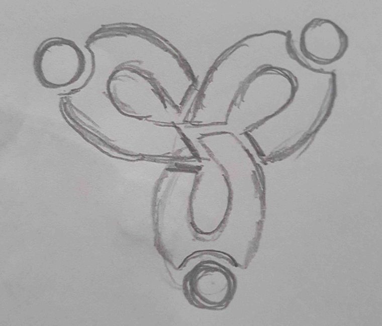
Would need to get the hands right in the middle...
-
@Aury88 i really like this, great starting point!
hummlbach's idea is also really good(thinking along the same lines as aury88).
-
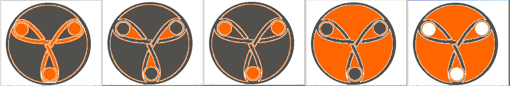
@Aury88 The logo should not be the same color as Yumi, we would not see the logo well, I show you some color changes that could be put in the logo,
I feel it for my drawings, I only give ideas...
Aury88 is your moment...
I forgot another...
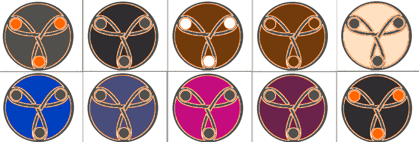
to decide well which color is possible to put to Yumi, it would be better to put it on Yumi or an orange background each logo and see which is the best.
I like the last image,greetings...
Xiaomi Redmi Note 9 pro
Oneplus Nord 100
Xiaomi Redmi Note 7
Nexus 5
Bq E4.5 Ubuntu edition .... is dead -
@Josele13 i do like the principle of the design as @Aury88 proposed it with 3 persons, reaching the hands.
I personally have less a problem with the basic design than with the coloring and the additional ring that in combination immediately reminded me of runes. And living in a region where people tend do abuse runes for unfriendly political codes, I rather prefer not to have a badge which makes me look like one of them.
Therefore I would prefer a badge which looks first less like a rune and secondly underlines the connection to the original design of Ubuntu.
I tried despite missing mastery in GIMP to illustrate my point by coloring the sketch of @hummlbach changing it only in two regards: linking the heads with the body and adding a colored circle. By linking the heads with the body the proposed rigid structure of lines and circles is broken and by adding a colored circle which intersects with the heads in their center a quote of the logo of ubuntu is introduced...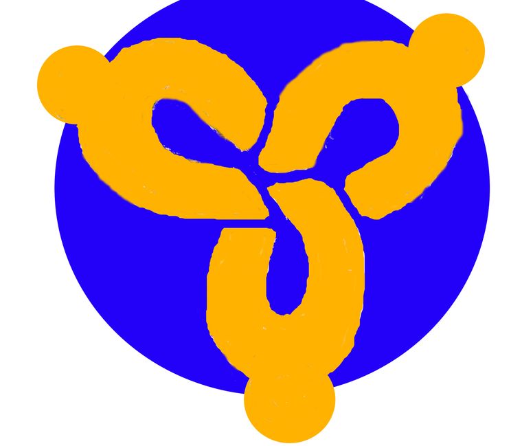
-
@Vartojas I like your proposal. We can call it "The friendly jacuzzi logo"

-
@Josele13 the color was only a choice during the Yunit Project (the orange is from the Ubuntu color palette associated to the community) but is not the point of my suggestion here.
Also changing color in Inkscape is a mater of few seconds.
As a yumi badge I would have kept it in the current style as a bright white "symbol" on the dark-gray background.
The choice of putting inside the circle instead of outside was merely to give more space to the arms part and because I feel it more phisiologicaly-correct 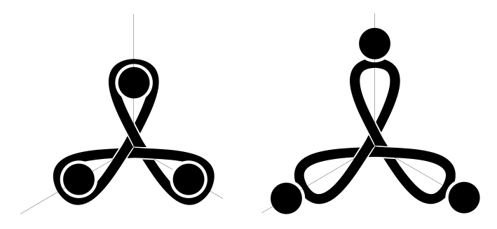
-
here some iterations..!
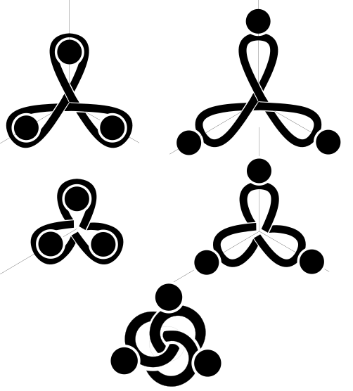
...my screen is filling with friendship...
Here the link to the svg:
https://mega.nz/#!UN0SDA7J!njORZM45c7EuA5DotnT8eW3KKdTD36mN9HL_iYIsmEo -
The last one looks best imo.
-
But imho it could lead to confusion have a symbol on the yumi badge different from the one displayed in the project logo

-
@Aury88 As Marius said in the original post and I quote
"One point i want to add, is that we might want to remove the "Ubuntu logo" since for this exact reason we are limited." It could all change. -
@Lakotaubp I don't know...it seemed to me he was referring there to yumi and it's badge
-
@Aury88 That's why I emphasized could.
The Ubuntu badge might just disappear which would solve any issue with Yumi. Or Yumi might have a Yumi/Ubports specific one which would also solve any issue using them as we wish. I Personally quite like that idea.
Maybe the less that looks like the Ubuntu (the badge) one the better. That would stop any other associated issues maybe.
After that.......... -
@Aury88 said in New badge for Yumi?:
here some iterations..!
...my screen is filling with friendship...
Here the link to the svg:
https://mega.nz/#!UN0SDA7J!njORZM45c7EuA5DotnT8eW3KKdTD36mN9HL_iYIsmEoI really like the bottom logo on this one a lot, far superior to the others in my opinion.
Best regards,
Steve Berson -
so if we are talking about a symbol that could substitute the Canonical's circle of friends imho we should also consider how it look in other UBports logos/symbols:
for examble:

also this is the only one among my suggestions that fit in the project name

-
@Lakotaubp
I think a new badge is a very good idea: I've privately maintained that Yumi was the lovechild of Wall-E's pet, Hal, and his girlfriend, EVE. -
@Aury88 these are exactly what i was thinking of if a "total rebrand" came about. good work!
-
@Aury88 i think, I do like the last best and I liked it even a bit more, were the 'o' in the color of the logo, not the letters.
-
The last one with the three linked circles reminds me of the borromean rings:
https://en.m.wikipedia.org/wiki/Borromean_rings
Hello! It looks like you're interested in this conversation, but you don't have an account yet.
Getting fed up of having to scroll through the same posts each visit? When you register for an account, you'll always come back to exactly where you were before, and choose to be notified of new replies (either via email, or push notification). You'll also be able to save bookmarks and upvote posts to show your appreciation to other community members.
With your input, this post could be even better 💗
Register Login