Clock Redesign Ideas
-
@CiberSheep said in Clock Redesign Ideas:
@cliffcoggin You can be part of «the quest» if you have time
I have the time and I'm willing to help, but note that while I am good with words I am useless at computing. I couldn't even load UT onto an Android phone, and had to pay somebody to do it for me. If that level of incompetence is of any use, try me.
-
@cliffcoggin said in Clock Redesign Ideas:
If that level of incompetence is of any use, try me.
You are already accepted

-
@3T_Ed said in Clock Redesign Ideas:
Would it be possible to have the alarm time dialer move slower by default for better control?
I don't understand what's your problem with this, as it moves at the exact speed you make it move, thus you can stop it with a touch at any moment, and if you want it slower, just launch it slower, or do not launch it at all, and swipe it instead.
I like it very much like it is, and never have problem setting an alarm with it.
-
I can't answer for Ed, but I have difficulty stopping the numerals once they are rolling at speed, and when I do stop one roller the other roller has moved. If that happens with my slender fingers I hate to think how others with big hands cope. I reckon larger numerals would help, or alternatively lower acceleration when swiped, or keyboard setting.
-
@cliffcoggin
Just swipe it gentle :beaming_face_with_smiling_eyes: -
@cliffcoggin said in Clock Redesign Ideas:
I can't answer for Ed, but I have difficulty stopping the numerals once they are rolling at speed, and when I do stop one roller the other roller has moved. If that happens with my slender fingers I hate to think how others with big hands cope. I reckon larger numerals would help, or alternatively lower acceleration when swiped, or keyboard setting.
Thank you for describing the difficulty here
-
@Keneda Gentle means more time, people that set their allarms they just want to go to sleep ASAP. Try swiping those numbers drunk :))))))))
-
@C0n57an71n
Reducing max speed means more time...
Reducing your swipe speed means the same more time, just those who know how to control the actual max speed would not be impacted.So more time means more time yes, but that time being you swiping more gentle or the max speed being reduced is not the same. In one case everybody have what he needs, in the other, only big finger and low motor control one have.
So maybe solution could be a swipe max speed setting, so that you can tweak max speed if you can't tweak your own finger swipe speed.
-
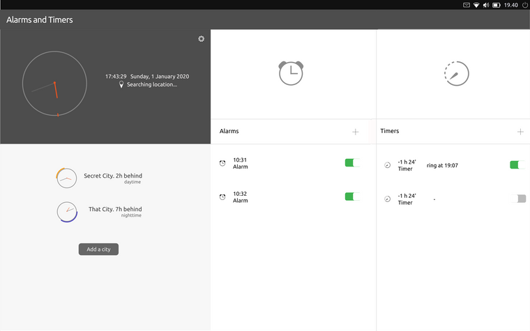
Don't look too close because it's really fast / dirty idea for tablet

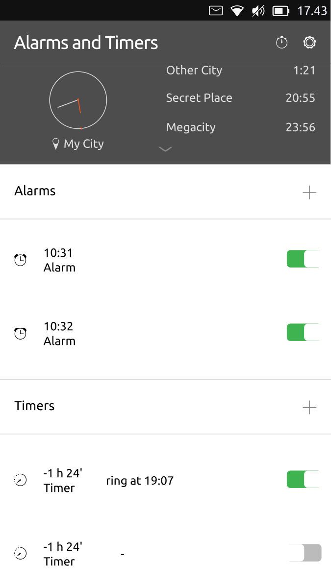
Adapt to mobile / side stage

-
That looks to be a big improvement.
-
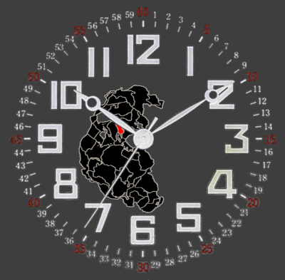
@CiberSheep I have an idea of tweaking the clock it self, I like the analog clock in the app. So add some design to it, I know this is not what you are looking for but hey it maybe makes it a little less ugly :winking_face:
This is just a mock up so please don't look to close.

The red field on Pangea is the country that you set your time accordingly too. It's not a very detailed map, there are better ones. -
@Rondarius said in Clock Redesign Ideas:
I know this is not what you are looking for but hey it maybe makes it a little less ugly :winking_face:
Thanks. I agree that that design is really busy and thinking that clock and world clock are the least used features of the app...
If you think about it. The main clock makes little sense: you have the time on the indicator... at all time... on the lock screen... when unlocking the phone, there's two clocks in front of you... at the same time...
-
Couple of words in general on clocks. I love to wear watches on my wrist. I tend to buy only analog-style watches. Because they have style, they look good. BUT, when it comes to information, even tho sometimes they have numbers, it takes a few good milliseconds to get the time (compare to digital). When it comes to daily driver and digital information, I would like it to be practical. (even tho I like Day/night indicator you made it very nice Job)
MHO I would of find how to combine style alongside with quick informative clock design. There is plenty of good stuff on the web, which can help.
I would love to help, But I'm too busy with other stuff on my mind.
-
I personally like having the dial.
It shows the seconds in a way that is convenient to measure your pulse or to set the time on your (not yet connected) oven or car clock...
I also like how the standard hands can be turned to digital values (but it lacks seconds) I use seconds frequently as a chronometer for small duration (less than 3 minutes).
And writing that, I realize that chronometer can be always available...So in order to sum up, we've got these features:
- Current time: redundant with the notification bar
- World clock: useful for me (and probably some other travelers or international workers)
- Alarms: Mostly used, so it has to be on the main page
- Timers: Could be merged with the alarms
- Chronometer: Should be easy and fast to access, I propose a single or double tap to start the chronometer.
Once started, the chronometer area is shown with buttons for laps and reset. To stop or pause the chronometer, the same single or double tap can be used.
-
@AppLee said in Clock Redesign Ideas:
Current time: redundant with the notification bar
I would like to oppose to this idea. Here are my arguments:
- Not everybody has good sight. The notification bar has small font. Without glasses/contacts everything is blurry, it's nice to have big clock there after opening the app.
- I'm doing some desk job, need to check the time just with the edge of an eye. So I open a clock app, set the phone not to sleep*, place the phone on desired position to have an improvised desk clock**.
- It's called the "Clock app", why isn't there any clock. Only world clocks, alarms, timers and stopwatch.
*\ Maybe a full screen mode with suspension prevention could be implemented.
**\ Though, there is an Night clock app in openstore, but with the fullscreen mode the app would be somehow redundant.So, what would be the solution? My proposal is to keep the clock, or make the clock optional via settings.
A full screen mode for clock, timers or stopwatch and some predefined clock/timer/stopwatch themes (classic, digital, binary, ...) would be just a bonus.
-
@jezek
I agree the clock has to stay.What I meant is that the world clock is actually giving the current time AND it also gives the time for preset timezones...
So no need for me to have a specific local clock...
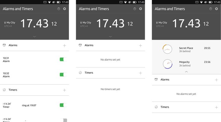
As cibersheep stated, the clock size can be responsive to the number of location set. -
@CiberSheep
Could the app have an open framework?
By that I mean that by long press on the icons for every function, it brings up a window with some settings, like:Launch at start
If you want the app to launch into clock, world clock, timer, alarm etc...
Or the last opened function will be the default function when relaunching the app.Resize
Resize the app that will be launched at start. Resize the clock, world clock etc. Resize the icons for every function.Move
Maybe you want all the icons to be on the left side of the phone, to be used with one hand. Or centered in the middle, to the right, up, down....Change the look of the different functions, if I now had something that looked like the clock in the previous post and wanted to use it, I could change the look of the clock, with some limitation of course. Or have different themes to choose from.
Just some ideas. :smiling_face:
-
@Kaizen said in Clock Redesign Ideas:
Couple of words in general on clocks.
Thanks
@AppLee said in Clock Redesign Ideas:
I personally like having the dial.
If it's to check seconds, I don't know if I would keep it. People doesn't know to read analogue clock. We might just show the seconds

@jezek said in Clock Redesign Ideas:
I would like to oppose to this idea.
By order of most to least used we have: Alarms, Timer, Chronometer, Clock, World Clock.
Having the clock in the lock screen and other apps that solve other requirements could be an option.
Sketches/Drawings are always welcome
@Rondarius said in Clock Redesign Ideas:
Could the app have an open framework?
Short answer: no

Long answer: you might want to show a sketch of your idea. Keep in mind that I would prefer to follow the guide lines for the core apps. The goal is have an elegant, minimalistic and simple app, yet useful that fits in Ubuntu Touch. So, no moving UI elements, over settings apps and alike. That's why of the long thinking. The app should do what is supposed to do (whatever that is :D) in the best way possible without intervention
To all: thanks all for your input. I'd rather to discuss from now on a more general vision on the app first before going into small details.
-
Maybe going this way...

-
@CiberSheep Great discussion and thank you for taking the lead on redesigning the UT clock.
I agree with @Kaizen that in terms of perceptual efficiency a numeric (aka "digital" display) is most efficient. However, as per @CiberSheep's survey people don't use the clock app to get the time at a glance. So I think there is an interest in an "analog" dial design of the clock app for the use cases identified in the survey.
I also agree with @Rondarius that a useful minimalist representation of a clock needs clearly distinguishable hands and some indicators of hours on the dial (e.g. bold dots/tick marks for 12,3,6 and 9h small ones for the other hours). Given the required precision of the clock app in every day use however, a second hand and tick marks or even numbers for seconds may be too much and reduce its usefulness.
I think @Rondarius design proposal without the seconds would be the way to go.NG
Hello! It looks like you're interested in this conversation, but you don't have an account yet.
Getting fed up of having to scroll through the same posts each visit? When you register for an account, you'll always come back to exactly where you were before, and choose to be notified of new replies (either via email, or push notification). You'll also be able to save bookmarks and upvote posts to show your appreciation to other community members.
With your input, this post could be even better 💗
Register Login