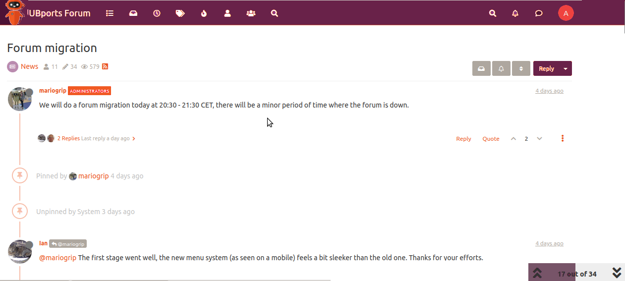
UBports Robot Logo UBports Forum
    • Categories
    • Recent
    • Tags
    • Popular
    • Users
    • Groups
    • Search
    • Register
    • Login

    Forum migration

    Scheduled Pinned Locked Moved News
    45 Posts 13 Posters 9.4k Views 5 Watching
    Loading More Posts
    • Oldest to Newest
    • Newest to Oldest
    • Most Votes
      Reply
      • Reply as topic
      Log in to reply
      This topic has been deleted. Only users with topic management privileges can see it.
      • D Offline
        domubpkm @mariogrip
        last edited by

        @mariogrip If possible, it would be nice to be able to adjust the font size (currently too small) as well as the font color (current gray is too light - washed out) in the Forum.

        mariogripM 1 Reply Last reply Reply Quote 0
        • mariogripM Offline
          mariogrip Administrators @domubpkm
          last edited by

          @domubpkm sadly i cannot do this easily, but will try.
          How does this look?

          D A 2 Replies Last reply Reply Quote 1
          • D Offline
            domubpkm @mariogrip
            last edited by

            @mariogrip It's already better.

            1 Reply Last reply Reply Quote 0
            • A Offline
              Alter @mariogrip
              last edited by Alter

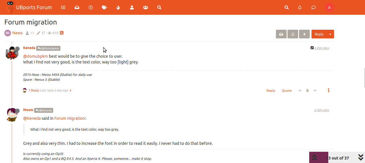
              @mariogrip : I like the change back to orange, and the black font which means more contrast. I did notice the following: In the UBports Forum webapp, the Yumi mascot and the myprofile button (at least here) have almost the same color as the orange background behind them, meaning they kind of disappear. I can't remember how it exactly was before the forum change, but this was not the case then.
              Also in the webapp, every thread features a scroll button at the bottom. This is dark grey text on very light grey. When you scroll to the bottom, background turns to dark purple, meaning text becomes less visible.

              Regular user, UT since 2020, Now: Volla Phone (20.04 Stable)

              KenedaK 1 Reply Last reply Reply Quote 0
              • KenedaK Offline
                Keneda @Alter
                last edited by Keneda

                @Alter said in Forum migration:

                In the UBports Forum webapp

                That's also the case in Morph.

                2015-2023 : Meizu MX4 ☠️⚰️✝️
                2023-2024 : Nexus 5 ☠️⚰️✝️
                2024-***** : FPOS Fairphone 5 waiting UT for freedom 😉
                🇲🇫🇬🇧

                1 Reply Last reply Reply Quote 1
                • MoemM Offline
                  Moem
                  last edited by

                  I do like the current bolder Ubuntu font. It helps with readability. The font is a friendly one, and on topic.
                  There is clearly some experimenting with colors going on! I don't mind the red at all, except that it's VERY saturated.

                  Is currently using an Op5t
                  Also owns an Op1, a BQ E4.5 and an Xperia X, as well as a BQ tablet and a Pinetab2. Please, someone... make it stop.

                  KenedaK 1 Reply Last reply Reply Quote 0
                  • KenedaK Offline
                    Keneda @Moem
                    last edited by

                    @Moem said in Forum migration:

                    I don't mind the red at all, except that it's VERY saturated.

                    I may have eyes problem, but i see orange, not red.
                    But very flashy indeed.

                    2015-2023 : Meizu MX4 ☠️⚰️✝️
                    2023-2024 : Nexus 5 ☠️⚰️✝️
                    2024-***** : FPOS Fairphone 5 waiting UT for freedom 😉
                    🇲🇫🇬🇧

                    MoemM 1 Reply Last reply Reply Quote 0
                    • C Offline
                      cliffcoggin @Lakotaubp
                      last edited by

                      @Lakotaubp said in Forum migration:

                      Quick note on Forum changes has evrybody noticed the changes available at the bottom of your profiles. Rights and consent, 2FA and Themes.

                      I see none of those in profile Settings. I do see the lurid orange background colour which makes text harder to read.

                      A 1 Reply Last reply Reply Quote 1
                      • MoemM Offline
                        Moem @Keneda
                        last edited by Moem

                        @Keneda said in Forum migration:

                        I may have eyes problem, but i see orange, not red.

                        Whatever we call it (and whatever our displays present us with), I think we agree that it's harsh and not very pleasant to look at.

                        Is currently using an Op5t
                        Also owns an Op1, a BQ E4.5 and an Xperia X, as well as a BQ tablet and a Pinetab2. Please, someone... make it stop.

                        1 Reply Last reply Reply Quote 0
                        • A Offline
                          Alter @cliffcoggin
                          last edited by

                          @cliffcoggin : If you click your profile image (avatar), and then your profile name you arrive at your profile.
                          There is a large version of your avatar and 3 dots menu next to it. Clicking the menu and scrolling down will show the options @Lakotaubp mentioned.

                          Regular user, UT since 2020, Now: Volla Phone (20.04 Stable)

                          T C 2 Replies Last reply Reply Quote 0
                          • T Offline
                            Taiga Woods @Alter
                            last edited by

                            I have to say it too: it is really hard to read now with this current orange-grey-purple color scheme. Also, the colors don't fit to each other. In german we'd say: those colors "bite each other". Honestly I'm really annoyed, it kind of hurts my eyes, please go back to the old style. Thanks a lot 🤓

                            alan_gA 1 Reply Last reply Reply Quote 2
                            • alan_gA Offline
                              alan_g @Taiga Woods
                              last edited by alan_g

                              I too can't find any settings to change the horrible colour scheme. But I found the colours are OK (unchanged?) on an iPhone. Time to switch?

                              D A alan_gA 3 Replies Last reply Reply Quote 0
                              • D Offline
                                domubpkm @alan_g
                                last edited by

                                @alan_g said in Forum migration:

                                I too can't find any settings to change the horrible colour scheme. But I found the colours are OK on an iPhone. Time to switch?

                                UT possible on an iPhone ? 😉

                                1 Reply Last reply Reply Quote 0
                                • C Offline
                                  cliffcoggin @Alter
                                  last edited by

                                  @Alter No there is nothing such as you describe in any part of the avatar menus.

                                  LakotaubpL 1 Reply Last reply Reply Quote 0
                                  • A Offline
                                    Alter @alan_g
                                    last edited by Alter

                                    @alan_g : I guess it's the settings of your display, rather than an old version of the site.
                                    Just compared the UBports Forum on my Volla with my iPad, every element has the same color, but my iPad has a less brighter setting, less contrast. This can be adjusted manually.

                                    Regular user, UT since 2020, Now: Volla Phone (20.04 Stable)

                                    1 Reply Last reply Reply Quote 0
                                    • LakotaubpL Offline
                                      Lakotaubp @cliffcoggin
                                      last edited by

                                      @cliffcoggin If you go to your profile in Users on the Forum, next to the large C there is a circle with three dots. If you tap on that and scroll right to the bottom what is there?

                                      C 1 Reply Last reply Reply Quote 0
                                      • C Offline
                                        cliffcoggin @Lakotaubp
                                        last edited by

                                        @Lakotaubp

                                        OK I got to the theme settings, but this is all that is shown:

                                        You can customise your theme settings here. Settings are stored on a per-device basis, so you are able to have different settings on different devices (phone, tablet, desktop, etc.)

                                        Switch which side each mobile menu is on

                                        Automatically hide the navbar on scrollVery small screens (e.g. phones in portrait mode)Smaller screens (e.g. phones, some tablets)Medium sized screens (e.g. tablets in landscape mode)Larger screens (e.g. desktop computers)

                                        A 1 Reply Last reply Reply Quote 0
                                        • A Offline
                                          Alter @cliffcoggin
                                          last edited by

                                          @cliffcoggin : This is also what I see on my phone or PC. So I presume these are the settings atm.

                                          Regular user, UT since 2020, Now: Volla Phone (20.04 Stable)

                                          1 Reply Last reply Reply Quote 0
                                          • A Offline
                                            Alter
                                            last edited by Alter

                                            @mariogrip : I don' t know how flexible the new forum is, as far as layout is concerned. As can be concluded from the response in this thread, which color scheme you prefer is personal, and an option to change it for yourself might be nice. I personally like it when the default forum settings use the Ubuntu colors which are orange/purple/dark grey/light grey and font in black or white depending on background. It also matches the rest of the UBports site. I personally would delete the red for Administrators. I think the header needs a different color to offset Yumi (and in my case my standard Avatar too). Also, the scroll indicator at the bottom could do with a lighter color. A (sketch) example attached. I don't know of course if it's doable at all. Just thought I'd share my opinion.

                                            ubports-forum-colors-option.png

                                            Below is a screenshot of the current forum colors. Thought to post them too, to be able to compare. Something to keep in mind are the avatar colors, having enough contrast between elements, and legibility.

                                            UBports-current-new-forum-colors.png

                                            Regular user, UT since 2020, Now: Volla Phone (20.04 Stable)

                                            1 Reply Last reply Reply Quote 0
                                            • ThePossessorT Offline
                                              ThePossessor
                                              last edited by

                                              Hi there. Just a quick feedback. I my opinion the color scheme is not good at all. A black text on a dark purple background is not readable. And Yumi gets erase on that orange background. I think it even doesn't matter if it looks nice or not. The current color scheme is just not practical. No offence. Just a feedback,

                                              1 Reply Last reply Reply Quote 0
                                              • First post
                                                Last post