tedit development and design discussion
-
Hi, I recently took over developing tedit app. I would like to try the forum, to gather some ideas and feedback regarding ongoing development.
In this thread, I will post questions regarding future design and functionality and let you, the users, comment and ask things. Lets see how this goes. We can always split it up or move discussions elsewhere.
I would still prefer to have issues and feature requests added in the gitlab repository, but I understand, that not everyone is familiar with gitlab and also that some things are easier to discuss here.
-
So here my first couple of questions for you:
-
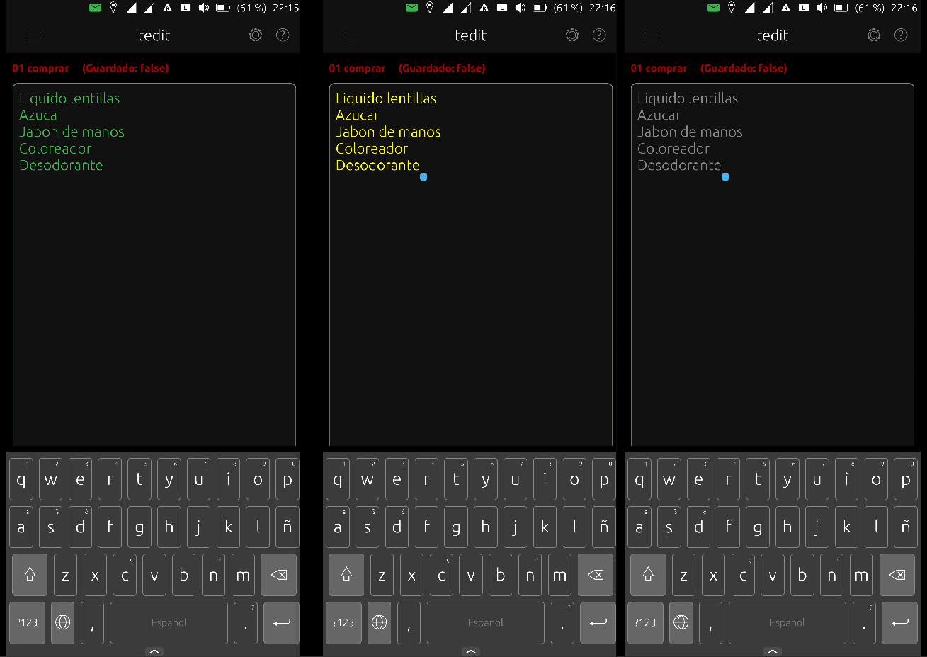
Do you consider the user configurable text and background colors for the writing area useful? Should they be kept? Or can they be dropped and some generic colors be uses that change with the system theme from bright/dark to dark/bright?
-
Should the app colors be only applied to the main page? Or should the background color also be used on all other pages? Currently most other pages change their color depending on the system theme.
The reason I am asking is, the colors
- create quite some work to keep them working
- can in some cases conflict with other functions
- I do plan to move (copy) some of the menu options into a toolbar for direct access. I would say definitely:
- save
- undo, redo
- open notes list
Depending on available space maybe also: - select all
- copy to and paste from clipboard
Any suggestions on that?
- Also I hope I can add another toolbar with some formatting stuff. I think I would add both toolbars at the bottom, below the line counter. They would then be easy to reach with the thumbs and sit "on top" of the OSK.
Please leave you ideas, comments or opinions about those things. Thanks!
(I can't promise anything. Some ideas may never come to life. )
) -
-
@danfro Hello. My opinion is that color management on pages should not be a blocking point in your development. The presentation of the pages must above all be coherent and respect contrasts: the characters must be clearly readable. I like your idea of using toolbars: I would like to be able to exit the app using an 'exit' option (without swiping). As a user, having some additional formatting features (which would mean files should be saved as .odt for example?) would satisfy me. In short, it is better that you concentrate your energy on the functional aspect than on color management I think.
-
@domubpkm said in tedit development and design discussion:
I would like to be able to exit the app using an 'exit' option (without swiping).
Could you elaborate on the reason for this request? The UT UX does not include exit options for applications. This would make TEdit different to the rest.
-
@domubpkm Thanks for your feedback.
Regarding colors, I do agree, they have to provide clear contrast. I think I will need to provide some letter/font color + edit area background color combinations that do work. I will need to refactor settings a bit. But I need to do some work there anyway.
We will definitely not have .odt files. This would require to include a full LibreOffice stack. I first don't know much about that and second this would make the app quite big (see docviewer size).
The component we are using is a TextArea. This component does allow Rich text and therefore should allow us to have some basic formatting like bold, italic,... I need to check how that works and how to implement it. But this should be possible with reasonable amount of work.
I think future versions of Qt will provide markdown formatting for TextArea, so this might become an option at some point. -
@arubislander Apps can be closed with a button press - if implemented. I think to remember uTorch or Timer app used that a while ago.
This is easily done, but it takes up space for one more icon. Unless many users think this useful, I would not provide it right now since it kind of is against the UT guidelines for UI and usage.
@domubpkm could you please file a feature request for that in the repo? We can keep the idea open and see what happens.
Edit: I guess the reason is simply convenience. I thought it useful at some point too. Just a single press, where otherwise several swipe gestures are needed.
-
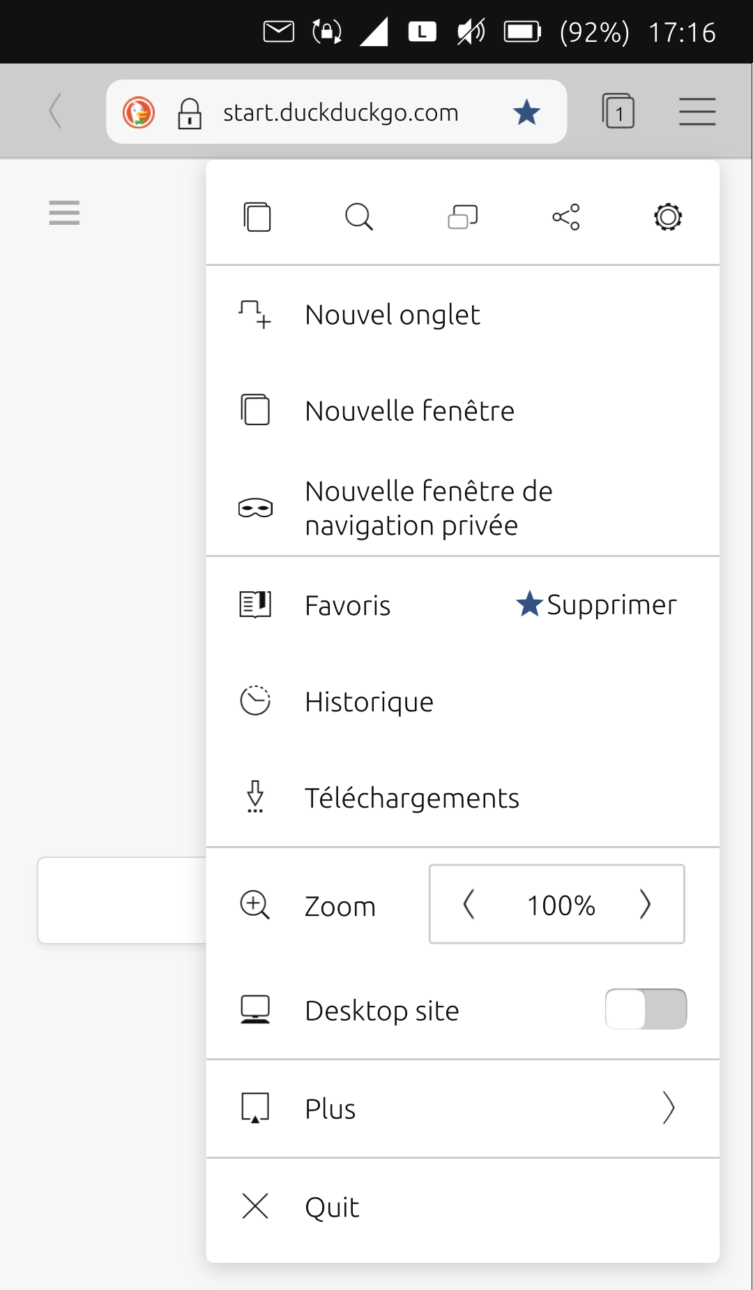
@danfro Just an example : in 'Sapot', there is the 'quit' option :

I don't want .odt
 . First, i thought it was necessary, but yes it isn't.
 -
I don't want .odt
 . First, i thought it was necessary, but yes it isn't.
It is perfectly fine to discuss this kind of features. I personally would like to have the option to use text, rich text, markdown but also odt as file format. The wish for that is perfectly understandable.
But that is beyond my skills and the technical capabilities right now. Also I don't think we should create a second LibreOffice.

-
@domubpkm said in tedit development and design discussion:
@danfro Just an example : in 'Sapot', there is the 'quit' option :
To be honest, in my opinion having this quit option in a menu makes it even less valuable. It either is a quick access or I may as well use the swipes.
Ah, I just checked Timer app. There I made this a setting. So users can choose to have a quit action on the header or not.
Thinking about it, I don't consider this good for tedit. Notes are not saved automatically. So accidentally pressing that button will make you loose all text. And having to confirm it every time makes it cumbersome to use. Again, my personal opinion.
-
@danfro Yes, the idea I submitted is not necessarily wise for tedit

-
Hi danfro, thanks for your efforts!
Color settings are not important to me. Only an adjustment to the system color scheme (dark mode) would be nice.
I would welcome a read-only mode. Sometimes I just want to read a note but unintentionally I change an entry while scolling. The keyboard also appears unintentionally.
-
When you open the app you can create a new note directly. That's pretty nice. But when you open an existing note, you first have to close the app to create a new not. In other words, there is no way back to the initial screen.
-
Notes are always saved in .local/share/tedit.danfro. When you select "save as" you can only choose a name but no directory. That would be a nice option.
When you open a file via file manager which is stored in your home directory you can edit the file. But a copy will be saved in .local/share/tedit.danfro. The original file in your home directory is unchanged.
-
@ma Thanks for the feedback.
Those two things I will implement. The theme adjustment already works but is not released. I need to fix the edit area background changing with the theme. That is difficult e.g. with yellow letters and then white background.

The read only mode I think we will be useful for other things in future too. I am just not quite sure where to place that in the UI. But my development version already has a button for that.
-
@ma True, a "open new note" is needed.
 Could you please open a feature request for that in the repo?
I would also like a "open last note on startup". Not sure if I get that done easily.
-
@ma Yes, only the apps folders are readable and writable. That is due to apparmor restrictions. The app would need to be unconfined to get past that.
A note shared to tedit will be copied, correct. That is so the app can store changes.
Please see the readme in the repo for a way to link another folder for tedit to be used.
-
@danfro said in tedit development and design discussion:
Thinking about it, I don't consider this good for tedit. Notes are not saved automatically. So accidentally pressing that button will make you loose all text. And having to confirm it every time makes it cumbersome to use. Again, my personal opinion.
 Maybe this actually would be the benefit of an "quit" button. If using that button would prompt the user if there are unsaved changes so they can be stored before closing the app, that would be better than closing the app and loosing all unsaved changes.
 -
@danfro said in tedit development and design discussion:
Maybe this actually would be the benefit of an "quit" button. If using that button would prompt the user if there are unsaved changes so they can be stored before closing the app, that would be better than closing the app and loosing all unsaved changes.
In any case, one action would not exclude the other: exit by a swipe (no recording) can coexist with the 'quit' option which would ask whether you want to record or not.
-
I think the app is perfect, if the background colors are a problem, you can remove that and leave it to change the Ut theme, I prefer in Ut the dark theme, in tedit too.
a good option would be to share one or several notes and that way you can easily export them to Teleports or to another location in the file manager,
the possibility of colors in the text is great, if you can keep it is perfect, if you see difficult to keep it then choose a viable color, for example with the dark theme it fits well the white, light grays and even the green that it has now.
Thanks for your great effort in this app
-
Hi @danfro most of the times I read the notes ... I'd like to open tedit directly on notes list and and tap the note to open it.
Regarding colors the dark mode possibility It's enough for me.