tedit development and design discussion
-
@DPITTI You are still around trolling and spamming and placing useless posts? Stop it! Otherwise I hope @Lakotaubp will kick you out.
For some reason, everytime I read chats and see your name, the posts are mostly deleted. I wonder why...
-
@domubpkm Thanks a lot for testing. It was too late last night, so I didn't test much myself.
The lock/pencil can be used unlimited times, BUT I found the icon is too small, so one often misses it. I must have been lucky, when coding it, it worked every time. :grinning_face_with_sweat:
Sad it doesn't allow scrolling. I will need to discover other ways of dealing with it.
What it does, it disables the edit area, so yes, expected that all notes are disabled unless the button is pressed again.
Regarding position, yes, many options. It will depend on how I do other things and where I may need room for controls. But as it seems not to be much helpful, we may not need to worry about that anyway.
-
@DPITTI Those comments are not funny, the tedit app has a lot of value, it is used to write down important data, those data can be even medical prescriptions that one should use, before commenting think a little bit.
-
Sorry, that's not what I meant Dear Mr. or Mrs. Danfro. Now I know which app you are trying to improve. I first thought of this shopping app, i.e. this shopping list app. Seems like you are trying to program a better alternative to an editor app!
I have no idea why posts are deleted. In any case, I can't see that posts are being deleted, at least not by everyone. Sorry again, I won't write anything more here in your science app tests.
OK, so an e-prescription app for UT, so to speak Josele13?
-
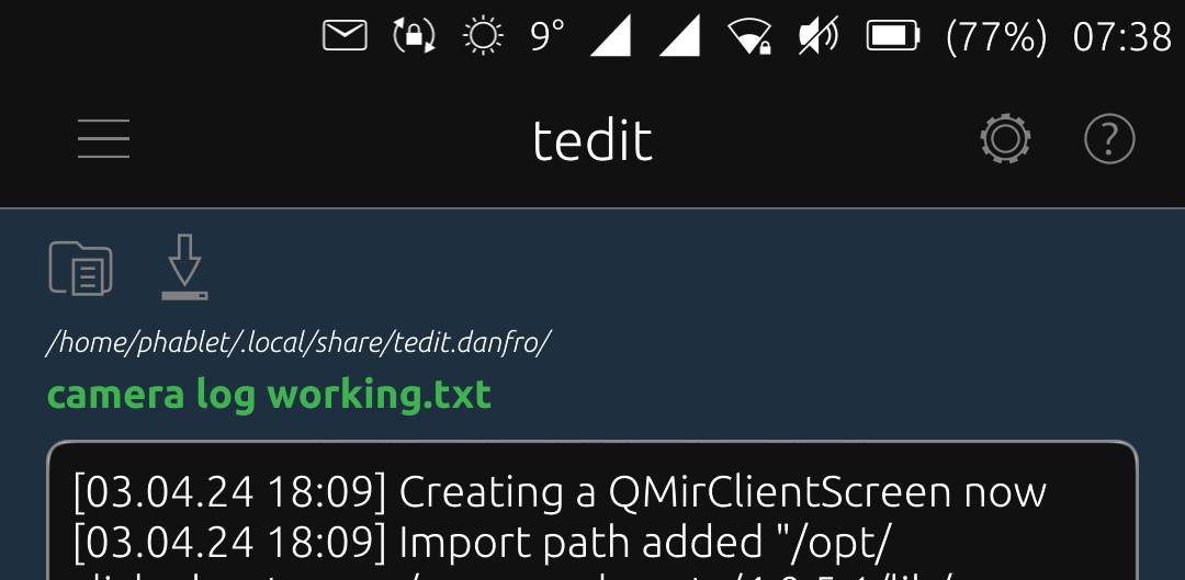
Ok, I think I have got enough stuff coded together for a new release of tedit.
If you like, please give it a good test before I release it. You can download the click file from the latest pipeline here.
v3.3.0
- fixed: #10 empty password and empty file name allow to press save button
- added: setting for minimum password length
- added: setting for theme selection
- added: import from note button for base64 coder
- added: warning dialogs if there is unsaved content on new note, website import and base64 import
- improved: added a network available check for website import
- improved: added a simple error message when import of website fails
- improved: notes can now be opended with a icon in the list, swipe is not needed anymore
- improved: qr code background works now with themes and show content at bottom to allow longer strings
- improved: hash calculator page now uses normal themed colors
- improved: save handling of base64 coder
- updated: translations, many thanks to all translators!
Note: new strings will be available for translation after I merged dev branch into main branch.
-
I would like to get some oppions on how you use tedit.
Since the file storage location did create some.confusion, I think adding it to the file name seems helpful. I will also remove the "saved: true" or "false" part. I think the colored label and a enabled/disabled save button (see below) are enough.
I too plan to add a top toolbar with some quick access keys. For sure we want to have save and open file there I would say. Of course space is limited.
One option is to add a full row of buttons. We could then have I guess 7 to max 10 depending on screen sizes. Below a screenshot of an early test stage.
Another option is, to only show two or maybe three most used icon on the right hand side next to the file name. This would give us more vertical space, but reduce vusible filename length and number of possible icons.
So question is, how many and which actions from the menu do you use very often and would like to see in a quick access toolbar?
-
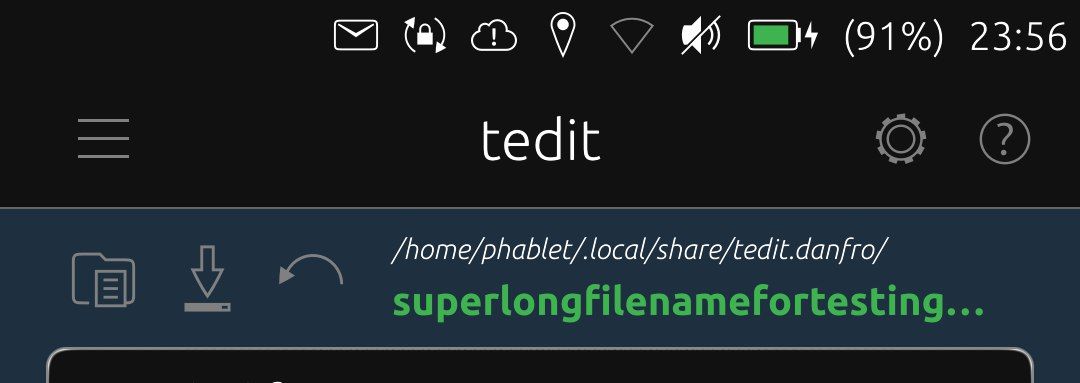
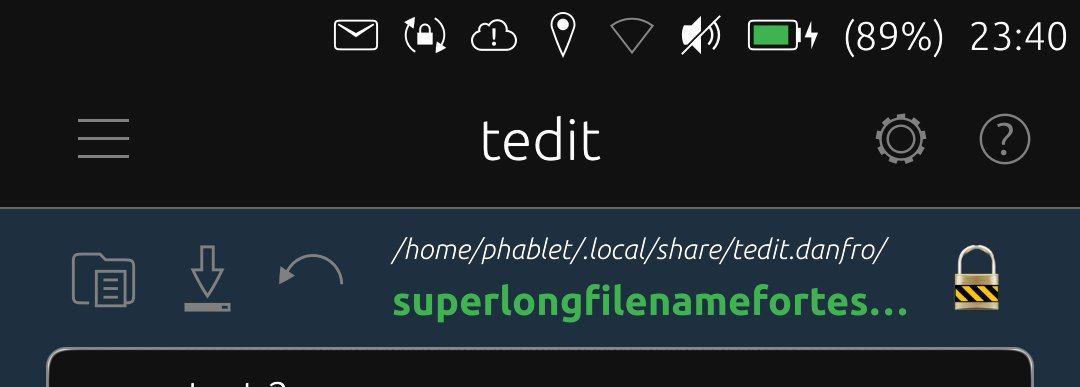
And here two screenshots with the short toolbar. open, save and undo I would consider the most used options. This looks fine I think. Xperia X, so no huge screen device.
-
@danfro This is necessary. With 3 options maximum, it makes sense.
-
@danfro I don't see it necessary but if you want to do it I see this option better than the one you have shown above, maybe the route to find the note is not necessary, I think it's better to put the route in Tedit information.
-
@Josele13 said in tedit development and design discussion:
maybe the route to find the note is not necessary, I think it's better to put the route in Tedit information.
The file storage folder is already named
- in the apps about section
- in the apps OpenStore description
- in the readme of the github
Users still get confused. This is partly due to how content hub works. Users do not expect that importing a file does copy the file. They think the original file will get modified.
So I think this does make the file storage folder very clear to avoid misunderstandings and users maybe using data.I too will try to improve the descriptions in the above places and maybe add some more details here and there.
And I need to run some tests to find out if that works with a symlink. So I may change it. But thanks for the opinion and thoughts about it.
-
@danfro This looks very good. Since there is enough space vertically, I would prefere two lines. One line for the file name (including path) and one for the icons.
With this solution there would be space for additional icons, e.g. redo or open.
-
@ma Thanks a lot for the feedback.
I am not sure if we rally have that much space vertically. On my Xperia X the edit area, when the OSK is visible, is maybe 1/3 of the screen. And I hope to be able to add a second toolbar with formatting options in the future. So after playing around with this, I am more inclined to use the short toolbar in one row with the file name. The short toolbar would have the actions open, save and undo.
Although I agree, some other actions might be nice to have in quick access too. But making this configurable (one option) seems to be complicated to implement without loosing stability.
So which other actions woukd you like to have in quick access bar? I think of maybe have a fourth one, maybe depending on the available width or configurable. This would also depend on the general length of your file names. If one uses long file names, the toolbar might be inconvenient.
-
@danfro Often I just want to read a note. But while scrolling I accidentally change the text. Unfortunately, the keyboard also appears, which takes up about 1/3 of the screen. Therefore I would welcome a "read-only button" that prevents changes and blocks the keyboard.
-
@ma I think someone else asked for that as well. But when I tested that, making the TextArea readonly also drops all scrolling and pan interaction, so there is no way to navigate through the note. So far I haven't found a way to solve this.
-
@danfro Instead of making the component readyonly, maybe it could be possible to ignore all keystrokes?
-
@arubislander I guess it would need to prevent the OSK from rising. Ignoring keystrokes is no problem. If you just read, you don't press any keys anyway. The trick is, how to be able to navigate without raising the OSK. Maybe have an "input blocker" above the text area and adding some (external) scroll components. But not sure if thats a good solution, if possible at all.
-
@danfro Ah, right. The TextArea would need to be prevented from getting direct focus, but still react to swipes for scrolling ...

-
I haven't tried but wouldn't placing TextArea into Flickable work, making the TextArea the height of the
max(main app window, its content)and making Flickable handle the scroll?Albeit it is probably (and unfortunately) not going to automatically scroll down when inserting new lines in edit mode or just scrolling through with keyboard. Additional code to deal with that would be required, if at all possible

-
@zubozrout The TextArea is already in a Flickable. But the height is attached to the top of the OSK. Otherwise the OSK would hide part of the text when writing, which is not nice. Actually that is what is was before, I fixed that recently.
I will need to look into that deeper in the future, but for now I don't see an easy solution.
-
Everyone who wishes to give the short toolbar a try feel free to install the click from the latest pipeline.
I may try to test the folder and file name in one line and a toolbar below. But feel free to share your experience and thoughts about this stage.
Hello! It looks like you're interested in this conversation, but you don't have an account yet.
Getting fed up of having to scroll through the same posts each visit? When you register for an account, you'll always come back to exactly where you were before, and choose to be notified of new replies (either via email, or push notification). You'll also be able to save bookmarks and upvote posts to show your appreciation to other community members.
With your input, this post could be even better 💗
Register Login