A possible Dash replacement
-
We could add an option to hide the bottom launcher
") so, with the scopes gone, it could be a replacement for the app scope.
so, with the scopes gone, it could be a replacement for the app scope. -
Personally I'm not a big fan of the idea, to me it seems far to android-y.
I like Ubuntu touch because it's Ubuntu touch, and I like it's personality.
I don't mind some ideas, but I do much prefer the style of homepage that I've seen before.
I'll try and find it, but it looked a bit like the today scope, except only had the weather and some apps.
Personally, I think the homescreen would be nice if it you could edit a bit more, if you could have your weather, your row of apps, your row of music or friends or what ever you want, but I think it needs to keep the unique feel, I think if it wants to, it can be a bit more KDE or gnome inspired.
There's a Android launcher which basically adds the windows 10 start button to your phone, I don't mind it, as it feels decent to me, but it's just windows 10 styled, I think we would be better imitating that, as it seems more like our kind of feeling than Android default.
Another problem I see, is that you swipe from the left to get your launcher, then you pull it all the way to get home, then you pull down from the bottom to access all apps.
The app draw means, you pull it from left to right slightly, you have your pinned apps, you pull it more and you have all your apps.
It's quicker and more responsive, it might not be editable at the moment, but my opinion is that, you've got the coding skills, I bet you could make the app draw look and feel amazing and add new ability's to it, and make it keep it in the feeling and style of Ubuntu touch.
That's just my opinion on the matter.
-
Hi everyone.
Personally, I appreciate Brian's work and abilities, but I think the original idea of Ubuntu Touch and then Ubports is to have an innovative OS. Android, iOS, Plasma and other systems, revolve around more or less the same scheme: a grid of applications.
Ubports has the sidebar that contains the "favorite" applications, so an alternative solution could be tested.
I was thinking of proposing an idea that is based on entities called "universe" that are customizable in the home.
Each "universe" is an icon (or logo) that can be pressed in two ways: quick click or long click.
I can have, for example, a "universe" WORK and a "universe" FRIENDS. By clicking on the "universe" WORK, I will expand the links to the applications I choose to make belong to this universe (eg Dekko2, Contacts, Camera, Message).
But this is not the "containers" of the apps in Android.
Clicking on the Universe will expand the links to the applications contained around the logo.
The links contained in the "universe" will pre-set the opening of the applications, based on specific parameters.
For example, if you open Dekko from the "WORK" Universe, the app will show the work account, the address book will show the work contacts, Telegram will open on a specific group, etc.
The same application (uniquely installed) can belong to several Universes.
Around the Logo will be placed the simplified icons of the applications that notify, with the number corresponding to the notifications received.
A long press on the Logo of the Universe will cause the drop-down to show the notifications referring to the specific Universe (the work email, a call from a work contact, etc.).
Of course, it's just about presets: if I enter the contacts of the Universe FRIENDS, I can still manually select the display of the other contacts.
It is not about using the multi-user typical of Linux systems. This, in fact, is designed to make use of the same device by multiple users. I think, instead, of a system that optimizes the device for the same person but for different uses.
I hope I've been sufficiently clear.
Gabriele -
I like the options that Sprint brings in terms of allowing a more standard Android-style app launch - although it would be nice if apps could be locked and unlocked on the grid more easily so they could be rearranged easier at will. But I definitely think besides the left-edge swipe favorite app launcher which I think needs to be kept - I would also like an option for a category based app browser too - something along the lines of say the Arc Menu extentsion for Gnome3 - with an "Alacarte" style menu editor so categories could be customized and icon choice customized as well.
Best regards,
Steve Berson -
You're discussing context-based computing, in a way. Maybe you'd like to expand your thoughts in the Design section?
-
Thank you all for the great feedback! Some really great discussions coming out of this and hopefully we can continue this and turn out a great operating system!
One thing that Sprint really suffers from right now is that its very rough and very early. It's not very well integrated with the rest of unity. I kinda ignored the launcher when making Sprint. That's probably something that we want to keep since it's uniquely Ubuntu. So rather than the current design in Sprint it might make sense to do away with the bottom "favorites" section and make sure the launcher is better suited for the most frequently used apps. At this point the app draw in the next big unity 8 release is a bit of an unknown. But once that's a reality then we should definitely look at how that will interact with Dash/Sprint.
One thing that came up several times is how this has an Android-like feel too it. And I did borrow some ideas for other OSs. This is similar to how on my computer I'm running a "traditional" desktop environment that you could say has a Windows-like feel. But that doesn't mean that its bad. Being different for the sake of being different isn't always a good thing. I think we should take a look at what we want to focus on for Ubuntu Touch that makes it stand out when compared to other OSs. Things like privacy, security, openness, and convergence come to mind. Yes we should most certainly have our own style, we want people to know when they are running an Ubuntu Touch device. But right now the app scope doesn't really do us any favors as its very rigid and lacks any customization. Another thing to consider is onboarding new users. Borrowing ideas from other OSs can help ease users into using Ubuntu Touch.
Due to the range of responses, I think it makes sense to include more customizations in the final solutions as people want different things out if their Ubuntu Touch. And the other take away (as mentioned above), is that we should come up with a few key features/points that we want to define Ubuntu Touch.
Again thank you all for the feedback!
-
@bhdouglass And Thank you for your time and effort too.
-
@bhdouglass I fully agree with you. Also I think that Ubuntu Touch still stays unique because of the launcher on the left side and the top menu. But it looks like there are a lot of different opinions about this topic and I dont want that the community splits so maybe we should make it easy to install different "homescreens" from the OpenStore which replaces automatically the current one. Like installing an android launcher. The dash button then will just point to another app, which can not be closed, and in the settings you can set which app should be the homescreen. So everyone can costumize his Ubuntu Phone in his/her own way and the most popular "homescreen" can become the default.
-
@krille I was about to say the same thing :D. I think it's a bit trivial to replace the dash with something else since it's basically just an app. Sprint would be good for new users or users that prefer traditional home screens.
But I'd stick with my opinion that it'll be an overlap on the app drawer.Personally, I would like to see a blank "home" or something like a one-pager scope. It shows notifications, events, favorite contacts, monitoring, etc....I guess something like the Events page in SFOS?
-
Thank you for your work in writing this app.
I personally am not a fan of an app grid. I think we all are smart and creative people to come up with something better. I liked the idea what Microsoft did with Windows Phone. Different size of the "icon" depending on the importance of the app to the user and also some information on whats going on inside the app. I think something similar would be the way to go. -
@unisuperbox said in A possible Dash replacement:
You're discussing context-based computing, in a way. Maybe you'd like to expand your thoughts in the Design section?
Ok. Thank you for the suggestion. I will try to explain this idea in "design"
-
@kugiigi in a word, you're looking for a Today scope as homescreen?
-
Been playing around with it quite a bit and I really like what you're doing and appreciate the familiarity. The dash reminds me more of iOS whereas Sprint is more "Android-like" so I appreciate it. As I mentioned in another thread, I do think there are better and more efficient ways to do launchers than combinations of grids and cards. With my personal flow and aesthetic preferences, I was really enjoying Niagara Launcher on Android and would love something more akin to that, BUT, everything will have different opinions on what a launcher should be. Definitely following development on Sprint and thanks for the awesome work!
-
I have used this as a dash replacement the last days and I still love it. I have to say: Yes it is very like Android. But it is also very like FirefoxOS, very like TizenOS, Plasma Mobile, even a little bit like iOS. A classic appgrid just has proven itself like a desktop with icons and one or two panels (Forget Gnome3 :-P). Even WIndows Phone has an app grid which just has some eye candy bling bling effects and different sizes. And dont forget that we STILL have the unique selling point: The launcher at the left and the swipe gestures which are still undefeated! And of course we still blame Samsung with our REAL convergence

So I only see advantages with your idea and I would like to have this as default.
-
@krille It really feel like FirefoxOS. I had played with Boot2Gecko before, it was neet. Anyway, it should be optional, every user can decide for him/herself. We have a saying in Slovakia, "100 people - 100 tastes"
This would only benefit the Opensource UT, give consumers options, not restrictions. -
@stefano said in A possible Dash replacement:
We have a saying in Slovakia, "100 people - 100 tastes"
My personal modified version is "100 people - 200 tastes"

-
I love Unity, that's a known fact but I love Sprint because lets you use icon packs.
However, I don't think Sprint should be the default launcher. -
In germany we say 'ask two people and you'll get three opinions'
Lets make the empty Sprint the default 'background'/home screen... Noone is forced to put any app icons on it. Additionally lets make it interchangeable/configurable maybe, s.t. the user is able to set an arbitrary app as home screen. (we could let the user define multiple apps as home screen and use the same left/right swipe mechanic as for scopes now.)
Then lets think about what the ideas have in common that were brought up here:
https://forums.ubports.com/topic/2043/a-possible-dash-replacement/4
https://forums.ubports.com/topic/2074/ut-home-concept
https://forums.ubports.com/topic/568/the-big-scope-question/8Whereas in the later we wont have scopes indeed but only apps and an interface where they can provide/consume information to/from each other as @Krille has suggested in the first.
-
Hi guys, I love the new Sprint design, a step forward that I can see well in the case of any change, and gives the user the ability to change the home screen, a fresh view of the home screen. We can put a family photo without the icons blocking it.
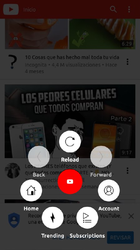
We could add widgets as well, but there are two things that are missing in this change: the current white background is horrible, I think it's better to put the Ubuntu colors or add transparency at least, and something that I think UT is lacking is that developers shouldn't place the buttons in any place they want, you must promote a set of design rules to make the system homogeneous. I like the lower button for everything, or an arrow pointing upwards, like in the youtube app for example, although there are people who like more the traditional way, the buttons in the top area, me too, whatever the choice, all applications treated equally.
I think it would be a good time for a change. Sorry for my english...thank you Bhdouglass for your dedication and hard work.
-
@josele13 turn settings->background->dash-background on to get your background image as background in sprint too.
concerning the buttons I'm not completely sure what you mean. I think its relatively consistent for core apps. everything else is up to the freedom of the app developers.