TELEports. New Telegram app icon design
-
@flohack Hehe that means nanus suggestions are the only ones valid up to now

-
-
I don't have the time to design a new icon, but I can help making the icon we'll chose more Suru (folds, shadows, gradients, etc...) if it's needed
-
could we fould Yumi somehow to make a plane of it.
or let him throw the paperplane? -
... maybe something like this...

-
@glocester Nice! I like it.
-
@glocester Also me... I like it!!!
-
Oh no... it looks so whatsappy to me...
 the color... lets make the color telegram-blueish, please.
And what about putting it upwards s.t. the suru fold matches the fold of the plane?
-
Nice participation @all btw! love this
-
@cibersheep Looks great! No, I dont need rounded corners if they are made automatically. Just wanted tomention the design considerations, so that people wont expect to have a circle as an icon xD
-
To complete the ideas from the Telegram-thread a few days ago I add my draft as well. Although I was already reminded that there used to be a browser "in the old times" using a similar logo.

Teleports - port - steering wheel was the idea behind it...Edit 1:
In Germany there is a phrase "ein sicherer Hafen" (a safe port). A port suggests safety (for ships).
If that makes sense in other languages a marketing phrase for TELEports (independent of the icon) could be:
<marketing> "TELEports - a safe port for your chats" </marketing>Edit 2: For legal purposes, the plane is taken from https://commons.wikimedia.org/wiki/Category:Telegram_Messenger#/media/File:Telegram_logo.svg and comes as public domain. No copyright fraud intended.

-
@flohack @cibersheep so the background of the icon will be white right?
If it will be transparent you wont see any rounded corners anyway no matter if they are made automatically or not?
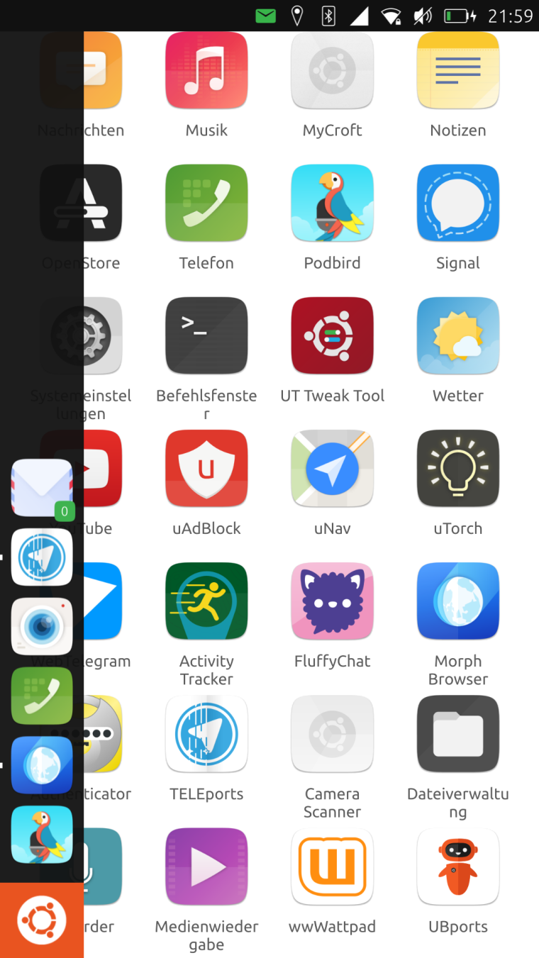
If the background will be white: could we see how it looks on a non white background? At best... just did it:


-
@hummlbach Yes that looks awesome!
-
@hummlbach I agree, looks awesome ... Sam Hewitt's work was excellent ... and this is just the old icon inside a circle...
-
That looks eerily similar to the uNav icon though. They are both a stylized arrow pointing to the upper right corner, and inside a circle.
-
The mysteries of design synchronicity : )
-
@dobey yes that bugs me too...

-
Maybe with any other colour...the design it's cool.
-
@hummlbach why not let it point left or right then...
-
@flohack no, keep it to top right like the original icon...

